ratio analysis of hero motocorp ltd.
•Download as DOCX, PDF•
3 likes•3,724 views

The analysis of Hero Motocorp Ltd. based on various ratios

Recommended
Recommended
More Related Content
What's hot
What's hot (20)
Viewers also liked
Viewers also liked (20)
Similar to ratio analysis of hero motocorp ltd.
Similar to ratio analysis of hero motocorp ltd. (20)
More from amritpal kaur
Recently uploaded
Recently uploaded (20)
ratio analysis of hero motocorp ltd.
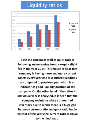
- 1. 0 0.1 0.2 0.3 0.4 0.5 0.6 0.7 0.8 0.9 1 2011 2012 2013 2014 2015 current ratio quick ratio Liquidity ratios Both the current as well as quick ratio is following an increasing trend except a slight fall in the year 2014. This makes it clear that company is having more and more current assets every year and less current liabilities as compared to previous year which is an indicator of good liquidity position of the company .On the other hand if the ratios in individual year is analysed, it is seen that the company maintains a large amount of inventory due to which there is a huge gap between current ratio and quick ratio but in neither of the years the current ratio is equal to the ideal ratio.
- 2. 0 0.2 0.4 0.6 0.8 1 1.2 2011 2012 2013 2014 2015 debt equity ratio debt to capital employed ratio proprietary ratio Solvency ratios The chart shows that the debt equity ratio is decreasing which means that company is having less debt in current year as compared to previous year which is a good sign as it decreases a fixed financial charge on the company i.e. interest payment. This also leads to decrease in debt to capital employed ratio which means that out of total money invested in the business, less money is borrowed one which ultimately causes an increase in proprietary ratio. The company is having same equity share capital every year just the reserves are increasing which means that company is having more profits and is retaining more of them .
- 3. 0 2 4 6 8 10 12 14 16 18 20 2011 2012 2013 2014 2015 Total assets to debt ratio total assets to debt ratio This ratio shows that how much part of total assets is financed by debt. High ratio indicates that less of total assets are financed out of debt. As the value of debt is decreasing every year and ultimately becomes nil so the ratio is increasing and in the last two years as the value of debt is nil so the ratio cannot be determined s is a good sign as it indicates that the company is in good solvency position.
- 4. 0 50 100 150 200 250 300 350 400 2011 2012 2013 2014 2015 Interest coverage ratio Interest coverage ratio This ratio shows that how much profit is available to pay off the interest payment. It is increasing every year. This reveals that the company is having enough profits to pay off interest. The ratio is increasing because the interest payment is decreasing because debt is decreasing year after year the company is having good solvency position
- 5. 0 20 40 60 80 100 120 140 160 180 2011 2012 2013 2014 2015 Inventory turnover ratio Debtor turnover ratio Total assets turnover ratio Turnover ratios Turnover ratios indicate the speed at which the activities of business are performed .Inventory turnover ratio shows number of times inventory is converted into revenue .this ratio is somewhat same every year and the company is in goodposition. Debtor turnover ratio shows the number of times debtors are convertedinto cash. The chart shows that the ratio is decreasing which means that the collection is not speedy. Company must take steps to cope up with this problem assets turnover ratio is somewhat same every year. It indicates good working activity of the firm.
- 6. 0% 5% 10% 15% 20% 25% 2011 2012 2013 2014 2015 Gross profit ratio Operating profit ratio Net profit ratio Profitability ratios There is a huge difference between gross profit and net profit ratio & operating profit ratio every year which means that the company is spending a lot on operating expenses which is leading to fall in the operating profit. So the company must take some steps to control the operating and non-operating expenses.
- 7. 0% 10% 20% 30% 40% 50% 60% 70% 80% 90% 2011 2012 2013 2014 2015 Return on investment Return on shareholders funds 76% 77% 77% 78% 78% 79% 79% 80% 2011 2012 2013 2014 2015 Operating ratio Operating ratio Graph 1 Graph 2 Graph 1 shows return on investment. It explains the overall utilisation of funds by a business enterprise.This ratio is decreasing every which indicates that company is not good return on investment and same is the case with return on shareholder funds Graph 2 shows operating ratio .This ratio indicates all the expenses. This ratio is very high but is decreasingyear after year which is a good sign for the company.
- 8. ₹ 0.00 ₹ 50.00 ₹ 100.00 ₹ 150.00 ₹ 200.00 ₹ 250.00 ₹ 300.00 ₹ 350.00 2011 2012 2013 2014 2015 Earning per share Book value 0 0.2 0.4 0.6 0.8 1 1.2 2011 2012 2013 2014 2015 Dividend payout ratio Dividend payout ratio Graph 3 Graph 4 Graph 3 shows the earning which a shareholder is getting on his share. This is increasing every year which means that the company is in good financial condition and is getting enough profit which is ultimately leading to good book value of the firm’s share. Graph 4 shows the dividend pay-out ratio which shows a decreasing trend which means although the company is having enough profits to pay dividend but it is not paying because it is keeping more as retained earnings in the form of reserves .