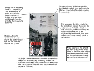
1. Sub-headings help section the contents into blocks to make it more reader-friendly. Changes in font help differentiate headings from contents. Unique way of presenting a title for contents page.This style reoccurs in many, if not all, Vibe magazine contents. Unique styles are always a good thing to have, in order for the magazine to stand out. Brief summaries of articles included in the contents are present. These give the reader an idea of what the details of each feature are, and therefore help the reader choose which part of the magazine they want to read, thus again increasing the reader-friendly nature of the contents. Interesting, thought-provoking image which compels the reader to read more and see what the magazine has to offer. All the features of the contents are there for a purpose. This is mainly to make the page easy to navigate for the reader, whilst still giving some stylish quality and eye-catching uniqueness. The image is effective because it combines an interesting background, with an equally interesting model in the foreground. The models dress, stance and body language bring in the reader and intrigue them with regards to the purpose of the image.
2. The contents is broken up into areas of interest (ie. Music, Records, etc) which helps break up the contents to make it easier to read and find the area they are interested in. Introductory title for concise guide. Interesting article titles to grab the readers attention, followed by brief summaries of each article, which leave the reader wanted to read more. Also, each article in the contents has its author credited, which may add extra appeal if the reader has a favourite writer. Like the previous magazine, all the features of the contents are there for a purpose. This is mainly to make the page easy to navigate for the reader, whilst still giving some stylish quality and eye-catching uniqueness. Again, simplicity is key. Dynamic, varied pictures are displayed on the contents page, to give further details of what is in the issue. A reader is more likely to look at the image if there is one, take an interest in it, then refer to the text in the contents to find where the interesting article is in the magazine.In other words, the text and images are used in conjunction in order to navigate the magazine.
3. Although the issue is an ‘Oasis Special’, the images included on the contents page are not of Oasis. Instead, the Courteeners and Nick Cave are pictured. This is because everyone knows who Oasis are, but they may not necessarily know the Courteeners. By balancing known acts with less well known ones, Q can attract a wider audience; the magazine appeals to Oasis fans, and also to a broader audience, such as fans of the Courteeners. Using Oasis’ status in such a way, the magazine can use vacant space to advertise other features of their magazine. In this Q edition’s contents, a clear colour scheme (red & black) is maintained to make the page have as little ‘chaos’ as possible, for the sake of the reader.However, as this is an ‘Oasis Special’ edition, a section of the contents concerning Oasis pages is separated from others and is differentiated with a stand-out gold font. The list of the issue’s contents is split into four titled categories (Features, the Oasis Specials, Every Month, and Reviews) by clear lines and boxes. This split allows the reader to know where to look for specific pages and their nature in the magazine. Space is allocated evenly to each section, including the images. Whilst this magazine contents has more text than my other samples, it is still easy to navigate. This is because of the allocation of space and categorising for each article; the contents is broke up by sub-headings and images. Whilst a little more complex than other magazines, it still balances stylishness with user-friendly qualities. Again, articles on the contents have a small summary to make it clear what the article includes. This helps the reader understand the meanings of ambiguous article titles.