SlideShare a Scribd company logo
1 of 42
Music Industry Magazine-
Coursework
Aisha Issa
Magazine
Life Style- Denoting advertising
or products designed to appeal to
a consumer by association with a
desirable lifestyle.
Music- Magazines that have a cover
image of a music artist and maybe sell
soundtracks to grab or hook readers
into buying the magazine. There are a
lot of publicity on music magazines.
Gossip- Magazine that are
based on the latest scoop
on celebrities. This is the
most bought and advised
magazine category through
the UK.
Fashion- These magazines are normally posted
on fashion week, but magazine like Vogue tend
to publish an article every week on the latest
style and fashion errors. These normally targets
an audience interested in clothes and the
modelling world.
Entertainment- the action of
providing or being provided
with amusement or enjoyment
through an article.
Sports- Magazine articles that
only base there topics and
interest on sports. The male
gender are mostly fascinated
about sports in the UK.
Fitness- Magazine
articles based on
how to work out and
the protein used by
famous athletically
built people or body
builders. Fitness
magazines are
normally targeted to
gym loving male
and female.
News- Formal and informal
written work on what’s
occurring worldwide to
inform audiences that are
interested in discovering
world affairs or local news
for those who want to know
what’s happening around
them. This is usually for
older audience.
Food/Cooking-
Magazine articles
typically based on
healthy recipe's.
Mostly the female
population of the
UK tend to read
Jamie Oliver’s 30
minutes cooking
techniques.
Home and Garden- Normally
written tips in informal
language to an audience
interested on gardens and
home décors.
Anchorage:
Straightforwardly recognisable and seen than
the other text on the magazine cover. It’s
relating to the cover image of ‘My Chemical
Romance.’ The background is white to make
stand out more and is to hook the readers into
buying the magazine.
Cover image:
The NME uses a medium close-up shoot of the
band to catch the attention of fans. My Chemical
Romance is shown wearing black attire in a blue
(the blue is faded)
background to make the reader notice the cover
image as black stand outs more than blue.
Cover line:
This cover line is keeping to the neutral colour theme.
Blue, black and white are used in the article. This is
so it has an effect on the reader and because the
magazine doesn’t have a lot of space it seems messy
and the three colour rule give the effect that it’s
messy on purpose.
Mast head:
NME logo is easily recognisable by many readers.
In this magazine the logo is in the colours red with
white outlining to make it standout in the black
box. The logo is clearly shown proudly and isn’t
hidden.
Strapline:
The slogan of the magazine is covered, this
could be because many people already know
what it by looking at the masthead. So this
further gives the impression that the
magazine is popular because the slogan was
covered causing the readers to focus on the
message, ‘Fractals VS The Horrors.’
Barcode:
Is shown at the bottom away from the main features of
the magazine, but it’s at the bottom right corner where
normally people last focus their eyes at and remember
more.
Subheading:
The subheading in the bottom left and top right of
this magazine cover to give the readers an insider
of what topics and article would be stated in the
magazine. Pictures are placed with the subheading
in a miniature frame.
Cover line:
The cover line is placed in a black frame with a
white text reading, ‘the week the world went black.’
The text is gripping and interesting to the target
audience, which is young people. The young
people aren’t interested in serious text so in order
to grip their attention you should shorten words
and make it mind blowing for them to wonder and
ask question regarding the message the cover has.
Mast head:
Similarly to NME, SPIN has there own logo
that has been there for many years and is
recognisable straight away by many readers.
In this magazine the logo is in the colours
white and a red box. On the other hand this
logo magazine has been hidden slightly by
the cover image because of this supposition
we know that the magazine is popular.
Cover Image:
Similar to NME, this magazine also uses a
medium close-up shoot of the band to catch
the band ‘My Chemical Romance’ in a better
light because you would only fit one close-up
of the band. A positive thing I could pick out of
the cover image is that it’s colourful and
stands out.
Main Cover Line:
Easily recognisable and seen than the other
text on the magazine cover. Like usually the
main cover line is relating to the cover image
which can be the most encouraging factor for
the readers to buy the magazine. The tag line
underneath furthers to a quote from the
magazine and this could be considered a
hook.
Cover Line:
This cover line has been placed in black background,
this suggest that the information in the box is to hook
the reader into buying the magazine.
Cover Line:
This cover line is keeping to the neutral colour theme
(3 colour rule) I’ve noticed that the magazine doesn’t
have any space, which could lead to the magazine
being messy, but keeping with the colour theme it
doesn’t look rather messy.
Puff:
Puff is used to keep important eye catching
information in a shape. In this Spin cover the puff is
placed in a circle, causing it to standout more.
Placing text in a shape would mean that it’s
extremely important and is alluring to the readers.
Colour scheme:
The colour scheme is the usual rock music
magazine colour houses used. In this one
however there is no yellow just black, red, and
white. These colours used with the cover image
make the magazine cover of Spin stand out
Mast head:
Similarly to SPIN, Kerrang has hidden there
logo with the cover image, this is because the
magazine logo is very popular and would be
easily recognisable for the usual buyer or new
buyers. The logo stands out since it’s black and
the background is white.
Main Cover Line:
Directly recognisable than the other text in the
magazine because it’s written boldly in white
with a blue box. The main cover line relates to
the cover image of ‘My Chemical Romance.’
The background is white to make stand out
more and is to hook the readers into buying the
magazine.
Cover Image:
Similar to SNIP and NWE, this magazine also
uses a medium close-up shoot of the band to
catch the band’s appearance and expressions.
My Chemical Romance is shown wearing black
attire in a white background to make the reader
notice the cover image.
Cover Line:
This cover line has been placed in black
background, this suggest that the information in
the box is to hook the reader into buying the
magazine.
Barcode:
Is shown at the bottom away from the main features
of the magazine, but it’s at the bottom right corner
where normally people last focus their eyes at and
remember more.
Puff:
A puff is used in this magazine in a circle to
show the importance of the information. Which in
this case is about a 7 day rock guide that would
catch the attention of rock music lovers.
Subheading:
There is subheading in the bottom left to give the
readers an insider of what topics and article
would be mentioned in the magazine. This is
helpful because it would attract readers into
reading more and maybe even convinced them
into buying the next issue.
Strapline:
The strapline is at the top and bottom on this
Kerrang magazine, this is a effect because it’s
excellent way of raising brand recognition and
enhancing the values of magazine.
Mast head:
Similarly to SPIN and Kerrang, Rock Sound
slightly hides a bit of the masthead by putting the
cover image. This is because the magazine logo
is very popular and would be simply recognisable
for the usual buyers or new readers. The
supposition of the masthead in this magazine
cover shows indicates that Rock Sound is a
popular rock music magazine.
Competition:
A competition is unlikely to be on the front cover of a
magazine, however Rock Sound places a
competition to win a signed disturbed guitar. This
makes the magazine audience young people
between the age of 16-24.
Cover line:
The cover line includes another rock artist that is
extremely popular in the rock music industry since
her songs were number one in the UK and Australia
through she was not famous when the magazine
was published that means she was undiscovered
and became more famous by Rock Sound. The
image of Lacuna Coil is seductive so would attract
the male gender more than the female.
Cover image:
The cover image is of My Chemical Romance
when there album ‘Tales From the Dark Side’
was released to the public making this
magazine in trend with the latest singles from
the well known rock artist or groups. The band
is wearing black to go well with the gloomy
background that associate with their album.
Cover line:
The cover line is written in sans serif front and in
white and yellow to standout from the dark
background. Informal language is used to
communicate to the younger audience sense
younger audience and known to be fund of
informal language because it feels like they are
speaking to friends not prime minster.
Colour scheme:
The colour scheme in the magazine front cover is
yellow, red, black and white. This is colours
typically found in rock based magazine such as
Kerrang, Spin and NME.
Barcode:
Similar to all music magazine front cover the
Rock Sound barcode is in the bottom right
because that were people’s last focus is at and
in order to buy the magazine you would need
the barcode.
Masthead:
Vogue logo is supposition in an usually way
compared to the other magazines I’ve analysed.
With the first two letter positioned in front of the
main image and the other three letters are
positioned behind the main image. This could be
because the magazine is well known among
women and feminine mans that are interested in
fashion.
Main image:
The cover image is of Jennifer Lawrence wearing
a stylish white and black flowery dress that could
instantly get a response from people that are
fascinated about fashion. Jennifer Lawrence is a
well known actress that has won many award and
wears many Dior clothes. She’s also know in
being the number one stylish in Glamour charts.
This would instantly attract people interested in
fashion since that is the target audience Vogue
wants reading the magazine.
Anchorage:
The acknowledgement of Jennifer Lawrence is
written in red bold front to standout and hook the
readers into knowing who the front cover image is.
This might make readers that don’t know Jennifer
Lawrence into wanting more so would read the
article dedicated to her.
Cover line:
The language used in this cover line is suited to
the target audience since it’s using words such
as ‘beauty’ to connect with the audience since
fashion lovers use words like that to describe
outfits. Often you would hear someone
interested in fashion using phrases such as
‘beauty’ to describe clothing.
Cover line:
The cover is used to interact with the readers that
want to know where they can shop online. This
gives an impression that Vogue is trying to have a
bond with the readers. Normally music magazine
would put this into puff so their readers could
easily see it. However, Vogue being a fashion
magazine would do the opposite; making it
standout with a different writing front compared to
the other text in the cover.
Cover line:
The cover line draws the readers into curiosity
since it uses phrases such as ‘cool kids’ and ‘faces
of now’. This is direct indication of what the
magazine article may contain and allures the
readers in suspense in discovering what the cover
line actually means. It may mean someone wearing
hideous or beautiful clothing that would live anyone
in shock or amazement. In fact this is alluring me
into finding out what Vogue cover line means.
Cover line:
The cover line allures readers into finding out what the latest stylish trends being reported. If it shocking or astonishing. It makes them want to know
who’s been judged by Vogue magazine in this issue. It’s like a exclusive report that could anyone feel like they are reading hidden secrets that are
opinionated by someone else. It’s a way to bring more readers to the next issue since they’ll have more opinions about this issue.
Focal image:
The main image is of Selena Gomez, this promotes the
content of the magazine which is the artist and her tour.
The main image is overlapping with the masthead which
means that the magazine is putting great emphasis on
the artist to attract buyers than the reputation of the
magazine, this means the advert is using the advertising
technique of celebrity endorsement. The focal image is
showing that Selena Gomez attention is focused on the
readers, direct address. This may have been used to
grab readers attentions and allure them to the focal
image.
Masthead:
The masthead of the magazine is “KISS”
position behind the focal image. This could
be because billboard is a extremely popular
music magazine so the readers could clearly
workout that the masthead. Another reason
might be to show the readers that the focal
image is the main focus of the magazine.
Barcode:
The barcode is position below, which is
mostly common in popular music magazines
like NME and Q. Barcodes are shown so that
the shop can scan the product.
Caption:
The magazine is using direct address in the
caption, ‘INSIDE THE CONFIDENT GIRL’S
HANDBOOK’ to appeal to the readers
because the caption is a direct quote of what
majority girls love. It’s a great method to use
when appealing to their feminine target
audience. I noticed that the language of the
caption is informal language, this could be
because the target audience are young
females.
Target audience:
Just by looking at the artist of the magazine
(Selena Gomez) it clearly indicates that the
target audience for this magazine issue is
younger girls between the ages of 11-17
because Selena Gomez appeals to that
particular age group and gender.
House Colours:
The three main colours used in the magazines are
purple, white and pink these colours are used to appeal
to the target audience. It’s common knowledge that
majority of girls like the famine colours, such as blue,
purple, white, pink, and etc. The colour would appeal to
the target audience because of the feminine colours.
Anchorage:
Selena Gomez is written in hyperbolic front, making
it standout in order to allure the fans to know the
main context. After analysing variety music
magazines front covers I’ve come to know that the
anchorage stands out and is clearly indicate. I’ll
make sure to include a bold anchorage.
Puff:
A puff is used in this magazine front cover to show the audience the price of the magazine. This is great
method in indicating to the readers the amount and the word ‘only’ makes us think it’s the cheapest
price you can get for the magazine.
Issue number and date:
The issue number and date is placed beside the
masthead since it’s the second thing people would
notice after the masthead. Our eyes look from left to
right in magazine. However, it could be used to fill the
space.
Masthead:
‘KERRANG CONTENTS’ is written in black
front with yellow filled in the background.
The front is sans serif since there’s no
flourish at the ends of the strokes and it’s
plain.
Competition:
The competition is written in a san serif front
and stands out with the red and white block
writing since the background is black. The
idea of the competition is to catch the
attention of Metallica fans because the prize
is a limited edition Metallic vans.
Picture and signature of editor:
The editors message gives the magazine an
informal and personal feel, with the editor
directing there message to the readers. The
language use is very casual. Young people may
prefer these kind feel as opposed to a serious
magazine, as they usually want to read a
magazine for entertainment.
Main image:
Immediately we could see the main image is a
picture of a band, in this case it’s Metallic, which
is being used to promote a competition to win a
merchandise. The puff makes it clear that there
is something to be won, which would grip the
readers attention.
Colour scheme:
The colour scheme used in the content page is
yellow, red, black and white. Kerrang doesn’t follow
the house colour theme since it uses four colours this
might be because the target audience is young
people. The colour theme is funky and vibrate while
keeping it professional. If there was too much text the
readers of the magazine might become bored so
there has to be a balance of text and image.
Subscription:
A subscription is used to encourage the readers into
buying more than one magazine since the image is a
of five magazine. The offer is used to catch the
readers attention into buying more copies made by
Kerrang.
Columns:
The columns are used to guide the readers into
knowing what the pages contain. The Kerrang
content column follows the colour scheme and has
subheading to draw the audience attention to one of
the subheading and obliviously help guide them to
the correct page.
Masthead:
‘Q CONTENTS’ is written in red and white
in a red background to make the masthead
standout and recognisable to readers easily
since it’s eye-catching. The front is serif
since it’s thick and has a thin stoke.
Main image:
The main is clearly show Dave Grohl, a
member of Foo Fighters holding a electrical
guitar to show the audience that the
magazine is mostly based on Dave Grohl and
music. Dave is wearing an outfit that goes
well with the colour scheme; red, white and
black.
Columns:
Similar to Kerrang, Q uses columns to
guide their readers and subheading to
further on guide them into knowing what the
pages consist off. The columns are in red,
black and white to stick to the colour
scheme.
Issue number:
The issue number is written to inform the readers
what issue the magazine is and the issue is
positioned right beside the masthead.
Sample pages:
Images shown of the pages are showing the
readers what’s written in the magazine. Sample
pages are used to give a glimpse and overview of
the magazine. This is often used to replace the
editors picture and signature.
Cover:
The cover of the magazine is on the content page to
show the readers or remind the readers of the aim
and purpose of the magazine. The purpose of the
magazine to entertain the audience that is adult
between the age 24-35. The aim is to inform the
audience about Foo Fighters.
Colour scheme:
The colour scheme of content is white, red
and black to catch the eyes of the masculine
and feminine readers since red could signify
passion and blood. The colour scheme is
elegant and lively and yet professional gives
the impression that’s what the target
audience like.
Masthead:
‘CONTENT’ is written in serif front that stands out
to the audience. The white text catches the readers
attention because white stands out in the red
background. ’DRUMMER’ the magazine title is
written below the content and much larger in a
black sans serif front to hook the audience.
Date:
In this text the date is written above the
masthead and larger, this shows that the date is
important in the content page. Normally
magazines aiming for younger readers would
often enlarge there date, this is because younger
people are often fund of showing the latest
magazine among their friend.
Main image:
The main image is different in this magazine
because a infamous drummer is used as the
focus image. This could indicate the magazine
into being new and not popular yet to older
readers so would be targeting young people fund
of any music.
Columns:
The columns are structured like a usual content
page would have. The title of the content is
‘Features’ this further on links to the fact that
the magazine is new because of the subheading
targeting preteens.
Colour scheme:
The colour scheme is red, white and black. The
vibrant colours attracts young people
experiencing a change of music. The children
that want to change from pop to rock or hip-hop
to jazz. The magazine doesn’t particularly doesn’t
focus on a genre of music, it expands to any
music genre.
Numbering:
There are numbering of pictures scattered
around the content pages with numbers on. This
could be used to inform the target audience
about what pages contain.
Masthead:
SPIN magazine uses the masthead on the
contents page to reassure the readers that they
are reading SPIN. It also gives the allusions that
the magazine is proud of their masthead by the
repetition and frequently reminded the readers of
the magazine. It’s a great technique.
Column:
The column in the contents page is positioned in
a usual style and gives the indication of what
would be included in the magazines. The
features are the only thing included when
compared to other music magazine contents
page. This is because many music magazine
contents page include other stuff than the
features. For example; live review, gigs and
subscriptions.
Layout:
The layout of SPIN contents page is plain and not
as interesting. This could be because the readers
are supposed to look at the focal image and focus
their attention on the brighter sectors of the
contents page, for example; the features column
and the quote in the top right corner.
Puff:
This puff is on the contents page with a square
informing the readers to turn to the front cover.
This is unusual as other music magazines like;
NME, Kerrang! and Q where this is uncommon.
SPIN contents page has a unusual style which is
strange and thrilling, probably to attract the target
audience.
Focal image:
The focal image is of two artist wearing clothing
that suits the house colour because it’s in black
and white. The attire of the clothing is classy
and sophisticated because they are wearing’
hats, stripe shirts and blazers. This dull scene
portrayed by SPIN could be a way for the
readers to notice the focal image as it takes up
the most space. Maybe it’s to show the
importance of the artists and the main focus of
the entire magazine or to even keep the
readers please of the contents page. This is a
great technique to be inspired by in a music
magazine. However, it doesn’t fit the scene my
partner and I are looking for as the contents
page is alluring a different target audience.
Target audience:
The focal image gives the sense that the
target audience are pop lovers because of the
artists. I could workout the age range is young
people between 16-24. SPIN is targeting both
genders without signalling out anyone.
House colours:
The house colours are grey and white. The
masthead is different colour to make it
standout, same thing goes for the puff. The
house colours suits the theme which is
sophisticated and classic.
Masthead, date and website:
The masthead with a web address and issue
date are situated at the top of the page which
creates continuity throughout the magazine, also
the web address gives the audience significant
information on the magazine. The colours of the
title are in three different type, green orange and
light blue, all of the colours accompaniment each
other pleasantly and stand out against the white
background.
Main image:
The main image is of Emma Watson, which is
placed in the centre of the Contents page on
the right-hand side. It is what will catch the
readers attention first, and explains to the
audience that Emma Watson is the main
article as she has her own large
advertisement. This may attract the reader into
turning to that page straight away, to see if it is
as good as what the magazine has hyped it up
to be with the advertising.Columns:
The image also breaks up the drop down
column, with the image breaking up the text
which suggests to the reader that the magazine
contains more images than the text itself, and
that the image is more important than the text.
Colour scheme:
The colour scheme is; pink, orange, green and
black and white. It’s attractive to women,
however, it is presented in a mature way so that
the colours contrast each other well. The use of
the green and orange used on the masthead
stands out on the page as it is luminous, giving
connotations of the Autumn season which is
upon us, as the magazine is the Autumn issue.
The text colour 'green' symbolises and gives
connotations of nature.
Target audience:
The target audience is Emma Watson and
people who like fashion since Glamour is a
fashion magazine. Due to the layout of the
content page I could work out that the target
are women or feminist mans between the
ages of 21+.
Heading:
The heading ‘Style Issue’ appeals to the
readers that the magazine is going to
judgemental and critical to fashion and
celebrity clothing. The word ‘issues’ refers
to problems and this being the heading of
the column attracts the readers into
digging deeper and figuring the pages
associate with the heading.
Main image:
The cover image is of Gerard Way
holding a mike whilst his hair flapping
across his face. This gives an insider
of what a concert performed by My
Chemical Romance is like and fans
easily respond to with recognition or
envy, even maybe desire to attend a
concert. This is good way to attract
fans and show a side to the band that
the fans might not have known.
Colour scheme:
The colour scheme in this double
page spread is black, red and white
to attract an audience that’s into
rock music because of the dark
colouring. You wouldn’t expect to
see a bright colour like pink in a
magazine that targets people that
love rock, emo and heavy metal.
Heading:
The heading is in an appealing style that would
attract the readers. The red and white bold writing
is spreads through both half of the double page
spreads making it standout and important
information since its based on the powering quote
from the band MCR.
Subheading:
The subheading is written below the heading to give the
effect that it could be a caption. The bands name MCR is
written in white bold white to be seen easily whilst the
rest of the sentence is matching the article. This is the
scheme to show that the band is most focused in this
article and double page spread.
Language:
The article is very short
compared to other music
magazines. This could be
because the target audience
are younger people that aren’t
interested into worded article
since majority of them don’t
like long explanation- short and
simple is the saying to gather
the attention of the youth.
Columns:
The effect of having a white
background in the corner of the
page adds good contrast and
allows the text to change to
black which makes the
magazine more exiting as
colour is played around with
and makes the article more
visually expressive.
Pictures:
There are several pictures displayed
in the double spread since I've
mentioned that the target audience is
young people between 13-18 since
those are the years that most young
people aren’t found of reading article
that are seemed like essay. That is
the reason why this double page
spread is mostly pictures.
The double page spread is taken from Kerrang Magazine, who’s target audience is mostly for
those who enjoy heavy metal and rock music. The interview publicized is by My Chemical
Romance, a very legendary band throughout the emo franchise that unfortunately spilt up in
2013. Usually double page spreads focus more on the main interview, showing a long
interview and a collage of photos. However, Kerrang is appealing more to the younger readers
since there is fewer text and more pictures of the band members. This would make Kerrang
target audience in being rock enthusiastic people between the ages 15-24.
On the double page spread, the first thing that would logically capture the readers eye would
be the full page image of Gerard Way on the left. This is the most dominant visual image,
implying that he is the lead singer, or main man of the band. Throughout the bottom half on
the other page are more images of the other band members and Gerard, with only a tiny bit of
text. This put forward that that target audience are interested in what they are getting up to in
the studio. Furthermore, the font is quite minor, drawing more attention to the pictures and
what they are displaying, as the text is primarily describing what is happening in the pictures.
The house colours are; black, red and white, which are mainly “in your face” colours. This then
connects to the target audience, those who like emo and rock music. In addition to this, these
colours are also My Chemical Romance’s logo colours. There are many presentational
devices used to attract the target audience. For example, on the right hand side of the page
there is a collapse of some of their new tracks and what they mean and sound like. This is
effective since it works well and appeals to the band’s followers as they would like to know
more about their new album at that time.
Kerrang magazine is recognised for it’s “different” and “rugged ”appearance, they don’t bleep
out vulgar language or anguish, which are shown to be made by the band throughout this
interview. This then reflects on the people who read this magazine, that they like the rock ‘n’
roll or alternative aspect, or even those who just like to be “different”. The only words that are
repeated throughout the double page spread are the obvious words “My Chemical Romance”
“Kerrang” “Rock ‘n’ Roll” and “emo”. Which implies the band and title name of the magazine,
as well as the genre in which they are compared to.
Main image:
Florence is looking directly at the
camera making the audience feel like
they have a connection with her. The
pose fits perfect with the layout since
it allows her to look attractive and
more appealing to the male readers
and envy to the female readers. The
attire she is wearing is black to
standout from the grey background
and the red and white flag she is
sitting on.
Colour scheme:
The colour scheme is grey and black.
The double page spread is dull since
it doesn’t have bright colours not
including Florence red hair and the
American flag- the red and white part
is shown. The attention is drawn on
the side that Florence is on since the
brighter colour are on that half of the
double page spread. This is a
scheme to make the page more
intriguing to the audience that listen
to her music.
Subheading:
The subheading is a verse from one of
her popular songs. Yet, another
scheme to attract Florence fans to read
the article further on since it’s big and
bold to standout.
Heading:
The heading is supposition behind the main image,
but we can workout that the heading says ‘USA’ to be
part of the theme since Florence is sitting on what
looks like the American flag. Its doesn’t take away the
attention from Florence since it blends in with the
background very well.
Language:
The article is in design that
standouts and attracts the
readers since it looks like a
filled in rectangle with a capital
letter to start the introduction.
However, younger readers
might be put off by the article
sine there’s a lot of words are
used. There’s a lot of words and
not enough images that indicate
the target audience for this
double page spread is 16+.
The feature headline is made up of two different; type one being a translucent, large, bold
front. The second is a smaller, opaque, italic script type front. The second part of the
caption draws more attention to the aforementioned, perhaps to reinforce that the magazine
is referring to one of Florence Welch’s songs; ‘You Got the Love’. The focal chunk of text,
the article, is all in one colour and front, which displays that is it part of the same thing. It is
not broken up by quotes or images or even side bars. It is not problematic layout article.
The image is on the left and the writing on the right. There is also only one image on this
double page spread thus making the reader instantly know that the article is based on
Florence Welch. The red colour of the ribbon and Florence Welch’s hair may be being
referred to by the ‘got the love’ part of the heading as love is often referred to by the colour
red. The mise-en-scene is equally important regarding the magazine article in the middle of
other parts of the double page spread. She is sat on top of a table, above eye height, with
her feet on the steps. The colour of her clothes may also be relevant to the article. The
kicker describes Florence as having ‘America at her feet’, so below her, this links to why
she is sat above the camera looking down on the camera’s point of view presenting
America is below her in a literal sense. Her feet are also raised off the ground strengthening
the caption that says of ‘at her feet’. The colour of her clothes, being black may signify
stubbornness, ruthlessness, aggressiveness, toughness, threatening and macho. However,
her face demonstrates the opposites of these things. This could be a way to show the
reason why ‘America is at her feet’.
The focal and lone image on the double page spread takes up half the double page spread;
this is usually the same layout as the VIBE other magazine double page spreads, with the
artist that the article based on in the left third and the writing on the right.
The text columns on the right are very well-ordered. The house colours on the double page
spread are shades of black, white and grey apart from the red ribbon over the white table
cloth and Florence Welch’s red hair. Her legs and hands are also different colours from the
shades. This could be scheme focus the readers eyes on the bright colours of the double
page spread due to the dull house colours and could be interrupted by the boldness and
loud red colour thrown over the table cloth.
Main image:
The main image is of Justin Bieber
sitting on a transparent plastic chair
looking like his directly staring at the
readers since his eyes are looking
straight forward at the camera. This
is used as an effect to make the
readers feel like they have a
connection with Justin. Justin Bieber
is used because thousands of young
girls listen to his music making him
popular and since his music is pop
could be the reason why his in the
double page spread since his songs
are popular among young children.
Heading:
The heading is written in two colours (pink and black)
with a bubble writing front. This is done because the
target audience are young girls between 12 and 15.
Justin Bieber fans are girls between those ages. The
colour of the heading to go with the theme of the
purpose the double page spread has which is to get
more younger age girls read.
Skyline:
The skyline isn’t at the top of the double page spread
rather underneath the heading. This could be a way to
attract the readers into reading more since the writing
is highlighted pink with the text written in purple which
are all colours girls like in the early stages.
Colour scheme:
The colour scheme is black, white
and pink. The colour pink is known
to be a colour young girls are fund
of since the article is to attract
young girls into reading on. The
colour black and white is to balance
out the double page spread from
looking too childish since children
now days want to be acknowledge
as young adults.
Picture:
A picture of Selena Gomez and
Justin Bieber is to give an
overview of what the article is
going to be about to the readers.
Its an insider without reading the
article yet. My prediction would
be that it’s either going to be
about them to dating again or the
split that occurred between them
since the heading helped me
come up with those prediction.
Language:
The article layout is like an
interview format since the
importance parts are highlighted
in pink and easy to notice with
interesting straight forward
questions that would be eye
catching to readers.
The double page spread is from We ♥ Pop Magazine. The double spread uses a whole page to promote
the artist by placing an image of Justin Bieber posing very seductively on a transparent chair. The whole
page is to this because it’s a way to inform the readers that the double page spread is based on him and
him only. The main colour scheme in the double page spread is pink, black and white. The colour pink is
mainly used because it contrasts passion and in this circumstance it means the passion of affection since
Justin Bieber has a strong passion for his music. The masthead is easily noticeable by the readers on the
double page spread. It’s a direct quote taken from an interview that is would standout and charm the
readers to read the article, whether it be Justin Bieber enthusiasts fans or simply the demographic of the
magazine wondering as to why younger girls go crazy over Justin Bieber. The masthead is shown in bold,
large serif font, this doesn’t essentially mean that Justin is concerned about getting a headache, because
what do you expect when you have a very large fan base worldwide, which is mostly young female are
on. If you are fan and are going to magically bump into Justin Bieber on street, no doubt Justin will get a
headache. However, in this case we don’t know if it’s his fans or love-life. When Justin was interviewed
on the double page spread he had a girlfriend who was also famous solo artist, being that she’s Selena
Gomez. We all are curious and want to find that whether he is taking the time to discuss to the
interviewer about his love life with Selena Gomez or how much his fans annoy him.
By the way Justin is posing we could instantly workout that he is a flirtatious young man, loving the
devotion off of his female fans. It’s not necessary for him to smile to make us girls fall in love with him, he
can merely raise his eyebrows and we will become weak at the knees. There is studio lighting which is
shining directly onto his face, highlighting his bone structure and the hair outlining his face this would
request to the magazines demographic as they have a average close up of an significant pop musician.
The article uses a typical convention outline, such as columns on the double page spread. This is
effective because it guides the readers making it easier for readers to read and pick important information
regarding Justin Bieber or gossip easily. The format of the questions are in bold red. This informs the
readers that the questions and answers are separated and in different front colours, which also alert us
that their isn’t as much to read. This could be because the target audience are younger so would be fund
of reading essay like article so would prefer article that have 200-300 words. Having a isolated section on
the bottom right hand corner of the first page which informs the readers his ‘Dressing Room DEMANDS’
this reels the focus away from the interview and makes the reader wonder why he has demands for his
dressing room. It builds many more questions to the readers head.
Main image:
The main image is of Jay-Z with
black glasses that make it
extremely hard to see his eyes
since the eyes are the way to tell
a persons emotions. Jay-Z gives
an impression of a ruthless man
because his eyes are covered
and his mouth doesn’t look like
it’s smiling. The main image takes
half of the double page spread
showing the importance and the
main focus on the article which is
Jay-Z.
Article:
There’s a huge J that covers most of the paragraphs. The letter is way to remind the
readers that the article is focused on Jay-Z. The article is long worded making the
target audience older since younger people aren’t fund of reading articles that have
more words than pictures. The capital words are to guide the readers into the most
important paragraphs.
Heading:
The heading is underlined by
the capital ‘j’ and right above it
to catch the readers eyes into
reading it since it’s smaller
and hard to see if it wasn’t in
this format or style. The
heading is a direct quote from
Jay-Z. This makes the readers
feel a recognition towards the
quote through his music.
Subheading:
RapRadar logo stands out and
does not follow the house style.
The font and colours used are
unique to the double page. For
those who do not know what
RapRadar is, they could be
forgiven for thinking RapRadar
is a radar for rap, and that Jay-Z
is under this radar, he has been
found. RapRadar is a rap news
and blog website and therefore
you could say the appearance
of the logo is a plug.
Colour scheme:
The colour scheme is red, black
and white to appeal to the target
audience because the colours
look more for young adults so
they wouldn’t be feeling childish
and feel more of an adult.
Language:
The language used in this
article is written to suit the
target audience that are adults
around their late or mid
twentieth because it’s long
worded so wouldn’t suit
younger audience and it’s not
the genre of music older
audience listen to due to Jay-Z
rap songs.
The double page from Q Magazine featuring rapper and record producer, Jay-
Z. The image of Jay-Z takes up half the double page spread and hence applying
that the article would be based on him. The image of Jay-Z is mid-shoot only
allowing us to see his face and shoulders, however his shoulders are cut off slightly.
This could be because of his broad shoulders, emotional of the struggles in his life
and the influence he now holds. He is wearing black shades along with a black t-
shirt. This is constant with his overall image, he is known for wearing 'all black'. The
dark glasses completely cover his eyes and give a sense that there are many things
that continue to be untold and that perhaps he could tell them in this article. The
sunglasses enhance importance to his characteristic such as his mouth and lips. T-
shirt worn by him is a V-neck, this could signify victory. The appearance is cast with
a red wash-like effect on one side. This is because red is the colour of the Q
magazine logo and also a colour of passion, love and blood. On the side the colour
is white, which symbols purity and sanitation. This could suggest that Jay-Z is purity
is disappearing, he is now stained.
The RapRadar logo stands-out due to the fact it doesn’t follow the house colours,
which are red, white and black. RapRadar is often confused with meaning radar for
rap, and that Jay-Z is under this radar, he has been found. However, RapRadar is a
rap news and blog website. The large red J behind the text in a serif font is a reflect
copy of the Q magazine logo, nonetheless the letter is j, because the interview is
about 'Jay-Z'. The whole text is in a sans serif font which grasps with the classy,
upper-end look of Q magazine. All over the double page, Jay-Z and other key words
are highlighted in red, the colour of power, passion and Q magazine.
The heading on the right hand side of ‘ The most exciting people in music, Jay z’
this straight away charms the reader as its a fact that they want to find is true. The
words ‘Jay-z are in red this is to tell the reader the article is based on him. The
beginning of some of the paragraph there is a drop caps used this adds style and
lures attention to reading the article. However in this article a massive J has been
placed over the top of the text, I think this looks decent as it represents Jay z.
Colour scheme:
The colour scheme for the ‘Teenage Vogue’ double
page spread is: pink, white, blue and black. The
pink and blue would point out that the magazine is
aimed at young teenage girls who are absorbed in
the fashion and latest trend. The colour black is
used to highlight the bad topics in the article for
example the words ‘My World”, “My Cup Of Tea”
and “My iMac Screen” are in a black, bold font on a
white background this makes it stand out this would
grab the readers attention immediately. The colour
scheme has been carried on throughout the
magazine which would give the readers a sense of
endurance.
Heading:
The heading isn’t easily recognisable with all the
subheading being in a bigger front. However, the
heading as been underline to show the readers that’s
the heading. “My World” could be associate with
someone telling the readers about what they do in
their life. In this case it’s young adult Japanese
model. The numbering from 1-10 also links to the
model favourite things in life.
Main image:
The main image is of stylish Japanese model
wearing bright colours that go perfectly with the
colour scheme. This double page spread is similar
to the other four music magazine I analysed-
though this magazine is a fashion genre. The main
image always standout in a magazine double page
by taking half or quarter of the double page spread.
Subheading:
All the subheading in this double page spread are numbered to show
the readers what particularly the focal image model prefers more than
the other things listed. It’s like a menu guide, where the restaurant
keeps the highly favoured meals at the top and the unpopular ones at
the bottom. In this context the numbers are a guide to indicate to the
fans ten things she likes in her life.
Pictures:
There are pictures used to
give the readers an image to
associate with what the
model likes. The picture of
the cup of tea is linked what
is mentioned on her second
favourite thing about the
world. Another example
would be the picture of the
notebook linking to the
seventh thing she likes.
Anchorage text:
In this double page spread
the model is referred to
‘Susie Bubble’ which could
be a nickname given by her
fans and a way for them to
recognise the focal image
and be instantly drawn to the
article. This is so the readers
could continue read on.
Typography of Kerrang
Having the Kerrang logo in it’s usual front; black
with an glass shattering look, this reminds the
readers what the magazine is about and promotes
the magazine. A sans serif front is used on the
masthead as a device for emphasis, due to their
typically blacker type of colour. This would attract
an audience into rock or gothic type of music. I
would consider this a perfect front for Kerrang
magazine because serif won’t suit it due to the fact
that it’s help guide the eye along the lines in large
blocks of text. This wouldn’t be attracting the eye of
usual young readers of Kerrang because it would
relate to Drummer- a not popular and fresh
magazine. By the image of Kerrang logo below you
could see that the front of the Kerrang is in fact
sans serif because there is no decorative flourish
on the end strokes, the strokes have even width.
Typography of Q
The Q logo in it’s usual front; white
with a red background, shows the
readers what the magazine would
contain since Q is a famous magazine
and a lot of people know what Q
features in their magazine and who Q
targets audience are. The serif front is
used on the letter Q because the serif
front would make it sound out and eye
catching to the readers since Q is a
single letter. The picture of the logo is
used to show the stroke in the letter
Q. This could be used to attract the
feminine readers more than the manly
readers.
Typography of NME
In the NME the masthead is in a sans serif
front, through the letter ‘m’ would mistaken
the judgement since it has tick in the middle.
The effect the sans serif front has on the NME
logo is to draw recognition to the readers
since NME audience are top chart artist
lovers. The ones that are normally in the UK
top 5 every month. I think that the sans serif is
better front rather than serif because picturing
the strokes wouldn’t attract the readers. The
logo I placed on the left shows you that the
front of NME is in fact sans serif because
there is no decorative flourish on the end
stroke, the strokes have wider space between
the letters.
Thick and
thin strokes
Strokes have even width
Glass shattering affect Strokes
have even
thickness
Plain
Interview 1
1. Do you buy music magazines?
I’ve only bought a couple of Vibe and Q magazines on my phone. I wouldn’t
consider myself a person who buys a lot of music magazines. Through I do like
keeping the magazines I buy.
2. What is it that made you buy Vibe and Q music magazine and not the other
ones?
I don’t know…..maybe it was the fact that its articles based on celebrity that I know.
I don’t know much music magazine, but I started to read Vibe when an issue about
Lady Gaga was the front cover.
3. What about Q? Why did you start buying Q the magazine?
That’s actually a good question. I don’t remember when or why, but the magazine
standout to me and I enjoyed exploring the magazine since it was mostly about the
music I like.
4. What music genre do you like listening to?
Obliviously pop, hip-hop, rap and dance. I only listen to songs that have a rhythm to
dance to (laugh) and (laugh) the sad-y moody ones. Like the one Professor Green
was in.
5. Do you only buy a music magazine based on the artist?
I wouldn’t put it like that. I would buy a magazine based on artist and the price. I
wouldn’t spend a lot on a magazine. Heaven sake my friends would think I’ve gone
mad spending money on a magazine when I could buy a sandwich from Gregg.
6. Do you participate in competition?
What person never participated in a competition? Of course I have.
7. What kind of prize do you want to win?
Um….I saw a signed shoes by Kate Moss I really wanted. I guess I would say
special editions or signed shoes.
8. Do you only buy magazines that have celebrity?
Shamefully yes (laugh), though I believe I’m not the only one obsessed with
Beyoncé and Jay-z.
9. Would you consider reading magazine that isn’t in the type of genre you
listen to?
I guess I would through I’m not into listening to heavy metal or rock. The only rock
band I would listen to is the Script.
10. To wrap things ups could you list three or four colours that you would
like to see in a music magazine?
Sure; white, red and black.
Interview 3
1. Do you buy music magazines?
I’ve only bought a some music magazines on my devices. I don’t frequently
buy magazines but when I do it’s mostly Kerrang because I like their layout.
2. What featured made you buy Kerrang other than the other music
magazines?
The layout of the magazine makes me want to read on. I like the way it’s
designed and when I was in high school I was doing a report on Kerrang so
found myself loving it.
3. Would you consider buying a music magazine that’s not Kerrang?
Depends on what kind of music. I normally buy magazine based on the music I
listen. It’s a shame the popular music magazine aren’t to my taste.
4. What music genre do you like listen to?
I could answer that from the top of my head; rock and country songs normally.
5. Do you only buy a music magazine based on the artist you like?
The front cover matters to me. I wouldn’t be caught with a Usher on the front
cover since me and my friends are classified emo and the music genre I listen
to gives away an image I’m depressed but honestly I like listening to country
songs and like the way I dress with dark colours. It suits me.
6. Do you participate in competitions?
Yeah, just last week I registered online to this website that gives people the
chance to win a signed shirt by Green Days.
7. What kind of prize do you want to win?
Anything really. I like the feeling I get when I win.
8. What artists or groups do you like?
My favourite bands are; Misfits, My Chemical Romance and Fall Out Boys.
Favourite artist are; Sam Hunter, Luke Bryan and Jason Aldean.
9. How much would you spend on a magazine?
I don’t know really. I never think of the money I spend on the music magazine.
10. To wrap things ups could you list three or four colours that you
would like to see in a music magazine?
Okay; white, yellow and black.
Interview 2
1. Do you buy music magazines?
I’ve always bought music magazine on my journey to Harrow College. The magazine
that I frequently purchase is Vibe on newsstand on my iPad.
2. What makes you want to read Vibe compared to the other music magazines?
Um…Vibe is written for a target audience like me; hip-hop enthusiasts. There’s always
articles about big hip-hop artists and sometimes there’s ones that are written about
undiscovered artists. The pictures speaks to me on the front covers. It sounds a little
crazy.
3. It’s not crazy. As you mentioned the pictures speaks to you; what in particular
about the images you like?
I normally like the images to look attractive or at least standout from the background. I’ll
give you an example; Vibes latest issue is based on Alicia Keys pregnant photos, do you
think she looked ugly on the photos in the article? No because she looked stunning and
totally attractive. No one ever looks ugly on Vibe.
4. Would you consider buying other magazines that aren’t Vibe?
Maybe one’s that are based on music genres I like.
5. What type of music genre do you listen to other than hip-hop?
It’s going to take me time to think. Got it. Obliviously hip-hop than rap and pop songs.
6. How much do you spend on a magazine?
I’m not picky with spending my money since the money is from my parents wallets
(laughs). I don’t have a limit on how much I spend on the magazines. I mostly buy
magazines do to the cover. You know that saying; never judge a book by its cover, well I
judge a magazine by its cover since it has to have an artist or group I like.
7. Do you participate in competitions?
Yes, I participate in competition but unfortunately I never won any.
8. Would you consider entering a competition if it was on a music magazine?
I guess I would if there’s a possibility I could win something that’s got a connection with a
celebrity. Celebrities items are really popular and posting it on Instagram and Tumblr
might give me more followers.
9. Would you buy a magazine if the front cover was an undiscovered?
No, actually I won’t. I’ve mentioned that I like to read articles about undiscovered artist
but why would anyone put them in the front cover and maybe I wouldn’t like their music
because they might be one hit wonders.
10. To finish this interview up, could you tell me three or four colours you’ll like to
see in a music magazine.
Sure, black….red…white and pink.
Interview 5
1. Do you buy music magazines?
No, I don’t buy music magazines.
2. Is there a particular reason why you don’t buy music magazines?
I prefer reading magazines about fashion or weekly television. Music
magazines are pointless to me because I like listening to music not reading a
magazine about a song I like when I could listen to the song on YouTube.
3. Do you know any music magazines?
Yes, I actually know some from my friends since they like spending money on
knowing the top charts and artists personal life when the television gives you
those information Saturday afternoon.
4. What genre of music do you like listening to?
I’m those indie lovers. So anything indie however I’m obsessed with one
direction. Don’t tell anyone that.
5. Do you participate in competitions?
Yeah. When I was younger I entered so much competitions. Now I only enter
ones that I see on television or emails sometimes even through people warn
me it’s dangerous. Dangerous my backside.
6. What prizes would you like to win?
One direction merchandise. I want lipsticks with their faces on them and a
lamp of Liam face to read the books I have of them. Just anything one
direction.
7. Would you buy a music magazine if it had one direction as the front
cover? You got me there. Honestly, I would buy a music magazine with their
faces on because I know I’ll keep it since I fan-girl them. They should of
casted me in the channel 4 documentary (laughs).
8. What are your favourite indie song?
Any songs Arctic Monkey sing since there my second obsesstion. I love
Imagine Dragon songs as well.
9. Would you buy magazines based on the genre of music you like?
No, I’ll only like to buy one directions one because it comes with something
and like I've mentioned I have YouTube to listen to the songs.
10. To end this interview could you list three or four colours you think
suit to be on a magazine?
Blue, white, red and black.
Interview 4
1. Do you buy music magazines?
Some occasions I intend to buy music magazines. This past week I’ve bought two
magazines on my way to college.
2. Could you be specific on the music magazine that you bought?
I don’t know, every week I buy a different music magazine depending on the front
cover. With the look your giving me I need to explain what I mean before you ask me.
What I mean by the cover is the artist I see in the cover that makes me buy it.
3. You mean to say you only buy the music magazines based on the artist not the
brand?
It sounds weird when you put it like that, but yeah I do waste my money on magazines
based on the artist. I’m not the only person here in Blackpool who does. I know for a
fact my sister buys her (laughs) magazines and books based on the cover.
4. What music genre do you listen to?
I don’t look like the kind of girl to listen to rock music, but I do listen to Coldplay and
MCR. Kind of shocking. Its only because I hang around with people that like those kind
of music and it grows on you. I mostly listen to Bollywood since I’m a belly-dancer and
pop songs because I’m your typical girl who dreams of meeting one direction and
marrying Harry Styles (laughs).
5. What artist are your favourite since you mentioned you buy music magazines
based on the artist on the front cover?
Rihanna, Drake, Katy Perry and Taylor Swift. You can work the artist I like based on the
one’s I listed. Like I said I’m not very different from everyone else.
6. How much do you spend on magazines?
I can’t say since it’s the amount I pay for my phone monthly. All you have to know is
that I don’t have a limit when it comes to spending.
7. Do you participate in competitions?
Yeah, I like to enter online competitions, television and on magazines.
8. What prize would you like to win?
Any prize really. I don’t mind winning anything as long as I win.
9. To finish things up; could you list three or four colours that you would like to
see in a magazine?
Alright; pink, blue, red, white and black. Wait that’s five colours. Okay; red, white, pink
and blue.
Vibe
43%
Q
27%
Kerrang
18%
Rolling
Stone
12%
RESULTS FROM INTERVIEWS
Vibe
Q
Kerrang
Rolling Stone
From interviewing five people that are completely different, this gave me an overview of how different people see music magazines. Each of the five
people I interviewed were consumes of magazines however one of five did not buy any music magazines due to her beliefs that music magazines are
pointless because music should be listened to, but she would buy a magazine based on One Direction since she thinks there would be a merchandise
from the band. This gave me an idea to use puff to display a merchandise and my contents page would hold a competition. I haven’t decided what the
prize would be but have an idea to use something relating to the main image.
My aim for the interview was to discover the most popular magazine and what people like on a magazine. The pie chart shows how popular the
magazines are from the most popular to the least. Vibe is known to be the most bought from what I gathered from the interviews among young people
in their twenties and Kerrang is popular among the teenagers however teenagers don’t spend a lot on music magazine compared to people in their
twenties. This might be the reason why majority music magazines target audience are people in their twenties. I haven’t decided what colour theme I
would use, but I'm thinking to use a colours scheme that would suit my target audience.
The music genre I would base my magazine is rock due to the fact that majority of songs I listen to are rock and I’ve analysed several magazines that
have rock fans as their target audience. This giving me an overall image of what my magazine can look like. I’ve explored two popular magazines that
are based on rock music from front page to the back page. Even through my interviewee were a fans of magazines that doesn’t appeal to rock, I still
think that rock based magazine would benefit me more than a hip-hop or pop since I’m not particular fund of bright colours and I had an idea to use
dark colours and one primary colour to blend pages of my magazine. I haven’t decided what colours yet with my partner.
I wasn’t pleased in finding out that Kerrang was placed second last in the results I gathered
from my interview because I was hoping that it would be the most popular among the 16-19
year olds that I interviewed. Vibe and Q is popular among the female population around the
ages of 15-24. Only a few young females are reading Kerrang compared to the males, the
difference is 20%.
Even through my results were showing me that the five people I interviewed were more likely to
buy Vibe and Q magazines rather than Rolling Stone and Kerrang. I still feel that I should based
the music genre of my music as rock and my targets audience as young male and female rock
enthusiasts. This is because rock magazine consists of all the typical magazine conventions;
logo, competitions, main image, cover line, and etc. Majority of the other genre music
magazines sometime don’t imply the basic conventions and cover it up with information on the
artist. I feel that would not appeal to me and so I have decided to beat the odds of my results
and go with basing my music magazine on rock.
Vibe is a music and entertainment magazine. The publication primarily features R&B and
hip-hop music artists, actors and other entertainers. Vibe was purchased by the private
equity investment fund Inter-Media Partners and is now issued every-other month with
double covers, with a higher online presence. In 2014, the magazine moved online-only (It
represents over twenty-five sites and subscribers receive a copy of the latest magazine
monthly. Vibe approximately has 863,000 readers). In addition to the magazine, Vibe also
distributes books on hip-hop culture. The magazine's target demographic is predominantly
young, urban followers of hip-hop culture. However, there has been issues on pop artist,
such Jennifer Lopez on the front cover. This could be because vibe is expanding their target
audience to gain a greater profit from the readers purchases. The magazine satisfies the
readers by including revolutions music reviews, a celebrity gossip column and devoted a
double page spread for high-end designer clothing and sportswear such as Fubu and Obey.
Vibe Magazine is known for the artistic direction of their covers. R&B vocalist Mary J.
Blige frequently made the cover of Vibe, with uncountable articles following her career. The
first non-photograph cover of Vibe was an illustration of late singer Aaliyah by well-known
artist Alvaro; this was Aaliyah’s very first appearance on the cover as well. Other well-known
cover subjects are; Mariah Carey, Beyoncé, Jennifer Lopez, Janet Jackson, Lil Wayne,
Eminem, R. Kelly and Michael Jackson.
Vibe magazine and XXL have been rivals for years as they both target the same ‘hip-hop’
genre and the same target audience. The audience that would be persuaded to buy these
particular magazines are urban hip-hop followers and young people interested in music such
as R&B and hip-hop. In the short period when Vibe magazine shut down, XXL’ s sales
increased as it was one of the best hip-hop based magazines. When Vibe magazine came
back it caused tension to grow again between the two power magazines as they equally
matched each other.
Q is a very popular music magazine published monthly in the UK. Q was first printed in October
1986; it established itself apart instantly from other music magazines outstanding to the monthly
publication and advanced standards of taking photographs and printing. The inventers of the
magazine Mark Ellen and David Hepworth were overwhelmed by the music press of the period,
which they sensed was disregarding a generation of elder music consumers who were purchasing
CDs. In the first years, the magazine was sub-titled "The modern guide to music and more".
Originally it was to be called Cue, but the name was altered so that it wouldn't be mistaken for a
snooker magazine.
Q is the well-known monthly magazine which celebrates the whole thing that’s great in rock and roll.
Since its launch in 1986 it has a meticulously constructed an global status for quality among fans,
stars and the music industry. With an astonishing record in producing exclusives, conclusive album
reviews, outstanding production standards and an unique sense of humour. Q forms music in the
UK and elsewhere.
According to effective information, the mainstream of Q’s readers are male, with the fraction for men
being 66.2%. The statistics also validates that 83.8% of the readers are 15-44 years of old. This
gives an expression that Q’s capable to make the magazine appeal to a wide range of ages and
social groups.
Q suffered sales declines of almost 20% year-on-year in a tough first six months of 2012 for the
music magazine market. Q was the poorest performer in the music magazine sector, with sales
down 16.7% compared to the six months to the end of December and 19.7% year on year.
Kerrang is a UK based magazine dedicated to rock. The magazine is published by Bauer
Media Group. The first issue was published on 6 June 1981 as a one-off addition in
the Sounds newspaper. The magazine is known for having a successful record of 80,186
copies in the social group ABC.
Kerrang releases new issues weekly with a different layout every week. This is because during
the 1980’s and early 1990’s the magazine placed many thrash and glam metal artist. Readers
would often complain about the magazine being unoriginal because of the repeat and similarity
in the issues. The magazine took a different leap when the new editors (Paul Rees) included
groups and solo artist that are not metallic, such as Linkin Park. The new format was
established successfully in attracting sustained readers. With the emerging of emo and metal-
core, Kerrang based majority of their issues on those new category of music to attract more
readers.
From 1993, the magazine has held an annual awards ceremony to mark the most popular
bands in the interests of their readers. The winners of the pervious years are often mentioned
before the new winner can take their trophy. The event is presented by major music celebrities
and thousands of people attend or watch it from home with hope that their favourite artist or
group win.
The devoted audience of Kerrang are enthusiastic rock fans. The percentage is 60% males
and 40% females so Kerrang would often attract the male populations. Kerrang’s demographic
falls into C making the target audience males between the ages of 16-24 years old. Kerrang
aims at male audience and appeals to them by using content such as hard rock and metal
core on the front cover. The female readers are target by the use of the artist (mostly male
bands) on free pull out posters.
Rolling Stone is an American based magazine that is devoted to all genres of music. The Rolling Stone
magazine is both modern and classic culture. However, the magazine features all form the music sector. It was
first published in 1967 by the founder Jann Wenner and Ralph J Gleason and the magazine is currently on it’s
1118th issue. Rolling stone is established in New York City. Rolling Stone is based in New York City and is
published throughout the world. The printing company has also created www.rollingstone.com, which is related
to the Rolling Stone magazine. Along with the altering times, Rolling Stone keeps up to date with pages on
Twitter and Facebook; all significant to appeal to young people that particularly like music around the world.
Rolling Stone costs £4.50; which is sensible considering its monthly status 58% of Rolling Stone’s readership
consists of males, and 42% of their readerships are female and 30% of the overall readers are aged 18-24.
“Rolling Stone” was named after the song “Like a rolling stone” by Bob Dylan in 1965. The rock band Rolling
Stones also based their name on this significant and iconic rock song. This name already put forward to the
reader that the magazine is music related genre, without even looking at any topographies or articles. The
Rolling Stone is printed every two weeks. In 1990’s the magazine has altered it’s format which would allow it to
appeal to a younger generation. In the recent years the magazine has resumed its old-style mixture of content.
The magazine also has political stories throughout it along with coverage of financial and banking issues. The
Rolling Stone magazine covers all the different genres of music as every time it’s published. The magazine also
have information on advice for different people. The Rolling Stone magazine is a characteristic of any other
music magazine that is exceptionally featured around music and the artists itself. It encloses interviews,
articles, reviews, updates, and prices on all things music. However, it also contains other news, to give wider
selection of media based information for the readers. Such as films reviews, upcoming films, interviews with
famous actors.
Rolling Stone have whispered that their target audience is the “middle of the road rock fans of all ages”. This
gives the impression that they want their target audience to have unlimited music knowledge, particularly in
rock music; which is what the magazine mostly emphases on. Personally, associated to other music
magazines, Rolling Stone stands out as the more urbane and serious one. Its style is humble up till now
effective and give the impression to be very professional, having skilful opinions on the music-industry. Their
target audience wants influential music facts and familiarity. The overall impact and result of Rolling Stone is
that it is a devoted music magazine, who wants to have a dedicated, serious music fan base.
Double Page Spread Draft
I decided to change the layout of my double page spread and the entire theme
and article. This is purely because I didn’t feel like that the double page spread I
first created didn’t sort or fit into the indie rock flair and looked more rock. The
theme of the music magazine Idil and I have decided to create together was indie
rock. After doing recent studies and analysing indie rock magazines, I have
noticed that they are bright vibrant colours with ordinary out going pictures. Arctic
Monkey and Death Cab of Cuties are indie rock bands that are portrayed to be
ordinary men dressed in casual attire that make them look like the common bad
boy. I’m giving this impression because of the black leather jacket and jean
jackets that the band members wear often, especially on concerts.
I initially investigated my double page spread and recognized my error that the
draft was focusing on rock fans and not non mainstream rock fans. This was the
motivation behind why I chose I would change my format to make it comparative
and extraordinary to other outside the box rock groups articles. In the new format
I didn't draw the central pictures or composed the article in light of the fact that
there wasn't sufficient space in light of the fact that I utilized an A4 paper so the
space would be constrained. I would be utilizing females not guys on the grounds
that I can't discover young men ready to help me in my coursework, which is
disquieting. In any case, I would make a band of four or more females. The name
of the band in my first double page spread was once more focusing on rock fans,
so I looked on the web and found that non mainstream rock groups have irregular
band names. November Elephants was made from the month I was conceived
and my most loved creature. Arctic Monkeys, an amazingly mainstream
independent rock band was framed by the picking their most loved creature
(monkeys).
Double Page Spread Analysis
The double page spread draft I created for RAM magazine is ruff sketch what I’m picturing and in
hope that it gives me a clear idea path. It actually helped me in working out what features I should
include in my double page spread to allure my target audience and the clear mistakes I’ve made. My
handwriting was bigger so I couldn’t fit my entire article. However, I typed it out and displayed it in the
pervious slide. I’ve used colloquial language in my article to appeal to the young people I’m targeting
in my magazines. This is because I didn’t want to be directly formal and make my article uninteresting
because young people won’t respond and instantly think the article is strict and suited to older people.
With colloquial language, however, the young people between the ages of 16-24 feel a connection
and can relate to it easily because it’s the sort of language that they communicate with their peers. I
did not use any text language because it would lose the focus of the article. Which is to sell and
attract the fans of my imagery band ‘The All American Band’ to buy the band’s newest album.
The focal image bleeds with taking half the page of the double page spread and isn’t as clear and
pretty as I wanted it. This is due to the fact that I’m not artistic in drawing accurately to the way I’m
picturing my ideas. I did come up with using the image I’ve drawn (obliviously unblemished and
appealing). The body type I’ve used is keeping the text in bold front and my captions styled in black
so it could oppose my headline. The front size of the text is 12, I think it would be easier and
readable. This is because my article is not lengthy and worded in hope to best suit my target
audience that isn’t’ particularly found of worded article and are more interested in images. I
discovered that through my interviews and questionnaire.
Colour scheme of the double page spread is blue, red, black and white so it could be associated with
the American flag. I’ve chosen these colours for the purpose of making my readers remember the
band name, which is ‘The All American Band’ since blue, red and white is in the American flag. The
colour white and grey is for the background because the colours signifies with wealth, power, gothic,
death and strength, all the characteristic I want my band to have. This would also appeal to my target
audience because they are more allured by the colour scheme I have chosen since it’s nor girly or
boyish.
After finishing my draft, I’ve discovered that the draft doesn’t have a column, which I really wanted to
include. So I’ve decided that I would place a column in the left section of the double page spread. The
column would include the following titles; The New release of Mingy, Truth or Dare with Michael Ernst
and Did you hear Hannah Gone Wild. The masthead I’ve written on the top of the double page spread
“RAM’s NEWS’ is to spread awareness and aids the house staff. I used a pull quote to draw the
readers into reading on further after writing my introduction.
Article of the Double Page Spread
Ten years ago in May, The November Elephants played
their first-ever gig. Having formed at school, the teenage band
were performing at the Gatsby, a kebab shop in the centre of
Wembley, and yet the band look healthier than ever.
So what, I ask Linda Bach, what were her were aspirations
that night? 'Just to get to the end of the night and draw the
feathered creature that I fancied that I'd got to descend,'
Bach, 16, says, laughing. 'Better believe it, that was it. Be that
as it may we had rehearsed so much already, and it was a
real arrangement just to go and play some place. I'd never
been on a stage in my life before that. I don't think I opened
my eyes for the entire set. Be that as it may that 25 minutes –
goodness,' she whispered.
The November Elephants are special among major English
groups of the previous 20 years in that they have hung out
together about all their lives – not at all like Desert spring
(warring siblings, a rotating entryway), Radio-head (met at
optional school), Mumford & Children (framed in their late
adolescents and early twenties), Obscure (combine out of
workmanship school loops) or Coldplay (college buddies).
They grew up together in Wembley, north west of London.
'We've known one another, all us four, for a long time, since
we were seven years of age,' Bach says.
Having been companions much sooner than they were band
mates must have any kind of effect, I recommend. It causes a
family relationship, a closeness that is far deeper than
simpatico musical tastes or desire. 'That is completely right,'
Bach says. 'That is the thing that it is, and its been that since
before we were a band. What's more that is very abnormal.
Also I maybe underestimated that for some time. Be that as it
may I see how critical it is currently.'
'We are very fortunate, we all appear to be identical,' Sofia
Cook, 18, the band's guitarist, lively danseur and exercise
centre goer, says. '"Should that be dark or white?" – that is at
least somewhat convoluted. "Which one of these photographs
is best?" Which is truly exhausting, truly. No punch-ups, no
contentions. We'll need to begin lying, say we detest one
another!”
Actually November Elephants are most likely closer than they
have ever been. Each of them four now live with their beaus a
short head out from one another in Los Angeles. It is the first
occasion when they have all existed in the same spot since
they blast out of Wembley in late 2010, when they entered the
outlines at number one with I Wager You Look Great on the
Move floor. It was their first legitimate single, and the out of the
blue accomplishment was credited to their fans offering
melodies over the web, a then obscure sensation. The tunes
that emulated – road genuine vignettes, for example, Mary
Bum, When The Sun Goes Down and Riot Van – spellbound
and energized an era like no English band since Oasis.
Linda Bach, Sofia Cook and Nikki Sparkles are reasonably
excited, not to say calmed, and celebrate by sticking around
for the weekend. The following night they watch the Moving
Stones from the side of the stage. 'That was astounding,' Linda
Bach lets me know subsequently. 'I'd never seen them
previously. What's more from where we were viewing there
was this little parcel behind the drums, and we could see all of
them before they went on. What's more it wasn't similar to they
all escaped from distinctive changing areas and went in front of
an audience; they were all remained there, having a buzz,
chuckling. At that point off they went and did their thing. What's
more at whatever point they went off stage you could see they
were cherishing it, visiting and stuff. Furthermore you thought,
"No doubt, the Stones are still a posse." Which was truly cool
to see, really.'
Four collections in, does Linda ever think
once again at November Elephants'
boisterous, advertised early days? 'I don't
generally, no. A transient minute every so
often in the event that somebody asks me.
However as far as being occupied normal,
I don't feel any contrast in the middle of
then and now. All that stuff was in the
outside, out on the border… I can't
generally recall to let you know reality,' she
says, giggling, just. 'Yes, what did we do?
We put that collection out, everybody went
frantic for it… " A perceptible shrug. 'Be
that as it may the extent that our everyday,
despite everything we do likewise stuff now
– do things like this [interview], then do a
show.'
Comparison of Articles
The NME double page spread is an interview of The Vaccines. When comparing the
layout of my articles with NME article, I’m able to see similarity between them. The layout
is closely identical to mine with having capital letters identify that’s it’s a completely
different paragraph compared to other ones. I didn’t use caption on my double page
spread because I would be using a technique that is frequency used in indie rock articles,
where I would live small heading on the pictures as a caption. The article is longwinded
instantly indicating that the target audience is adults because young adults aren’t fund of
reading a long passage that might consume more times. Short and simple applies to the
younger target audience and clearly NME is targeting adults in adulthood. The language
used the article is formal language whilst the language I used was informal language.
This is because my target audience are younger and won’t feel like they have a
connection because formal language makes them seem like they are reading a essay
about Martin Luther King, which I would tell you from experience isn’t exciting and
thrilling.
From reading the article I could inform you that the article was exhilarating. The Vaccines
are platinum selling English indie rock band so I felt when reading the article that the
band were being themselves and honestly loved their music. It’s uncommon in the
modern world for a band like The Vaccines to be passionate about their music because
most indie rock bands are a copy of the others. Arctic Monkeys are similar to The Stroke
and their music is identical to each other. The quote “We are a pop band and we want to
be a pop band,” said by Justin Young is used to make a mockery of pop bands because
The Vaccines are a extremely popular indie rock band that often get confused by pop
music. The repetition of the words “we” and “pop band” instantly draws the readers and
makes them actually picture a pop band and compare and contrast the difference
between the indie rock bands and pop bands. I think this article is an inspiration to mine.
Week 1
 In the first week, Idil and I decided that are genre of our music magazine would be indie rock, which is a fusion of rock and
indie music. I constructed a genre primary research were I analysed popular indie and rock magazines to get a perspective of
who particularly likes rock and indie music and why they’ll buy those certain magazines. Kerrang and Rock Sound are
extremely popular with young men due to them featuring bands that are known to be popular among them and highlights
extra information like gigs and up coming albums. Indie, the music magazine, has completely different allure to the typical
rock magazines due to the strange imagery of the front covers and lack of detail; there’s no slogan, anchorage text or article
that would be included in the magazine mentioned. Indie contrasts rock, however it’s a known fact that, indie was birthed
from rock.
 I also constructed a questionnaire with elven quick and simple questions to discover what attracts the specific age group of
15-24 to read a arrange of music magazines. I directly handed ten questionnaires to ten people that I know read music
magazines and are around the age group I’m targeting. The questionnaire was useful in giving me a pathway for my partner
and I to use as a guide. I received ten responses and I was able to pick point similarity and differences of each participant
without analysing it in depth. I did analyse the results of my questionnaire because I wanted to include a slide to show the
similarity and differences of my target audience.
 I constructed a double page spread in the same week as well. The double page spread draft I made for RAM magazine is ruff
sketch what I'm imagining and with the expectation that it provides for me a reasonable thought way. It really bailed me in
working out what characteristics I ought to incorporate in my twofold page spread to appeal my intended interest group and
the reasonable missteps I've made. My penmanship was larger so I couldn't fit my whole article. Notwithstanding, I wrote it
out and showed it in the previous slide. I've utilized casual dialect as a part of my article to engage the youngsters I'm
focusing in my magazines. This is on the grounds that I would not like to be specifically formal and make my article
uninteresting on the grounds that youngsters won't react and immediately think the article is strict and suited to more
established individuals. With conversational dialect, be that as it may, the youngsters between the ages of 16-24 feel an
association and can identify with it effectively in light of the fact that its the kind of dialect that they speak with their
associates. I didn't utilize any content dialect in light of the fact that it would lose the centre of the article. Which is to offer and
pull in the fanatics of my symbolism band 'The All American Band' to purchase the band's most current collection.
Week 2
• In the second week Idil and I constructed a draft of our context page and front cover of the magazine by drawing it and
colouring by our self in order to get a clear perspective of how our music magazine would look before hand and not rushing it
because we’ll have a clear path of our music magazine. Idil drafted the front cover of the music magazine that we have named
RAM, that stands for Rage Against the Machines. She had a perfect picture in her mind to do a gothic- yet strange- band
wearing a day of the dead clothing and mask. I was pleased that it looked indie rock and suggested that two men would be
behind the female- the female would be wearing a dark bloody red dress with a mask and the men would be wearing identical
clothing. Day of the dead is Mexican celebration for the relative or friends that have passed away and often people would dress
up in gothic clothing of skeletons and death masks that have bright and dark vibrant colouring to suit the theme of death. It’s
thrilling and strange celebration that appeals to the indie rock genre.
• I developed a draft of the contents page that would suit the non mainstream rock kind. From my contents page draft I could
right away workout the essential mix-ups I made in the design and numbering of the segments. I disparaged the measure of my
central picture in being to a great degree littler than I initially arranged. This is on account of I assumed my central picture would
consume more room than I generally suspected so I was more on edge about it being to huge and this brought about my
central picture being littler than what I was trusting. I needed to draw a picture of the shoes that the band 'The Honest Illusion'
would be marking. In the wake of teaming up with my accomplice we've arranged on changing the band name from 'Gothic
Freak' to 'The Honest Illusion' to best suit the outside the box rock classification and to verify that its not confused for an emo
band on the grounds that the central picture depicts a gothic and emo appeal so the name of the band ought to complexity it.
This is on account of the band parts I've drawn on the substance page are wearing dark apparel and dark connotes critical,
gothic and gloom. In any case, the band name 'The Honest Illusion' gives the feeling that the band is communicating social
assignment, which is very prominent in outside the box rock groups. I've incorporated a rival in my contents page to win a
couple of shoes marked by the band. This is absolutely in light of the fact that the results I've accumulated from my
questionnaire and interviews had provided for me the feeling that my intended interest group are agreeable to a music
magazine to have a rival in the substance page instead of the intro page in light of the fact that they trust when all is said in
done that it is 'tasteless'. In this week, I also changed the article on my double page spread.
• In the third week, I added extra features that were missing in my contents page, such as; the editors signature and
competition information. This was key because I realised that I haven’t done as much as I wanted. I could workout through
annotating and evaluating all drafts, the simple mistakes I made in the layout and numbering of the columns. I miscalculated
the size of my focal image in being particularly smaller than I first planned. This is because I thought my focal image would
take extra space than I in general thought so I was more apprehensive about it being to big and this resulted in my focal
image being smaller than what I was hoping. I wanted to draw a picture of the shoes that the band ‘The Honest Illusion’
would be signing. After co-operating with my partner we’ve conveyed on changing the band name from ‘Gothic Freak’ to ‘The
Honest Illusion.’ This purely because we’re hoping that the band name appeals to the target audience. It’s a known fact that
majority of young people consider themselves to be deep with their emotions. The Honest Illusion is somewhat sounds deep
because it’s a know fact that illusions cant be honest since it’s a trick to make the audience think in a certain way.
• Idil and I were trying to analyse the front cover, double page spread and contents page drafts. This was to give us an over
view of our drafts and workout the missing bits and include what went wrong and right in the drafts. I first analysed my double
page spread and noticed my mistake that the draft was targeting rock fans and not indie rock fans. This was the reason why I
decided I would change my layout to make it similar and unique to other indie rock bands articles. In the new layout I didn’t
draw the focal images or wrote the article because there wasn’t enough space because I used an A4 paper so the space
would be limited. I would be using females not males because I can’t seem to find boys willing to help me in my coursework,
which is upsetting. Nevertheless, I would create a band of four or more females. The name of the band in my first double
page spread was yet again targeting rock fans, so I searched on the internet and discovered that indie rock bands have
unusual band names. November Elephants was created from the month I was born and my favourite animal. Arctic Monkeys,
an extremely popular indie rock band was formed by the picking their favourite animal (monkeys). I was able to pick out my
mistakes in the contents page analyses, which was useful in giving me an overview.
Week 3
Week 4
• In this week, Idil and I was finishing the touches of the target audience and music genre analysis. Idil created a psychographic
profile of our target audience to present the stereotypical viewpoints that come across our target audience. I began to write the
demographic of our target audience. Our target audience falls in the category of C1 and C2 because they are more to be the
emerging class. The emerging class is a sociological term to describe to describe the young that have low economic capital,
but has high levels of ‘emerging’ cultural capital and social capital. I created a mind-map for the indie rock genre to discuss the
stereotypes and the definition of indie rock. I decided to do this because whilst I was re-reading my genre primary research I
was thinking that this would not be enough to demonstrate my understanding of indie rock since it was a foreign music to me.
Creating the mind-map was helpful for to understand indie rock even more to depth compared to when I first of it. It’s a shame
Idil and I didn’t choose the rock genre and had to converse on indie rock because she wanted to do a magazine on indie. The
representation of indie rock wasn’t as difficult for me to do because I’ve listed most of it on the mind-map that all I had to do
was write it in paragraphs with more detail discussing the music genre and the target audience. I learnt that indie rock is
represented as the ‘good side of rock’ because the bands of indie rock are not arrested or convicted of crimes and aren’t
consuming drugs. Bands like The Strokes, Arctic Monkeys, Death Cabs for Cuties, The Black Keys, Stone Roses and Arcade
Fire are portrayed to be angels when compared to other bands and artists.
• I constructed a survey in Survey Monkey, which is a website to enable people to submit a quick and easy survey to others for
responses. What I liked about the survey was that the responses was already analysed with charts, which made it easier for
me to describe the results. I asked a wide range of questions for my double page spread, contents page and front cover draft
to know what my target audience think of my work. I had got 16 responses, which is a good fraction what I predicted. The
response gave me a wide range of viewpoint and I’ve taken to consideration of what I should do to make my double page
layout standout and look stunning. The contents page was beloved and I’m going to change a few things to make it more
appealing to my target audience.
Week 5
• In this week, the aim was to finish the writing for the photography plan for my contents and double page spread. This included
the mise-en-scene; the attire, props, setting and lighting and the camera angle. I decided to take my photos in different
locations from park to a café. The photography plan was helpful guide for me to use because it created a clear plan for me
when it came to my contents page and double page draft. I was able to figure about the camera angle I would use and the
locations for the perfect scenery. However, I did have to change my photography plan several times because I couldn’t decide
if my photos for the contents and double page spread should be bright and cheery or gloomy. I choose to make it contrast
both. I’m thinking of editing some of the pictures either bright correlation or dark. I hope this appeals to my target audience
because I figured a blend of the bright and dark colours is magnificent, however, because I’m not a fan of indie rock and
prefer rock music it’s bias. I’ll have to ask someone that’s a massive indie rock fan.
• I created a flat plan were I organised the numbering from 1-23 in order for my contents page to not look randomly done. I
have also analysed it, stating the reasons why Idil and I won’t be creating all the advertisement and would be creating the
contents page, front cover and our double page spread. I had to this because we wouldn’t be creating all the pages as it’s
time consuming and the contents, front over and the double page spread are the most important ones to construct. This was
advised by my teacher and I took it to considerate to complete on the group PowerPoint.
• I started to create the layout of my double page spread this week on Photoshop. There was a lot of tools I didn’t know how to
use and started to adapt using it with the help of watching tutorials and reading guide sheets I found on the internet.
Photoshop began easier to use and I really liked how the layout turned out for my double page spread. Now I have to edit the
pictures before placing them in the layout. I was impressed with the layout because it turned out better than I hoped. I want to
include several common media conventions in music magazines double page spread. This is the heading, focal image,
article, page numbering and columns. I want to make my double page spread actually look like it’s a real music magazines
double page spread.
Week 6
• In this week, the aim was to finish editing the pictures to apply for the double page spread and begin starting my contents page.
However, unfortunately I didn’t get enough time editing my pictures and I decided to do the layout of my contents page and then
edit my photos all together on Photoshop. I couldn’t change the correlation of the photos on Photoshop so I decided to edit some
of the photos on PowerPoint because it was easy for me since I know how to use PowerPoint more than Photoshop. I also began
editing the group PowerPoint by creating a slide to discuss the representation of men and women of my target audience in detail
compared what I did before. The men are represented to be gothic and leather jacket lovers and women are stereotypically seen
as the girls that would fund over the band members and aren’t the typically ones to like indie rock music. Scratch that there seen
as pop lovers and not rock because of the feminine characteristic and history deeming women to be the lower and not intellectual
gender.
• I started writing the risk assessment, describing the hazard that have occurred when I was taking my contents page and double
page spread photos. I created two columns talking about the issues that could have occurred if it wasn’t my lack of safety. I was
listing out the possibility that didn’t occur, but could have happened. There was one section were I wrote that my sister could have
hurt herself, I was describing one photo. That’s what I did; I described the possibility of what would have occurred in each photo. It
was hard coming up the ‘what if’ because majority of time I felt that I was repeating myself, which would not be good. I had to
create a list of possibility and cross out when I used the possibility once in order to stop myself from repeating the same things.
• I finished writing about the typography of the music magazines. Typography of the masthead Idil and I chose our masthead
appearing to be comparative or indistinguishable to Indie, the music magazine, in light of the fact that dominant part of our
peculiarities in the substance page and title page are having the basic normal gimmicks of rock magazines that we've needed to
make something champion as independent. It's as though this is brand to show to the peruses that this magazine isn't shake nor
outside the box, its independent rock. The typography of the masthead is sans-serif on the grounds that the a serif front wouldn't
look speaking to the intended interest group that Idil and I are concentrating on drawing in. Sans-serif is more suited for are
specific target gathering of people in light of the fact that it doesn't have the tips and is normal in independent and rock magazines.
Week 7
• In this week, the aim was to finish the double page spread, which fortunately I have accomplished. I loved the way my double
page spread has turned out to be because it’s what I picture an indie rock magazine to look like. I’ve included music magazine
conventions that are common; focal image, article, columns, headings, direct quote and etc. This is because I want my double
page spread to look realistic, that’s its actually is music magazine. I stuck to the house colours for my double page spread,
which is; red, black and white. I covered the entire space of the landscape paper I used on Photoshop without overlapping the
borders, this is because blank space isn’t appealing to the readers and if it’s don’t accidently or purposely wouldn’t make a
different because there would be a whole lot of empty space. I’m happy of how my photos turned out because they all had
different correlations and brightness level so I wasn’t hundred percent sure that they would turn out the same way I imagined.
When you picture something you can actually make it happen, I finally understand the meaning of ‘nothing is impossible’ expect
the really impossible stuff. Now my double page spread is completed I could focus on completing my contents page on
Photoshop.
• I finished the layout of my contents page on Photoshop and now I just have to finish the small finishes on my focal image and
edit the group PowerPoint before submitting in. I found constructing my contents page on Photoshop much easier when
compare to my double page spread. This may be because I started to grasp on understanding Photoshop much better than
before. I’m sticking with the house colours by making the background white, text black and the highlight/rectangular box red.
This would be used throughout the entire music magazine so the readers can notice the colour pattern, however, other colours
would be used , but they won’t be the main house colours.
• I’ll have to carry on editing the group work PowerPoint in order for it to be ready to summit in next week. I want everything to
look perfect and organised in the group PowerPoint because my partner choose me to be the editor so its my responsibility to
look at the grammar and spelling mistakes whilst keeping it tidy and in a reasonable order.

More Related Content

What's hot

Music magazine analysis
Music magazine analysisMusic magazine analysis
Music magazine analysisBailey Shooter
 
Mojo’ magazine analysis
Mojo’ magazine analysisMojo’ magazine analysis
Mojo’ magazine analysisasmediac14
 
Front cover essay
Front cover essayFront cover essay
Front cover essayHeidi94
 
Evaluation Presentation
Evaluation PresentationEvaluation Presentation
Evaluation PresentationSamMarie1023
 
Coursework document
Coursework documentCoursework document
Coursework documentJoe Pearce
 
Evaluation Presentation
Evaluation PresentationEvaluation Presentation
Evaluation PresentationSamMarie1023
 
Market research
Market researchMarket research
Market researchKaris Hays
 
Research into existing music magazines
Research into existing music magazinesResearch into existing music magazines
Research into existing music magazinesjessicamaythorpe
 
Music Magazine Analysis
Music Magazine AnalysisMusic Magazine Analysis
Music Magazine Analysisasmediag13
 
As media research assignment for music magazines
As media research assignment for music magazinesAs media research assignment for music magazines
As media research assignment for music magazinesFazBegum
 
Kerrang!
Kerrang!Kerrang!
Kerrang!J_h45
 
LLIAR Anaylsis Front Cover
LLIAR Anaylsis Front CoverLLIAR Anaylsis Front Cover
LLIAR Anaylsis Front Coverbethhayes
 
Mojo magazine analysis
Mojo magazine analysisMojo magazine analysis
Mojo magazine analysisLittlePainter
 

What's hot (18)

Music magazine analysis
Music magazine analysisMusic magazine analysis
Music magazine analysis
 
Liiar
LiiarLiiar
Liiar
 
Mojo’ magazine analysis
Mojo’ magazine analysisMojo’ magazine analysis
Mojo’ magazine analysis
 
Front cover essay
Front cover essayFront cover essay
Front cover essay
 
LLIAR
LLIARLLIAR
LLIAR
 
Evaluation Presentation
Evaluation PresentationEvaluation Presentation
Evaluation Presentation
 
MOJO
MOJOMOJO
MOJO
 
Coursework document
Coursework documentCoursework document
Coursework document
 
Evaluation Presentation
Evaluation PresentationEvaluation Presentation
Evaluation Presentation
 
Market research
Market researchMarket research
Market research
 
Research into existing music magazines
Research into existing music magazinesResearch into existing music magazines
Research into existing music magazines
 
Magazine analysis
Magazine analysisMagazine analysis
Magazine analysis
 
Music Magazine Analysis
Music Magazine AnalysisMusic Magazine Analysis
Music Magazine Analysis
 
As media research assignment for music magazines
As media research assignment for music magazinesAs media research assignment for music magazines
As media research assignment for music magazines
 
Kerrang!
Kerrang!Kerrang!
Kerrang!
 
LLIAR Anaylsis Front Cover
LLIAR Anaylsis Front CoverLLIAR Anaylsis Front Cover
LLIAR Anaylsis Front Cover
 
Mojo magazine analysis
Mojo magazine analysisMojo magazine analysis
Mojo magazine analysis
 
Textual analsis
Textual analsisTextual analsis
Textual analsis
 

Viewers also liked

A2 media portfolio evaluation aaaaa
A2 media portfolio evaluation aaaaaA2 media portfolio evaluation aaaaa
A2 media portfolio evaluation aaaaachloesmedia
 
Sistemas de ficheros gnu
Sistemas de ficheros gnuSistemas de ficheros gnu
Sistemas de ficheros gnuRaul Ortiz
 
Python_Certificate
Python_CertificatePython_Certificate
Python_CertificateDylan Wilson
 
August F5 Nyhedsbrev 2014 copy
August F5 Nyhedsbrev 2014 copyAugust F5 Nyhedsbrev 2014 copy
August F5 Nyhedsbrev 2014 copyDavid Williams
 
Resume - Sept 2015
Resume - Sept 2015Resume - Sept 2015
Resume - Sept 2015Nagaraj Ba
 
Tecnologia de la informacion y comunicacion
Tecnologia de la informacion y comunicacionTecnologia de la informacion y comunicacion
Tecnologia de la informacion y comunicacionkitzel28
 
مختصر مفاتح الفرج لفضيلة الشيخ / فوزى محمد أبوزيد
مختصر مفاتح الفرج لفضيلة الشيخ / فوزى محمد أبوزيدمختصر مفاتح الفرج لفضيلة الشيخ / فوزى محمد أبوزيد
مختصر مفاتح الفرج لفضيلة الشيخ / فوزى محمد أبوزيدعبد الفتاح درويش الرشايده
 
Bq challenge-q+a science
Bq challenge-q+a scienceBq challenge-q+a science
Bq challenge-q+a scienceBherly Rosete
 
مختصر زاد الحاج والمعتمر لفضيلة الشيخ / فوزى محمد أبوزيد
مختصر زاد الحاج والمعتمر لفضيلة الشيخ / فوزى محمد أبوزيدمختصر زاد الحاج والمعتمر لفضيلة الشيخ / فوزى محمد أبوزيد
مختصر زاد الحاج والمعتمر لفضيلة الشيخ / فوزى محمد أبوزيدعبد الفتاح درويش الرشايده
 
Intro to Coffee: Home Brewing for the College Student (NY Edition)
Intro to Coffee: Home Brewing for the College Student (NY Edition)Intro to Coffee: Home Brewing for the College Student (NY Edition)
Intro to Coffee: Home Brewing for the College Student (NY Edition)Jeffrey Wang
 

Viewers also liked (18)

Evolucion de la web
Evolucion de la webEvolucion de la web
Evolucion de la web
 
P E -email
P E -emailP E -email
P E -email
 
Chapter 2b
Chapter 2bChapter 2b
Chapter 2b
 
MBA 635 Chapter 1
MBA 635 Chapter 1MBA 635 Chapter 1
MBA 635 Chapter 1
 
A2 media portfolio evaluation aaaaa
A2 media portfolio evaluation aaaaaA2 media portfolio evaluation aaaaa
A2 media portfolio evaluation aaaaa
 
Camila
CamilaCamila
Camila
 
Sistemas de ficheros gnu
Sistemas de ficheros gnuSistemas de ficheros gnu
Sistemas de ficheros gnu
 
Python_Certificate
Python_CertificatePython_Certificate
Python_Certificate
 
LifeTimeReport_v7
LifeTimeReport_v7LifeTimeReport_v7
LifeTimeReport_v7
 
August F5 Nyhedsbrev 2014 copy
August F5 Nyhedsbrev 2014 copyAugust F5 Nyhedsbrev 2014 copy
August F5 Nyhedsbrev 2014 copy
 
Resume - Sept 2015
Resume - Sept 2015Resume - Sept 2015
Resume - Sept 2015
 
ch12
ch12ch12
ch12
 
MBA 635 chapter 17
MBA 635 chapter 17MBA 635 chapter 17
MBA 635 chapter 17
 
Tecnologia de la informacion y comunicacion
Tecnologia de la informacion y comunicacionTecnologia de la informacion y comunicacion
Tecnologia de la informacion y comunicacion
 
مختصر مفاتح الفرج لفضيلة الشيخ / فوزى محمد أبوزيد
مختصر مفاتح الفرج لفضيلة الشيخ / فوزى محمد أبوزيدمختصر مفاتح الفرج لفضيلة الشيخ / فوزى محمد أبوزيد
مختصر مفاتح الفرج لفضيلة الشيخ / فوزى محمد أبوزيد
 
Bq challenge-q+a science
Bq challenge-q+a scienceBq challenge-q+a science
Bq challenge-q+a science
 
مختصر زاد الحاج والمعتمر لفضيلة الشيخ / فوزى محمد أبوزيد
مختصر زاد الحاج والمعتمر لفضيلة الشيخ / فوزى محمد أبوزيدمختصر زاد الحاج والمعتمر لفضيلة الشيخ / فوزى محمد أبوزيد
مختصر زاد الحاج والمعتمر لفضيلة الشيخ / فوزى محمد أبوزيد
 
Intro to Coffee: Home Brewing for the College Student (NY Edition)
Intro to Coffee: Home Brewing for the College Student (NY Edition)Intro to Coffee: Home Brewing for the College Student (NY Edition)
Intro to Coffee: Home Brewing for the College Student (NY Edition)
 

Similar to Music industry

Music magazine research
Music magazine researchMusic magazine research
Music magazine researchbroganl4
 
textual analysis
textual analysistextual analysis
textual analysisbroganl4
 
Noel gallagher front cover analysis
Noel gallagher front cover analysisNoel gallagher front cover analysis
Noel gallagher front cover analysisasmediad14
 
Kerrang analysis
Kerrang analysisKerrang analysis
Kerrang analysisscoley
 
Kerrang analysis
Kerrang analysisKerrang analysis
Kerrang analysisscoley
 
Front Cover Analysis
Front Cover AnalysisFront Cover Analysis
Front Cover Analysiskelseyhaslam
 
Music magazine cover_analysis
Music magazine cover_analysisMusic magazine cover_analysis
Music magazine cover_analysisNamibiaM
 
Textual Analysis
Textual AnalysisTextual Analysis
Textual Analysisbrookside1
 
Media powerpoints
Media powerpointsMedia powerpoints
Media powerpointsbrookside1
 
Evaluation music magazine
Evaluation music magazineEvaluation music magazine
Evaluation music magazineJoe Wilson
 
Music magazines
Music magazinesMusic magazines
Music magazinesA99elpula
 
Music magazine analysis
Music magazine analysisMusic magazine analysis
Music magazine analysisJamieAllen8
 
Researching music magazines
Researching music magazinesResearching music magazines
Researching music magazinesjawgeenahh
 
Music Magazine analysis
Music Magazine analysisMusic Magazine analysis
Music Magazine analysissharnelmehmi
 
Front cover research
Front cover researchFront cover research
Front cover researchezreen_b
 

Similar to Music industry (20)

Music magazine research
Music magazine researchMusic magazine research
Music magazine research
 
textual analysis
textual analysistextual analysis
textual analysis
 
Magazine analysis
Magazine analysisMagazine analysis
Magazine analysis
 
Noel gallagher front cover analysis
Noel gallagher front cover analysisNoel gallagher front cover analysis
Noel gallagher front cover analysis
 
LLIAR
LLIARLLIAR
LLIAR
 
Magazine Analysis
Magazine AnalysisMagazine Analysis
Magazine Analysis
 
Magazine anaylsis
Magazine anaylsisMagazine anaylsis
Magazine anaylsis
 
Kerrang analysis
Kerrang analysisKerrang analysis
Kerrang analysis
 
Kerrang analysis
Kerrang analysisKerrang analysis
Kerrang analysis
 
Front Cover Analysis
Front Cover AnalysisFront Cover Analysis
Front Cover Analysis
 
Music magazine cover_analysis
Music magazine cover_analysisMusic magazine cover_analysis
Music magazine cover_analysis
 
Textual Analysis
Textual AnalysisTextual Analysis
Textual Analysis
 
Media powerpoints
Media powerpointsMedia powerpoints
Media powerpoints
 
Evaluation music magazine
Evaluation music magazineEvaluation music magazine
Evaluation music magazine
 
Music magazines
Music magazinesMusic magazines
Music magazines
 
Music magazine analysis
Music magazine analysisMusic magazine analysis
Music magazine analysis
 
Researching music magazines
Researching music magazinesResearching music magazines
Researching music magazines
 
Music Magazine analysis
Music Magazine analysisMusic Magazine analysis
Music Magazine analysis
 
Magazine analysis
Magazine analysisMagazine analysis
Magazine analysis
 
Front cover research
Front cover researchFront cover research
Front cover research
 

Recently uploaded

O9654467111 Call Girls In Shahdara Women Seeking Men
O9654467111 Call Girls In Shahdara Women Seeking MenO9654467111 Call Girls In Shahdara Women Seeking Men
O9654467111 Call Girls In Shahdara Women Seeking MenSapana Sha
 
Call Girls In Dwarka ⏩7838079806 ⏩Escort Service In Patel Nagar Delhi
Call Girls In Dwarka ⏩7838079806 ⏩Escort Service In Patel Nagar DelhiCall Girls In Dwarka ⏩7838079806 ⏩Escort Service In Patel Nagar Delhi
Call Girls In Dwarka ⏩7838079806 ⏩Escort Service In Patel Nagar Delhidelhiescort
 
The--Fraud: Netflix Original Media Pitch
The--Fraud: Netflix Original Media PitchThe--Fraud: Netflix Original Media Pitch
The--Fraud: Netflix Original Media Pitch17mos052
 
Models Call Girls Shettihalli - 7001305949 Escorts Service 50% Off with Cash ...
Models Call Girls Shettihalli - 7001305949 Escorts Service 50% Off with Cash ...Models Call Girls Shettihalli - 7001305949 Escorts Service 50% Off with Cash ...
Models Call Girls Shettihalli - 7001305949 Escorts Service 50% Off with Cash ...jicagig173
 
VIP Moti Bagh Call Girls Free Doorstep Delivery 9873777170
VIP Moti Bagh Call Girls Free Doorstep Delivery 9873777170VIP Moti Bagh Call Girls Free Doorstep Delivery 9873777170
VIP Moti Bagh Call Girls Free Doorstep Delivery 9873777170Komal Khan
 
Amplify Your Brand with Our Tailored Social Media Marketing Services
Amplify Your Brand with Our Tailored Social Media Marketing ServicesAmplify Your Brand with Our Tailored Social Media Marketing Services
Amplify Your Brand with Our Tailored Social Media Marketing ServicesNetqom Solutions
 
定制(ENU毕业证书)英国爱丁堡龙比亚大学毕业证成绩单原版一比一
定制(ENU毕业证书)英国爱丁堡龙比亚大学毕业证成绩单原版一比一定制(ENU毕业证书)英国爱丁堡龙比亚大学毕业证成绩单原版一比一
定制(ENU毕业证书)英国爱丁堡龙比亚大学毕业证成绩单原版一比一ra6e69ou
 
THE FRAUD NETFLIX ORIGINAL MEDIA PITCH PROJECT
THE FRAUD NETFLIX ORIGINAL MEDIA PITCH PROJECTTHE FRAUD NETFLIX ORIGINAL MEDIA PITCH PROJECT
THE FRAUD NETFLIX ORIGINAL MEDIA PITCH PROJECT17mos052
 
Mastering Wealth with YouTube Content Marketing.pdf
Mastering Wealth with YouTube Content Marketing.pdfMastering Wealth with YouTube Content Marketing.pdf
Mastering Wealth with YouTube Content Marketing.pdfTirupati Social Media
 
AI Virtual Influencers: The Future of Influencer Marketing
AI Virtual Influencers:  The Future of Influencer MarketingAI Virtual Influencers:  The Future of Influencer Marketing
AI Virtual Influencers: The Future of Influencer MarketingCut-the-SaaS
 
Protecting Your Little Explorer at Home!
Protecting Your Little Explorer at Home!Protecting Your Little Explorer at Home!
Protecting Your Little Explorer at Home!andrekr997
 
Music Video Codes and Conventions 2 .pptx
Music Video Codes and Conventions 2 .pptxMusic Video Codes and Conventions 2 .pptx
Music Video Codes and Conventions 2 .pptxjenrobinson12
 
Cosmic Conversations with Sociocosmos...
Cosmic Conversations with Sociocosmos...Cosmic Conversations with Sociocosmos...
Cosmic Conversations with Sociocosmos...SocioCosmos
 
办理伯明翰大学毕业证书文凭学位证书
办理伯明翰大学毕业证书文凭学位证书办理伯明翰大学毕业证书文凭学位证书
办理伯明翰大学毕业证书文凭学位证书saphesg8
 
social media advantages and disadvantages
social media advantages and disadvantagessocial media advantages and disadvantages
social media advantages and disadvantagesmehwishkhan1018786
 

Recently uploaded (20)
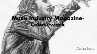
O9654467111 Call Girls In Shahdara Women Seeking Men
O9654467111 Call Girls In Shahdara Women Seeking MenO9654467111 Call Girls In Shahdara Women Seeking Men
O9654467111 Call Girls In Shahdara Women Seeking Men
 
Call Girls In Dwarka ⏩7838079806 ⏩Escort Service In Patel Nagar Delhi
Call Girls In Dwarka ⏩7838079806 ⏩Escort Service In Patel Nagar DelhiCall Girls In Dwarka ⏩7838079806 ⏩Escort Service In Patel Nagar Delhi
Call Girls In Dwarka ⏩7838079806 ⏩Escort Service In Patel Nagar Delhi
 
FULL ENJOY Call Girls In Mohammadpur (Delhi) Call Us 9953056974
FULL ENJOY Call Girls In Mohammadpur  (Delhi) Call Us 9953056974FULL ENJOY Call Girls In Mohammadpur  (Delhi) Call Us 9953056974
FULL ENJOY Call Girls In Mohammadpur (Delhi) Call Us 9953056974
 
The--Fraud: Netflix Original Media Pitch
The--Fraud: Netflix Original Media PitchThe--Fraud: Netflix Original Media Pitch
The--Fraud: Netflix Original Media Pitch
 
Models Call Girls Shettihalli - 7001305949 Escorts Service 50% Off with Cash ...
Models Call Girls Shettihalli - 7001305949 Escorts Service 50% Off with Cash ...Models Call Girls Shettihalli - 7001305949 Escorts Service 50% Off with Cash ...
Models Call Girls Shettihalli - 7001305949 Escorts Service 50% Off with Cash ...
 
Hot Sexy call girls in Ramesh Nagar🔝 9953056974 🔝 Delhi escort Service
Hot Sexy call girls in Ramesh Nagar🔝 9953056974 🔝 Delhi escort ServiceHot Sexy call girls in Ramesh Nagar🔝 9953056974 🔝 Delhi escort Service
Hot Sexy call girls in Ramesh Nagar🔝 9953056974 🔝 Delhi escort Service
 
VIP Moti Bagh Call Girls Free Doorstep Delivery 9873777170
VIP Moti Bagh Call Girls Free Doorstep Delivery 9873777170VIP Moti Bagh Call Girls Free Doorstep Delivery 9873777170
VIP Moti Bagh Call Girls Free Doorstep Delivery 9873777170
 
Amplify Your Brand with Our Tailored Social Media Marketing Services
Amplify Your Brand with Our Tailored Social Media Marketing ServicesAmplify Your Brand with Our Tailored Social Media Marketing Services
Amplify Your Brand with Our Tailored Social Media Marketing Services
 
定制(ENU毕业证书)英国爱丁堡龙比亚大学毕业证成绩单原版一比一
定制(ENU毕业证书)英国爱丁堡龙比亚大学毕业证成绩单原版一比一定制(ENU毕业证书)英国爱丁堡龙比亚大学毕业证成绩单原版一比一
定制(ENU毕业证书)英国爱丁堡龙比亚大学毕业证成绩单原版一比一
 
THE FRAUD NETFLIX ORIGINAL MEDIA PITCH PROJECT
THE FRAUD NETFLIX ORIGINAL MEDIA PITCH PROJECTTHE FRAUD NETFLIX ORIGINAL MEDIA PITCH PROJECT
THE FRAUD NETFLIX ORIGINAL MEDIA PITCH PROJECT
 
Enjoy ➥8448380779▻ Call Girls In Noida Sector 93 Escorts Delhi NCR
Enjoy ➥8448380779▻ Call Girls In Noida Sector 93 Escorts Delhi NCREnjoy ➥8448380779▻ Call Girls In Noida Sector 93 Escorts Delhi NCR
Enjoy ➥8448380779▻ Call Girls In Noida Sector 93 Escorts Delhi NCR
 
Mastering Wealth with YouTube Content Marketing.pdf
Mastering Wealth with YouTube Content Marketing.pdfMastering Wealth with YouTube Content Marketing.pdf
Mastering Wealth with YouTube Content Marketing.pdf
 
AI Virtual Influencers: The Future of Influencer Marketing
AI Virtual Influencers:  The Future of Influencer MarketingAI Virtual Influencers:  The Future of Influencer Marketing
AI Virtual Influencers: The Future of Influencer Marketing
 
Protecting Your Little Explorer at Home!
Protecting Your Little Explorer at Home!Protecting Your Little Explorer at Home!
Protecting Your Little Explorer at Home!
 
Music Video Codes and Conventions 2 .pptx
Music Video Codes and Conventions 2 .pptxMusic Video Codes and Conventions 2 .pptx
Music Video Codes and Conventions 2 .pptx
 
young Call girls in Dwarka sector 23🔝 9953056974 🔝 Delhi escort Service
young Call girls in Dwarka sector 23🔝 9953056974 🔝 Delhi escort Serviceyoung Call girls in Dwarka sector 23🔝 9953056974 🔝 Delhi escort Service
young Call girls in Dwarka sector 23🔝 9953056974 🔝 Delhi escort Service
 
Cosmic Conversations with Sociocosmos...
Cosmic Conversations with Sociocosmos...Cosmic Conversations with Sociocosmos...
Cosmic Conversations with Sociocosmos...
 
办理伯明翰大学毕业证书文凭学位证书
办理伯明翰大学毕业证书文凭学位证书办理伯明翰大学毕业证书文凭学位证书
办理伯明翰大学毕业证书文凭学位证书
 
looking for escort 9953056974 Low Rate Call Girls In Vinod Nagar
looking for escort 9953056974 Low Rate Call Girls In  Vinod Nagarlooking for escort 9953056974 Low Rate Call Girls In  Vinod Nagar
looking for escort 9953056974 Low Rate Call Girls In Vinod Nagar
 
social media advantages and disadvantages
social media advantages and disadvantagessocial media advantages and disadvantages
social media advantages and disadvantages
 

Music industry

  • 2. Magazine Life Style- Denoting advertising or products designed to appeal to a consumer by association with a desirable lifestyle. Music- Magazines that have a cover image of a music artist and maybe sell soundtracks to grab or hook readers into buying the magazine. There are a lot of publicity on music magazines. Gossip- Magazine that are based on the latest scoop on celebrities. This is the most bought and advised magazine category through the UK. Fashion- These magazines are normally posted on fashion week, but magazine like Vogue tend to publish an article every week on the latest style and fashion errors. These normally targets an audience interested in clothes and the modelling world. Entertainment- the action of providing or being provided with amusement or enjoyment through an article. Sports- Magazine articles that only base there topics and interest on sports. The male gender are mostly fascinated about sports in the UK. Fitness- Magazine articles based on how to work out and the protein used by famous athletically built people or body builders. Fitness magazines are normally targeted to gym loving male and female. News- Formal and informal written work on what’s occurring worldwide to inform audiences that are interested in discovering world affairs or local news for those who want to know what’s happening around them. This is usually for older audience. Food/Cooking- Magazine articles typically based on healthy recipe's. Mostly the female population of the UK tend to read Jamie Oliver’s 30 minutes cooking techniques. Home and Garden- Normally written tips in informal language to an audience interested on gardens and home décors.
  • 3. Anchorage: Straightforwardly recognisable and seen than the other text on the magazine cover. It’s relating to the cover image of ‘My Chemical Romance.’ The background is white to make stand out more and is to hook the readers into buying the magazine. Cover image: The NME uses a medium close-up shoot of the band to catch the attention of fans. My Chemical Romance is shown wearing black attire in a blue (the blue is faded) background to make the reader notice the cover image as black stand outs more than blue. Cover line: This cover line is keeping to the neutral colour theme. Blue, black and white are used in the article. This is so it has an effect on the reader and because the magazine doesn’t have a lot of space it seems messy and the three colour rule give the effect that it’s messy on purpose. Mast head: NME logo is easily recognisable by many readers. In this magazine the logo is in the colours red with white outlining to make it standout in the black box. The logo is clearly shown proudly and isn’t hidden. Strapline: The slogan of the magazine is covered, this could be because many people already know what it by looking at the masthead. So this further gives the impression that the magazine is popular because the slogan was covered causing the readers to focus on the message, ‘Fractals VS The Horrors.’ Barcode: Is shown at the bottom away from the main features of the magazine, but it’s at the bottom right corner where normally people last focus their eyes at and remember more. Subheading: The subheading in the bottom left and top right of this magazine cover to give the readers an insider of what topics and article would be stated in the magazine. Pictures are placed with the subheading in a miniature frame. Cover line: The cover line is placed in a black frame with a white text reading, ‘the week the world went black.’ The text is gripping and interesting to the target audience, which is young people. The young people aren’t interested in serious text so in order to grip their attention you should shorten words and make it mind blowing for them to wonder and ask question regarding the message the cover has.
  • 4. Mast head: Similarly to NME, SPIN has there own logo that has been there for many years and is recognisable straight away by many readers. In this magazine the logo is in the colours white and a red box. On the other hand this logo magazine has been hidden slightly by the cover image because of this supposition we know that the magazine is popular. Cover Image: Similar to NME, this magazine also uses a medium close-up shoot of the band to catch the band ‘My Chemical Romance’ in a better light because you would only fit one close-up of the band. A positive thing I could pick out of the cover image is that it’s colourful and stands out. Main Cover Line: Easily recognisable and seen than the other text on the magazine cover. Like usually the main cover line is relating to the cover image which can be the most encouraging factor for the readers to buy the magazine. The tag line underneath furthers to a quote from the magazine and this could be considered a hook. Cover Line: This cover line has been placed in black background, this suggest that the information in the box is to hook the reader into buying the magazine. Cover Line: This cover line is keeping to the neutral colour theme (3 colour rule) I’ve noticed that the magazine doesn’t have any space, which could lead to the magazine being messy, but keeping with the colour theme it doesn’t look rather messy. Puff: Puff is used to keep important eye catching information in a shape. In this Spin cover the puff is placed in a circle, causing it to standout more. Placing text in a shape would mean that it’s extremely important and is alluring to the readers. Colour scheme: The colour scheme is the usual rock music magazine colour houses used. In this one however there is no yellow just black, red, and white. These colours used with the cover image make the magazine cover of Spin stand out
  • 5. Mast head: Similarly to SPIN, Kerrang has hidden there logo with the cover image, this is because the magazine logo is very popular and would be easily recognisable for the usual buyer or new buyers. The logo stands out since it’s black and the background is white. Main Cover Line: Directly recognisable than the other text in the magazine because it’s written boldly in white with a blue box. The main cover line relates to the cover image of ‘My Chemical Romance.’ The background is white to make stand out more and is to hook the readers into buying the magazine. Cover Image: Similar to SNIP and NWE, this magazine also uses a medium close-up shoot of the band to catch the band’s appearance and expressions. My Chemical Romance is shown wearing black attire in a white background to make the reader notice the cover image. Cover Line: This cover line has been placed in black background, this suggest that the information in the box is to hook the reader into buying the magazine. Barcode: Is shown at the bottom away from the main features of the magazine, but it’s at the bottom right corner where normally people last focus their eyes at and remember more. Puff: A puff is used in this magazine in a circle to show the importance of the information. Which in this case is about a 7 day rock guide that would catch the attention of rock music lovers. Subheading: There is subheading in the bottom left to give the readers an insider of what topics and article would be mentioned in the magazine. This is helpful because it would attract readers into reading more and maybe even convinced them into buying the next issue. Strapline: The strapline is at the top and bottom on this Kerrang magazine, this is a effect because it’s excellent way of raising brand recognition and enhancing the values of magazine.
  • 6. Mast head: Similarly to SPIN and Kerrang, Rock Sound slightly hides a bit of the masthead by putting the cover image. This is because the magazine logo is very popular and would be simply recognisable for the usual buyers or new readers. The supposition of the masthead in this magazine cover shows indicates that Rock Sound is a popular rock music magazine. Competition: A competition is unlikely to be on the front cover of a magazine, however Rock Sound places a competition to win a signed disturbed guitar. This makes the magazine audience young people between the age of 16-24. Cover line: The cover line includes another rock artist that is extremely popular in the rock music industry since her songs were number one in the UK and Australia through she was not famous when the magazine was published that means she was undiscovered and became more famous by Rock Sound. The image of Lacuna Coil is seductive so would attract the male gender more than the female. Cover image: The cover image is of My Chemical Romance when there album ‘Tales From the Dark Side’ was released to the public making this magazine in trend with the latest singles from the well known rock artist or groups. The band is wearing black to go well with the gloomy background that associate with their album. Cover line: The cover line is written in sans serif front and in white and yellow to standout from the dark background. Informal language is used to communicate to the younger audience sense younger audience and known to be fund of informal language because it feels like they are speaking to friends not prime minster. Colour scheme: The colour scheme in the magazine front cover is yellow, red, black and white. This is colours typically found in rock based magazine such as Kerrang, Spin and NME. Barcode: Similar to all music magazine front cover the Rock Sound barcode is in the bottom right because that were people’s last focus is at and in order to buy the magazine you would need the barcode.
  • 7. Masthead: Vogue logo is supposition in an usually way compared to the other magazines I’ve analysed. With the first two letter positioned in front of the main image and the other three letters are positioned behind the main image. This could be because the magazine is well known among women and feminine mans that are interested in fashion. Main image: The cover image is of Jennifer Lawrence wearing a stylish white and black flowery dress that could instantly get a response from people that are fascinated about fashion. Jennifer Lawrence is a well known actress that has won many award and wears many Dior clothes. She’s also know in being the number one stylish in Glamour charts. This would instantly attract people interested in fashion since that is the target audience Vogue wants reading the magazine. Anchorage: The acknowledgement of Jennifer Lawrence is written in red bold front to standout and hook the readers into knowing who the front cover image is. This might make readers that don’t know Jennifer Lawrence into wanting more so would read the article dedicated to her. Cover line: The language used in this cover line is suited to the target audience since it’s using words such as ‘beauty’ to connect with the audience since fashion lovers use words like that to describe outfits. Often you would hear someone interested in fashion using phrases such as ‘beauty’ to describe clothing. Cover line: The cover is used to interact with the readers that want to know where they can shop online. This gives an impression that Vogue is trying to have a bond with the readers. Normally music magazine would put this into puff so their readers could easily see it. However, Vogue being a fashion magazine would do the opposite; making it standout with a different writing front compared to the other text in the cover. Cover line: The cover line draws the readers into curiosity since it uses phrases such as ‘cool kids’ and ‘faces of now’. This is direct indication of what the magazine article may contain and allures the readers in suspense in discovering what the cover line actually means. It may mean someone wearing hideous or beautiful clothing that would live anyone in shock or amazement. In fact this is alluring me into finding out what Vogue cover line means. Cover line: The cover line allures readers into finding out what the latest stylish trends being reported. If it shocking or astonishing. It makes them want to know who’s been judged by Vogue magazine in this issue. It’s like a exclusive report that could anyone feel like they are reading hidden secrets that are opinionated by someone else. It’s a way to bring more readers to the next issue since they’ll have more opinions about this issue.
  • 8. Focal image: The main image is of Selena Gomez, this promotes the content of the magazine which is the artist and her tour. The main image is overlapping with the masthead which means that the magazine is putting great emphasis on the artist to attract buyers than the reputation of the magazine, this means the advert is using the advertising technique of celebrity endorsement. The focal image is showing that Selena Gomez attention is focused on the readers, direct address. This may have been used to grab readers attentions and allure them to the focal image. Masthead: The masthead of the magazine is “KISS” position behind the focal image. This could be because billboard is a extremely popular music magazine so the readers could clearly workout that the masthead. Another reason might be to show the readers that the focal image is the main focus of the magazine. Barcode: The barcode is position below, which is mostly common in popular music magazines like NME and Q. Barcodes are shown so that the shop can scan the product. Caption: The magazine is using direct address in the caption, ‘INSIDE THE CONFIDENT GIRL’S HANDBOOK’ to appeal to the readers because the caption is a direct quote of what majority girls love. It’s a great method to use when appealing to their feminine target audience. I noticed that the language of the caption is informal language, this could be because the target audience are young females. Target audience: Just by looking at the artist of the magazine (Selena Gomez) it clearly indicates that the target audience for this magazine issue is younger girls between the ages of 11-17 because Selena Gomez appeals to that particular age group and gender. House Colours: The three main colours used in the magazines are purple, white and pink these colours are used to appeal to the target audience. It’s common knowledge that majority of girls like the famine colours, such as blue, purple, white, pink, and etc. The colour would appeal to the target audience because of the feminine colours. Anchorage: Selena Gomez is written in hyperbolic front, making it standout in order to allure the fans to know the main context. After analysing variety music magazines front covers I’ve come to know that the anchorage stands out and is clearly indicate. I’ll make sure to include a bold anchorage. Puff: A puff is used in this magazine front cover to show the audience the price of the magazine. This is great method in indicating to the readers the amount and the word ‘only’ makes us think it’s the cheapest price you can get for the magazine.
  • 9. Issue number and date: The issue number and date is placed beside the masthead since it’s the second thing people would notice after the masthead. Our eyes look from left to right in magazine. However, it could be used to fill the space. Masthead: ‘KERRANG CONTENTS’ is written in black front with yellow filled in the background. The front is sans serif since there’s no flourish at the ends of the strokes and it’s plain. Competition: The competition is written in a san serif front and stands out with the red and white block writing since the background is black. The idea of the competition is to catch the attention of Metallica fans because the prize is a limited edition Metallic vans. Picture and signature of editor: The editors message gives the magazine an informal and personal feel, with the editor directing there message to the readers. The language use is very casual. Young people may prefer these kind feel as opposed to a serious magazine, as they usually want to read a magazine for entertainment. Main image: Immediately we could see the main image is a picture of a band, in this case it’s Metallic, which is being used to promote a competition to win a merchandise. The puff makes it clear that there is something to be won, which would grip the readers attention. Colour scheme: The colour scheme used in the content page is yellow, red, black and white. Kerrang doesn’t follow the house colour theme since it uses four colours this might be because the target audience is young people. The colour theme is funky and vibrate while keeping it professional. If there was too much text the readers of the magazine might become bored so there has to be a balance of text and image. Subscription: A subscription is used to encourage the readers into buying more than one magazine since the image is a of five magazine. The offer is used to catch the readers attention into buying more copies made by Kerrang. Columns: The columns are used to guide the readers into knowing what the pages contain. The Kerrang content column follows the colour scheme and has subheading to draw the audience attention to one of the subheading and obliviously help guide them to the correct page.
  • 10. Masthead: ‘Q CONTENTS’ is written in red and white in a red background to make the masthead standout and recognisable to readers easily since it’s eye-catching. The front is serif since it’s thick and has a thin stoke. Main image: The main is clearly show Dave Grohl, a member of Foo Fighters holding a electrical guitar to show the audience that the magazine is mostly based on Dave Grohl and music. Dave is wearing an outfit that goes well with the colour scheme; red, white and black. Columns: Similar to Kerrang, Q uses columns to guide their readers and subheading to further on guide them into knowing what the pages consist off. The columns are in red, black and white to stick to the colour scheme. Issue number: The issue number is written to inform the readers what issue the magazine is and the issue is positioned right beside the masthead. Sample pages: Images shown of the pages are showing the readers what’s written in the magazine. Sample pages are used to give a glimpse and overview of the magazine. This is often used to replace the editors picture and signature. Cover: The cover of the magazine is on the content page to show the readers or remind the readers of the aim and purpose of the magazine. The purpose of the magazine to entertain the audience that is adult between the age 24-35. The aim is to inform the audience about Foo Fighters. Colour scheme: The colour scheme of content is white, red and black to catch the eyes of the masculine and feminine readers since red could signify passion and blood. The colour scheme is elegant and lively and yet professional gives the impression that’s what the target audience like.
  • 11. Masthead: ‘CONTENT’ is written in serif front that stands out to the audience. The white text catches the readers attention because white stands out in the red background. ’DRUMMER’ the magazine title is written below the content and much larger in a black sans serif front to hook the audience. Date: In this text the date is written above the masthead and larger, this shows that the date is important in the content page. Normally magazines aiming for younger readers would often enlarge there date, this is because younger people are often fund of showing the latest magazine among their friend. Main image: The main image is different in this magazine because a infamous drummer is used as the focus image. This could indicate the magazine into being new and not popular yet to older readers so would be targeting young people fund of any music. Columns: The columns are structured like a usual content page would have. The title of the content is ‘Features’ this further on links to the fact that the magazine is new because of the subheading targeting preteens. Colour scheme: The colour scheme is red, white and black. The vibrant colours attracts young people experiencing a change of music. The children that want to change from pop to rock or hip-hop to jazz. The magazine doesn’t particularly doesn’t focus on a genre of music, it expands to any music genre. Numbering: There are numbering of pictures scattered around the content pages with numbers on. This could be used to inform the target audience about what pages contain.
  • 12. Masthead: SPIN magazine uses the masthead on the contents page to reassure the readers that they are reading SPIN. It also gives the allusions that the magazine is proud of their masthead by the repetition and frequently reminded the readers of the magazine. It’s a great technique. Column: The column in the contents page is positioned in a usual style and gives the indication of what would be included in the magazines. The features are the only thing included when compared to other music magazine contents page. This is because many music magazine contents page include other stuff than the features. For example; live review, gigs and subscriptions. Layout: The layout of SPIN contents page is plain and not as interesting. This could be because the readers are supposed to look at the focal image and focus their attention on the brighter sectors of the contents page, for example; the features column and the quote in the top right corner. Puff: This puff is on the contents page with a square informing the readers to turn to the front cover. This is unusual as other music magazines like; NME, Kerrang! and Q where this is uncommon. SPIN contents page has a unusual style which is strange and thrilling, probably to attract the target audience. Focal image: The focal image is of two artist wearing clothing that suits the house colour because it’s in black and white. The attire of the clothing is classy and sophisticated because they are wearing’ hats, stripe shirts and blazers. This dull scene portrayed by SPIN could be a way for the readers to notice the focal image as it takes up the most space. Maybe it’s to show the importance of the artists and the main focus of the entire magazine or to even keep the readers please of the contents page. This is a great technique to be inspired by in a music magazine. However, it doesn’t fit the scene my partner and I are looking for as the contents page is alluring a different target audience. Target audience: The focal image gives the sense that the target audience are pop lovers because of the artists. I could workout the age range is young people between 16-24. SPIN is targeting both genders without signalling out anyone. House colours: The house colours are grey and white. The masthead is different colour to make it standout, same thing goes for the puff. The house colours suits the theme which is sophisticated and classic.
  • 13. Masthead, date and website: The masthead with a web address and issue date are situated at the top of the page which creates continuity throughout the magazine, also the web address gives the audience significant information on the magazine. The colours of the title are in three different type, green orange and light blue, all of the colours accompaniment each other pleasantly and stand out against the white background. Main image: The main image is of Emma Watson, which is placed in the centre of the Contents page on the right-hand side. It is what will catch the readers attention first, and explains to the audience that Emma Watson is the main article as she has her own large advertisement. This may attract the reader into turning to that page straight away, to see if it is as good as what the magazine has hyped it up to be with the advertising.Columns: The image also breaks up the drop down column, with the image breaking up the text which suggests to the reader that the magazine contains more images than the text itself, and that the image is more important than the text. Colour scheme: The colour scheme is; pink, orange, green and black and white. It’s attractive to women, however, it is presented in a mature way so that the colours contrast each other well. The use of the green and orange used on the masthead stands out on the page as it is luminous, giving connotations of the Autumn season which is upon us, as the magazine is the Autumn issue. The text colour 'green' symbolises and gives connotations of nature. Target audience: The target audience is Emma Watson and people who like fashion since Glamour is a fashion magazine. Due to the layout of the content page I could work out that the target are women or feminist mans between the ages of 21+. Heading: The heading ‘Style Issue’ appeals to the readers that the magazine is going to judgemental and critical to fashion and celebrity clothing. The word ‘issues’ refers to problems and this being the heading of the column attracts the readers into digging deeper and figuring the pages associate with the heading.
  • 14. Main image: The cover image is of Gerard Way holding a mike whilst his hair flapping across his face. This gives an insider of what a concert performed by My Chemical Romance is like and fans easily respond to with recognition or envy, even maybe desire to attend a concert. This is good way to attract fans and show a side to the band that the fans might not have known. Colour scheme: The colour scheme in this double page spread is black, red and white to attract an audience that’s into rock music because of the dark colouring. You wouldn’t expect to see a bright colour like pink in a magazine that targets people that love rock, emo and heavy metal. Heading: The heading is in an appealing style that would attract the readers. The red and white bold writing is spreads through both half of the double page spreads making it standout and important information since its based on the powering quote from the band MCR. Subheading: The subheading is written below the heading to give the effect that it could be a caption. The bands name MCR is written in white bold white to be seen easily whilst the rest of the sentence is matching the article. This is the scheme to show that the band is most focused in this article and double page spread. Language: The article is very short compared to other music magazines. This could be because the target audience are younger people that aren’t interested into worded article since majority of them don’t like long explanation- short and simple is the saying to gather the attention of the youth. Columns: The effect of having a white background in the corner of the page adds good contrast and allows the text to change to black which makes the magazine more exiting as colour is played around with and makes the article more visually expressive. Pictures: There are several pictures displayed in the double spread since I've mentioned that the target audience is young people between 13-18 since those are the years that most young people aren’t found of reading article that are seemed like essay. That is the reason why this double page spread is mostly pictures.
  • 15. The double page spread is taken from Kerrang Magazine, who’s target audience is mostly for those who enjoy heavy metal and rock music. The interview publicized is by My Chemical Romance, a very legendary band throughout the emo franchise that unfortunately spilt up in 2013. Usually double page spreads focus more on the main interview, showing a long interview and a collage of photos. However, Kerrang is appealing more to the younger readers since there is fewer text and more pictures of the band members. This would make Kerrang target audience in being rock enthusiastic people between the ages 15-24. On the double page spread, the first thing that would logically capture the readers eye would be the full page image of Gerard Way on the left. This is the most dominant visual image, implying that he is the lead singer, or main man of the band. Throughout the bottom half on the other page are more images of the other band members and Gerard, with only a tiny bit of text. This put forward that that target audience are interested in what they are getting up to in the studio. Furthermore, the font is quite minor, drawing more attention to the pictures and what they are displaying, as the text is primarily describing what is happening in the pictures. The house colours are; black, red and white, which are mainly “in your face” colours. This then connects to the target audience, those who like emo and rock music. In addition to this, these colours are also My Chemical Romance’s logo colours. There are many presentational devices used to attract the target audience. For example, on the right hand side of the page there is a collapse of some of their new tracks and what they mean and sound like. This is effective since it works well and appeals to the band’s followers as they would like to know more about their new album at that time. Kerrang magazine is recognised for it’s “different” and “rugged ”appearance, they don’t bleep out vulgar language or anguish, which are shown to be made by the band throughout this interview. This then reflects on the people who read this magazine, that they like the rock ‘n’ roll or alternative aspect, or even those who just like to be “different”. The only words that are repeated throughout the double page spread are the obvious words “My Chemical Romance” “Kerrang” “Rock ‘n’ Roll” and “emo”. Which implies the band and title name of the magazine, as well as the genre in which they are compared to.
  • 16. Main image: Florence is looking directly at the camera making the audience feel like they have a connection with her. The pose fits perfect with the layout since it allows her to look attractive and more appealing to the male readers and envy to the female readers. The attire she is wearing is black to standout from the grey background and the red and white flag she is sitting on. Colour scheme: The colour scheme is grey and black. The double page spread is dull since it doesn’t have bright colours not including Florence red hair and the American flag- the red and white part is shown. The attention is drawn on the side that Florence is on since the brighter colour are on that half of the double page spread. This is a scheme to make the page more intriguing to the audience that listen to her music. Subheading: The subheading is a verse from one of her popular songs. Yet, another scheme to attract Florence fans to read the article further on since it’s big and bold to standout. Heading: The heading is supposition behind the main image, but we can workout that the heading says ‘USA’ to be part of the theme since Florence is sitting on what looks like the American flag. Its doesn’t take away the attention from Florence since it blends in with the background very well. Language: The article is in design that standouts and attracts the readers since it looks like a filled in rectangle with a capital letter to start the introduction. However, younger readers might be put off by the article sine there’s a lot of words are used. There’s a lot of words and not enough images that indicate the target audience for this double page spread is 16+.
  • 17. The feature headline is made up of two different; type one being a translucent, large, bold front. The second is a smaller, opaque, italic script type front. The second part of the caption draws more attention to the aforementioned, perhaps to reinforce that the magazine is referring to one of Florence Welch’s songs; ‘You Got the Love’. The focal chunk of text, the article, is all in one colour and front, which displays that is it part of the same thing. It is not broken up by quotes or images or even side bars. It is not problematic layout article. The image is on the left and the writing on the right. There is also only one image on this double page spread thus making the reader instantly know that the article is based on Florence Welch. The red colour of the ribbon and Florence Welch’s hair may be being referred to by the ‘got the love’ part of the heading as love is often referred to by the colour red. The mise-en-scene is equally important regarding the magazine article in the middle of other parts of the double page spread. She is sat on top of a table, above eye height, with her feet on the steps. The colour of her clothes may also be relevant to the article. The kicker describes Florence as having ‘America at her feet’, so below her, this links to why she is sat above the camera looking down on the camera’s point of view presenting America is below her in a literal sense. Her feet are also raised off the ground strengthening the caption that says of ‘at her feet’. The colour of her clothes, being black may signify stubbornness, ruthlessness, aggressiveness, toughness, threatening and macho. However, her face demonstrates the opposites of these things. This could be a way to show the reason why ‘America is at her feet’. The focal and lone image on the double page spread takes up half the double page spread; this is usually the same layout as the VIBE other magazine double page spreads, with the artist that the article based on in the left third and the writing on the right. The text columns on the right are very well-ordered. The house colours on the double page spread are shades of black, white and grey apart from the red ribbon over the white table cloth and Florence Welch’s red hair. Her legs and hands are also different colours from the shades. This could be scheme focus the readers eyes on the bright colours of the double page spread due to the dull house colours and could be interrupted by the boldness and loud red colour thrown over the table cloth.
  • 18. Main image: The main image is of Justin Bieber sitting on a transparent plastic chair looking like his directly staring at the readers since his eyes are looking straight forward at the camera. This is used as an effect to make the readers feel like they have a connection with Justin. Justin Bieber is used because thousands of young girls listen to his music making him popular and since his music is pop could be the reason why his in the double page spread since his songs are popular among young children. Heading: The heading is written in two colours (pink and black) with a bubble writing front. This is done because the target audience are young girls between 12 and 15. Justin Bieber fans are girls between those ages. The colour of the heading to go with the theme of the purpose the double page spread has which is to get more younger age girls read. Skyline: The skyline isn’t at the top of the double page spread rather underneath the heading. This could be a way to attract the readers into reading more since the writing is highlighted pink with the text written in purple which are all colours girls like in the early stages. Colour scheme: The colour scheme is black, white and pink. The colour pink is known to be a colour young girls are fund of since the article is to attract young girls into reading on. The colour black and white is to balance out the double page spread from looking too childish since children now days want to be acknowledge as young adults. Picture: A picture of Selena Gomez and Justin Bieber is to give an overview of what the article is going to be about to the readers. Its an insider without reading the article yet. My prediction would be that it’s either going to be about them to dating again or the split that occurred between them since the heading helped me come up with those prediction. Language: The article layout is like an interview format since the importance parts are highlighted in pink and easy to notice with interesting straight forward questions that would be eye catching to readers.
  • 19. The double page spread is from We ♥ Pop Magazine. The double spread uses a whole page to promote the artist by placing an image of Justin Bieber posing very seductively on a transparent chair. The whole page is to this because it’s a way to inform the readers that the double page spread is based on him and him only. The main colour scheme in the double page spread is pink, black and white. The colour pink is mainly used because it contrasts passion and in this circumstance it means the passion of affection since Justin Bieber has a strong passion for his music. The masthead is easily noticeable by the readers on the double page spread. It’s a direct quote taken from an interview that is would standout and charm the readers to read the article, whether it be Justin Bieber enthusiasts fans or simply the demographic of the magazine wondering as to why younger girls go crazy over Justin Bieber. The masthead is shown in bold, large serif font, this doesn’t essentially mean that Justin is concerned about getting a headache, because what do you expect when you have a very large fan base worldwide, which is mostly young female are on. If you are fan and are going to magically bump into Justin Bieber on street, no doubt Justin will get a headache. However, in this case we don’t know if it’s his fans or love-life. When Justin was interviewed on the double page spread he had a girlfriend who was also famous solo artist, being that she’s Selena Gomez. We all are curious and want to find that whether he is taking the time to discuss to the interviewer about his love life with Selena Gomez or how much his fans annoy him. By the way Justin is posing we could instantly workout that he is a flirtatious young man, loving the devotion off of his female fans. It’s not necessary for him to smile to make us girls fall in love with him, he can merely raise his eyebrows and we will become weak at the knees. There is studio lighting which is shining directly onto his face, highlighting his bone structure and the hair outlining his face this would request to the magazines demographic as they have a average close up of an significant pop musician. The article uses a typical convention outline, such as columns on the double page spread. This is effective because it guides the readers making it easier for readers to read and pick important information regarding Justin Bieber or gossip easily. The format of the questions are in bold red. This informs the readers that the questions and answers are separated and in different front colours, which also alert us that their isn’t as much to read. This could be because the target audience are younger so would be fund of reading essay like article so would prefer article that have 200-300 words. Having a isolated section on the bottom right hand corner of the first page which informs the readers his ‘Dressing Room DEMANDS’ this reels the focus away from the interview and makes the reader wonder why he has demands for his dressing room. It builds many more questions to the readers head.
  • 20. Main image: The main image is of Jay-Z with black glasses that make it extremely hard to see his eyes since the eyes are the way to tell a persons emotions. Jay-Z gives an impression of a ruthless man because his eyes are covered and his mouth doesn’t look like it’s smiling. The main image takes half of the double page spread showing the importance and the main focus on the article which is Jay-Z. Article: There’s a huge J that covers most of the paragraphs. The letter is way to remind the readers that the article is focused on Jay-Z. The article is long worded making the target audience older since younger people aren’t fund of reading articles that have more words than pictures. The capital words are to guide the readers into the most important paragraphs. Heading: The heading is underlined by the capital ‘j’ and right above it to catch the readers eyes into reading it since it’s smaller and hard to see if it wasn’t in this format or style. The heading is a direct quote from Jay-Z. This makes the readers feel a recognition towards the quote through his music. Subheading: RapRadar logo stands out and does not follow the house style. The font and colours used are unique to the double page. For those who do not know what RapRadar is, they could be forgiven for thinking RapRadar is a radar for rap, and that Jay-Z is under this radar, he has been found. RapRadar is a rap news and blog website and therefore you could say the appearance of the logo is a plug. Colour scheme: The colour scheme is red, black and white to appeal to the target audience because the colours look more for young adults so they wouldn’t be feeling childish and feel more of an adult. Language: The language used in this article is written to suit the target audience that are adults around their late or mid twentieth because it’s long worded so wouldn’t suit younger audience and it’s not the genre of music older audience listen to due to Jay-Z rap songs.
  • 21. The double page from Q Magazine featuring rapper and record producer, Jay- Z. The image of Jay-Z takes up half the double page spread and hence applying that the article would be based on him. The image of Jay-Z is mid-shoot only allowing us to see his face and shoulders, however his shoulders are cut off slightly. This could be because of his broad shoulders, emotional of the struggles in his life and the influence he now holds. He is wearing black shades along with a black t- shirt. This is constant with his overall image, he is known for wearing 'all black'. The dark glasses completely cover his eyes and give a sense that there are many things that continue to be untold and that perhaps he could tell them in this article. The sunglasses enhance importance to his characteristic such as his mouth and lips. T- shirt worn by him is a V-neck, this could signify victory. The appearance is cast with a red wash-like effect on one side. This is because red is the colour of the Q magazine logo and also a colour of passion, love and blood. On the side the colour is white, which symbols purity and sanitation. This could suggest that Jay-Z is purity is disappearing, he is now stained. The RapRadar logo stands-out due to the fact it doesn’t follow the house colours, which are red, white and black. RapRadar is often confused with meaning radar for rap, and that Jay-Z is under this radar, he has been found. However, RapRadar is a rap news and blog website. The large red J behind the text in a serif font is a reflect copy of the Q magazine logo, nonetheless the letter is j, because the interview is about 'Jay-Z'. The whole text is in a sans serif font which grasps with the classy, upper-end look of Q magazine. All over the double page, Jay-Z and other key words are highlighted in red, the colour of power, passion and Q magazine. The heading on the right hand side of ‘ The most exciting people in music, Jay z’ this straight away charms the reader as its a fact that they want to find is true. The words ‘Jay-z are in red this is to tell the reader the article is based on him. The beginning of some of the paragraph there is a drop caps used this adds style and lures attention to reading the article. However in this article a massive J has been placed over the top of the text, I think this looks decent as it represents Jay z.
  • 22. Colour scheme: The colour scheme for the ‘Teenage Vogue’ double page spread is: pink, white, blue and black. The pink and blue would point out that the magazine is aimed at young teenage girls who are absorbed in the fashion and latest trend. The colour black is used to highlight the bad topics in the article for example the words ‘My World”, “My Cup Of Tea” and “My iMac Screen” are in a black, bold font on a white background this makes it stand out this would grab the readers attention immediately. The colour scheme has been carried on throughout the magazine which would give the readers a sense of endurance. Heading: The heading isn’t easily recognisable with all the subheading being in a bigger front. However, the heading as been underline to show the readers that’s the heading. “My World” could be associate with someone telling the readers about what they do in their life. In this case it’s young adult Japanese model. The numbering from 1-10 also links to the model favourite things in life. Main image: The main image is of stylish Japanese model wearing bright colours that go perfectly with the colour scheme. This double page spread is similar to the other four music magazine I analysed- though this magazine is a fashion genre. The main image always standout in a magazine double page by taking half or quarter of the double page spread. Subheading: All the subheading in this double page spread are numbered to show the readers what particularly the focal image model prefers more than the other things listed. It’s like a menu guide, where the restaurant keeps the highly favoured meals at the top and the unpopular ones at the bottom. In this context the numbers are a guide to indicate to the fans ten things she likes in her life. Pictures: There are pictures used to give the readers an image to associate with what the model likes. The picture of the cup of tea is linked what is mentioned on her second favourite thing about the world. Another example would be the picture of the notebook linking to the seventh thing she likes. Anchorage text: In this double page spread the model is referred to ‘Susie Bubble’ which could be a nickname given by her fans and a way for them to recognise the focal image and be instantly drawn to the article. This is so the readers could continue read on.
  • 23. Typography of Kerrang Having the Kerrang logo in it’s usual front; black with an glass shattering look, this reminds the readers what the magazine is about and promotes the magazine. A sans serif front is used on the masthead as a device for emphasis, due to their typically blacker type of colour. This would attract an audience into rock or gothic type of music. I would consider this a perfect front for Kerrang magazine because serif won’t suit it due to the fact that it’s help guide the eye along the lines in large blocks of text. This wouldn’t be attracting the eye of usual young readers of Kerrang because it would relate to Drummer- a not popular and fresh magazine. By the image of Kerrang logo below you could see that the front of the Kerrang is in fact sans serif because there is no decorative flourish on the end strokes, the strokes have even width. Typography of Q The Q logo in it’s usual front; white with a red background, shows the readers what the magazine would contain since Q is a famous magazine and a lot of people know what Q features in their magazine and who Q targets audience are. The serif front is used on the letter Q because the serif front would make it sound out and eye catching to the readers since Q is a single letter. The picture of the logo is used to show the stroke in the letter Q. This could be used to attract the feminine readers more than the manly readers. Typography of NME In the NME the masthead is in a sans serif front, through the letter ‘m’ would mistaken the judgement since it has tick in the middle. The effect the sans serif front has on the NME logo is to draw recognition to the readers since NME audience are top chart artist lovers. The ones that are normally in the UK top 5 every month. I think that the sans serif is better front rather than serif because picturing the strokes wouldn’t attract the readers. The logo I placed on the left shows you that the front of NME is in fact sans serif because there is no decorative flourish on the end stroke, the strokes have wider space between the letters. Thick and thin strokes Strokes have even width Glass shattering affect Strokes have even thickness Plain
  • 24. Interview 1 1. Do you buy music magazines? I’ve only bought a couple of Vibe and Q magazines on my phone. I wouldn’t consider myself a person who buys a lot of music magazines. Through I do like keeping the magazines I buy. 2. What is it that made you buy Vibe and Q music magazine and not the other ones? I don’t know…..maybe it was the fact that its articles based on celebrity that I know. I don’t know much music magazine, but I started to read Vibe when an issue about Lady Gaga was the front cover. 3. What about Q? Why did you start buying Q the magazine? That’s actually a good question. I don’t remember when or why, but the magazine standout to me and I enjoyed exploring the magazine since it was mostly about the music I like. 4. What music genre do you like listening to? Obliviously pop, hip-hop, rap and dance. I only listen to songs that have a rhythm to dance to (laugh) and (laugh) the sad-y moody ones. Like the one Professor Green was in. 5. Do you only buy a music magazine based on the artist? I wouldn’t put it like that. I would buy a magazine based on artist and the price. I wouldn’t spend a lot on a magazine. Heaven sake my friends would think I’ve gone mad spending money on a magazine when I could buy a sandwich from Gregg. 6. Do you participate in competition? What person never participated in a competition? Of course I have. 7. What kind of prize do you want to win? Um….I saw a signed shoes by Kate Moss I really wanted. I guess I would say special editions or signed shoes. 8. Do you only buy magazines that have celebrity? Shamefully yes (laugh), though I believe I’m not the only one obsessed with Beyoncé and Jay-z. 9. Would you consider reading magazine that isn’t in the type of genre you listen to? I guess I would through I’m not into listening to heavy metal or rock. The only rock band I would listen to is the Script. 10. To wrap things ups could you list three or four colours that you would like to see in a music magazine? Sure; white, red and black.
  • 25. Interview 3 1. Do you buy music magazines? I’ve only bought a some music magazines on my devices. I don’t frequently buy magazines but when I do it’s mostly Kerrang because I like their layout. 2. What featured made you buy Kerrang other than the other music magazines? The layout of the magazine makes me want to read on. I like the way it’s designed and when I was in high school I was doing a report on Kerrang so found myself loving it. 3. Would you consider buying a music magazine that’s not Kerrang? Depends on what kind of music. I normally buy magazine based on the music I listen. It’s a shame the popular music magazine aren’t to my taste. 4. What music genre do you like listen to? I could answer that from the top of my head; rock and country songs normally. 5. Do you only buy a music magazine based on the artist you like? The front cover matters to me. I wouldn’t be caught with a Usher on the front cover since me and my friends are classified emo and the music genre I listen to gives away an image I’m depressed but honestly I like listening to country songs and like the way I dress with dark colours. It suits me. 6. Do you participate in competitions? Yeah, just last week I registered online to this website that gives people the chance to win a signed shirt by Green Days. 7. What kind of prize do you want to win? Anything really. I like the feeling I get when I win. 8. What artists or groups do you like? My favourite bands are; Misfits, My Chemical Romance and Fall Out Boys. Favourite artist are; Sam Hunter, Luke Bryan and Jason Aldean. 9. How much would you spend on a magazine? I don’t know really. I never think of the money I spend on the music magazine. 10. To wrap things ups could you list three or four colours that you would like to see in a music magazine? Okay; white, yellow and black. Interview 2 1. Do you buy music magazines? I’ve always bought music magazine on my journey to Harrow College. The magazine that I frequently purchase is Vibe on newsstand on my iPad. 2. What makes you want to read Vibe compared to the other music magazines? Um…Vibe is written for a target audience like me; hip-hop enthusiasts. There’s always articles about big hip-hop artists and sometimes there’s ones that are written about undiscovered artists. The pictures speaks to me on the front covers. It sounds a little crazy. 3. It’s not crazy. As you mentioned the pictures speaks to you; what in particular about the images you like? I normally like the images to look attractive or at least standout from the background. I’ll give you an example; Vibes latest issue is based on Alicia Keys pregnant photos, do you think she looked ugly on the photos in the article? No because she looked stunning and totally attractive. No one ever looks ugly on Vibe. 4. Would you consider buying other magazines that aren’t Vibe? Maybe one’s that are based on music genres I like. 5. What type of music genre do you listen to other than hip-hop? It’s going to take me time to think. Got it. Obliviously hip-hop than rap and pop songs. 6. How much do you spend on a magazine? I’m not picky with spending my money since the money is from my parents wallets (laughs). I don’t have a limit on how much I spend on the magazines. I mostly buy magazines do to the cover. You know that saying; never judge a book by its cover, well I judge a magazine by its cover since it has to have an artist or group I like. 7. Do you participate in competitions? Yes, I participate in competition but unfortunately I never won any. 8. Would you consider entering a competition if it was on a music magazine? I guess I would if there’s a possibility I could win something that’s got a connection with a celebrity. Celebrities items are really popular and posting it on Instagram and Tumblr might give me more followers. 9. Would you buy a magazine if the front cover was an undiscovered? No, actually I won’t. I’ve mentioned that I like to read articles about undiscovered artist but why would anyone put them in the front cover and maybe I wouldn’t like their music because they might be one hit wonders. 10. To finish this interview up, could you tell me three or four colours you’ll like to see in a music magazine. Sure, black….red…white and pink.
  • 26. Interview 5 1. Do you buy music magazines? No, I don’t buy music magazines. 2. Is there a particular reason why you don’t buy music magazines? I prefer reading magazines about fashion or weekly television. Music magazines are pointless to me because I like listening to music not reading a magazine about a song I like when I could listen to the song on YouTube. 3. Do you know any music magazines? Yes, I actually know some from my friends since they like spending money on knowing the top charts and artists personal life when the television gives you those information Saturday afternoon. 4. What genre of music do you like listening to? I’m those indie lovers. So anything indie however I’m obsessed with one direction. Don’t tell anyone that. 5. Do you participate in competitions? Yeah. When I was younger I entered so much competitions. Now I only enter ones that I see on television or emails sometimes even through people warn me it’s dangerous. Dangerous my backside. 6. What prizes would you like to win? One direction merchandise. I want lipsticks with their faces on them and a lamp of Liam face to read the books I have of them. Just anything one direction. 7. Would you buy a music magazine if it had one direction as the front cover? You got me there. Honestly, I would buy a music magazine with their faces on because I know I’ll keep it since I fan-girl them. They should of casted me in the channel 4 documentary (laughs). 8. What are your favourite indie song? Any songs Arctic Monkey sing since there my second obsesstion. I love Imagine Dragon songs as well. 9. Would you buy magazines based on the genre of music you like? No, I’ll only like to buy one directions one because it comes with something and like I've mentioned I have YouTube to listen to the songs. 10. To end this interview could you list three or four colours you think suit to be on a magazine? Blue, white, red and black. Interview 4 1. Do you buy music magazines? Some occasions I intend to buy music magazines. This past week I’ve bought two magazines on my way to college. 2. Could you be specific on the music magazine that you bought? I don’t know, every week I buy a different music magazine depending on the front cover. With the look your giving me I need to explain what I mean before you ask me. What I mean by the cover is the artist I see in the cover that makes me buy it. 3. You mean to say you only buy the music magazines based on the artist not the brand? It sounds weird when you put it like that, but yeah I do waste my money on magazines based on the artist. I’m not the only person here in Blackpool who does. I know for a fact my sister buys her (laughs) magazines and books based on the cover. 4. What music genre do you listen to? I don’t look like the kind of girl to listen to rock music, but I do listen to Coldplay and MCR. Kind of shocking. Its only because I hang around with people that like those kind of music and it grows on you. I mostly listen to Bollywood since I’m a belly-dancer and pop songs because I’m your typical girl who dreams of meeting one direction and marrying Harry Styles (laughs). 5. What artist are your favourite since you mentioned you buy music magazines based on the artist on the front cover? Rihanna, Drake, Katy Perry and Taylor Swift. You can work the artist I like based on the one’s I listed. Like I said I’m not very different from everyone else. 6. How much do you spend on magazines? I can’t say since it’s the amount I pay for my phone monthly. All you have to know is that I don’t have a limit when it comes to spending. 7. Do you participate in competitions? Yeah, I like to enter online competitions, television and on magazines. 8. What prize would you like to win? Any prize really. I don’t mind winning anything as long as I win. 9. To finish things up; could you list three or four colours that you would like to see in a magazine? Alright; pink, blue, red, white and black. Wait that’s five colours. Okay; red, white, pink and blue.
  • 27. Vibe 43% Q 27% Kerrang 18% Rolling Stone 12% RESULTS FROM INTERVIEWS Vibe Q Kerrang Rolling Stone From interviewing five people that are completely different, this gave me an overview of how different people see music magazines. Each of the five people I interviewed were consumes of magazines however one of five did not buy any music magazines due to her beliefs that music magazines are pointless because music should be listened to, but she would buy a magazine based on One Direction since she thinks there would be a merchandise from the band. This gave me an idea to use puff to display a merchandise and my contents page would hold a competition. I haven’t decided what the prize would be but have an idea to use something relating to the main image. My aim for the interview was to discover the most popular magazine and what people like on a magazine. The pie chart shows how popular the magazines are from the most popular to the least. Vibe is known to be the most bought from what I gathered from the interviews among young people in their twenties and Kerrang is popular among the teenagers however teenagers don’t spend a lot on music magazine compared to people in their twenties. This might be the reason why majority music magazines target audience are people in their twenties. I haven’t decided what colour theme I would use, but I'm thinking to use a colours scheme that would suit my target audience. The music genre I would base my magazine is rock due to the fact that majority of songs I listen to are rock and I’ve analysed several magazines that have rock fans as their target audience. This giving me an overall image of what my magazine can look like. I’ve explored two popular magazines that are based on rock music from front page to the back page. Even through my interviewee were a fans of magazines that doesn’t appeal to rock, I still think that rock based magazine would benefit me more than a hip-hop or pop since I’m not particular fund of bright colours and I had an idea to use dark colours and one primary colour to blend pages of my magazine. I haven’t decided what colours yet with my partner. I wasn’t pleased in finding out that Kerrang was placed second last in the results I gathered from my interview because I was hoping that it would be the most popular among the 16-19 year olds that I interviewed. Vibe and Q is popular among the female population around the ages of 15-24. Only a few young females are reading Kerrang compared to the males, the difference is 20%. Even through my results were showing me that the five people I interviewed were more likely to buy Vibe and Q magazines rather than Rolling Stone and Kerrang. I still feel that I should based the music genre of my music as rock and my targets audience as young male and female rock enthusiasts. This is because rock magazine consists of all the typical magazine conventions; logo, competitions, main image, cover line, and etc. Majority of the other genre music magazines sometime don’t imply the basic conventions and cover it up with information on the artist. I feel that would not appeal to me and so I have decided to beat the odds of my results and go with basing my music magazine on rock.
  • 28. Vibe is a music and entertainment magazine. The publication primarily features R&B and hip-hop music artists, actors and other entertainers. Vibe was purchased by the private equity investment fund Inter-Media Partners and is now issued every-other month with double covers, with a higher online presence. In 2014, the magazine moved online-only (It represents over twenty-five sites and subscribers receive a copy of the latest magazine monthly. Vibe approximately has 863,000 readers). In addition to the magazine, Vibe also distributes books on hip-hop culture. The magazine's target demographic is predominantly young, urban followers of hip-hop culture. However, there has been issues on pop artist, such Jennifer Lopez on the front cover. This could be because vibe is expanding their target audience to gain a greater profit from the readers purchases. The magazine satisfies the readers by including revolutions music reviews, a celebrity gossip column and devoted a double page spread for high-end designer clothing and sportswear such as Fubu and Obey. Vibe Magazine is known for the artistic direction of their covers. R&B vocalist Mary J. Blige frequently made the cover of Vibe, with uncountable articles following her career. The first non-photograph cover of Vibe was an illustration of late singer Aaliyah by well-known artist Alvaro; this was Aaliyah’s very first appearance on the cover as well. Other well-known cover subjects are; Mariah Carey, Beyoncé, Jennifer Lopez, Janet Jackson, Lil Wayne, Eminem, R. Kelly and Michael Jackson. Vibe magazine and XXL have been rivals for years as they both target the same ‘hip-hop’ genre and the same target audience. The audience that would be persuaded to buy these particular magazines are urban hip-hop followers and young people interested in music such as R&B and hip-hop. In the short period when Vibe magazine shut down, XXL’ s sales increased as it was one of the best hip-hop based magazines. When Vibe magazine came back it caused tension to grow again between the two power magazines as they equally matched each other.
  • 29. Q is a very popular music magazine published monthly in the UK. Q was first printed in October 1986; it established itself apart instantly from other music magazines outstanding to the monthly publication and advanced standards of taking photographs and printing. The inventers of the magazine Mark Ellen and David Hepworth were overwhelmed by the music press of the period, which they sensed was disregarding a generation of elder music consumers who were purchasing CDs. In the first years, the magazine was sub-titled "The modern guide to music and more". Originally it was to be called Cue, but the name was altered so that it wouldn't be mistaken for a snooker magazine. Q is the well-known monthly magazine which celebrates the whole thing that’s great in rock and roll. Since its launch in 1986 it has a meticulously constructed an global status for quality among fans, stars and the music industry. With an astonishing record in producing exclusives, conclusive album reviews, outstanding production standards and an unique sense of humour. Q forms music in the UK and elsewhere. According to effective information, the mainstream of Q’s readers are male, with the fraction for men being 66.2%. The statistics also validates that 83.8% of the readers are 15-44 years of old. This gives an expression that Q’s capable to make the magazine appeal to a wide range of ages and social groups. Q suffered sales declines of almost 20% year-on-year in a tough first six months of 2012 for the music magazine market. Q was the poorest performer in the music magazine sector, with sales down 16.7% compared to the six months to the end of December and 19.7% year on year.
  • 30. Kerrang is a UK based magazine dedicated to rock. The magazine is published by Bauer Media Group. The first issue was published on 6 June 1981 as a one-off addition in the Sounds newspaper. The magazine is known for having a successful record of 80,186 copies in the social group ABC. Kerrang releases new issues weekly with a different layout every week. This is because during the 1980’s and early 1990’s the magazine placed many thrash and glam metal artist. Readers would often complain about the magazine being unoriginal because of the repeat and similarity in the issues. The magazine took a different leap when the new editors (Paul Rees) included groups and solo artist that are not metallic, such as Linkin Park. The new format was established successfully in attracting sustained readers. With the emerging of emo and metal- core, Kerrang based majority of their issues on those new category of music to attract more readers. From 1993, the magazine has held an annual awards ceremony to mark the most popular bands in the interests of their readers. The winners of the pervious years are often mentioned before the new winner can take their trophy. The event is presented by major music celebrities and thousands of people attend or watch it from home with hope that their favourite artist or group win. The devoted audience of Kerrang are enthusiastic rock fans. The percentage is 60% males and 40% females so Kerrang would often attract the male populations. Kerrang’s demographic falls into C making the target audience males between the ages of 16-24 years old. Kerrang aims at male audience and appeals to them by using content such as hard rock and metal core on the front cover. The female readers are target by the use of the artist (mostly male bands) on free pull out posters.
  • 31. Rolling Stone is an American based magazine that is devoted to all genres of music. The Rolling Stone magazine is both modern and classic culture. However, the magazine features all form the music sector. It was first published in 1967 by the founder Jann Wenner and Ralph J Gleason and the magazine is currently on it’s 1118th issue. Rolling stone is established in New York City. Rolling Stone is based in New York City and is published throughout the world. The printing company has also created www.rollingstone.com, which is related to the Rolling Stone magazine. Along with the altering times, Rolling Stone keeps up to date with pages on Twitter and Facebook; all significant to appeal to young people that particularly like music around the world. Rolling Stone costs £4.50; which is sensible considering its monthly status 58% of Rolling Stone’s readership consists of males, and 42% of their readerships are female and 30% of the overall readers are aged 18-24. “Rolling Stone” was named after the song “Like a rolling stone” by Bob Dylan in 1965. The rock band Rolling Stones also based their name on this significant and iconic rock song. This name already put forward to the reader that the magazine is music related genre, without even looking at any topographies or articles. The Rolling Stone is printed every two weeks. In 1990’s the magazine has altered it’s format which would allow it to appeal to a younger generation. In the recent years the magazine has resumed its old-style mixture of content. The magazine also has political stories throughout it along with coverage of financial and banking issues. The Rolling Stone magazine covers all the different genres of music as every time it’s published. The magazine also have information on advice for different people. The Rolling Stone magazine is a characteristic of any other music magazine that is exceptionally featured around music and the artists itself. It encloses interviews, articles, reviews, updates, and prices on all things music. However, it also contains other news, to give wider selection of media based information for the readers. Such as films reviews, upcoming films, interviews with famous actors. Rolling Stone have whispered that their target audience is the “middle of the road rock fans of all ages”. This gives the impression that they want their target audience to have unlimited music knowledge, particularly in rock music; which is what the magazine mostly emphases on. Personally, associated to other music magazines, Rolling Stone stands out as the more urbane and serious one. Its style is humble up till now effective and give the impression to be very professional, having skilful opinions on the music-industry. Their target audience wants influential music facts and familiarity. The overall impact and result of Rolling Stone is that it is a devoted music magazine, who wants to have a dedicated, serious music fan base.
  • 33. I decided to change the layout of my double page spread and the entire theme and article. This is purely because I didn’t feel like that the double page spread I first created didn’t sort or fit into the indie rock flair and looked more rock. The theme of the music magazine Idil and I have decided to create together was indie rock. After doing recent studies and analysing indie rock magazines, I have noticed that they are bright vibrant colours with ordinary out going pictures. Arctic Monkey and Death Cab of Cuties are indie rock bands that are portrayed to be ordinary men dressed in casual attire that make them look like the common bad boy. I’m giving this impression because of the black leather jacket and jean jackets that the band members wear often, especially on concerts. I initially investigated my double page spread and recognized my error that the draft was focusing on rock fans and not non mainstream rock fans. This was the motivation behind why I chose I would change my format to make it comparative and extraordinary to other outside the box rock groups articles. In the new format I didn't draw the central pictures or composed the article in light of the fact that there wasn't sufficient space in light of the fact that I utilized an A4 paper so the space would be constrained. I would be utilizing females not guys on the grounds that I can't discover young men ready to help me in my coursework, which is disquieting. In any case, I would make a band of four or more females. The name of the band in my first double page spread was once more focusing on rock fans, so I looked on the web and found that non mainstream rock groups have irregular band names. November Elephants was made from the month I was conceived and my most loved creature. Arctic Monkeys, an amazingly mainstream independent rock band was framed by the picking their most loved creature (monkeys). Double Page Spread Analysis The double page spread draft I created for RAM magazine is ruff sketch what I’m picturing and in hope that it gives me a clear idea path. It actually helped me in working out what features I should include in my double page spread to allure my target audience and the clear mistakes I’ve made. My handwriting was bigger so I couldn’t fit my entire article. However, I typed it out and displayed it in the pervious slide. I’ve used colloquial language in my article to appeal to the young people I’m targeting in my magazines. This is because I didn’t want to be directly formal and make my article uninteresting because young people won’t respond and instantly think the article is strict and suited to older people. With colloquial language, however, the young people between the ages of 16-24 feel a connection and can relate to it easily because it’s the sort of language that they communicate with their peers. I did not use any text language because it would lose the focus of the article. Which is to sell and attract the fans of my imagery band ‘The All American Band’ to buy the band’s newest album. The focal image bleeds with taking half the page of the double page spread and isn’t as clear and pretty as I wanted it. This is due to the fact that I’m not artistic in drawing accurately to the way I’m picturing my ideas. I did come up with using the image I’ve drawn (obliviously unblemished and appealing). The body type I’ve used is keeping the text in bold front and my captions styled in black so it could oppose my headline. The front size of the text is 12, I think it would be easier and readable. This is because my article is not lengthy and worded in hope to best suit my target audience that isn’t’ particularly found of worded article and are more interested in images. I discovered that through my interviews and questionnaire. Colour scheme of the double page spread is blue, red, black and white so it could be associated with the American flag. I’ve chosen these colours for the purpose of making my readers remember the band name, which is ‘The All American Band’ since blue, red and white is in the American flag. The colour white and grey is for the background because the colours signifies with wealth, power, gothic, death and strength, all the characteristic I want my band to have. This would also appeal to my target audience because they are more allured by the colour scheme I have chosen since it’s nor girly or boyish. After finishing my draft, I’ve discovered that the draft doesn’t have a column, which I really wanted to include. So I’ve decided that I would place a column in the left section of the double page spread. The column would include the following titles; The New release of Mingy, Truth or Dare with Michael Ernst and Did you hear Hannah Gone Wild. The masthead I’ve written on the top of the double page spread “RAM’s NEWS’ is to spread awareness and aids the house staff. I used a pull quote to draw the readers into reading on further after writing my introduction.
  • 34. Article of the Double Page Spread Ten years ago in May, The November Elephants played their first-ever gig. Having formed at school, the teenage band were performing at the Gatsby, a kebab shop in the centre of Wembley, and yet the band look healthier than ever. So what, I ask Linda Bach, what were her were aspirations that night? 'Just to get to the end of the night and draw the feathered creature that I fancied that I'd got to descend,' Bach, 16, says, laughing. 'Better believe it, that was it. Be that as it may we had rehearsed so much already, and it was a real arrangement just to go and play some place. I'd never been on a stage in my life before that. I don't think I opened my eyes for the entire set. Be that as it may that 25 minutes – goodness,' she whispered. The November Elephants are special among major English groups of the previous 20 years in that they have hung out together about all their lives – not at all like Desert spring (warring siblings, a rotating entryway), Radio-head (met at optional school), Mumford & Children (framed in their late adolescents and early twenties), Obscure (combine out of workmanship school loops) or Coldplay (college buddies). They grew up together in Wembley, north west of London. 'We've known one another, all us four, for a long time, since we were seven years of age,' Bach says. Having been companions much sooner than they were band mates must have any kind of effect, I recommend. It causes a family relationship, a closeness that is far deeper than simpatico musical tastes or desire. 'That is completely right,' Bach says. 'That is the thing that it is, and its been that since before we were a band. What's more that is very abnormal. Also I maybe underestimated that for some time. Be that as it may I see how critical it is currently.' 'We are very fortunate, we all appear to be identical,' Sofia Cook, 18, the band's guitarist, lively danseur and exercise centre goer, says. '"Should that be dark or white?" – that is at least somewhat convoluted. "Which one of these photographs is best?" Which is truly exhausting, truly. No punch-ups, no contentions. We'll need to begin lying, say we detest one another!” Actually November Elephants are most likely closer than they have ever been. Each of them four now live with their beaus a short head out from one another in Los Angeles. It is the first occasion when they have all existed in the same spot since they blast out of Wembley in late 2010, when they entered the outlines at number one with I Wager You Look Great on the Move floor. It was their first legitimate single, and the out of the blue accomplishment was credited to their fans offering melodies over the web, a then obscure sensation. The tunes that emulated – road genuine vignettes, for example, Mary Bum, When The Sun Goes Down and Riot Van – spellbound and energized an era like no English band since Oasis. Linda Bach, Sofia Cook and Nikki Sparkles are reasonably excited, not to say calmed, and celebrate by sticking around for the weekend. The following night they watch the Moving Stones from the side of the stage. 'That was astounding,' Linda Bach lets me know subsequently. 'I'd never seen them previously. What's more from where we were viewing there was this little parcel behind the drums, and we could see all of them before they went on. What's more it wasn't similar to they all escaped from distinctive changing areas and went in front of an audience; they were all remained there, having a buzz, chuckling. At that point off they went and did their thing. What's more at whatever point they went off stage you could see they were cherishing it, visiting and stuff. Furthermore you thought, "No doubt, the Stones are still a posse." Which was truly cool to see, really.' Four collections in, does Linda ever think once again at November Elephants' boisterous, advertised early days? 'I don't generally, no. A transient minute every so often in the event that somebody asks me. However as far as being occupied normal, I don't feel any contrast in the middle of then and now. All that stuff was in the outside, out on the border… I can't generally recall to let you know reality,' she says, giggling, just. 'Yes, what did we do? We put that collection out, everybody went frantic for it… " A perceptible shrug. 'Be that as it may the extent that our everyday, despite everything we do likewise stuff now – do things like this [interview], then do a show.'
  • 35. Comparison of Articles The NME double page spread is an interview of The Vaccines. When comparing the layout of my articles with NME article, I’m able to see similarity between them. The layout is closely identical to mine with having capital letters identify that’s it’s a completely different paragraph compared to other ones. I didn’t use caption on my double page spread because I would be using a technique that is frequency used in indie rock articles, where I would live small heading on the pictures as a caption. The article is longwinded instantly indicating that the target audience is adults because young adults aren’t fund of reading a long passage that might consume more times. Short and simple applies to the younger target audience and clearly NME is targeting adults in adulthood. The language used the article is formal language whilst the language I used was informal language. This is because my target audience are younger and won’t feel like they have a connection because formal language makes them seem like they are reading a essay about Martin Luther King, which I would tell you from experience isn’t exciting and thrilling. From reading the article I could inform you that the article was exhilarating. The Vaccines are platinum selling English indie rock band so I felt when reading the article that the band were being themselves and honestly loved their music. It’s uncommon in the modern world for a band like The Vaccines to be passionate about their music because most indie rock bands are a copy of the others. Arctic Monkeys are similar to The Stroke and their music is identical to each other. The quote “We are a pop band and we want to be a pop band,” said by Justin Young is used to make a mockery of pop bands because The Vaccines are a extremely popular indie rock band that often get confused by pop music. The repetition of the words “we” and “pop band” instantly draws the readers and makes them actually picture a pop band and compare and contrast the difference between the indie rock bands and pop bands. I think this article is an inspiration to mine.
  • 36. Week 1  In the first week, Idil and I decided that are genre of our music magazine would be indie rock, which is a fusion of rock and indie music. I constructed a genre primary research were I analysed popular indie and rock magazines to get a perspective of who particularly likes rock and indie music and why they’ll buy those certain magazines. Kerrang and Rock Sound are extremely popular with young men due to them featuring bands that are known to be popular among them and highlights extra information like gigs and up coming albums. Indie, the music magazine, has completely different allure to the typical rock magazines due to the strange imagery of the front covers and lack of detail; there’s no slogan, anchorage text or article that would be included in the magazine mentioned. Indie contrasts rock, however it’s a known fact that, indie was birthed from rock.  I also constructed a questionnaire with elven quick and simple questions to discover what attracts the specific age group of 15-24 to read a arrange of music magazines. I directly handed ten questionnaires to ten people that I know read music magazines and are around the age group I’m targeting. The questionnaire was useful in giving me a pathway for my partner and I to use as a guide. I received ten responses and I was able to pick point similarity and differences of each participant without analysing it in depth. I did analyse the results of my questionnaire because I wanted to include a slide to show the similarity and differences of my target audience.  I constructed a double page spread in the same week as well. The double page spread draft I made for RAM magazine is ruff sketch what I'm imagining and with the expectation that it provides for me a reasonable thought way. It really bailed me in working out what characteristics I ought to incorporate in my twofold page spread to appeal my intended interest group and the reasonable missteps I've made. My penmanship was larger so I couldn't fit my whole article. Notwithstanding, I wrote it out and showed it in the previous slide. I've utilized casual dialect as a part of my article to engage the youngsters I'm focusing in my magazines. This is on the grounds that I would not like to be specifically formal and make my article uninteresting on the grounds that youngsters won't react and immediately think the article is strict and suited to more established individuals. With conversational dialect, be that as it may, the youngsters between the ages of 16-24 feel an association and can identify with it effectively in light of the fact that its the kind of dialect that they speak with their associates. I didn't utilize any content dialect in light of the fact that it would lose the centre of the article. Which is to offer and pull in the fanatics of my symbolism band 'The All American Band' to purchase the band's most current collection.
  • 37. Week 2 • In the second week Idil and I constructed a draft of our context page and front cover of the magazine by drawing it and colouring by our self in order to get a clear perspective of how our music magazine would look before hand and not rushing it because we’ll have a clear path of our music magazine. Idil drafted the front cover of the music magazine that we have named RAM, that stands for Rage Against the Machines. She had a perfect picture in her mind to do a gothic- yet strange- band wearing a day of the dead clothing and mask. I was pleased that it looked indie rock and suggested that two men would be behind the female- the female would be wearing a dark bloody red dress with a mask and the men would be wearing identical clothing. Day of the dead is Mexican celebration for the relative or friends that have passed away and often people would dress up in gothic clothing of skeletons and death masks that have bright and dark vibrant colouring to suit the theme of death. It’s thrilling and strange celebration that appeals to the indie rock genre. • I developed a draft of the contents page that would suit the non mainstream rock kind. From my contents page draft I could right away workout the essential mix-ups I made in the design and numbering of the segments. I disparaged the measure of my central picture in being to a great degree littler than I initially arranged. This is on account of I assumed my central picture would consume more room than I generally suspected so I was more on edge about it being to huge and this brought about my central picture being littler than what I was trusting. I needed to draw a picture of the shoes that the band 'The Honest Illusion' would be marking. In the wake of teaming up with my accomplice we've arranged on changing the band name from 'Gothic Freak' to 'The Honest Illusion' to best suit the outside the box rock classification and to verify that its not confused for an emo band on the grounds that the central picture depicts a gothic and emo appeal so the name of the band ought to complexity it. This is on account of the band parts I've drawn on the substance page are wearing dark apparel and dark connotes critical, gothic and gloom. In any case, the band name 'The Honest Illusion' gives the feeling that the band is communicating social assignment, which is very prominent in outside the box rock groups. I've incorporated a rival in my contents page to win a couple of shoes marked by the band. This is absolutely in light of the fact that the results I've accumulated from my questionnaire and interviews had provided for me the feeling that my intended interest group are agreeable to a music magazine to have a rival in the substance page instead of the intro page in light of the fact that they trust when all is said in done that it is 'tasteless'. In this week, I also changed the article on my double page spread.
  • 38. • In the third week, I added extra features that were missing in my contents page, such as; the editors signature and competition information. This was key because I realised that I haven’t done as much as I wanted. I could workout through annotating and evaluating all drafts, the simple mistakes I made in the layout and numbering of the columns. I miscalculated the size of my focal image in being particularly smaller than I first planned. This is because I thought my focal image would take extra space than I in general thought so I was more apprehensive about it being to big and this resulted in my focal image being smaller than what I was hoping. I wanted to draw a picture of the shoes that the band ‘The Honest Illusion’ would be signing. After co-operating with my partner we’ve conveyed on changing the band name from ‘Gothic Freak’ to ‘The Honest Illusion.’ This purely because we’re hoping that the band name appeals to the target audience. It’s a known fact that majority of young people consider themselves to be deep with their emotions. The Honest Illusion is somewhat sounds deep because it’s a know fact that illusions cant be honest since it’s a trick to make the audience think in a certain way. • Idil and I were trying to analyse the front cover, double page spread and contents page drafts. This was to give us an over view of our drafts and workout the missing bits and include what went wrong and right in the drafts. I first analysed my double page spread and noticed my mistake that the draft was targeting rock fans and not indie rock fans. This was the reason why I decided I would change my layout to make it similar and unique to other indie rock bands articles. In the new layout I didn’t draw the focal images or wrote the article because there wasn’t enough space because I used an A4 paper so the space would be limited. I would be using females not males because I can’t seem to find boys willing to help me in my coursework, which is upsetting. Nevertheless, I would create a band of four or more females. The name of the band in my first double page spread was yet again targeting rock fans, so I searched on the internet and discovered that indie rock bands have unusual band names. November Elephants was created from the month I was born and my favourite animal. Arctic Monkeys, an extremely popular indie rock band was formed by the picking their favourite animal (monkeys). I was able to pick out my mistakes in the contents page analyses, which was useful in giving me an overview. Week 3
  • 39. Week 4 • In this week, Idil and I was finishing the touches of the target audience and music genre analysis. Idil created a psychographic profile of our target audience to present the stereotypical viewpoints that come across our target audience. I began to write the demographic of our target audience. Our target audience falls in the category of C1 and C2 because they are more to be the emerging class. The emerging class is a sociological term to describe to describe the young that have low economic capital, but has high levels of ‘emerging’ cultural capital and social capital. I created a mind-map for the indie rock genre to discuss the stereotypes and the definition of indie rock. I decided to do this because whilst I was re-reading my genre primary research I was thinking that this would not be enough to demonstrate my understanding of indie rock since it was a foreign music to me. Creating the mind-map was helpful for to understand indie rock even more to depth compared to when I first of it. It’s a shame Idil and I didn’t choose the rock genre and had to converse on indie rock because she wanted to do a magazine on indie. The representation of indie rock wasn’t as difficult for me to do because I’ve listed most of it on the mind-map that all I had to do was write it in paragraphs with more detail discussing the music genre and the target audience. I learnt that indie rock is represented as the ‘good side of rock’ because the bands of indie rock are not arrested or convicted of crimes and aren’t consuming drugs. Bands like The Strokes, Arctic Monkeys, Death Cabs for Cuties, The Black Keys, Stone Roses and Arcade Fire are portrayed to be angels when compared to other bands and artists. • I constructed a survey in Survey Monkey, which is a website to enable people to submit a quick and easy survey to others for responses. What I liked about the survey was that the responses was already analysed with charts, which made it easier for me to describe the results. I asked a wide range of questions for my double page spread, contents page and front cover draft to know what my target audience think of my work. I had got 16 responses, which is a good fraction what I predicted. The response gave me a wide range of viewpoint and I’ve taken to consideration of what I should do to make my double page layout standout and look stunning. The contents page was beloved and I’m going to change a few things to make it more appealing to my target audience.
  • 40. Week 5 • In this week, the aim was to finish the writing for the photography plan for my contents and double page spread. This included the mise-en-scene; the attire, props, setting and lighting and the camera angle. I decided to take my photos in different locations from park to a café. The photography plan was helpful guide for me to use because it created a clear plan for me when it came to my contents page and double page draft. I was able to figure about the camera angle I would use and the locations for the perfect scenery. However, I did have to change my photography plan several times because I couldn’t decide if my photos for the contents and double page spread should be bright and cheery or gloomy. I choose to make it contrast both. I’m thinking of editing some of the pictures either bright correlation or dark. I hope this appeals to my target audience because I figured a blend of the bright and dark colours is magnificent, however, because I’m not a fan of indie rock and prefer rock music it’s bias. I’ll have to ask someone that’s a massive indie rock fan. • I created a flat plan were I organised the numbering from 1-23 in order for my contents page to not look randomly done. I have also analysed it, stating the reasons why Idil and I won’t be creating all the advertisement and would be creating the contents page, front cover and our double page spread. I had to this because we wouldn’t be creating all the pages as it’s time consuming and the contents, front over and the double page spread are the most important ones to construct. This was advised by my teacher and I took it to considerate to complete on the group PowerPoint. • I started to create the layout of my double page spread this week on Photoshop. There was a lot of tools I didn’t know how to use and started to adapt using it with the help of watching tutorials and reading guide sheets I found on the internet. Photoshop began easier to use and I really liked how the layout turned out for my double page spread. Now I have to edit the pictures before placing them in the layout. I was impressed with the layout because it turned out better than I hoped. I want to include several common media conventions in music magazines double page spread. This is the heading, focal image, article, page numbering and columns. I want to make my double page spread actually look like it’s a real music magazines double page spread.
  • 41. Week 6 • In this week, the aim was to finish editing the pictures to apply for the double page spread and begin starting my contents page. However, unfortunately I didn’t get enough time editing my pictures and I decided to do the layout of my contents page and then edit my photos all together on Photoshop. I couldn’t change the correlation of the photos on Photoshop so I decided to edit some of the photos on PowerPoint because it was easy for me since I know how to use PowerPoint more than Photoshop. I also began editing the group PowerPoint by creating a slide to discuss the representation of men and women of my target audience in detail compared what I did before. The men are represented to be gothic and leather jacket lovers and women are stereotypically seen as the girls that would fund over the band members and aren’t the typically ones to like indie rock music. Scratch that there seen as pop lovers and not rock because of the feminine characteristic and history deeming women to be the lower and not intellectual gender. • I started writing the risk assessment, describing the hazard that have occurred when I was taking my contents page and double page spread photos. I created two columns talking about the issues that could have occurred if it wasn’t my lack of safety. I was listing out the possibility that didn’t occur, but could have happened. There was one section were I wrote that my sister could have hurt herself, I was describing one photo. That’s what I did; I described the possibility of what would have occurred in each photo. It was hard coming up the ‘what if’ because majority of time I felt that I was repeating myself, which would not be good. I had to create a list of possibility and cross out when I used the possibility once in order to stop myself from repeating the same things. • I finished writing about the typography of the music magazines. Typography of the masthead Idil and I chose our masthead appearing to be comparative or indistinguishable to Indie, the music magazine, in light of the fact that dominant part of our peculiarities in the substance page and title page are having the basic normal gimmicks of rock magazines that we've needed to make something champion as independent. It's as though this is brand to show to the peruses that this magazine isn't shake nor outside the box, its independent rock. The typography of the masthead is sans-serif on the grounds that the a serif front wouldn't look speaking to the intended interest group that Idil and I are concentrating on drawing in. Sans-serif is more suited for are specific target gathering of people in light of the fact that it doesn't have the tips and is normal in independent and rock magazines.
  • 42. Week 7 • In this week, the aim was to finish the double page spread, which fortunately I have accomplished. I loved the way my double page spread has turned out to be because it’s what I picture an indie rock magazine to look like. I’ve included music magazine conventions that are common; focal image, article, columns, headings, direct quote and etc. This is because I want my double page spread to look realistic, that’s its actually is music magazine. I stuck to the house colours for my double page spread, which is; red, black and white. I covered the entire space of the landscape paper I used on Photoshop without overlapping the borders, this is because blank space isn’t appealing to the readers and if it’s don’t accidently or purposely wouldn’t make a different because there would be a whole lot of empty space. I’m happy of how my photos turned out because they all had different correlations and brightness level so I wasn’t hundred percent sure that they would turn out the same way I imagined. When you picture something you can actually make it happen, I finally understand the meaning of ‘nothing is impossible’ expect the really impossible stuff. Now my double page spread is completed I could focus on completing my contents page on Photoshop. • I finished the layout of my contents page on Photoshop and now I just have to finish the small finishes on my focal image and edit the group PowerPoint before submitting in. I found constructing my contents page on Photoshop much easier when compare to my double page spread. This may be because I started to grasp on understanding Photoshop much better than before. I’m sticking with the house colours by making the background white, text black and the highlight/rectangular box red. This would be used throughout the entire music magazine so the readers can notice the colour pattern, however, other colours would be used , but they won’t be the main house colours. • I’ll have to carry on editing the group work PowerPoint in order for it to be ready to summit in next week. I want everything to look perfect and organised in the group PowerPoint because my partner choose me to be the editor so its my responsibility to look at the grammar and spelling mistakes whilst keeping it tidy and in a reasonable order.