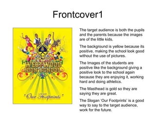
1. Frontcover1 The target audience is both the pupils and the parents because the images are of the little kids. The background is yellow because its positive, making the school look good without the use of pictures. The Images of the students are positive like the background giving a positive look to the school again because they are enjoying it, working hard and doing athletics. The Masthead is gold so they are saying they are great. The Slogan ‘Our Footprints’ is a good way to say to the target audience, work for the future.
2. Frontcover2 The background is a relaxing blue, making the school look relaxed, hard working and pleasant. The Font looks artistic therefore the school must approve art. The Images show positive looking work, they are hard working and enjoying it however this looks better for the parents rather than the pupils. The masthead is easy to read but a bit small and in a strange spot. The Logo is in a good spot however with it being bigger than the title, people could think the college was called SAC.
3. Frontcover3 This Magazine appeals more to hard working student because it shows a hard working student and there are no positive Images. The Font is too small and therefore hard to read however the colours go well with the background. The images are set out like a film strip so they must do something in photography. The Masthead is easy to read.
4. Contents1 The contents is more positive than the front cover changing the mood because of the Image. They have kept the title the same which is good and they are still using the same colour scheme. The Colours still work well with the background however some of the text is too small.
5. Contents2 The Masthead is easy to read because the font is good however the white text doesn’t go well with the actual contents, its hard to read some of the text. The background makes it hard for the text to be the right colour because not all of the colours are good with white. The balloons are good for the target audience because for people who have completed GCSE’s, its showing celebrations for finishing however with it saying happy 21 st birthday, this isn't good but it’s a bit comical.
6. Contents3 The background is very feminine so it wont appeal so much to a male audience. The language is informal because they have not bothered with using capital letters. The white is not easy to read so it can be off putting for the reader so they should review this. The masthead is a very feminine colour therefore this would not appeal to a male audience.