Magazinemasthead
•Download as PPT, PDF•
0 likes•173 views

The document discusses the development of a magazine masthead for a romance magazine. Several fonts and color options were considered based on feedback. Initially sharper and edgier fonts were considered unsuitable. A softer, rounded font was selected. Black and red color options were deemed too plain or not matching other magazine elements. Finally, a silver font color was selected as suiting the romance genre and working well with gold accents planned for the magazine cover.

Recommended
More Related Content
What's hot
What's hot (19)
Similar to Magazinemasthead
Similar to Magazinemasthead (20)
More from Tom Royston
Magazinemasthead
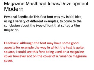
- 1. Magazine Masthead Ideas/Development Modern Personal Feedback: This first font was my initial idea, using a variety of different examples, to come to the conclusion about the type of font that suited a Film magazine. Feedback: Although the font may have some good aspects for example the way in which the text is quite square, I could see this font being used on a magazine cover however not on the cover of a romance magazine cover.
- 2. •MODERN • Personal Response: This text could be the least successful for my masthead however, I would attempt to use this font in my magazine cover as a while. • Feedback: I believe that this particular font would not be effective as a masthead for a magazine, it could be used for the font for the name of the film, if the film were sci-fi or action/adventure however I don’t believe this font would be a good masthead for a magazine representing this particular genre.
- 3. • MODERN • Personal Response:This was the stage in masthead development where the idea was beginning to take shape, this suited the name of the magazine. However for a romance cover I believed it was too sharp. • Feedback: This font could potentially be a good font for a masthead, however the font is not actually bold enough to be used on a masthead and the characters themselves are a little sharp and edgy which the romance genre doesn’t tend to resemble.
- 4. MODERN Personal Response: This font was the font that I finally chosen to use in my masthead the idea of the font resembling the name of the magazine, and also incorporating the soft, rounded edges that I wanted to have. Feedback: This font has all the elements in which to make a decent masthead, the characters are soft and rounded whilst the characters also are bold giving the masthead the opportunity to be coloured and changed, this font I could see being used on a magazine of this genre.
- 5. • After deciding the develop the final font further, I had to then develop the colour of the font, beginning with a plan normal font colour. • Personal Response: The colour black did not resemble the feeling that I wished to portray through my magazine, the black did not incorporate the soft yet stylish love feeling as well as I wished. • Feedback: The colouring of this font is too plain to be used on a masthead resembling this genre, the black you would particularly expect to be seen on a horror magazine or a magazine relating to darkness.
- 6. • Personal Response:As a common colour associated with the romance genre, I believed that red would be a good colour to use, however I realised that relating to the image I would want to use, that the red would not actually match the rest of the magazine cover. • Feedback- Again the colouring of the font here does not work in terms of the poster itself however it does resemble the romance genre, I can understand the use of the red colour however I don’t believe that the picture and other elements of the poster could match this. If the poster would be darker this could be effective.
- 7. • Personal Response: The gold was a good progression in terms of the colours for the masthead, however I did not believe that the colours were what I wanted just yet so I decided to use the gold colour elsewhere on the cover. • Feedback: If the font were to be gold rather than a browny colour I think it could be good, however the colour shown above isnt too effective.
- 8. • Personal Response: Finally I came to the colour that I believed suited the magazine the most and using the softer, silver colour, I think this and the gold colours on the poster would work sufficiently well. • Feedback: Although the colours may be quite plain, the colours actually would fit the expectations of the audience in terms of the masthead and the rest of the magazine cover.