Visualizing Healthcare Data: Information Design Best Practices (eHealth 2012 Presentation)
•
22 likes•26,173 views

This is my eHealth 2012 presentation will focuse on the principles behind information design and how visualization best practices can be leveraged within context of healthcare data. It illustrates theory in action, by drawing specific attention to the successful public facing solution, the 2012 Canadian Hospital Reporting Project (CHRP). The CHRP tool is a pan-Canadian external facing solution with an audience of over 3000+ users; it received over 25,000 impressions in the first 24 hours, and was called by the Toronto Star as “an innovative online tool that is being heralded as the most advanced of its kind in the world.”

Recommended
More Related Content
What's hot
What's hot (20)
Viewers also liked
Viewers also liked (20)
Similar to Visualizing Healthcare Data: Information Design Best Practices (eHealth 2012 Presentation)
Similar to Visualizing Healthcare Data: Information Design Best Practices (eHealth 2012 Presentation) (20)
Recently uploaded
Recently uploaded (20)
Visualizing Healthcare Data: Information Design Best Practices (eHealth 2012 Presentation)
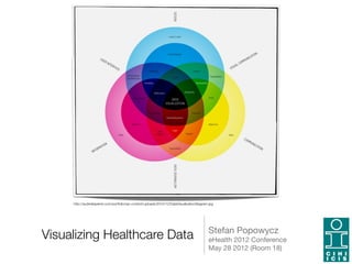
- 1. http://audreelapierre.com/portfolio/wp-content/uploads/2010/12/DataVisualizationDiagram.jpg Stefan Popowycz Visualizing Healthcare Data eHealth 2012 Conference May 28 2012 (Room 18) "1
- 2. Updated Overview This presentation will focus on the theory and best practices behind information design. Using tangible examples of production data visualizations published by CIHI, namely the CHRP 2012 Custom Public Solution, I will demonstrate how these principles can be best leveraged within context of visualizing healthcare data. This presentation is to viewed starting point. "2
- 3. Data Visualizations "3
- 4. Me • Stefan Popowycz, B.Sc., B.A.Hons., M.A • Trained as a Medical Sociologist, Statistician, Researcher • Senior Business Systems Architect • Lead Design and Information Architect for the Canadian Hospital Reporting Project 2012 Custom Public Reports. • eReporting & Enterprise Data Warehousing Service Team, CIHI "4
- 5. Presentation Overview • First, I will define Information Design and describe the three elements behind this approach. • Second, I will briefly explain the CHRP solution and provide an overview of the suite of public interactive data visualizations that were created. • Lastly, I will outline the five main components of Information Design, the respective best practices associated with each of these categories, and how these were implemented in the CHRP solution. "5
- 6. Information Design "6
- 7. Information Design (J&K O'Grady) • Information design represents the clean and effective presentation of information, and involves a multi- disciplinary approach to communication. "7
- 8. Information Design • Its goal is to communicate a specific message to an end user in a way that is clear, accessible and easy to understand. • Combines graphic design, communications theory, technical and non- technical practices, cultural studies and psychology. "8
- 9. Data Visualization • Data visualization is a visual representation of data that has a main goal to communicate quantitative information clearly and effectively through graphical means. • Objects/components/artefacts generated during the Information Design process. • More analytical in nature, and can be static, animated, or interactive. "9
- 10. Infographics • Infographics are graphic visual representations of information, data or knowledge, and present complex information quickly and clearly, such as in signs, maps, journalism, technical writing, and education. • Static and less analytic in nature. Also an artefact of the information design process. • Currently very popular with media and are published almost on a weekly basis. "10
- 11. Why? • Healthcare data is both pervasive and extremely important to all Canadians. • Traditionally, CIHI has had a clear obligation to analyze these data, publish and communicate the results to all Canadians (Vision and Mandate). • Clear shift in the way people are organizing, sharing, and consuming data. "11
- 12. Why? • Intrinsically, healthcare data is important as it is used to inform decision makers on progress, overall comparison, and most importantly best practice. • Proper data visualizations facilitate the comprehension of complex analysis and patterns. • But, data visualizations do not need to be boring and uninviting. "12
- 13. Why? • Although this represents CIHI's first attempt at interactive data visualizations and it is far from perfect, but it represent a positive step in the right direction. • Strong belief in better communication through visualization. • In the end, data wins! "13
- 14. CHRP 2012 Data Visualizations "14
- 15. CHRP 2012 Public • The Canadian Hospital Reporting Project is a national quality improvement initiative providing hospital decision makers, policy makers and Canadians with access to clinical and financial indicator results for more than 600 facilities, from every province and territory in Canada. • The Public Data Visualizations of the CHRP project were designed with the intent to visually and interactively communicate key messages to end users using a web-based business intelligence solution. "15
- 16. CHRP Key Findings "16
- 17. CHRP Key Findings • The first type of data visualization created for the CHRP we called a Key Finding. These are intended to be quick fact sheets that print neatly on a legal sized document. • It's summary level data, at 2-3 different levels of analysis for a specific indicator of interest, and represent an interactive approach to data presentation. "17
- 18. CHRP Standalone Solutions "18
- 19. CHRP Standalone Solution • The second category of data visualizations created are what I like to term standalone interactive solutions. • These consist of more complex data visualizations that combine several types of data within an interactive real-estate frame. "19
- 20. CHRP Standalone Solution • Contains guided analysis, allowing the end user to focus in on information of interest. • Layered views of the same data provides better contextual understanding of the whole message being communicated. "20
- 21. Information Design Components "21
- 22. Three Essential Elements • There are three essential elements for information design: the classic relationship between content, function and form. • A delicate balance needs to be maintained between all three in order to achieve an effective data visualization. "22
- 23. Three Essential Elements • Content: the information that you want to communicate • Function: the intended actions associated with the object you are designing. • Form: the size, shape, dimension and other distinct parameters of the object you are designing. "23
- 24. Negotiation • Preconceived notions of what type of data visualizations are appropriate hinder the overall information design process. • Developers need to participate in gentle negotiation between the business and all three elements. • Ex: academic vs graphic art (boxplots vs data variability). "24
- 25. Five Design Components • Key messages (critical analysis) • Types of underlying data • Typography (fonts) • Colour selection • Design and layout "25
- 26. Key Messages "26
- 27. Key Messages • It is important to clearly define 3-5 key messages that you want to communicate? • This requires that you distill the various components of your critical analysis into nuggets of information. • What are they key metrics? "27
- 28. Key Messages Best Practice • Important to be explicit when defining your key messages, and try to contextualize them as much as possible. • Arrange them hierarchically, as it will allow you to get a better understanding of the overall message you want to communicate. "28
- 29. CHRP Key Findings Best Practice in Action • 30-Day Readmission example. • Three key messages clearly defined and levels arranged hierarchically in all Key Findings. • Graphs are clean and crisp. • Colour palette is muted and maintained throughout all the key findings. "29
- 30. Types of Data "30
- 31. Types of Data • Important to assess the types of data available for development. • Compare data to the key messages in order to assess if all necessary fields are available or if additional data collection is necessary. • Why? The data visualization techniques for one data type may not be appropriate for another type of data. "31
- 32. Types of Data (Stephen Few) • Time series analysis (trends, variability, rate of change) • Part to whole and ranking analysis (bar, pie, Pareto) • Deviation analysis (categorical, comparative, thresholds) "32
- 33. Types of Data (Stephen Few) • Distribution analysis (histogram, box plots, categorical) • Correlation analysis (scatter plot) • Multivariate analysis (heat, multiple line) • Each type has an appropriate graphic technique associate with it. "33
- 34. Data Type Best Practice • Select the appropriate chart type and units of measurement. • Include a reference line (if possible). • Optimize the aspect ratio of the graph (zero line). • Maintain consistency throughout the graph: fonts, colours, design. • Avoid 3D graphs. "34
- 35. CHRP Key Findings Best Practices in Action • Cost per Weighted Case example. • Mix of traditional and aesthetic visualizations (negotiation between traditional content and current design standards). • Scatter plot (correlation), bar graph over multiple fiscals (time series and part to whole), categorical analysis (deviation). "35
- 36. CHRP Key Findings Best Practices in Action • 30-Day Mortality example. • Reference line used to indicate thresholds. Error bars indicate confidence intervals. • Pervasive meta data provides contextual information • Narrative flow is simple (description, left, right, left flow) "36
- 37. Typography "37
- 38. Typography • Font selection is extremely important when thinking about information design and communication. • Rule of thumb, keep it simple and ensure the legibility of your design. • Aesthetics vs communicability. "38
- 39. Typography Best Practice • Compromise between visual impact and the richness of data. • Try not to use all caps, stylized fonts, or angled fonts. Different types of fonts can be mixed, but be careful. • Adjust the size, weight, colour of the font for additional impact. • Integrating Corporate standards and design. "39
- 40. CHRP Key Findings Best Practices in Action • Large chunky fonts used to draw end users attention to top. • Sans serif font employed throughout (web and print). • All titles are two points larger than the text for impact. • This pattern is maintained though all data visualizations created for the CHRP public. "40
- 41. Colour "41
- 42. Colour • Selecting a colour scheme is also very important when designing data visualizations. • Allows the designer to set the tone of the data visualization. • Colours used as categorical highlight (performance allocation) • Corporate colours? "42
- 43. Colour Best Practice • Try to keep the representation consistent across your data visualizations. • Altering the hues and intensity are a good way to draw distinctions and make comparisons. • Do not use distracting colours. • Print everything in black and white. "43
- 44. CHRP Standalone Solution Best Practice in Action • Clean, crisp, and simple. • Contrasting colours differentiate between values that are above national average and those that are not. • The colour scheme is carried over into the interactive graph. "44
- 45. CHRP Standalone Solution Best Practice in Action • In the performance allocation example, the shape and colour indicate these stability and performance of the result. • Both schemes carried over to the scatterplot below. • Similar pattern for key findings. "45
- 46. Design and Layout "46
- 47. Analytical Design • Selecting the proper design and layout for your data visualization is also very important. • Adhering to simplicity and being aware of narrative flow, will greatly aid in communicating. • The information should flow with ease for the consumer. "47
- 48. Analytical Design Best Practice • Designing the data visualization environment requires some key features: comparing, sorting, filtering, highlighting, aggregating, re-expressions, re-visualization, zooming and panning, re-scaling, access to details on demand, annotation and bookmarking "48
- 49. Analytical Design Best Practice • Trellises and cross tabs: provides more contextual view of the data you would like to present. • Web and social media integration. • Designed with printing in mind. "49
- 50. CHRP Standalone Solution Best Practice in Action • Trellises and cross tabs: provides more contextual view of the data you would like to present. • Multiple concurrent views of the data provides helps to provide contextual understanding of your key message. • Facebook and Twitter functionality, and JavaScript embedding. "50
- 51. CHRP Standalone Solution Best Practice in Action • Entire key finding is interactive. • Analytical techniques and practices, such as directed vs exploratory navigation, hierarchical navigation • Hover over meta data on every data point. "51
- 52. Lightweight BI Tools • Gartner Magic Quadrant for Business Intelligence Platforms • Why are they so important? They have a lot of the best practices built into them, so it makes it easier for the developer to create effective data visualizations. • Many have social media functionality and web integration build directly in. "52
- 53. Things to Remember • Look at you data: What story do you want to tell? How will they consume the info? • Keep it simple. Less is more. • Design, don't decorate. • Remember that a chart is always more memorable than a table. "53
- 54. Authors to Read • Stephen Few • Jen and Ken O'Grady • Donna Wong • Edward Tufte • Nathan Yaw • Manuel Lima • David McCandless "54
- 55. Websites to See • good.is • visualnews.com • thedailyviz.com • datavisualization.ch • pinterest.com • printmag.com "55
- 56. Questions? "56
- 57. Thanks! Stefan Popowycz Email: spopowycz@cihi.ca Website: www.cihi.ca Pinterest: http://pinterest.com/ stefanpopowycz/information-design/ LinkedIn: http://ca.linkedin.com/pub/ stefan-popowycz/1a/141/649 "57