
Recommended
More Related Content
What's hot
What's hot (18)
Viewers also liked
Viewers also liked (12)
Similar to Magazine Advert Analysis - Mika
Similar to Magazine Advert Analysis - Mika (20)
More from Smith_
More from Smith_ (20)
Recently uploaded
Recently uploaded (20)
Magazine Advert Analysis - Mika
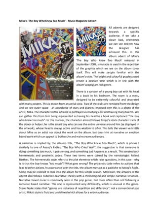
- 1. Mika's'The Boy WhoKnew Too Much' - MusicMagazine Advert All adverts are designed towards a specific audience. If we take a closer look, oftentimes we can see directly how the designer has achieved this. In this album advert of Mika's 'The Boy Who Knew Too Much' released in September 2009, simulacra is used in the repetition of the graphics which we see on the album cover itself. This will make people familiar with the album's style. The bright and colourful graphics used create a positive tone which is in line with the album'spop/glamrockgenre. There is a cartoon of a young boy sat with his head in a book in his bedroom. The room is a mess, designed to be extremely colourful and decorated with many posters. This is drawn from an aerial view. Two of the walls are removed from the design and we see outer space - an abundance of stars and planets. Imposed over this is a photo of the artist, Mika. The character in the artwork is portrayed as studying a lot and having many talents. We can gather this from him being represented as having his head in a book and captioned "the boy who knew too much". In this manner, the character almost follows Propp's stock character traits of the donor or helper; he is the smart boy who can see the entire universe around him (as displayed in the artwork), whose head is always active and has wisdom to offer. This tells the viewer very little about Mika as an artist nor about the work on the album, but does hint at narrative or emotion basedworkwhichcan appeal to bothniche andmainstreamaudiences. A narrative is implied by the album's title, "The Boy Who Knew Too Much", which is phrased similarly to one of Aesop's Fables, "The Boy Who Cried Wolf"; the suggestion is that someone is doing something too much, it goes wrong, and something bad happens as a result. This creates both hermeneutic and proairetic codes. These two terms were coined by the narratologist Roland Barthes. The hermeneutic code refers to the plot elements which raise questions, in this case - why is it that the boy knows "too much"? What goes wrong? The proairetic code refers to actions that lead to other actions. In accordance with the title, the album may act as a pastiche to Aesop's Fable. Some may be inclined to look into the album for this simple reason. Moreover, the artwork of the advert also follows Todorov's Narrative Theory with a chronological and simple narrative structure. Narrative based music is commonly seen in the pop genre, but more often than not following a romance based narrative. This one is represented very differently, which is unusual in the genre. Steve Neale states that "genres are instances of repetition and difference"; not a conventional pop artist,Mika's style isfluidandundefinedwhichallowsfora wideraudience.
- 2. As the advert features a busy cartoon drawing rather than an actual photograph, there are no pieces of iconography that particularly stand out. The books and mess in the room help to create the stereotypical “nerd” character representation. Likewise, the photo of Mika stands out on the advert as black and white, contrasting the technicolour mise en scene; this could be to emphasise the difference between the created narrative of the cartoon and the reality of the artist, as creativity and storiesare oftenpresentedinbrightcolours. The use of cartoons is a unique selling point for the artist, recognisable with his debut album “Life in Cartoon Motion”. The artwork has been inspired by children's picture books from the 1940s to 1970s, which almost confuses our understanding of the intended audience behind Mika’s advert. The setting of the artwork used on both the advert and the album will appeal to mainly teenage viewers.