One to One Insights Online Banking Experience Presentation 11.18.2010

This presentation highlights One to One Insight’s latest customer experience research findings on the top ten retail banks in the UK (Barclays, Halifax, HSBC, first direct, Lloyds TSB, Nationwide, NatWest, Santander, The Co-operative Bank, and Yorkshire Bank) in terms of the online customer experience they provide users who are interested in purchasing a Cash ISA (an individual savings account which offers savers special tax advantages) . Research will directly compare the online experience provided by leading banks by scoring each bank, and providing qualitative insights into: Positioning of Cash ISAs on the top 10 banking websites Information relating to Cash ISAs Tools and features related to Cash ISAs Application process for a Cash ISA

Recommended
Recommended
More Related Content
What's hot
What's hot (19)
Similar to One to One Insights Online Banking Experience Presentation 11.18.2010
Similar to One to One Insights Online Banking Experience Presentation 11.18.2010 (20)
More from One to One
More from One to One (20)
Recently uploaded
Recently uploaded (20)
One to One Insights Online Banking Experience Presentation 11.18.2010
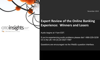
- 1. www.OTOinsights.com 1 November 2010 Expert Review of the Online Banking Experience: Winners and Losers Audio begins at 11am EST. If you’re experiencing audio problems please dial 1-866-229-3239 Or in the UK +44 (0) 20-3027-7997 Questions are encouraged via the WebEx question interface.
- 2. 2www.onetooneinteractive.com Agenda Company Overview Part 1: Context: UK Online Banking Landscape Part 2: Review of sites Part 3: Insights & Conclusions Q&A
- 4. www.OTOinsights.com 4 Established in 1997, One to One Interactive is the first global enterprise to assemble a complete solution for brands, agencies, and publishers executing one-to-one marketing strategies. The company employs over 140 professionals in 7 offices located in North America, Latin America, Europe, and Asia. One of the 20 “Hottest Independent Digital Firms” Globally AdAge, 2007 One of the Fastest Growing Private Companies Inc Magazine, 2008
- 5. www.OTOinsights.com 5 OTOinsights Overview Established in 2002, OTOinsights has conducted over 400 research project in over 30 countries. Specialists in neuromarketing and customer experience strategy, research and design. Undertake discrete point-in-time projects and strategic engagements. Experience across all platforms including digital (e.g. web, intranets, mobile devices, PDA’s, i-TV, etc.), call centers, retail environments and physical products (e.g. laptops, printers, etc.) OTOinsights Offerings: Amplifying Engagement OTOinsights quantemo Customer Experience Research Neuromarketing Research
- 6. www.OTOinsights.com 6 OTOinsights | Amplifying Engagement Brand Perception Research Information DesignNeuromarketing Research Customer Experience Research • Eye-Tracking • Pre-Cognitive Neurological Engagement • Cognitive Emotional Tagging • Usability Testing • Focus Groups • In-Depth/Paired Interviews • Online Surveys • Expert Evaluations • Accessibility Audits • Ethnographics • Research/Tracking • Socially Informed/ Multi- Channel Personas • Engagement Mapping • Cultural Anthropology • Trend Spotting • User Needs Analysis • Information Architecture • User Scenarios • Behavioral Use Cases • Feature Matrix • Wireframes • Site Maps • Prototype Development
- 7. 7www.onetooneinteractive.com PART 1 | Context: The UK Online Banking Landscape
- 8. 8www.onetooneinteractive.com Context: The UK online retail banking landscape • Almost 60% of UK Net users have researched a financial product online in 2009, more than in any other European country. • 40% UK Internet users have applied for a financial product online in 2009, which is double the Western European average. • So you think that UK bank web sites are all highly effective sales sites? • The Internet is now a core distribution channel for most retail financial products, yet how are banks capitalising on that potential growth. Source: Forrester Research computerweekly.com
- 9. 9www.onetooneinteractive.com Context: The UK online retail banking landscape • Many of the UK banks' sites are not giving prospective customers enough help, particularly when it comes to comparing different accounts and helping customers work out which account is right for them. • Given the popularity of using the Internet to research and apply for financial services amongst Brits, the nation's retail banks have been oddly slow to develop world-class web sites to support users who want to research and buy a product in all phases of the customer journey. Source: Forrester Research computerweekly.com
- 10. 10www.onetooneinteractive.com • Many banks are strong in attracting customers — fewer are good at supporting product comparison and selection. Context: The UK online retail banking landscape Source: Forrester Research computerweekly.com
- 12. 12www.onetooneinteractive.com Methodology • Expert Approach • 2 experienced customer experienced consultants • Independently reviewed top 10 UK online banking sites • Focus • Cash ISA • Application process • Positioning • Information • Tools and features
- 15. 15www.onetooneinteractive.com Results | Summary The numbers • 7/10 sites have ability to compare products • 6/10 sites have ISA link on the homepage • 4/10 have links on deeper pages • 6/10 sites allow users to apply for ISA without having to register with online banking • 3/6 sites allows users to recover from mistakes by going back • 5/10 sites help users make decision by providing 'is this right for me?’
- 16. 16www.onetooneinteractive.com Results | Application Key criteria used in the analysis: Homepage 1. Is the cash ISA link available from the homepage 2. ‘One-click’ to cash ISA product page 3. Efficient search functionality 4. Items of related content are kept together Product page 5. Good presentation of product (ISA) e.g.: layout, colour, font, easy to read? 6. Adequate product information to help users? 7. Ability to compare products 8. Help users make decision by providing 'is this right for me?'
- 17. 17www.onetooneinteractive.com Results | Application Key criteria used in the analysis: Application process 9. New customers can apply online 10. No Unnecessary information needed to complete the application 11. Steps to complete is shown 12. User’s current location is shown 13. Good error messages 14. Interactive elements are easy to use 15. Adequate information to help users in completing application? E.g: set up security phrase etc. 16. Allows users to recover from mistakes by going back 17. Efficient process in terms of time, steps and information required
- 19. 19www.onetooneinteractive.com o Co-operative meet 15/16 key criteria o Application process is particularly good o New customers are able to apply online o Provide adequate content, easy to read and consume o First Direct gives least useful experience for cash ISAs o No ISA link on the homepage o Not easy to compare products o No ‘is it right for me?’ section to help users make decision o Many banks provide good product information, but the presentation of product is not excellent, the application process is not intuitive enough. Users would think the bank is not thoughtful due to some typical issues:- o Information of product is not ready-to-consume o Doesn’t help users make decision by providing 'is this right for me?‘ o Inadequate information to help users in completing application o Users are unable to recover from mistakes by going back 1st 10th Overall Key criteria met
- 20. 20www.onetooneinteractive.com Below the fold on 1280 x 1024 screen resolution Homepage |Location of cash ISA Not on homepage
- 21. 21www.onetooneinteractive.com Product page |Content & presentation of product Inadequate content Poor presentation Adequate content Good presentation Adequate content Easy to read and consume Adequate content Logic and fluid presentation
- 22. 22www.onetooneinteractive.com Product page |Content & presentation of product What is further information? Where is overview? Where are key benefits? Good flow of feeding information Overview How the account works Interest rates Apply
- 23. 23www.onetooneinteractive.com Product page | Ability to compare products
- 24. 24www.onetooneinteractive.com Product page | Ability to compare products o 7/10 banks provide a separate page for product comparison o First Direct , Nationwide and Yorkshire bank provide key information of products, but users are not able to directly compare different ISAs o Co-operative provides users with the differences between ISAs. However, this information cannot be found on the product page. The information given is rather short and generic
- 25. 25www.onetooneinteractive.com Product page | Provision of “is this right for me?”
- 26. 26www.onetooneinteractive.com Product page | Provision of “is this right for me?” o Co-operative provides a ISA quick check tool to help users find out how to make the most of ISA allowance, but this doesn’t differentiate their product from others o HSBC provides ‘choosing the right ISA’, but users still need to read and analyse before they can make decision o As an alternative to ‘is this right for me?’ Barclays provides a tool, ‘savings chooser’ to help users select the right ISA o Santander provides customers with key benefits of each ISA. Users are unable to make direct comparison, but it tells users which ISA might suit them. o Lloyds TSB provides an account selector tool; answer a few questions the site will show users accounts that might suit them o First direct, Halifax, Nationwide, Yorkshire Bank and NatWest do not provide adequate help to users in finding the right ISA to meet their needs
- 27. 27www.onetooneinteractive.com Application | Number of pages
- 28. 28www.onetooneinteractive.com Application | Time to complete
- 29. 29www.onetooneinteractive.com Application | Number of pages o NatWest’s application process consists of 9 pages, which is almost double the length of HSBC’s, Nationwide’s and Co-operative’s o An initial deposit is required to open a saving account, this is why the application asks users to enter amount they want to deposit, bank detail, how frequent users want to make regular savings, how payments will be made etc. o It is good to have the account well set-up, but banks need to strike a balance, lengthy application process can frustrate users and send them to the competitors
- 31. 31www.onetooneinteractive.com • Step 2, Products are displayed side by side; this will help users read key information of different products. • Easy to digest information, but could indicate priority/hierarchy of messages more clearly. Links of product summary and key features can be easily found on product page. Clear call to action. • Information of product provided is adequate. It provides users with the differences between different ISAs. However, this information cannot be found on the product page. The information given is rather short and generic. 1 2 2b • Step 1, an ISA link is available on the homepage. • ‘Two-click’ to product page. • Search function is provided on homepage. Users can find ISA link on the first page of the results • Links of related product are logically grouped.
- 32. 32www.onetooneinteractive.com • Good feedback throughout the form. Progress bar clear shows how much users have completed. Selected fields are highlighted. • Interactive elements are conventional easy to use. • Adequate information is given for each field to help users in completing the form. It is interactive and helpful. • Application process consist of 5 pages, which is good length of process. 3 • New customers can apply Cash ISA online. • No Unnecessary information needed to complete the application. • Steps to complete is clearly shown at the top of the page. • User’s current location is shown.
- 33. 33www.onetooneinteractive.com • Step 2, Good presentation of product information. It is easy to read the content. • Product information is displayed in box with clear border lines. This gives users an overview of different ISAs. The site also helps users make comparison between different ISAs • Good Informative product detail is provided; easy to read and consume. 1 2 2b • Step 1, the cash ISA link is available on the homepage. However, the link is not very salient. • ‘Two-click’ to product page. • Search function on homepage is efficient. The results returned are prioritised according to relevance. • Links of related product are grouped or boxed together.
- 34. 34www.onetooneinteractive.com • Good error messages to help users recover from mistakes. Interactive elements are easy to understand and use. • Adequate information to help users in completing application. • The site allows users to recover from mistakes by going back. • Application process consist of 9 pages, which is quite long compare to other online banking sites. • New customers can apply Cash ISA online. • No Unnecessary information needed to complete the application. • Steps to complete is shown. The title of the steps informs users what information they need to enter. • User’s current location is shown. users know where they are and how many pages more to complete the application. 3
- 36. 36www.onetooneinteractive.com • It is not easy to distinguish between rows due to the colour used. Titles are not hyperlinked • Product page has 3 tabs which helps break down the info. However, overview of product information is shown in bullet point, which can be best shown in tables. • Information of product provided is adequate, but lack ‘is this the right one?’ information for users. • The site provides key information of products, but they do not allow users to directly compare different ISAs. 1 2 2b • Step 1, the cash ISA link is not available on the homepage. • ‘Two-click’ to product page. • There is no search function provided on homepage.
- 37. 37www.onetooneinteractive.com 3 • Only existing current account holders can apply ISA online. New customers have to apply in branch.
- 38. 38www.onetooneinteractive.com PART 3: Insights & Conclusions
- 39. 39www.onetooneinteractive.com Best Practice customer’s journey (Application) : Homepage • Include ISA link on the homepage at least in run up to new financial year • At least prominently include the link on the ‘Savings’ page • ‘One-click’ to cash ISA product page • Provide an efficient site search function • Items of related content are kept together to aid reading and scanning Conclusions
- 40. 40www.onetooneinteractive.com Best Practice customer’s journey (application) : Product page A good mix of sales-oriented, informative, and educational product content. • Avoid information which looks like an advert • Highlight calls to action like ‘Apply’ • Write for the web; concise bullet points, headings etc • Comparison of products; tables are good for this Conclusions
- 41. 41www.onetooneinteractive.com Best Practice customer’s journey (application) : Product page • Ample product information, preferably broken down with tabs or other means • Include an overview of products on product page to help users comparing different products • Include “is this right for me?” section to help users work out which product is right for me Conclusions
- 42. 42www.onetooneinteractive.com Best Practice customer’s journey (application) : Application process • Allow new customers (without any account) to be able to buy ISA online • Do not require any unnecessary information to be entered, e.g. initial deposit, which could be asked for at a later time • Show steps / progress indicator • Consider the flow of the users eye in layout • Ensure few steps, but not at the expense of clarity and feeling of progression • Good error prevention and handling Conclusions
- 43. 43www.onetooneinteractive.com Best Practice customer’s journey (application) : Application process • Offer interactive help and intuitive interactive elements • Allows users to recover from mistakes by going back and saving Conclusions
- 44. 44www.onetooneinteractive.com Best Practice customer’s journey (application) : Application process • Include a clear indication on the website that the application process is complete and has been successful • Ideally include a clear, separate confirmation page • Include a clear thank you message on this page • Provide helpful post-application information online via email or by post to inform users what they can expect next Conclusions
- 45. 45www.onetooneinteractive.com Best Practice customer’s journey (application) : Application process • Send email confirmation immediately • Ensure consistency with site i.e. branding and logo, etc. • Include a link back to the website • Include contact details Conclusions
- 46. 46www.onetooneinteractive.com Questions? Dr. Alex DeWitt: adewitt@onetooneinteractive.com For copies of the presentation or further info on OTOinsights services please email: marketing@onetooneinteractive.com Follow OTOinsights on Twitter: http://twitter.com/OTOinsights
- 47. 47www.onetooneinteractive.com Join Us for Our Next Webinar Join us for our next Webinar on January 20 at 11 AM Eastern Time: The Principles and Goals of Human-Centric Marketing Presenters: Jeremi Karnell, President, One to One Robb Smith, Chairman and CEO of Integral Institute David LaPlante, SVP Sales and Marketing, One to One When/Where: Thursday, January 20th at 11 a.m. Eastern Time Register at: http://bit.ly/d3jxV8
Editor's Notes
- Four Attributes of Online Customer Experience: Customized by the End User Aggregated at the Point of Use Relevant to the Moment Social as a Rule Brand Perception Probe for social media behavior when conducting ethnographic research. To develop personas that help designers create CARS experiences, researchers should incorporate observations of users engaged in social media activities like blogging and micro blogging. Multi-Channel Personas Designing next-generation online experiences will demand the kind of insight that personas provide. Although many firms already have single-channel personas, they’ll need new personas that reflect the complexity of users’ multichannel behavior. This means developing personas that provide a full picture of each customer’s journey through physical and interactive touch points, their information and functionality needs at each stop along the way, and which devices they use to support their current behaviors. Customer Experience Research Multi-touch-point evaluation and analytics will become must-haves. Measuring customer experience across multiple channels is still a major challenge for most firms.13 But consumers will increasingly use multiple apps, devices, and sites to complete a single goal — online and in conjunction with other channels. In response, customer experience professionals will create centralized groups to coordinate metrics and a common framework for measurement. And to make data integration manageable, they will focus on one channel pair at a time.14 Experiment and test. To mitigate the risk associated with building increasingly sophisticated interactions, customer experience professionals should experiment before rolling out massive changes to the marketplace. But having an incubation environment on the scale of Fidelity Labs or Google Labs isn’t in the budgets of most companies. Instead, customer experience professionals should plan to leverage low-cost usability testing techniques to try out their experiments with CARS online experiences. Testing paper prototypes early and often during the design process and leveraging remote testing tools to gather feedback can help evolve leading-edge designs at a price most companies can afford. Information Design Create atomized content and functionality. In response to rising expectations for customized, aggregated interactions, customer experience professionals should begin atomizing online content and functionality so that it’s available for re-use across sites and devices.
- 4 banks, Lloyds TSB, Barclays, Yorkshire Bank and First Direct ask users to log in their online banking account in order to apply for the ISA. Application process of these banks are not assessed.