Global Terrorism and its types and prevention ppt.
Evaluation q1
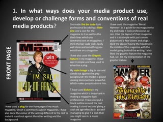
1. 1. In what ways does your media product use,
develop or challenge forms and conventions of real
I’ve made the bar code look I have used the magazine ‘Metal
media products? professional by adding a Date Hammer’ as a guide for my magazine to
Line and a cost for the try and make it look professional as I
magazine to it as well as the can. I like the layout of their magazine
black lines which you and it is so simple with just a main
commonly see on magazines. I picture and a few kickers and plugs. I
think the bar code looks really liked the idea of having the headline in
well done and something you the middle of the magazine with the
FRONT PAGE
would see on a magazine model going behind the writing. I also
liked the graphic feature the magazine
I have also used the Graphic had, so I did my interpretation of the
feature in my magazine. I have graphic feature
kept it simple and have used to
advertise a plug
My main image is big in size and
stands out against the grey
background> the model is posed
Looking dominant and powerful.
Which makes people admire him.
I have used kickers in my
magazine which is important in
making a magazine look
professional. I have also put a
black outline around the text
I have used a plug for the front page of my music making it stand out and giving a
magazine, which is commonly used in magazines. I have cool old age effect to it but still
also done the colour of the writing different to the rest to managing to give it a look that
make it stand out against the other writing and the you might see in a music
background magazine
2. I have used, a simple design for my Masthead and have used big
block capitals for the name of the magazine to stand out on the
front page. It is has 2 basic colours red and black which are
commonly considered dark colours and commonly used in a lot of
metal magazines. The black could connote darkness or evil and the
red can connote blood and danger. and is also the big theme
throughout my magazine. The writing is a big size and stands out
on the front page.
FRONT PAGE
I also added an Anchorage in my music magazine to add a short
quick bit of speech (IM BACK!!) explaining what the band is
doing. It also allows more space for the magazine to be filled by.
The writing is in the colour yellow and that connotes riches and
fame making the band seem big. It also showing clearly from the
background and easy to read.
I have used, The Headline similar to the way ‘Metal Hammer’
have used there Headline in there magazine. Although they
have it more in the middle of their magazine while I have used
mine towards the bottom. I wanted it to look like the model
of the magazine was holding the title of the band to make him
look powerfull. I think the effect worked well.
I liked the way ‘Metal Hammer’ wrote there Headline for
the band ‘Bring Me The Horizon’ although I did something
different to what they did to there’s. I like the way the
writing is a big size and covers the width of the page.
3. Finally I have used a Selling Line in the music
magazine. All magazines have a Selling Line in
FRONT PAGE
them (Including other types of genres) to
advertise something very briefly, which is in the
magazine. E.g. win free stuff, advertise music,
posters etc. I have used my main house style red
and black for my Selling Line to stand out and to
keep the same throughout the magazine.
‘Metal Hammer’ have also put in a Selling Line in
their music magazine. They are advertising
content which is inside the magazine. Whereas I
have given people a chance to win a free guitar
signed by a made up band (In-Sane)
4. Throughout the magazine i have kept the 2 simple colours of red and white
throughout the magazine. I have kept the magazine simple and not
complicated it. I have added features such as a small box with a little
information on what you get if you subscribe to the magazine.
CONTENTS
5. CONTENTS
For the contents page i have also done a little speech. During
research for the magazine i noticed that many of the
contents pages have a little bit of speech from the author
talking about the magazine and also a little bit about them
selves. I also added a little bit of speech to my magazine as to
make the magazine look professional and to make the
magazine look good. I have also added a signature as to make
the magazine look that more professional like they have done
in the ‘Kerrang; magazine.
6. During the middle of the page i have split the page into 2 to make
the magazine look more tidy. On the top half i have added a main
picture as well as a title and the name o the magazine at the top.
On the bottom half i have put the contents list and the subscription
boss. Kerrang have also used this style which is wear i got the idea
from as i thought it ooked quite professional and nicer to read and
understand what the contents page had to offer
7. I have done the title in a different way with the text and
rotated the text a little bit. The text looks different and adds a
cool effect to the double page. The colour of the text is good
to using red text with a hint of black within the text.
Finally the main colours of the double page are red and white
which are main colours for both the Union Jack and the St
Georges flag which relaters with what the magazine is about.
I liked the idea of having a big picture of the model which
covers a full page and going over to the second page of the
Double Page Spread
double page spread.
I also liked the idea of having the text from the interview going
around the model for it would better to present and would
give me more room to make the model bigger.
I think that the double page has good qualities that could be
seen on a professional music magazine. It is plain and simple
and is not overcomplicated and hard to read what is on the
page.
I have took some ideas from the magazine especially with the
way the text is slanted a bit which I thought looked pretty
cool. Like I said I liked the idea of having a big picture of the
model. Although I changed it a bit and wanted the model to
go over onto the other side of the page. With the writing
going around him.
The facial expressions of the model is a major key in making
the magazine look professional. For instance if you are trying
to make a metal magazine the facial expressions need to be
quite serious and look like they are not caring much about
their picture being taken.
8. Double Page Spread
One of the many things I thought was important was
to advertise the name of the magazine throughout
the magazine. I therefore added a small drop box
indicating the name of the magazine. Using that idea
it would get people seeing the name and making
them want to read the magazine more.
9. HOUSE STYLE
The house style is mainly red and white. These are commonly the colours
of the England flag which is a country in Great Brittan. I used these colours
to indicate that the magazine is British and also that the colours worked
well together and made the magazine look good. The yellow writing on the
front page connotes that the Magazine is valuable and would be worth the
purchase. I have only used 3 main colours which is White, Red and Grey so
the magazine is not over complicated