MOBILE READY HERO IMAGES - delivering a better experience across all devices & screen sizes
•Als PPTX, PDF herunterladen•
6 gefällt mir•1,807 views

This document discusses the shift to mobile commerce and strategies for optimizing product images and information for mobile devices. It notes that mobile now accounts for the majority of screen time in several countries. Product images need to be optimized for smaller screens with mobile-ready hero images and consistent formatting of key details like size, brand, and variant across retailers. Testing with retailers found recognition of these details improved when guidelines around font, color, and positioning were followed.

Empfohlen
Weitere ähnliche Inhalte
Was ist angesagt?
Was ist angesagt? (20)
Ähnlich wie MOBILE READY HERO IMAGES - delivering a better experience across all devices & screen sizes
Ähnlich wie MOBILE READY HERO IMAGES - delivering a better experience across all devices & screen sizes (20)
Kürzlich hochgeladen
Kürzlich hochgeladen (20)
MOBILE READY HERO IMAGES - delivering a better experience across all devices & screen sizes
- 6. Moto E
- 9. 125 104 129 96 125 148 147 113 89 132 68 97 77 95 102 97 103 146 161 117 150 175 173 193 169 166 194 215 229 291 0 100 200 300 400 500 600 Japan Canada Germany India Australia UK USA Brazil China Indonesia Daily Distribution of Screen Minutes, By Country TV Laptop + PC Mobile (Smartphone + Tablet) Source: Mary Meeker State of the Internet 2015
- 10. “ because PC purchases still represent the majority of online shopping transactions…”
- 11. Mobile Share of eCommerce Transactions by Country: Source: Criterio 2016 “State of Mobile Commerce”
- 14. 60% of all retail sales will be digitally influenced by 2017 FORRESTER
- 15. 4 – 4.3 in 3.5 in 4.7- 5.1 in 5.7 in 5.5 in http://www.digit.in/mobile-phones/4.7-inches-is-still-the-favourite-screen-size-report-27993.html
- 16. Can you read this? older shoppers have poorer eyesight
- 17. *Omniture Clickstream from Tesco.com (2.4 million shoppers)
- 25. • • • •
- 26. • • • •
- 27. *Omniture Clickstream from Tesco.com (2.4 million shoppers)
- 28. Hero Images vs. Packshots
- 32. : MOBILE READY HERO IMAGES Retailer.com feedback
- 34. 95% 100% 78% 96% 0% 10% 20% 30% 40% 50% 60% 70% 80% 90% 100% Read SIZE / Pack Count Recognise VARIANT Determine FORMAT Recognise BRAND Inclusive Design Std: 75% of UK adults
- 35. 0% 90% 50% 86% 0% 10% 20% 30% 40% 50% 60% 70% 80% 90% 100% Read SIZE / Pack Count Recognise VARIANT Determine FORMAT Recognise BRAND Inclusive Design Std: 75% of UK adults
- 36. *A/B split test with Retailer A
- 37. (& find their flavour fast) before after *test with Retailer C
- 38. *A/B split test with Retailer D
- 39. ^*A/B split test with Retailer B
- 46. Medium Zoom FORMAT callout i.e. “Lotion” Colour matches variant colour SIZEcallout Colour matches the BRAND “Open Sans” font Sentence Case
- 47. Open Sans typeface: CONSISTENCYBrand led typeface = INCONSISTENT.
- 48. Variant Colour in Large strip Brand Colour in Size lozenge Wrong Colours for callouts.
- 49. SIZE in Open Sans always bottom rightSIZE in brand font & placed anywhere.
- 50. SIZE always bottom rightSIZE placed anywhere.
- 51. 51 >20 countries >40 retailers UK US IN BR CA NL ES FR AU TR RU SG IN SE VI DE
- 54. The shift to mobile has already happened.
Hinweis der Redaktion
- Our Unilever eCommerce team is fascinated by how technology is reshaping shopping, and the potential of digital in delivering better shopper insight and experience. Today I want to explore with you the mobile revolution. Two out of 3 of you here today slept with your mobile next to your bed and used it to wake you to get here on time today. For many of you your mobile is the last thing you put down before you go to sleep and the first thing you check when you wake up. For most of us we are now doing more email on our smartphones between meetings that on our laptops outside of meetings. The humble smartphone has reshaped our behaviour.
- Today I’m going to explore 3 things that show we need a fresh approach to meet online shopper’s needs better ONE: MOBILE IS NOW THE FIRST SHOPPER TOUCHPOINT TWO: DIGITAL CONTENT FOR THE MOST PART HASN’T BEEN OPTIMISED FOR MOBILE THREE: WE NEED A SHOPPER FIRST CATEGORY SOLUTION RATHER THAN BRAND CENTRIC SOLUTION.
- One of the most exciting (and simultaneously exhausting) facets of working in eCommerce is the relentless pace of change. Put simply the future is arriving fast than predicted and often we’re not quite ready.
- Despite all the recent hype its not actually about the iPhone 7 that’s particularly disruptive, but instead…
- It’s about the humble Indian Ringing Bells Freedom 251 – the world’s cheapest smartphone as it represents the PERVASIVE ACCESSIBILITY OF TECHNOLOGY.
- A more credible example actually is the Moto E and the proliferation now of sub $50 US dollar smartphones. What does this mean?
- It means we have become the Planet of smartphones. Since 2014 there has been more smartphones connecting to the internet than PC’s. THIS IS THE FRONT COVER OF THE ECONOMIST IN MARCH 2015 predicting that 80% of adults globally will have a smartphone in their pocket by 2020.
- Does this apply here in the UK? Absolutely we are in the top 10 countries for smartphone penetration. Deloitte in a 2016 study quotes the UK to now be at 81% smartphone penetration, but regardless of who is doing the survey the conclusion is the same – mobile has replaced PC as the device of choice to go online.
- But now let’s look at how much time is spent on different screens. Without exception MOBILE & TABLET beat TV & LAPTOPS ON SCREEN TIME. This slide is from Mary Meeker’s 2015 “State of the Internet” presentation and quotes Milward Brown data.
- But I hear some of you object “Mobile isn’t that important yet, because PC purchases still represent the majority of online shopping transactions” Well…
- I would put to you that the UK in eCommerce right now has reached tipping point. This is a chart from Criterio’s 2016 “State of Mobile Commerce” study showing that the UK along with Japan and South Korea have got to the 50% of transactions from mobile mark To quote Internet Retailer June 28 2016 “Ocado says 55% of transactions on mobile”
- So our joint challenge is we need to deliver a great experience for shoppers across ALL SCREEN SIZES. BUT RATHER THAN START WITH DESKTOP. WE NOW NEED TO DESIGN #MOBILEFIRST I’d like to show you a related example of who is leading the way in delivering mobilefirst and digitalfirst design we can learn from….
- Many of us remember perusing the DVD racks at Blockbuster… These DVD racks have been replaced with swiping up and down looking at image thumbnails on mobile and tablet, so it’s no surprise Disney Pixar have created SIMPLER, CLEANER, DE-CLUTTERED HERO IMAGES for their film cover artwork to help them get noticed & chosen in fast scrolling.
- So the question is IF 60% OF ALL RETAIL SALES WILL BE DIGITALLY INFLUENCED BY 2017 then… How do we WIN SHOPPERS AT THE VERY FIRST SHOPPER TOUCHPOINT ON MOBILE?
- Well the answer is remarkable simple at first glance B1: DESIGN MOBILE FIRST B2: FOR 5 INCH SCREENS B3: BECAUSE 80% OF MOBILE TRAFFIC IS STILL ON SCREENS SMALLER THAN 5 INCHES
- So I hear you ask “Do we REALLY NEED better eCommerce primary images?” We do. 2 simple reasons… ONE: MOBILE IS NOW THE FIRST SCREEN AHEAD OF TV AND LAPTOP TWO: ONLINE SHOPPING HAS MAINSTREAMED and if you are not able to read my chart it may be because like me you are over 40 and need glasses – put simply your eyesight deteriorates massively and unfortunately irrevocably over 40 making multiscreening very tricky.
- And now for the SCIENCE BIT. Eye tracking has shown us that ONE: shoppers dislike and AVOID READING – why because your brain can process visual images 4000x faster than reading text. TWO: As a result people tend to visually scan only the image and ignore nearly everything else in your app other than the images.
- So let me then ask you a question. Other than price – what 4 things do online shoppers need to know to successfully choose the right product?
- 1. BRAND – yes Magnum in this case the world’s most valuable ice cream brand.
- 2. Format – Dove beauty bar – the soap that technically isn’t actually a soap.
- 3. Variant – in this case Toni & Guy Sea Salt spray – who would have known surf tousled casual look hair would be so hotly sought after?
- 4. Size – all our Lynx showergels look identical at thumbnail size so we had to make it easier for shoppers to not get this wrong.
- VIDEO EMBED SLIDE – PART ONE Here’s your challenge – COUNT THE DOVE PACKS IN FAST VERTICAL SCROLL and show me by number of fingers held up how many you saw… HOW MANY DOVE PACKSHOTS? 3? 2? 1? NONE?
- OKAY LET’S TRY THAT EXERCISE AGAIN – THIS TIME USING HERO IMAGES How many Dove Hero Images did you count? 5? 4?
- Okay let’s do another quick challenge as I can see you like being challenged. What’s the brand here? Dove –good – now lets see how you do on the other 3 things. Format? Variant? Size?
- Now let’s compare that with a Cambridge Inclusive Design Mobile Ready Hero Image… Brand? Format? Variant? Size?
- We know that shoppers struggle to find their variant in fast vertical scroll – so we’ve made it simple and easy MEDIUM ZOOM VARIANT COLOUR ON VERTICAL FORMAT CALL OUT STRIP
- But I hear some of you say – why do you need off pack text in Lozenges anyway? Well not all packsizes are square and therefore you struggle to see what they are.
- Let me show you one more example to illustrate just how poor the shopper experience is on mobile Actually I dare you to get your mobiles out and try it – in any retailer app – “search eyeliner” on your mobile and you’ll see what looks like a range of wands from Hogwarts. Who know what the brand is? MAYBE IT’S MAYBELLINE?
- So we’ve tackled this with Lakme our cosmetic brand in India (a mobile only market) and solved it because finding EYELINER should not cause eyestrain.
- We started our quest for a better thumbnail image back in 2013 with 3 pillars to our approach: VISUAL SCIENCE: the University of Cambridge helped with the rigour of delivering inclusive designs that would succeed with more than 75% of the UK adult population. PROVEN SHOPPER INSIGHT : We partered with SKIM and Tobii Eyetracking to test our hero images versus packshots across all screen sizes to prove they would convert more strongly than conventional packshots. LASTLY VISUAL CONSISTENCY: We’ve worked with Google, followed GS1 rules and gathered Retailer feedback in order to avoid visual Armageddon and create a category led solution that’s visually consistent.
- So I hear you ask – what is an inclusive design audit? the purpose of an audit is to estimate the percentage of the population who can/cannot do something. Example task “Find and successfully add the following products to basket on mobile” Let’s look at a real case study featured in the video.
- Going back to the 4 questions What % of UK adults looking at a 23mm image on a 7 inch tablet from 1 metre away can Recognise BRAND Determine FORMAT Recognise VARIANT Read PACK SIZE / PACK COUNT? We set our minimum standard as 75% of the UK adult population should be able to complete all 4 tasks Our HERO IMAGES PASSED.
- The results were a lot less pretty for the packshots. They struggle unsurprisingly on FORMAT & SIZE - So it’s these two elements we advise to call out off pack in lozenge strips.
- And we’ve got some proven live in market results Just adding the number of washes callout with retailer A in Europe delivered a 2.6% lift in an AB split test
- Taking our lids off Ben & Jerrys and making the variant bigger and easier to read – got us 3.6% lift in retailer C
- On Simple swapping pack shots for hero images gave us 19.6% lift Not entirely surprising given without hero images the packshots look confusingly similar.
- And back to Magnum – this 24% lift in an AB split test took our breath away (and that of our retail partner who tested with us). Small things do make a big difference.
- So lets finish this story with how we are working in partnership with retailers to deliver visual consistency which is good for everyone Good for Shoppers Good for Brands Good for Retailers
- We experimented with yellow lozenges showing number of washes back in 2012 but decided they were visually too noisy
- I’m open to admit we had brand led solutions back in 2015 but since early 2016 we’ve worked very hard to deliver a category led solution
- The Cambridge Inclusive Design hero image formula isn’t particularly difficult to decode. When it’s difficult to see what the product is because its not square – then medium zoom and add visually consistent strip lozenges with size and format.
- From April 2016 Cambridge University Open Sourced our joint solution so everyone could benefit from our work together – saving time and money.
- Let me quickly explain how to create a hero image when you have tall thin products like we have in personal care
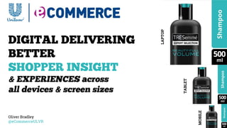
- Tall thin bottles and tubes in Personal Care categories should be medium zoomed unless the pack shape is very distinctive and recognisable to the shopper. We learned to ditch the brand led typefaces in favour of a clean personality free typeface OPEN SANS. We standardised putting size bottom right – knowing shoppers look in a Z shaped pattern from eye tracking.
- Tall thin bottles and tubes in Personal Care categories should be medium zoomed unless the pack shape is very distinctive and recognisable to the shopper. We learned to ditch the brand led typefaces in favour of a clean personality free typeface OPEN SANS. We standardised putting size bottom right – knowing shoppers look in a Z shaped pattern from eye tracking.
- And where it is self –evident what the format is – we just have the size lozenge.
- The main thing is to ensure we have visual consistency everywhere. Landscape packs would get a horizontal strip if required. Size again bottom right.
- So where are we now? We have hero images live in 15 countries across the globe in over 20 retailers and this updates weekly with new retailers going live.
- In honesty – we no longer see this as a UNILEVER THING….
- This is a digitalfirst INDUSTRY SHIFT.
- And the question I want to leave you with is “Will you be a part of it?” Because the shift to mobilefirst has already happened – lets not get left behind.