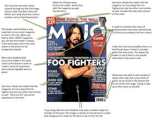
1. Sub-story. Shows the reader that the magazine isn’t just about the Foo Fighters but also has other main articles as well. Includes the only other picture on the cover. Advert for CD give-away. Entices the reader. Shows that with this magazine you get that bit extra. This issue has one main colour scheme through out the front page. Colours: Red, Pale Blue, Grey and White. Just using these four colours creates a sense of professionalism. The header and branding is very important on any music magazine as seen in this one. When you look at other ‘MOJO’ magazines you see that the header is always in the same place and in the same colour so the brand can be recognised instantly. Main story headline bold across this middle in the same colour as the brand in order to create a sense of importance and instantly highlight what its about. Sub-story. Shows the reader that the magazine isn’t just about the Foo Fighters but also has other main articles as well. There are 6/7 sub-stories advertised on the front. To go along side the main headline they have a related image of a member of the band. The image is a photo on one person on a plain blue background in order for the focus to be on him not the surroundings. In order to maintain that sense of professionalism they have selected only 2/3 fonts to accompany the four colours. Under the main story headline there is a brief break down of what is included within the main story. This allows the reader to see if there is any specific information they want to see. Obviously to be able to sell a product it needs a bar code and a price, both of which can be found in the bottom left corner of the front page. Trying to take up as little space as possible.
2. Page header/article theme. This logo is used over several pages as it is all about one theme. Main story headline in bold. Creates a sense of importance and instantly highlight what its about. Brief intro to what the article is about as some readers will only read the first paragraph to see whether they are interested or not. Main article. Not very long as its an interview. Allows for more space for image. Text is positioned well along side image. Short description of what the image is so the reader can know more. One stand out quote that sums up the article or represents it in the best way so it looks as if the picture is saying something. Main image of the band. Positioned and compiled so that the background fits the whole page not only the people.
3. There are two contents pages the first of which includes all the main stories that are mostly advertised on the front cover. Use of only two colours keeps it simple and effective. Red for page numbers and black for the content. Establishes main cover story to allow reader easy access to it. Quote to go with the image. Only other font used in the contents. Uses same colour scheme. Allows reader to understand why the picture is used. Main image takes up most of the page. Its a photo of a music icon that is featured in the magazine. Matches the quote. The text is aligned and fits around the image to allow for more text and a better flow on the page. Main header and logo incorporated at the top of the page. As well as the issue date and issue number.
4. The header and branding is very important on any music magazine, but because this is a special issue of UNCUT it is titled accordingly specifying an artist. The actual magazine brand can be found at the bottom. Because the magazine is a special there are only sub=stories which are found along the sides of the front page with the text fitting round the image. In order to maintain that sense of professionalism they have selected only 2/3 fonts to accompany the two font colours. To go along side the main headline they have a related image of a member of the band. The image is a photo of a rock star in a classic rock n roll pose. This immediately shows the reader that this magazine is aimed at rock fans. This issue has one main colour scheme through out the front page. Colours: Red, Blue and White. Just using these three colours creates a sense of professionalism. These colours were chosen as the music artist is American so it represents the American flag. Obviously to be able to sell a product it needs a bar code and a price, both of which can be found in the bottom left corner of the front page. Trying to take up as little space as possible.
5. In comparison to the other contents pages this one is very busy with lost going on. I would say that it has a bit too much going on. Use of only 3 colours keeps it simple and effective. Red for page numbers and black for the content, with gold headers Not really sure how effective the pictures are. They a slightly random and not very specific. It also doesn’t give details of what they are about. Added a few facts in a box in the centre of the page. Looks quite dull not very aesthetically pleasing. The use of double layered text looks quite effective especially with the colours they use. What is also quite attractive is the fact it doesn’t all line up perfectly. That could relate to rock n roll not being perfect. As they have used 3 columns it shows that they have gone into a lot more detail about what’s on each page.
6. Double page spread about a band incorporating one full page photo and a full page article. Image is of the band members all posing in a different way to create a sense of stylishness . The photos also include several props such as a guitar and a dog which helps gives the reader a sense of what sort of band they are. Chosen to use a font that will best represent the band. So they have gone for quite a retro black and white font. This middle section could be classed as the first paragraph as it acts as an introduction to the article so the reader can read that and then decide whether they want to read further. The main article is the shaped around the centre introduction to give a classy, neat and professional look.