
Empfohlen
Weitere ähnliche Inhalte
Was ist angesagt?
Was ist angesagt? (18)
Andere mochten auch
Andere mochten auch (17)
Ähnlich wie Digital illustration handbook
Ähnlich wie Digital illustration handbook (20)
Mehr von MrLawler
Mehr von MrLawler (20)
Kürzlich hochgeladen
Kürzlich hochgeladen (20)
Digital illustration handbook
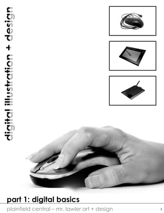
- 1. digitalillustration+design plainfield central – mr. lawler art + design part 1: digital basics 1
- 2. digitalillustration+design plainfield central – mr. lawler art + design the parts of a pen tablet and how a pen tablet works 2 Accuracy Graphic tablets are computer peripherals which allow computer users to interact with their computers more accurately and naturally than a mouse. The accuracy of moving the cursor to a precise location on the screen is improved by the user touching a stylus pen to a graphic tablet. A mouse, however, requires users to test and feel their way around the screen. With a graphic tablet the user knows where the cursor will be on the screen to a greater degree of certainty. The Pen (Stylus) The stylus pen, or digitizer pen, is operated without the use of batteries, which allows the pen a lightweight design (giving it the feel of an ordinary ink pen). A graphic tablet gives power to the pen via electromagnetic waves. Because it is more natural for people to hold a pen, as opposed to a mouse, the trigger finger syndrome (pressing a mouse button by reflex) is removed from the computing experience. A digitizer pen with an eraser end allows the user to erase text, or even activate the eraser tool in graphics applications like Photoshop or Paint. Pressure Graphic tablets come in different levels of sensitivity to pressure applied on the surface by the digitizer pen. Applied pressure on the drawing surface of the graphic tablet gives a mark or line its thickness. Pressing the digitizer pen hard against the drawing surface will result in the line or mark being very dark. Lightly touching the pen to the surface of the graphic tablet will result in a lighter mark or line. With pressure sensitivity the user experiences a more natural approach to drawing on a computer (as opposed to using a mouse). Tablet Size Tablet sizes range anywhere from 4-by-5 inches, to 10-by- 13 inches. Variety in tablet size is important to different users. Drafters and illustrators, for example, will use the larger graphic tablets for need of extra surface area for complex drawings. However, the typical computer user will select the smaller size graphic tablet in order to reduce unnecessary arm movement to navigate their operating system. A smaller surface area means less strain on the arms, wrists and hands. As for monitors, the tablet's surface area is irrelevant to monitor size, because the software that comes with the tablet maps the surface area of the tablet to the monitor's screen display area.
- 3. digitalillustration+design plainfield central – mr. lawler art + design connecting the tablet to your computer and printing image creation illustrating software output (printing) printing services online services storage device personal computer USB cord connects pen tablet to computer or laptop 3
- 4. digitalillustration+design plainfield central – mr. lawler art + design BIT DEPTH AND THE DIGITAL IMAGE 0 0 0 0 1 0 0 0 0 0 95 191 31 127 223 63 159 255 one bit per pixel produces a two tone image (black and white) eight bits per pixel produces a 256 range image (white, grays, and blacks) 255 0 0 0 255 255 0 0 0 0 255 0 255 0 255 140 63 184 0 0 255 255 153 51 255 255 255 twenty four bits per pixel produces a true RGB color image (16,777,216 colors) MEGAPIXELS, RESOLUTION & PPI (DPI) All of these numbers indicate the quality of an image and the maximum size the image can be printed before the “pixels” become unfavorable noticeable (what we call pixelation). Megapixels determine how large an image can be sized. An 8 in x 10 in 100 PPI image if resized to a 4 in x 5in will then have 200 PPI. MP (megapixeL) = one million pixels; 3.1 megapixels (2048 × 1536 = 3,145,728) PPI (DPI) pixels per inch (dots per inch) = resolution quality (number of pixels) Height x Width = image size measured in inches 4
- 5. digitalillustration+design plainfield central – mr. lawler art + design part 2: design basics 5
- 6. digitalillustration+design plainfield central – mr. lawler art + design ILLUSTRATION AS A BRANCH OF DESIGN Simple design principles and techniques which will enhance your illustration skills. Using line can help lead the viewers eyes through the composition by creating perspective. Line helps establish boundaries, creates pattern, shows rhythm, points directions, implies movement and defines shape. Shape is defined by lines and can be geometric or organic. Empty shapes allow the viewer to imagine; complete shapes create variety and interest through pattern. Texture and pattern are each comprised of the repetition of shapes and lines. Texture and pattern can both be used to create detail which the viewer sees as visual interest. look for basic elements apply them in principle 6
- 7. digitalillustration+design plainfield central – mr. lawler art + design ILLUSTRATION AS A BRANCH OF DESIGN Simple design principles and techniques which will enhance your phototaking skills. Value is the measure of lightness and darkness established by exposure. When bright highlights are paired with deep shadows, you can achieve quality, contrast image. Color, saturation and temperature are properties of light. Saturation refers to the intensity of a color where temperature refers to mood, feel and coolness/warmness. Harmony is established by the relationships of color in an image. Certain colors go better with other colors – we call these color schemes. Complimentary colors are those that are opposite one another. Analogous colors are grouped in a row on the color wheel. Triadic and Tetradic schemes are based on geometric pairings. look for basic elements apply them in principle 7
- 8. digitalillustration+design plainfield central – mr. lawler art + design THE USE OF VISUAL SPACE “Space is not just something to be filled in; it is itself a valuable tool for achieving engaging, clear visual messages. White space can help direct the viewer’s eye to positive elements. White space is necessary for creating designs with balance, harmony and clear hierarchy” – Garr Reynolds, Zen Design: Simple Design Principles and Techniques negative space: referred to as the empty area or sometimes called white space positive space: objects and forms which occupy space; sometimes called black space 1 43 2 alignment: refers to where objects are placed on the page. good compositions try to balance white and black space, but also use position to create focus and. emphasis. 1. center alignment – viewer look directly in the middle of the page 2. cropped – the image is cropped and draws the viewer into the corner 3. left alignment – draws the viewer to the left side of the page 4. right alignment – draws the viewer to the right side of the page balance: balance is created through the use of symmetry. there are three types of symmetry: bilateral, radial and asymmetrical. the illustration to the left demonstrates bilateral symmetry as the object can be divided in the middle with mirror images on both sides of the axis (in nature this is more loose than in mathematics). 8
- 9. digitalillustration+design plainfield central – mr. lawler art + design RULES OF COMPOSITION – USING LINE, SHAPE + BALANCE Framing There are two ways in which you can use framing to create a strong image. The first is frame-within-a-frame: that is, having the viewer look through a frame such as a doorway or window. This draws the viewer inside the image. The second is filling-the-frame: this is similar to cropping and refers to a full bleed image which has a lot if impact. These images are achieved by using macro photography. Leading Lines + Proportion Like framing, you can draw the viewer into your picture through the use of depth. When you use lines to create direction, movement, or perspective, the viewer follows those lines into the image. You can also create depth by establishing a clear foreground, midground and background. The objects in the foreground should overlap the other objects and proportion should be established by scaling sizes of objects. Rule of Thirds An image should be imagined as being divided into a 3x3 grid. Important compositional elements should be placed along the lines or at the intersections. Aligning a subject with these points creates more tension, energy and interest in the composition by placing the focus off center (avoiding bull’s-eyeing the subject). 9
- 10. digitalillustration+design plainfield central – mr. lawler art + design RULES OF COMPOSITION – USING EMOTION Tension Images with tension are engaging. There are many ways of creating tension in an image, but some of the best ways include: 1. visual tension: lonely, off center objects 2. psychological tension: image depicting tense moments or allow the viewer to anticipate action 3. chaos vs. order: images which show order through pattern and then a disturbance of that order 4. out of place: objects or forms that are out of place in comparison to the context of the image S-Curves The elusive s-curve - an art term for a sinuous body position. S-curves were identified by the Ancient Greek sculptors as being the best way to position a figure. Why? Because the curve appears sensual, sensuous, and seductive. S-curves can also be found in nature, evoking the same titillating or romantic feelings. Using the s-curve plays on a person’s emotional drives. 10
- 11. digitalillustration+design plainfield central – mr. lawler art + design SCANNING + IMAGE STORAGE TIPS ON SCANNING Color Depth: when scanning try to use true color whenever possible. The best color depth will be measured in the millions (typically 16 million). Scanner programs also offer a 256 Color mode. The advantage of 256 Color images is that the files are significantly smaller than true color image files. Resolution: A computer monitor might have a resolution of 72 dpi, while a laser printer might be 600 dpi and an ink jet printer can be anywhere from 300 – 720 dpi and even higher. For printing I recommend 200 or 300 dpi as a minimum. However these files can become very large. STORAGE DEVICES When you connect your hard drive to your computer and turn it on, you do not need to install any software or drivers to make the drive available for use. 1. The drive will appear as a drive letter in (My) Computer (ie: Drive E:, F:, or some other letter) within approximately 30 seconds of connecting and turning on the drive. 2. Often the AutoPlay window will appear within 30 seconds. 3. Then you can simply drag- and-drop data, or copy-and- paste data, into the drive to use it manually. external hard drive connects via a USB cable 11
- 12. digitalillustration+design plainfield central – mr. lawler art + design part 3: photoshop basics 12
- 13. digitalillustration+design plainfield central – mr. lawler art + design ADOBE PHOTOSHOP WORK SPACE photoshop tool bar photoshop layer menu photoshop menu and status bar 13
- 14. digitalillustration+design plainfield central – mr. lawler art + design 3D GRAPHICS IN PHOTOSHOP Step 1 • NEW DOCUMENT 10” x 10” (200 PPI – resolution) • Use the GRADIENT TOOL • then change the GRADIENT MODE DIFFERENCE • Draw dozens of gradients going different ways Step 2 • DUPLICATE the LAYER • Use the ELLIPTICAL MARQUEE and draw a perfect circle • Go to FILTER DISTORT SPHEREIZE 100% • Go to FILTER SPHEREIZE (preloaded) and repeat to taste • CTRL SHIFT I or SELECT INVERSE • Hit DELETE & DESLECT Step 3 • DUPLICATE LAYER • On the middle layer (should be the ball on a transparent background) increase the LEVELS to make it very dark • Then BLUR GAUSSIAN BLUR 30 or to taste • Use the MOVE TOOL to nudge this layer downward creating a shadow effect around the top layer Step 4 • Go to the BACKGROUND LAYER and increase the LEVELS • Experiment with BLUR MOTION BLUR Step 5 • Make a NEW BLANK LAYER and drag this to the top • Draw a white circle on the top right corner of your ball • Make sure you have nothing selected and then FILTER DISTORT SPHEREIZE • BLUR and TRANSFORM to taste 14
- 15. digitalillustration+design plainfield central – mr. lawler art + design USING THE BRUSH TOOL (FOR ERASERS, BURN AND DODGE) select the BRUSH TOOL and the BRUSH MENU appears at the top in the STATUS BAR selecting the brush tool brings up a menu of its own – you can select how big the brush is and how soft the brush is, as well the brush type and shape the play button brings up different brush families tools like BURN, DODGE, ERASER and others use the same BRUSH settings when using these tools I recommend starting with: 1. SIZE: use a large brush 100 px – 400 px 2. TYPE: try a soft brush – if you hover over the brush types it will tell you the name of the brush 3. HARDNESS: use a soft opacity 10% or so 15
- 16. digitalillustration+design plainfield central – mr. lawler art + design CREATING A BRUSH IN PHOTOSHOP 16 Step 1 • NEW document 200 PX (width and height do not matter) • Make a NEW blank LAYER from the LAYER MENU • On this LAYER draw something in BLACK only Step 2 • If you want to use an image or a scan, import this to the blank layer • Then use EDIT IMAGE ADJUSTMENTS THRESHOLD to turn this image solid black • -OR- you can use FILTER SKETCH STAMP • I recommend using a SOFT FUZZY BRUSH and making a scattered pattern Step 3 • Then using the RECTANGULAR MARQUEE tool select the entire image • Go to EDIT DEFINE BRUSH PRESET • Name your brush • Now you will see your CUSTOM BRUSH in the PRESETS when changing your BRUSH SELECTION
- 17. digitalillustration+design plainfield central – mr. lawler art + design BASIC DIGITAL PAINTING IN PHOTOSHOP 17 Step 1 • NEW document 10 x 10 (200 PX) • Scan in a sketch or create a rough sketch in Photoshop • Make sure to think about negative space and composition (see rules) • I started with a very basic drawing using a low opacity brush (50%) Step 2 • Think about the light source – where is the light coming from? • I used the PAINT BUCKET and turned by BACKGROUND a light blue because my painting is going to have a cool color scheme Step 3 • Make a NEW BLANK LAYER • Start by painting just your mid- tones – I used my custom brush at a low opacity • At this stage it is not about accuracy and more about getting color on the page Step 4 • Start adding contrast by putting in the highlights and the shadows • Do this in selective areas and do not worry about blending • To do this, simply EYEDROPPER a midtone and then using the COLOR PICKER change the color to a SHADE or TINE Step 5 • Use the EYEDROPPER and COLORPICKER to start pick BLENDING TONES • USE ALT as you paint to quickly color pick and change the opacity to 30% • I tend to work in circular motions as I blend
- 18. digitalillustration+design plainfield central – mr. lawler art + design BASIC DIGITAL PAINTING IN PHOTOSHOP (CONT’D) 18 Step 6 • I also tend to work in the background first and then build on top • I find that if you vary your brush size, opacity and continuously choose colors you can move very quickly • Remember the toggle keys { } allow you to change BRUSH SIZE quickly Step 7 • After blending and adding highlights and shadows, begin adding details • I also use this time to paint in negative spaces – areas of emptiness and background Step 8 • Begin to add midground and foreground shapes • Again focus on blotches of color and not precision • You will add details later Step 9 • NEW BLANK LAYER • Use this layer to add the foreground details – this will help create emphasis Step 10 • SMUDGE PAINTING – this is a technique where you use the SMUDGE tool to blend and smear areas • SMUDGE painting works great for reflections or shiny surfaces Step 11 • Use the burn and doge tools to create areas of shadow • Use other editing tools such as levels or curves to increase the contrast of the work my final product