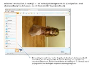
1. I used this site ipiccy.com to edit Maya as I am planning on cutting her out and placing her on a more
alternative background where you can tell it is in an older house (apartment).
These editing tools allow me to alter the picture before I start playing around with
some effects, the first thing I need to do is rotate the image and adjust the hue
saturation and exposure. However the first item of “Fix Image” is an automatic way of
playing around with making the brightness and sharpening skills.
2. This icon allows the skills
that some Photoshop
software will not allow, for
example the item of
Vignette that allows a black
fainted frame so it creates
the look that I designed on
my poster of the darkness
seeping into the page, the
result of all these edits
should look darker and
more disturbed.
To make it look darker and
more disturbed, I can
change the size and the
strength to make it
stronger:
3. In order to make the dark vignette around the fame darker and more like my poster design
there are different options that will allow this, for example to make this golden and
authentic look I used “Henry” to get the right look I need, if it comes out too strong, then I
can easily use “fade” to lower the glow down.
The erase button allows the
golden effect to be
eliminated from the girl so
it’s just the back ground
that’s effected, however I
can also keep the darkness.
Ending effect should look
like this:
4. Once I’ve altered all of the effects, the next icon allows me to do more Photo-shopping skills such
as: Air brushing and shine remover. These effects just make it more professional and sophisticated
so it will suit my poster. Once I’ve done these changes and happy with the simple editting stage, I
can save it:
The next stage is Photoshop to edit everything else…
5. To create the old feeling of the room that
Maya will be in, I found the image on Google
as the setting didn’t work out the best. After I
found the image I changed the opacity to
make it blend into background:
To make the effect of it blending in, I’ve had to turn the
opacity down to 61%. This percentage is perfect because
it’ll still show the image when I add all the other layers
and effects, and it won’t be to over powered. It’ll have the
perfect balance.
6. Once I’ve edited the room I can move
on to the image of Maya- the first time
I’ve edited her was a try out to get the
idea. Unfortunately I couldn’t use the
image I saved, but I have managed to
alter and change the room picture to
have the exact same effect of the
previous image of Maya.
In order to cut Maya out of the
picture I have to use the tools on
the left that will allow me to cut
around the image so I just have
her instead of the background.
After that I can use the cutting
tool closer to her dress and tidy
up the left over's that I don’t
need.
Before After As you can see, I am starting to build on the layers of the
different stages that I have to go through in order to
accomplish all of the editing. Also I have changed the
brightness and contrast down to make Maya look more
pale and ghost like before:
7. Now I have Maya cut out and the
other backgrounds (edited the same
way I tried out with the original
picture) I can now merge them all
together to make my poster.
The light is an original image which I
have cut out from the picture so I can
add it to the ceiling to create an eerie
atmosphere.
Maya still looks stuck on and just placed
there, so now I need to make her blend
in, but first I need to make the poster
darker to create an eerie and authentic
atmosphere by changing the brightness
panel that I have done before:
8. Now I have altered the brightness and got the
authentic look that I was looking for… I now
need to make Maya opaque in order to look
more ghost like and less placed in the
picture. I need to create the feeling that she is
actually there looking at the audience.
You can see the different layers I have used in order
to make my image more darker and the way Maya is
on her own layer. If Maya wasn’t in her own layer
then the whole poster would turn opaque and that
would ruin everything.
9. Since all of the editing is sorted out and I am satisfied with the poster, I can now move on to the text of
the title and many more.
The font I used was on an older version of Photoshop, so
I’ve had to change it, but in the mean time I preferred this
font because it seems more realistic and almost like
someone out of the film has written it.
Now that I have figured out the name of the film and the
idea of the font I want to use, I can now add the side lines
and the production credits that you usually see on posters:
Real Poster My Poster
10. Everything is starting to take shape nicely, originally I was going
to go with a review on my poster at the top, but as someone said
for feedback, that it didn’t look right and you don’t normally see
the reviews on the layout of my poster. So instead I have
decided to go with the casting name at the three main people
that are in my film in the font of:
The hourglass and the Tribeca Film Festival I
got from the internet, I’ve used the hourglass
because of my production line companies
name is Hourglass studios which is
mentioned in the procudtion credits.
I’ve added the film festival on the poster as it’s showing that
my film hasn’t started of as a global film, but instead an
independent film that will be shown on film festivals and
many more. That way the more people will hear about
it, the more they would want to see it, instead of it being
plastered every where you go like most horror film
posters… for example SAW 6 which was on nearly every
stagecoach bus instead of a rare few.
11. Finished Product:
One all of the additions have been added and font being changed around, my Photoshop desktop looks like
this:
Full of different layers, different tools that I have used and many more…
As you can see I have added an age classification
so it is clear to my target audience on who can
see my film and what they may be expecting to
be in my film.
The final changes that I have done to my work is
changed the Body Sitter to be wide spread across the
page with a type writer style to complete the authentic
and old styled look.
In order to save, I had to go to “file” at the top and save it as a JPEG so I can post it on my blogger site.