Gender gap article
•Als DOC, PDF herunterladen•
1 gefällt mir•896 views

The gender pay gap statistic, which shows that women earn 77 cents for every dollar men earn, is often misunderstood and misused by both critics and supporters of gender equality. While the statistic does not account for all factors like occupation and experience, it still provides useful information about gender inequality in the workplace. The author analyzes additional data showing the pay gap varies in different situations but never disappears, suggesting discrimination remains an issue. More nuanced analysis is needed to fully understand the causes of the gender pay gap.

Empfohlen
Weitere ähnliche Inhalte
Was ist angesagt?
Was ist angesagt? (20)
Ähnlich wie Gender gap article
Mehr von Lisa Schmidt
Mehr von Lisa Schmidt (20)
Kürzlich hochgeladen
Kürzlich hochgeladen (20)
Gender gap article
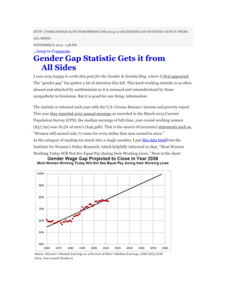
- 1. HTTP://FAMILYINEQUALITY.WORDPRESS.COM/2013/11/08/GENDER-GAP-STATISTIC-GETS-IT-FROM- ALL-SIDES/ NOVEMBER 8, 2013 · 1:38 PM ↓ Jump to Comments Gender Gap Statistic Gets it from All Sides I was very happy to write this post for the Gender & Society blog, where it first appeared. The “gender gap” has gotten a lot of attention this fall. This hard-working statistic is as often abused and attacked by antifeminists as it is misused and misunderstood by those sympathetic to feminism. But it is good for one thing: information. The statistic is released each year with the U.S. Census Bureau’s income and poverty report. This year they reported 2012 annual earnings as recorded in the March 2013 Current Population Survey (CPS): the median earnings of full-time, year-round working women ($37,791) was 76.5% of men’s ($49,398). That is the source of (accurate) statements such as, “Women still earned only 77 cents for every dollar that men earned in 2012.” In the category of reading too much into a single number, I put this data brieffrom the Institute for Women’s Policy Research, which helpfully informed us that, “Most Women Working Today Will Not See Equal Pay during their Working Lives.” Here is the chart:
- 2. Of course, real life projections are not usually made by simply extending a trend with a straight line. The future is not that easy to foresee. If you did want to fit a line to that trend, however, the bad news is that it’s not a straight line that fits, but a third-order polynomial (which improves the measure of fit from .90 to .98). And projected this way, the trend will never reach equality: Fortunately, curvy lines are often no better at predicting the future than straight ones. Flog that stat Some defenders of equal pay for women misstate the statistic, as President Bill Clinton did when he said: “How would you like to show up for work every day, but only get to take home three out of every four paychecks? … if you get paid 75 percent for the same kind of work, it’s as if you were only picking up three paychecks, instead of four, in four pay periods. The average woman has to work, therefore, an extra 17 weeks a year to earn what a similarly-qualified man in the same kind of job makes.” The mistake here is that he said “same kind of work” and “similarly-qualified man.” That led to the screaming headline on the American Enterprise Institute website, “Still Hyping the Phony Pay Gap.” But he also went on to say:
- 3. “Yes, some of this can be explained — by differences in education, experience and occupation. But even after you make all those adjustments, there is still a very significant gap.” So he belatedly acknowledged the complexities, and that second statement is true. Oh, and that exchange occurred in 2000. How far we’ve come. When Clinton, ever a repository for handy statistics, essentially repeated his statement on September 29 of this year, he played right into the screaming headlines of today’s anti- feminists, including Hanna Rosin, who declared, “I feel the need to set the record straight” in a piece she titled, “The Gender Gap Lie.” Kay Hymowitz also has written extensively to debunk the gender gap, arguing that it mostly results from women’s choices – the educations and occupations they choose, the hours they choose, the “mommy track” they prefer. (Naturally, sociologists are very interested in that construction of “choice.”) There is no single number that can tell us the true state of gender inequality. But if you had to pick one, this one is pretty good. That’s because it combines factors that affect employment levels, work experience, occupational distributions, and pay discrimination – to give a sense of the place of the typical worker. As long as that number is not zero, there is a gender inequality problem to discuss, whether it results from socialization, family demands, educational sorting and tracking, hiring and promotion discrimination, or pay discrimination – and the details depend on further scrutiny. Take your pick We could use a different gender gap. The next figure shows some gender gaps for earnings among full-time, full-year workers in the 2011 American Community Survey (ACS). I’ve cut the sample to compare men and women by education, long-hours status (50+ hours), parenthood (no co-residential children) and marital status (never married). As you can see, the gaps range from a low of 65% for women with an MA degree and no children all the way up to 93% for never-married professional degree or PhD holders with no kids. Generally,
- 4. the 50-hour limit doesn’t help, but marriage and children make a big difference. Another way of restricting the data to consider real-world gaps is shown in the next figure. Here, from the same data, I’ve taken full-time, full-year workers who have a bachelor’s degree and no further education, and sorted them by college major. So these gaps account for educational specialization, and reflect – in addition to any hiring and pay discrimination – occupational sorting within those categories, as well as other educational processes such as university prestige and school performance. The gaps range from 69% for transportation science majors all the way up to 94% for architecture majors.
- 5. Finally, we might look more closely at occupations. In this figure, again from the 2011 ACS, I have sorted 484 detailed occupational categories according to the median earnings wage gap within them, for full-time, year-round workers. The y-axis shows the cumulative percentage of women who work at or below each level as you move from less equal occupations on the left to more equal ones on the right. I’ve labeled the 25th, 50th and 75th percentile, showing,
- 6. for example, that half of women work in occupations with a wage gap of 83% or worse. Although this figure shows inequality within occupations, it is occupational segregation itself, which extends the gender division of labor into the labor market, that lies behind much of the gender gap – representing the culmination of historical and contemporary processes of allocating people to tasks. In summary, the wage gap clearly is smaller in some situations than others – smaller for workers without children, especially if they’re never married, smaller for some college majors and in some occupations. Each of these comparisons tells us something different. (More complete statistical analysesthat control for several factors at once create counterfactuals that don’t actually exist, but that do help us isolate important dynamics behind the gender gap.) We mustn’t read into these numbers more than they can tell us. None of the numbers I’ve shown can discern occupational choice from employer discrimination, for example; or the cumulative effects of time out of the labor force versus discrimination in previous jobs. But the gender gap numbers are measures of inequality. And as long as we are accurate and responsible in our use of these numbers, they are useful sources of information. Share this:
- 7. for example, that half of women work in occupations with a wage gap of 83% or worse. Although this figure shows inequality within occupations, it is occupational segregation itself, which extends the gender division of labor into the labor market, that lies behind much of the gender gap – representing the culmination of historical and contemporary processes of allocating people to tasks. In summary, the wage gap clearly is smaller in some situations than others – smaller for workers without children, especially if they’re never married, smaller for some college majors and in some occupations. Each of these comparisons tells us something different. (More complete statistical analysesthat control for several factors at once create counterfactuals that don’t actually exist, but that do help us isolate important dynamics behind the gender gap.) We mustn’t read into these numbers more than they can tell us. None of the numbers I’ve shown can discern occupational choice from employer discrimination, for example; or the cumulative effects of time out of the labor force versus discrimination in previous jobs. But the gender gap numbers are measures of inequality. And as long as we are accurate and responsible in our use of these numbers, they are useful sources of information. Share this: