Apidays New York 2024 - Passkeys: Developing APIs to enable passwordless auth...
Plan
1. The magazine has really morphed and changed as I've worked on it and s now totally
unrecognisable from the first draft I attempted. This plan outlines some of the major
changes
FRONT COVER
Splat!’s front cover follows the conventions of other magazines of the pop genre. The
masthead is not in the centre of the page but is a central focus above the main image.
This is slightly unconventional as most magazines have the masthead in the top left hand
of the page so its easier to locate on a newsagent’s stand. The main sells are on either
side of the photograph without masking it, which is a typical position for music
magazines of this kind.I chose a house style of grey, turquoise and pink as these colours
(apart from grey) are two of three in a complimentary triad of colours. Apart from the
large main article and pull quote I kept the writing on the page to a minimum, making
the main image the focus of the cover. The model’s pose helps to add to the immediate
pull of the magazine which is aimed at a young, female audience much like the model.
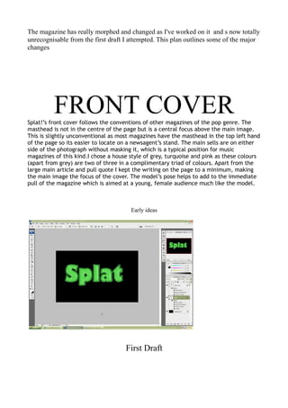
Early ideas
First Draft
4. CONTENTS PAGE
I tried to continue the house style through into the contents page, using the same
grey for the background and echoing the pink and turquoise in the text and
images. These pages focus mostly on the contents of the magazine, with only
three small images to the side of the page and the central focus being on the title
CONTENTS. The page is slightly unconventional as there are three photos, with
small captions and isn’t dominated by a main image, instead the text is allowed
to stand out more and be the main focus. I echoed the same lipstick mark brush
on the contents page as I used to surround the flash on the front cover to help
create continuity.
7. DOUBLE PAGE SPREAD
The double page spread(DPS) is laid out in a similar style to many other music magazines with the main
focus being on the photography used in the article. Instead of the same black and white images I’d used
on the front cover, I used an image that was in colour and bleached some of the colour from it. Because I
really liked the composition and appeal of that particular image and the difficulty that following this
convention would cause around that image, I decided to use very little text on that page rather than
follow the convention of having the article’s title above the image. The DPS uses a lot less colour than the
contents and the front page, but is in keeping with the house style as the colours used were the original
pink and turquoise used throughout the magazine. I did this so that the colour left in the main image
would be intensified and more eye-catching. The article is in black text and contains several pull quotes
to attract reader’s attention. I used a small copy of the masthead in the top left hand corner of the page
as seen in many music magazines. I found that my article went over to a third page, as many article do
when there is a wholly image-based page in the DPS and used a black and white image similar to the one
used on my front page.