A detailed description of color theory and color scheme to make a good understanding about the element of design i.e., color.
Color wheel and pictures allow you to expand your knowledge about colors and help you to make your designs pleasing and interesting.
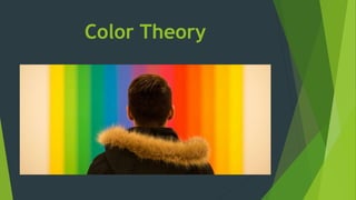
2. Color Theory
Color theory is the collection of rules and guidelines which designers use to
communicate with users through appealing color schemes in visual interfaces.
Color theory is both the science and art of using color.
Color theory also involves the messages colors communicate; and the methods
used to replicate color.
In color theory, colors are organized on a color wheel and grouped into 3
categories: primary colors, secondary colors and tertiary colors.
3. Understanding color
Color is perception.
Our eyes see something (the sky, for example), and data sent from our eyes to
our brains tells us it’s a certain color (blue). Objects reflect light in different
combinations of wavelengths. Our brains pick up on those wavelength
combinations and translate them into the phenomenon we call color.
People decide whether or not they like a product in 90
seconds or less. 90% of that decision is based solely on
color. So, a very important part of your branding
must focus on color.
4. Color Systems
RGB: the additive color mixing model
Mixing light—or the additive color
mixing model—allows you to create
colors by mixing red, green and blue
light sources of various intensities.
The more light you add, the brighter
the color mix becomes. If you mix all
three colors of light, you get pure,
white light.
TVs, screens and projectors use red,
green and blue (RGB) as their
primary colors, and then mix them
together to create other colors.
5. Why should you care?
Let’s say you have a very distinct brand with a
bright yellow logo. If you post the logo on
Facebook, Twitter or your website and don’t use
the correct color process, your logo will appear
muddy instead of that bright yellow. That’s why,
when working with files for any screen, use RGB,
not CMYK.
6. CMYK: the subtractive color mixing model
Any color you see on a physical
surface (paper, signage, packaging,
etc.) uses the subtractive color
mixing model. Most people are
more familiar with this color model
because it’s what we learned in
kindergarten when mixing finger
paints. In this case, “subtractive”
simply refers to the fact that you
subtract the light from the paper
by adding more color.
7. Conti…
Traditionally, the primary colors used in subtractive process were red, yellow
and blue, as these were the colors painters mixed to get all other hues. As
color printing emerged, they were subsequently replaced with cyan,
magenta, yellow and key/black (CMYK), as this color combo enables printers
to produce a wider variety of colors on paper.
8. Why should you care?
You’ve decided to print a full-color brochure. If you’re investing all that
money into your marketing (printing ain’t cheap!), you expect your printer is
going to get the colors right.
Since printing uses the subtractive color mixing method, getting accurate
color reproduction can only be achieved by using CMYK. Using RGB will not
only result in inaccurate color, but a big bill from your printer when you’re
forced to ask them to reprint your entire run.
9. The color wheel
A color wheel or color circle is an
abstract illustrative organization of
color hues around a circle, which
shows the relationships between
primary colors, secondary colors,
tertiary colors etc.
The first color wheel was designed by
Sir Isaac Newton in 1666 .
The color wheel consists of
three primary colors (red, yellow,
blue), three secondary colors (colors
created when primary colors are
mixed: green, orange, purple) and
six tertiary colors (colors made from
primary and secondary colors, such
as blue-green or red-violet).
10. Primary Colors
In traditional color theory
(used in paint and
pigments), primary colors
are the 3 pigment colors
that cannot be mixed or
formed by any
combination of other
colors. All other colors are
derived from these 3
hues.
11. Secondary Colors:
Green, orange and
purple
These are the colors
formed by mixing the
primary colors.
12. Tertiary Colors
These are the colors
formed by mixing a
primary and a secondary
color. That's why the hue
is a two word name, such
as blue-green, red-violet,
and yellow-orange.
13. Warm colors and Cool colors
Draw a line through the center of the wheel, and you’ll
separate the warm colors (reds, oranges, yellows)
from cool colors (blues, greens, purples).
14. Warm colors
Warm colors are
generally
associated with
energy, brightness,
and action
20. Shade
a hue to which black
has been added
For example,
red + black = burgundy
21. Tint
a hue to which white
has been added
For example,
red + white = pink
22. Tone
a color to which black
and white (or grey)
have been added
more subtle and less
intense
23. Color schemes
Monochromatic Color Scheme
a color palette in
which a single color
tint and shades are
used
is built entirely around
a single color
24.
25.
26. Analogous colors
Colors sit next to one
another on the color
wheel
For example- red,
orange and yellow
Pleasing to the eye
27.
28. Complementary colors
Opposites on the color
wheel
For example - red and
green
offers sharp contrast
and clear
differentiation
between images