
Empfohlen
Weitere ähnliche Inhalte
Ähnlich wie Codes and conventions - magazine.pptx
Ähnlich wie Codes and conventions - magazine.pptx (20)
Mehr von EveRyan4
Mehr von EveRyan4 (9)
Kürzlich hochgeladen
Kürzlich hochgeladen (20)
Codes and conventions - magazine.pptx
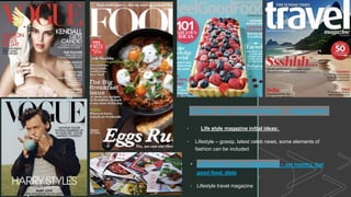
- 1. z Codes and conventions - magazine • Life style magazine initial ideas: • Lifestyle – gossip, latest celeb news, some elements of fashion can be included • Lifestyle food magazine – eat healthy, feel good food, diets • Lifestyle travel magazine
- 2. z Codes and conventions analysis of magazines: • Setting • Mise en scene • Editing • Lighting • Typography • Colour scheme • visual composition • Text • Graphics • Pull quotes • Iconography • Cinematography • Sell quotes, ratings • Masthead • Title • Tag line • Strap lines • Selling line/slogan • Cover lines • Central image • Cover model/celeb/image • Header/ footer • Edition/edition line • Article • Double spread page/ featured sections • Price • Barcode • Content page
- 3. z Examples/inspiration from other magazines Healthy food Feel good food Snack attack Vegan food Sugar free / gluten free / low calories
- 4. z
- 5. z Cover image, general analysis - there is a clear contrast across the cover as a whole between the royal blue background and the bright orange font, matching the main dish. This is to catch the buyers attention from the onset. Furthermore there is a key attention to detail played in this cover emphasised by the matching bright white font of the main title, with the sauce standing out in the dish. Anchoring photo/Main Cover image - the subject of this anchoring photo on the cover page is the bowl of chilli. This image is a very though-out tactic because it creates temptation in the customers, attracting them to the sole sight of the delicious food. Through the close-up shot of the food, audiences are revealed each ingredient distinctly, for example the deep red sauce and meatballs, contrasted with the vibrant green parsley and again with the bright white sour cream. The less busy background of the main image/anchoring photo prevents any distraction from the main dish; clearly aiming to target food lovers (good/healthy dishes). Barcode/price - The barcode is located at the bottom right of the page, it is the last thing the customers will look at (as a result of the Z-rule), this is to make sure the audiences view is not ruined (as it would be if the barcode was placed anywhere else) and it does not take away attention from the main selling points. Furthermore, the use of the puff/splash next to the barcode further takes the attention way from the almost unpleasant feature; instead it draws the focus to the main aim of the magazine, and towards what the target audience want - "cook smart". Taglines and slogans are similar, but minor differences set them apart. Taglines are more permanent representations of the brand, while slogans can be changed frequently and are often particular to specific campaigns. The 'Get creative with spice' shows the edition and content of this magazine (the slogan) and the 'Biggest selling food magazine' is the tagline as it is a more permanent element/achievement and selling point of the brand. Plug - A strong outline, such as the one used stating that 'gf recipes always work', are often used to plug a competition or another incentive to purchase the magazine.
- 6. z z Colour scheme in magazines - as the cover is the main selling point of magazines, it's important to use a colour which compliments the core feature image. By complimenting the photograph with the header and text devices, the photograph appears more vibrant and striking against the background color's The colours used in the title are often similar to the main or central image, this can also been noticed in featured and lead articles (headings and subheadings).
- 7. z Cover lines - Other important stories are floated along the sides of the cover. Bold and italics will emphasise the text. Short and catchy buzzwords are used to tease the reader into buying the magazine In publishing, the masthead refers to the title of the magazine. Printed in large type, it is usually positioned at the top of the page and fills the width of the cover. These factors ensure the brand is instantly recognisable The choice of colour and font weight will connect to the genre and ideology of the magazine. e.g. - 'good' is emphasised in bold to exaggerate the style of the life- style magazine. Furthermore, the colour choice of the word 'spice' reflects the content the magazine is based on. The use of the orange (in the coverline) is also eye catching – standing out from the main white font used; it is against a blue background (the opposite colour scale to orange). The use of the letter 'e' in 'creative' to dot the 'I' is interesting and unusual again further reflecting the magazines intentions (e.g. creativity within food). Tag line Header Splash/Puff - A puff is a circular eye-catching graphic used to catch buyers attention, proving very popular with designers. The editors are trying to grab the reader's attention, they hope the most important story of the day will “make a splash”. Having a yellow coloured puff contrasted with the black font is very eye-catching for the buyers and they will look at the puffs before the cover line because of the way they/it is placed. Sell line – Words that attempt to sell the product to the consumer with a promise of benefit using persuasive writing. They describe the content of the magazine e.g. '80+ recipes' Another example of sell lines Strips and banners – Often run across the bottom, in the form of a list. These strips usually include information about more minor articles and regular features inside the magazine. A banner is a larger version of this approach. - gives info about the issue and date of the magazine
- 8. z Cover Image - Magazines will splash an image of a popular band, artist, or in this case a chef (Gordon Ramsey) on the front page – Celebrity sells. Many publications note a sharp increase in revenue when the most famous faces dominate the cover. Celebrities are famous for their extreme success in various professions, whether it is music or here, food, which again helps convince buyers that this is the best magazine to for them. Cover Image - The direct gaze of the person (Gordon Ramsey) will pierce the viewer and a medium shot (shown here) will connect us to the emotional energy of the glamorous model or star. Other non-verbal codes will help support the magazine’s values and message, such as how Gordon Ramsey holds a powerful stance (showing of his fit physique in a tight black t-shirt – an example of costume), while smiling - this encodes the right meaning for the target audience as this mise-en- scene creates an image of a healthy, happy person - which is the aim of a healthy food magazine. To achieve the most appropriate representation, the mise-en-scène needs to be controlled, therefore you should expect the main image to be taken from a studio photoshoot. High key lighting (which is a common convention) is used in this magazine to keep the image looking fresh and youthful. Links to high Production value The main image will be directly related to the lead article.
- 9. z Graphics - are visual elements often used to point readers and viewers to particular information Visual Composition refers to how you arrange and place design elements on a page. The spaces between the design, the arrangement, and the ways in which the designs interact or crossover with other elements. This design idea shows the contents of the magazine, persuading audiences that they want to buy it and read more. The use of the 3 attached rectangles ,parallel to the barcode (used to pay), is also an example of graphics and design choice. Even when we have a food magazine focusing on a celebrity, food is still displayed on the front as the main point of the magazine, this is a common convention for food magazines/celebrity based food magazines. Typography – There is 3 different forms of typography shown in this food magazine cover – multiple fonts can be seen in many food magazines (a common convention). The first font stating 'Jamie' is a fancy, sophisticated font used possibly to suggest that this is also the style of Jamie Oliver as a chef and therefore in his recipes. Fonts are often stylish in order to make the magazine seem more sophisticated. We also see a second font, a similar style to bubble writing, the pale blue colour matches that of Jamie's shirt , linking the Italiaanse Herfst to the chef (linking chef to content) – another common code used. The uneven font gives the impression of something hand-made again reflecting the food, fonts in magazines are often used to create the intended impression for the brand. The 3rd font used is a simple one, reflecting the style of which recipes inside magazines are written in (a convention almost always used), reflecting the style of which the recipes are written in (simple and easy to follow – language and font wise). Lighting – naturalistic and high key when a human is featured on the cover – to create an open warm, comfortable environment/look – familiar to the audience. Whereas when food by itself is featured on the cover the saturation (colour) tends to be toned up to make it look more appealing and buyable to the audience – they want to indulge. This links to Editing - The editing process makes sure that each sentence is clear and written as well as possible. It looks at the format and structure of the press release and makes sure that the information flows. A common code and convention of a celebrity chef based magazine would see a featured article (in this case from Jamie Oliver)
- 10. z z Content (inside) codes and conventions Codes and conventions seen inside a magazine (in the content) include: Headings – headlines / sub- headings. Columns. Composition – grid structures / balance / use of white space. Page numbering and folios. Design elements – colour / graphics / typography and layout to engage with specific target audience. Featured Article - a feature is a longer piece of writing which covers an element in greater depth than a normal article or paragraph. The lead article will also be some sort of exclusive with the broadest appeal to the readership. In a food magazine it is common that this featured or lead article would likely be one from a well-known celebrity chef or expert. The featured article is similar or sometimes is the same as the main body text A generic code and convention for a magazine sticks to the single portrait page, however, it is also common that a double spread page is used in a food (or fashion magazine) – often showing the final dish and the recipe – a double spread page allows more space for these elements and therefore matches the written text (or recipe) to the images around, instead of separating them. The image will go across the two pages or be on one with the writing on the other side. Usually, the photo goes on the left but not always. The writing in a column will never be split across the stap line Magazine Articles use codes and conventions such as: Headings – headlines / sub- headings. Columns. Compositi on – grid structures / balance / use of white space (seen here) The use of font makes it simplified and easy to read but also makes a bold statement e.g. the use of bold numbers down the side of the recipe and larger typed (sometimes underlined and commonly bold ) subtitles/headings. This is a common convention for a food magazines font/typography (My own picture)
- 11. z I can apply all the Codes and Conventions I have analysed to my magazine, but I am going to specifically aim the magazine towards my target audience – 16-25 year olds in the sense of a healthy lifestyle. Side Note of ideas – young people in modern times often look for aesthetic looking food to post on social media, more vegan options have started trending, its become popular to eat health, many students will also need a helping hand in this area. Here is the image used for New York Times Magazine(2014 Food Issue – Eater) This is the August 2020 issue of a food magazine put out by the brand 'Your Teen' - encouraging teens to venture into the kitchen more I could also take a magazine in this style and format and put my own spin on it in order to target its content and ,obviously cover, towards younger people (16-25).