
Empfohlen
Weitere ähnliche Inhalte
Was ist angesagt?
Was ist angesagt? (19)
Andere mochten auch
Andere mochten auch (17)
Ähnlich wie Pp magazine
Ähnlich wie Pp magazine (20)
Pp magazine
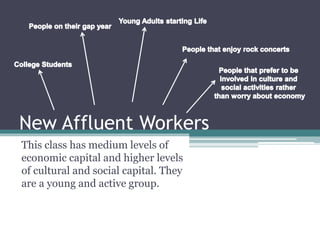
- 1. New Affluent Workers This class has medium levels of economic capital and higher levels of cultural and social capital. They are a young and active group.
- 2. How does my media product represent a particular social class… Masthead: The font used for the masthead reflects the name of the magazine as well as the message that is output from the type of music the magazine inhabits; Indie Rock, this type of music is a way of retreating from the negativities, it is used to identify those acts that retained an outsider and underground perspective. Colour Scheme: The use of yellow, red and black was used to represent a hazardous tone. The colours also contrast each other, to reflect how Indie rock is contrasting to mainstream music. Cover Lines: All of the cover lines were chosen specifically to follow the music style and appeal to the demographic. The ink splats are an original and custom shape that emphasises individuality. Feature Article Photo: The Feature Article Photo displays two young men that do not have anything remotely ‘mainstream’ about them, which is why I chose to use them for my magazine as the magazine is supposed to represent and support individuality. Plugs and Puffs: written in angled text boxes to reinforce the idea of individuality and introduce more of the colour scheme as well as highlighting the contents of the magazine for demographic appeal. Puff: Integration of text was used to display how humanity is a collective, however with different collectives within.
- 3. Running Head: Incorporating the colour scheme and giving an easily identifiable page. To be able to read the information clearly is good for customers. The running head also makes the magazine more familiar for common readers. Images: The images advertise the article as well as appeals to the demographic as it allows them view the article briefly before reading it. Contents: The contents are laid out clearly with headings and subheadings, this is efficient for my demographic as they like to be familiar with the magazine and read the contents clearly. Editor Column: The editor column is appreciated by readers because they feel as though they’re more familiar with the magazine and that they can trust the contents of it. Image: The image is similar to that on the double page spread, it gives readers a taster of the contents of the article. Images: Images for the other contents of the magazine makes the page more interesting as there is more to look at, it gives the reader an idea of what to expect and also highlights some reader’s favourite artists.
- 4. Heading: The heading of the article continues the colour scheme, it uses the colour scheme to it’s advantage in order to highlight important words, phrase or key points. Lede: The lede introduces readers to what is in the article, however it does produce and idea of having the capability to make a difference and bringing society into realisation. Article: the article has been written I three columns so that the text is not too much to bare, the text gets to the point of the story and that is what readers want. I also wrote it in a non-formal tone so that it is more familiar and friendly with readers.Candid Photo: The demographic prefer subjects of images to be caught on camera in their natural environment, they especially enjoy images of people rehearsing or playing at a concert etc. Page Numbers: The page numbers incorporate the colour scheme and the name of the magazine for familiarization, it is easy to read visually and when turning pages it is noticeable.