
Recommended
More Related Content
What's hot
What's hot (20)
Similar to Comparison of digital and print
Similar to Comparison of digital and print (20)
More from DylanClarkRich
More from DylanClarkRich (20)
Recently uploaded
Recently uploaded (20)
Comparison of digital and print
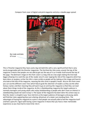
- 1. Compare front cover of digital and print magazine and also a double page spread This is Thrasher magazine they have used a big red bold title with a very significant font that is very easily recognizable with the thrasher magazines. The fact that the title curves around the top of the magazine it means that people are not able to get out the way of it as it molds itself around the top of the page. The dominant image on this front cover is a long shot at a low angle making the trick look bigger allowing it to catch the eye of the reader also it’s over lapping the title of the magazine which has been done on purpose so that the title is more visible as people will be looking at the image and have to also look at the title of the magazine, meaning the title sticks in people’s heads. Also on this front cover you can see the different cover lines which help to grab the attention of readers as they see the other famous names and then meaning they will want to go on and buy the magazine so that they can read about them things inside of the magazine. As this is Skateboarding magazine the target audience is normally teenagers and young adults who enjoy skateboarding as people who don’t have an interest in skateboarding would not want to buy it. The layout of the magazine has been done this certain way so that the skater is straight in your face mid trick as the target audience of teenagers and young adults will find that more appealing than just a boring old picture of a skater just standing there. The advantages of having this magazine as a print is that people are actually able to feel the magazine itself and feel a part of it. Again with having a print magazine it means that you have a more memorable experience as you have had to invest time into it. Bar code and date of issue
- 2. Famous name This double page spread is a bit different from the normal double page spread that you would get as there is a lot of images on this page whereas normally there is an even balance between images and writing. They have used these images as a way to grab people’s attention who are reading the magazine due to them being very colorful and a little bit strange compared to the images you would normally see in a magazine. Because the audience of people who read this magazine as well are normally teenagers and young adults this layout is more suiting to them as they would not want a page full of writing as they would just not read it but with these images on it instead it means that they will spend more time looking at the page. Amongst the cartoon images there is an actually a real picture of a skater doing a trick this has been put there as it gives the reader something that the can aspire to be as they would want a page in a magazine like this. Furthermore, on this page there is a pull quote in the top left of the page which grabs the attention of the reader as it is as if the skater in the magazine is actually saying something to them and as this is a skateboarding magazine this would mean a lot the reader. In addition, there is a famous name in the top left of the screen in bold as well so that it stands out even more.
- 3. There is not much different with this front cover of a digital magazine compared to a print magazine it uses the same codes and convention as the audience who is reading this magazine will be the same as the thrasher magazine. The main person on this magazine is in the middle of the page and the fisheye lens has been used so that he sticks out in the readers face as he is the center of attention for this magazine cover. Again following the same layout of the thrasher magazine print version it is very simple layout as the target audience for this magazine would not be interested in loads of writing they are just there for the skating part of the magazine as this However, there are other features in the digital magazine that you cannot get with a normal print magazine such as being able to zoom in on the magazine giving the reader the feeling that they can explore the magazine in more detail than they would be able to if it was a print magazine. Also on this magazine you are able to share it around with ease not like a print magazine where you would have to physically give the magazine to the person but with this being digital it allows the reader of the magazine to spread it around quicker as it would only take one email meaning that the magazine is able to reach a bigger audience as the majority of the people who like this sort of stuff are young adults or teenagers who spend a lot of time on the internet.
- 4. This is a digital double page spread of the same magazine you can see that there is no strap line on this page this is unusual as there normally is but in this case there isn’t signifying that he is that important that the reader should know it I shimas he is on the front cover of the magazine. Furthermore, the byline in this magazine is bigger than usual indicating that there is some importance behind the person who has taking the picture in this double page spread making the reader wanting to go check his other work that he has done in photography. The background in this image has also been blurred out this has been done to give the effect that there is a lot of importance with the person in the picture as there is only him you can actually see in the image. Again the picture is eye level with you reading this giving you the feeling that he is actually looking at you as your reading the magazine this would be good for the audience that is reading the magazine as they would feel like there a part of the magazine while reading the magazine. In addition, the writing is plain and simple so that the reader does not get bored while reading it as there going to be teenagers or young adults who won’t want to read loads of boring text on a page. In this digital magazine as well there are links on the pages which take you to websites so that you can buy things that have been in the magazine if this was a print magazine it would not allow you to do this a that is just not possible. This gives the digital magazine an advantage as people will want to buy things as it does not take much effort to do so. Because this is a digital magazine it means that there is not any need to pay for ink which van cost a lot for a print magazine to publish all the time.