Rebranding Carbogen Amcis & Dishman
•
0 likes•214 views

An overview of our rebranding procedure for Swiss pharmaceutical company, Carbogen Amcis, and how this work led to us rebranding their parent company Dishman, a global concern based in India.

Recommended
Recommended
More Related Content
What's hot
What's hot (19)
Similar to Rebranding Carbogen Amcis & Dishman
Similar to Rebranding Carbogen Amcis & Dishman (20)
Recently uploaded
Recently uploaded (20)
Rebranding Carbogen Amcis & Dishman
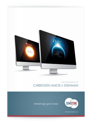
- 1. THE REBRANDING OF CARBOGEN AMCIS & DISHMAN refreshingly good ideas SemiStoneMedia.com
- 2. www.SemiStoneMedia.comwww.SemiStoneMedia.com REBRANDING CARBOGEN AMCIS & DISHMAN NEW VISUAL IDENTITY FOR CARBOGEN AMCIS Agency Brief As part of a 5-year strategy, Carbogen Amcis is looking to realign the company’s values, vision & mission and update its visual identity. The company website and brand identity were developed in 2006, a few months prior to their acquisition by India-based company Dishman. Carbogen Amcis is now looking for a marketing agency to update the company’s brand identity and roll-out the new design concept to all marketing collaterals including the company’s webpage. Carbogen Amcis will maintain its current logo and its corporate word templates. Carbogen Amcis company overview Carbogen Amcis is a leading provider of drug development and commercialization services to the pharmaceutical and biopharmaceutical industries, at all stages of drug development. Carbogen Amcis has research and manufacturing facilities in Switzerland, UK, France and India. Primarily, our customers are based in US and EU (Germany, Switzerland, France, Spain, Italy, Scandinavia, UK & Ireland) and we have a growing presence in Israel & Japan. We are dedicated to helping pharmaceutical and biopharmaceutical companies reduce the time, cost and risks associated with drug development. For our clients’ benefit, we have integrated the early phase with the late phase and commercial supply. All our services (highly potent API supply, API manufacture, life cycle management, chromatography, analytics, formulation, sterile manufacture) are available as part of our end-to-end core services or on a stand-alone basis. Our staff comprises more than 200 dedicated chemists, approximately 40 percent of whom hold a Ph.D. in chemistry. website: www.carbogen-amcis.com Dishman company overview Carbogen Amcis has been a part of the Dishman Group since August 2006. Dishman is an India-based outsourcing partner for pharmaceutical companies, offering a portfolio of products and development, scale-up and manufacturing services. The Dishman group is a global, multi- site, multi-location organization, offering its customers the opportunity to obtain a comprehensive range of chemical and manufacturing solutions from one single supplier. This extends from rapid Active Pharmaceutical Ingredients (APIs) supply to large-scale manufacture of intermediates, APIs, highly potent APIs and fine chemicals. By offering manufacturing excellence in multiple cGMP-compliant and FDA-inspected facilities in Europe, China, and India as well as technical support in all major markets, Dishman is the global outsourcing partner for the pharmaceutical industry, providing innovative development, life cycle management and cost-effective commercial supply through economies of scale and locations. website: www.dishmangroup.com Agency Selection Criteria The agency pitch will be scored on the following criteria: • Agency Creativity • Agency Experience • Design Capabilities • Resources Available • Communication & Reporting • Web Capabilities • Costs “A brand’s strengthis built upon its determination to promote its own distinctive values and mission.” Jean-Noel Kapferer THE BRIEF Carbogen Amcis Headquarters in Switzerland
- 3. REBRANDING CARBOGEN AMCIS & DISHMAN www.SemiStoneMedia.comwww.SemiStoneMedia.com SemiStone Media were invited to pitch against several agencies for the rebranding work of Carbogen Amcis, and in the initial teleconferences a people-focus was the requested direction of the company. However, exploring the market and the competition showed this to be a common theme, and so it was suggested that a different approach might be considered, and embrace the desire to be different. With this out of the box thinking approach, numerous taglines with supporting imagery were produced. From these it was requested that two of the designs be developed further and applied to various marketing materials to see how flexible the two themes were. The outcome of all this being that the CEO and vice-presidents were unanimous in their agreement that the design and tagline opposite best portrayed the company and it’s aspirations, and also demonstrated a great deal of flexibility in its application. This new look also demonstrated the company’s determination to promote its own distinctive values and mission, with it being very different to any of their competitors. As such, SemiStone Media were commissioned to carry out the rebranding work and tasked with applying this new look and feel across the entire range of their marketing tools. INNOVATIVE CHEMISTRY SOLUTIONS This was the theme for Carbogen Amcis’ branding prior to the implementation of the rebranding created by SemiStone Media.
- 4. REBRANDING CARBOGEN AMCIS & DISHMAN www.SemiStoneMedia.comwww.SemiStoneMedia.com The first marketing tool to be rebranded was the main corporate brochure, for which a few variations were created for consideration. Eventually it was decided to use the style as seen here. With this style decided upon, this would now dictate the direction of the process for the application of the rebranding across the remaining marketing materials.
- 5. REBRANDING CARBOGEN AMCIS & DISHMAN www.SemiStoneMedia.comwww.SemiStoneMedia.com A set of four brochures were required that clients could use to get specific information on various processes and services that Carbogen Amcis offered. Here are the four front covers, showing how the developed styling was implemented to produce these specific titles.
- 6. REBRANDING CARBOGEN AMCIS & DISHMAN www.SemiStoneMedia.comwww.SemiStoneMedia.com This was their branding prior to the implementation of the rebranding created by SemiStone Media. With the rebranding and tagline development for Carbogen Amcis agreed upon and in progress the parent company, Dishman, asked to see how it was progressing. They were impressed with what they saw and requested that SemiStone Media submit some rebranding suggestions for the Dishman brand. SemiStone Media felt that it should be in keeping with the established theme for Carbogen Amcis, and also reflect the relationship between the two brands. With this in mind, it was suggested that the visual identity to be associated with Dishman should be the Sun, and a tagline with a double meaning developed, as was done for Carbogen Amcis. This not only kept it in theme, but also established the correct hierarchical relationship between the two companies. Numerous designs based on this theme were submitted for their consideration. This concept idea was received with great enthusiasm, with the design and tagline opposite being the chosen option. Dishman requested that the rebranding for both Carbogen Amcis and Dishman be completed and ready in time for the CPhI Worldwide 2014 Event. ENERGISING SCIENCE ENERGISING LIFE ENHANCINGLIFEENERGISINGSCIENCE ENERGISING SCIENCE ENHANCING LIFE ENERGISE YOUR SCIENCE FOR LIFE ENERGISE THE DELIVERY OF YOUR SCIENCE ENERGISE YOUR SCIENCE FOR LIFE ENERGISE YOUR SCIENCE FOR LIFE ENERGISE YOUR SCIENCE FOR LIFE ENERGISING S C IENCE EN H ANCING LIFE ENERGISE YOUR SCIENCE FOR LIFE ENERGISE YOUR SCIENCE FOR LIFE A selection of initial design and tagline proposals submitted for consideration. GLOBAL PARTNERSHIP SOLUTIONS GLOBAL PARTNERSHIP SOLUTIONS
- 7. REBRANDING CARBOGEN AMCIS & DISHMAN www.SemiStoneMedia.comwww.SemiStoneMedia.com Again, the first marketing tool to be rebranded was the main corporate brochure. With a style set for Carbogen Amcis it was felt that to reinforce the relationship between the two brands, a common style should be used. As can be seen here, the same template was implemented to develop the Dishman brochure, with the branding imagery and corporate colours being the differentiation.
- 8. REBRANDING CARBOGEN AMCIS & DISHMAN www.SemiStoneMedia.comwww.SemiStoneMedia.com When it came to the websites, the decision was made that for the time being it would be more convenient to reskin, rather than carry out a complete rebuild of both sites. However, to build on the association of the two brands, and emphasise the ‘one company, two brands’ notion, the idea of a common landing page with joint gateways was explored. The decided medium was to be an animation, which could then also be used on the large-format screens on the trade stand at CPhI Worldwide. Opposite can be seen a series of frames from the animation created for this purpose that was produced by SemiStone Media, who also produced the soundtrack. The animation can be viewed by visiting either of the inks below: www.carbogen-amcis.com www.dishmangroup.com Some frames from the animation created for the website landing pages.
- 9. REBRANDING CARBOGEN AMCIS & DISHMAN www.SemiStoneMedia.comwww.SemiStoneMedia.com The rebranding has been applied to various forms of information banners and panels for sales meetings and trade shows, from roller banners to trade show stands. With the CPhI Worldwide Event set to be the official unveiling of the new branding, a great deal of time and effort was spent in sourcing a suitable company to construct the stand. Once decided upon, SemiStone Media closely liaised with the chosen company, whilst carrying out the task of branding the stand, in order to avoid any technical issues. CPhI Worldwide 2014 Parc des Expositions, Paris Nord Villepinte, Paris, France, 7-9 October, 2014 Contact: DinaStrelkova SponsorshipandDigital SalesExecutive Tel:+31204099586 dina.strelkova@ubm.com “Our trade stand at the 2014 CPhI Worldwide Event in Paris was, without doubt, the best at the show and by far the best we’ve ever had. SemiStone Media consistently deliver design that works.” Mark Griffiths, CEO, The Dishman Group. The final designs created for the combined trade show stand at CPhI Worldwide.
- 10. REBRANDING CARBOGEN AMCIS & DISHMAN www.SemiStoneMedia.comwww.SemiStoneMedia.com The flexibility of the branding style has allowed it to be applied in numerous ways, and has been successfully implemented in the design of various marketing materials, including promotional items and invites to press events. This example, seen right, shows how the branding was used in the design of a dinner invite for clients attending CPhI Worldwide in Paris. The example below shows how the combined branding was implemented to create a UI for an iPad app used at the CPhI event. Clients and staff enjoy an evening of fine dining and entertainment in Paris.
- 11. Mobile Apps Development User Experience / Interface Design SMS Marketing Digital Strategy Marketing, Channel & Sales Toolkits Facebook Apps Ecommerce Content Management Systems Software Design & Implementation Database Architecture & Management WEB DESIGN: Branding / Corporate Identity Advertising Campaigns Sales Brochures / POS Logo / Stationery Design Leaflets / Posters / Billboards Magazines / Newsletters / Books Corporate Brochures Financial Reports Exhibition Stands / Trade Banners Illustration / Photo Manipulation PRINT DESIGN: Our desire is to help our clients deliver a message that resonates with their target audience, whether that’s achieved through a website design, an effective advertising campaign or the rebranding of the company. Ultimately, our passion is your success. SemiStone Media for refreshingly good ideas For further information call +44(0)330 222 0023 or visit SemiStoneMedia.com ©2015 SemiStone Media Ltd. All rights reserved. Registered in England and Wales No. 08869170.