Breaking the Kubernetes Kill Chain: Host Path Mount
Draft font stlyes
1. Draft Font Styles
I will be looking for a text to use on my front cover, my contents page and double page spreads. The
fonts should be consistent throughout. I will be using bolder fonts for headlines and mastheads. I
shall use clear text for the cover story, pull quotes and captions.
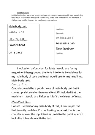
Main body text.
Headlines
Candy Inc Capture it
Unrealised
BorisBlackBloxx
Assassins dub
Power Chord
New facebook
Unispace Coalition
I looked on dafont.com for fonts I would use for my
magazine. I then grouped the fonts into fonts I would use for
my main body of texts and text I would use for my headlines.
Main body text:
Candy Inc
Candy inc would be a good choice of main body text but it
comes up a bit smaller than usual text, If I included it at the
maximum it would as a kicker as it isn’t the clearest of texts.
BorisBlackBloxx
I would use this for my main body of text, it is a simple text
that is easily readable; I’m not looking for a text that is too
complex or over the top. It isn’t set solid to the point where it
looks like it blends in with the text.
2. PowerChord
Power chord is a text that doesn’t allow spaces for big chunks
of text wouldn’t look very good; unless I used capitals for
every word. I like the fact that it has flicks of every letter but
isn’t over the top. It would also make a good choice for a
heading font.
Unispace
to incorporate this into my magazine the rest of my text
would have to be slim line as it wouldn’t work to well larger
fonts. It also looks futuristic and wouldn’t tie in with the look
I’m trying to go for with my magazine. If I was to use it I
would work well on captions or pull quotes instead of italics.
Headline Texts:
Capture it
I like this text as it is broken it seems to have a rough look to
it. On a shelf it would stand out as a magazine so hopefully it
would lead someone to buy it.
Assassins Dub
This text is very exotic it has a scary effect. It would work it
many colours but is very effective in black. The lettering isn’t
completely level giving it a unique style.
3. Coalition
this has an alien effect, it seems like it’s been let out of area
51. It isn’t as fussy as the last two, but it is quite bold.
New facebook
this text is very childish for what is, the effect of it is cool, but
seeing as it has been made from the Facebook logo isn’t very
original.
Unrealised
If I had this with powerchord they would work well together
as they are both are flicky sorts of texts. This one is also
bolder and could be much larger.
The fonts I would choice overall for my magazine would be:
Coalition
BorisBlackBloxx
Colour scheme
For my colour scheme I won’t be looking for extravagant
colours. I will at a maximum use 3 colours that I will stick to a
house style with through. The colours will be enough to fill
the page and look indie enough.
Green Grey White
4. These colours tie together well and they aren’t too exciting
but together they would be effective.
Purple Blue Yellow
This would be unique house-style the yellow would over lay
on the purple and blue really well but the purple and blue
wouldn’t work too well.
Blue Black Grey
These colours work well together they are 2 light colours
work well on a dark background and vice-versa.
All the colours I picked are chosen because they are rather
casual.
Royal Blue Red White
This would be a good selection of colours as they represent
the union jack colours making the magazine look very British;
therefore tying in with the indie genre giving it a more
original theme.
6. This is a first attempt of a layout it will be bold and more than
less across the middle of the page. I will have a few of the
caption boxes dotted across the page. What I may do to
improve this is change the colours slightly; swapping them
around but I am happy using them as my house style.
Content page.