Power point sales slide improvement
•Download as PPTX, PDF•
13 likes•11,528 views

Bar charts appear frequently in PowerPoint based corporate presentations. However most of these are boring and are difficult for the viewer to comprehend. Here are a few techniques and guidelines to follow to improve a sales slide during your next company or investor presentation.

Recommended
Recommended
More Related Content
Similar to Power point sales slide improvement
Similar to Power point sales slide improvement (20)
Recently uploaded
Recently uploaded (20)
Power point sales slide improvement
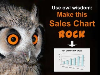
- 1. Make this Sales Chart Rock Use owl wisdom: 0 5 10 15 20 2011 2012 2013 2014 2015 2016 YoY GROWTH IN SALES
- 2. A VP of Sales wants management to back his sales plan. He presents a chart that shows an expected increase in revenue. Picture by Engin Erdogan
- 3. Generally, he would show something like this: A VP of Sales wants management to back his sales plan. He presents a chart that shows an expected increase in revenue.
- 4. 0 5 10 15 20 2011 2012 2013 2014 2015 2016 YoY GROWTH IN SALES
- 5. 0 5 10 15 20 2011 2012 2013 2014 2015 2016 YoY GROWTH IN SALES Not too inspiring, is it?
- 6. Allow me and my buddies to explain how to improve this slide. We are that clever!
- 7. Let’s break it down to three points:
- 9. Title
- 10. The title shouldn’t describe what the viewer sees on the slide; it should reflect the main takeaway. This would be the point you want the audience to remember the most. YoY GROWTH IN SALES
- 11. Perhaps an annual change in sales can represent a roadmap to success? YoY GROWTH IN SALES
- 12. Now that’s powerful! (ah…and enlarge the fonts of course). The road to $20M (in $M)
- 13. Layout
- 14. Simplicity contributes to engagement Make charts that are easy to understand by eliminating clutter and reducing noise So…
- 15. 0 2 4 6 8 10 12 14 16 18 20 2011 2012 2013 2014 2015 2016 Remove Gridlines Gridlines are a nuisance. They create a “dirty” and distracting background making information more difficult to comprehend.
- 16. 0 2 4 6 8 10 12 14 16 18 20 2011 2012 2013 2014 2015 2016 Ditch 3D! 3D is proven to be less effective and more difficult to read than 2D.
- 17. 0 2 4 6 8 10 12 14 16 18 20 2011 2012 2013 2014 2015 2016 Put Data Next to Bar Chart The eye needs to shift back and forth to associate the axis with the chart’s height. Now that’s annoying!
- 18. 1 - Remove Gridlines
- 19. 1 - Remove Gridlines 2 - Ditch 3D!
- 20. 1 - Remove Gridlines 2 - Ditch 3D! 3 – Place Data Near Bars
- 21. 5 8 12 14 17 20 2011 2012 2013 2014 2015 2016 The road to $20M (in $M)
- 22. Color
- 23. 5 8 12 14 17 20 2011 2012 2013 2014 2015 2016 The road to $20M (in $M) Create Good Contrast! The chart and background are not sufficiently contrasted causing poor readability.
- 24. 5 8 12 14 17 20 2011 2012 2013 2014 2015 2016 The road to $20M (in $M)
- 25. 5 8 12 14 17 20 2011 2012 2013 2014 2015 2016 The road to $20M (in $M) Separate Past and Future Actual sales figures and the projected ones should be colored differently.
- 26. 5 8 12 14 17 20 2011 2012 2013 2014 2015 2016 The road to $20M (in $M)
- 27. Now if you really want to WOW them
- 28. 5 8 12 14 17 20 2011 2012 2013 2014 2015 2016 The road to $20M (in $M)
- 29. 5 8 12 14 17 20 2011 2012 2013 2014 2015 2016 The road to $20M (in $M)
- 30. Before After
- 31. See the difference? Before After
- 32. Picture by Engin Erdogan
- 33. Thank you! Chen Sirkis Would you like to join our medical marketing blog and receive a FREE copy of an ebook with more presentation tips? click