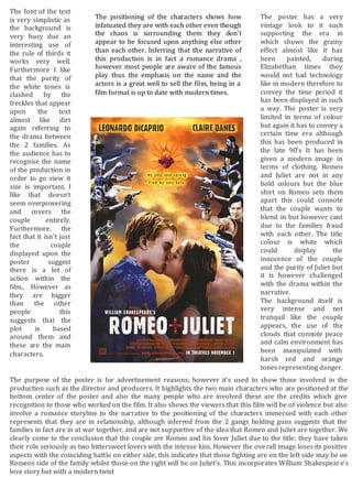
1. The purpose of the poster is for advertisement reasons; however it’s used to show those involved in the
production such as the director and producers. It highlights the two main characters who are positioned at the
bottom center of the poster and also the many people who are involved these are the credits which give
recognition to those who worked on the film. It also shows the viewers that this film will be of violence but also
involve a romance storyline to the narrative to the positioning of the characters immersed with each other
represents that they are in relationship, although inferred from the 2 gangs holding guns suggests that the
families in fact are in at war together, and are not supportive of the idea that Romeo and Juliet are together. We
clearly come to the conclusion that the couple are Romeo and his lover Juliet due to the title; they have taken
their role seriously as two bittersweet lovers with the intense kiss. However the overall image loses its positive
aspects with the coinciding battle on either side, this indicates that those fighting are on the left side may be on
Romeos side of the family whilst those on the right will be on Juliet’s. This incorporates William Shakespeare’s
love story but with a modern twist
The poster has a very
vintage look to it such
supporting the era in
which shows the grainy
effect almost like it has
been painted, during
Elizabethan times they
would not had technology
like in modern therefore to
convey the time period it
has been displayed in such
a way. The poster is very
limited in terms of colour
but again it has to convey a
certain time era although
this has been produced in
the late 90’s It has been
given a modern image in
terms of clothing. Romeo
and Juliet are not in any
bold colours but the blue
shirt on Romeo sets them
apart this could connote
that the couple wants to
blend in but however cant
due to the families fraud
with each other. The title
colour is white which
could display the
innocence of the couple
and the purity of Juliet but
it is however challenged
with the drama within the
narrative.
The background itself is
very intense and not
tranquil like the couple
appears, the use of the
clouds that connote peace
and calm environment has
been manipulated with
harsh red and orange
tones representing danger.
The font of the text
is very simplistic as
the background is
very busy due an
interesting use of
the rule of thirds it
works very well.
Furthermore I like
that the purity of
the white tones is
clashed by the
freckles that appear
upon the text
almost like dirt
again referring to
the drama between
the 2 families. As
the audience has to
recognise the name
of the production in
order to go view it
size is important, I
like that doesn’t
seem overpowering
and covers the
couple entirely.
Furthermore, the
fact that it isn’t just
the couple
displayed upon the
poster suggest
there is a lot of
action within the
film,. However as
they are bigger
than the other
people this
suggests that the
plot is based
around them and
these are the main
characters.
The positioning of the characters shows how
infatuated they are with each other even though
the chaos is surrounding them they don’t
appear to be focused upon anything else other
than each other. Inferring that the narrative of
this production is in fact a romance drama ,
however most people are aware of the famous
play thus the emphasis on the name and the
actors is a great well to sell the film, being in a
film format is up to date with modern times.