
Empfohlen
Weitere ähnliche Inhalte
Was ist angesagt?
Was ist angesagt? (16)
Ähnlich wie THE portfolio
Ähnlich wie THE portfolio (20)
Kürzlich hochgeladen
Kürzlich hochgeladen (20)
THE portfolio
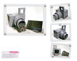
- 1. Adam Elmakias Adam Elmakias is one of the top photographers in the music industry. He has worked with the top in the field and still continues his success at such a young age. This signature press kit was created to display his skills and show off his work. This includes an wood structured camera, jump drive with his portfolio, a limited edition printed booklet and a business card.
- 4. Make Better Choices Make better choices is an Ad campaign that has a powerful meaning. Mainly image driven for impact purposes, the ad campaign focuses on young adult females who are desperate and make poor choices to receive a ring from a male. There are so many failed marriages today in the US and getting these girls to see how their actions have consequences could really help them.
- 5. Wedding Brochure Wedding Brochures/Programs and stationary may be one of the most common everyday design pieces but I wanted this couples program to be unique yet match the rest of their wedding. Putting a spin on a tri fold program and making it like unwrapping a gift is what makes this program stand out from the competition.
- 7. Fairytale Book A Modern Day Fairytale is a elegant childrens book. The color choices and the elements is what makes this book sophisti- cated and set apart from the others. The saturated and organic colors make this book look slightly mature with its diversity of placed elements on the pages.
- 9. Fraternize Game Fraternize is a board game created with bright colors and trendy graphics to attract its target audience for young adults. The name Fraternize and the logo represents pink and blue--boys and girls--socializing. The board itself was inspired by drink stirrers scattered in radial symmetry.
- 10. ICFF Stationery ICFF stands for “International Contemporary Furniture Fair”. If you look closely you can see that the blue man is actually made of the characters ICFF. The monochromatic blues set a contemporary elegance along with the simplicity of the design. Stationery includes business card, letterhead, and envelope.
- 12. Newsletter Dirty Birdy is a unique newsletter with a vintage retro style which perfectly suits New York City. The use of halftones and duotone images is what takes this newsletter back in time as it discusses the current topics of a New York City traveller. Bright colors and curvy fonts is what makes this attractive and fun.
- 13. Posters This poster series is a visual illustration of David Cook’s chart topping hits. Each song lyric has a powerful meaning and thus is displayed in each poster. The balance between chaos and simplicity is what makes these limited edition prints unique.
- 14. 25 Spoiled Spoiled is a upscale magazine publication published monthly featuring a different small dog breed every month. The magazine design is modern and clean to attract its target audience as well as keeping the focus on the small dogs and photography. All photos were taken by C3 Crystal Clear Concepts™.
- 15. 27 28
- 16. Suite Direct Mailers Suite is a high end upscale club located in the heart of Charlotte. This club needed direct mailers to inform its audience and future artist of its’ amenities and what separates them from the competition. The mailers are dressed for the event that they are promoting.
- 18. Sushi Offish Sushi Offish is a product that you may see in a specialty office supply botique or maybe even a seasonal item for a conglomerate such as Office Depot or Staples. Product includes a notepad, eraser, paper clips, pens, in a Japanese style house package. The Pop Display created on the left is for counter purposes to sell the product.
- 19. Warped Tour 2010 Warped Tour is an annual event which tours the US with over 100 bands for one of the largest concerts of the summer. The target audience is teenagers and young adults. The bright colors grab your attention and the wind up toys are the theme for 2010. Just getting wound up is appropriate due to the fact that the show has been going on for 10 years.