1. Newspaper Billboard Research
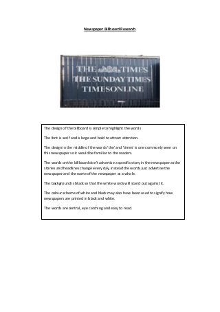
The design of the billboard is simple to highlight the words
The font is serif and is large and bold to attract attention.
The design in the middle of the words 'the' and 'times' is one commonly seen on
this newspaper so it would be familiar to the readers.
The words on the billboard don’t advertise a specific story in the newspaper as the
stories and headlines change every day, instead the words just advertise the
newspaper and the name of the newspaper as a whole.
The background is black so that the white words will stand out against it.
The colour scheme of white and black may also have been used to signify how
newspapers are printed in black and white.
The words are central, eye catching and easy to read.
2. The background of the billboard for this newspaper is also rather simple but it
includes a faded image of the sea and some rocks, to connotate with a holiday or
desire to be by the sea, which would represent the magazine as something to be
desired or wanted.
The words are bold, large and eye catching to attract readers.
The billboard is trying to appeal to younger readers through the use of words like
‘exciting’ and ‘for young minds’
The fact they use an image of a young woman also contributes to them trying to
appeal to a younger audience.
This image of the woman is also the first thing that the audience’s eye will go to
(using the Guttenberg principle) and this may interest someone to carry on and
read what the billboard is about.
They include in smaller but still large font that they there has been a growth in
readers, this is so that the newspaper will appeal to people as they will think there
must be a reason for why more people have been reading it.
A picture of the newspaper is also included in the bottom corner as it will be the
last thing the audience see’s (using the Guttenberg principle) and will stay in their
mind for when they see it in on sale somewhere.
The coral/red colour of the text makes it stand out against the paler background.
3. The first thing the eye of the audience would go to on this billboard are the words
‘’union county’s most read newspaper” the words are used as they would attract a
reader into wanting to see why the newspaper is the most read.
An image of the newspaper is also used on this billboard and is also the last thing
the person looking at the billboard would see (because of the Guttenberg
principle) which means the image would be what stays in the audiences mind.
The design of the billboard is simple and there is only one background colour
(blue) which gives off another simple soothing effect which may influence
someone to buy the newspaper being advertised as it is being represented as
uncomplicated and easy to read.
The number ‘250,000’ is included to show how popular the newspaper is to
influence an audience that it is worth purchasing.
The font used is sans serif as it is to the point and simplistic which is used to
represent the newspaper as a whole.
The use of the words being white means it stands out against the background.
The use of the colours white and blue being used together gives off a professional
look to the audience and this in turn represents the newspaper being professional
and uncomplicated.
They advertise home delivery to appeal to the audience as the process of getting
the newspaper is simple and easier for the buyer.