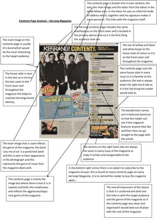
1. The contents page is broken into 3 main sections, the
text, the main image and the letter from the editor in the
weak fallow area. In the letter he uses an informal mode
of address which, together with his signature makes it
Contents Page Analysis – Kerrang Magazine more personal. This links with the magazine itself.
The Kerrang contents page includes the same
masthead as on the front cover and is located in
the primary optical area so it is the first thing
The main image on the the audience look see.
contents page is usually The use of yellow and black
of a band which would and white keeps to the
be the most interesting house style of colour as it is
to the target audience. on the front cover and
throughout the magazine.
The contents page uses the
The house style is seen same house style in every
in the text as it mirrors issue so it is familiar to the
the text used on the audience; the text is always
front cover and down the right hand side as
throughout the it is the last thing the reader
magazine this helps to would look at.
maintain kerrangs brand
identity.
The band/artists names
are in bold and stand out
so that the reader can
see if the magazine
features anyone they like
and then they can go
straight to the page with
the article.
The main image that is used reflects
the genre of the magazine, the band The sections on the right hand side are always
‘you me at six’ is a punk/rock band the same in every issue of the magazine to
and this is seen in their appearance make it similar and recognisable to the
in the photograph and this audience
represents the genre of music that
the magazine deals with. In the bottom right corner there is an advert to subscribe to the
magazine all year; this is found on every contents page on every
kerrang! Magazine, it is to remind the reader to buy the magazine
The contents page is mainly the again.
image but where there is text it is in
capitals and bold, this emphasises The overall impression of the layout
and reflects the aggressive/angry is that it is cluttered and bold and
rock genre of the magazine. this links in with the target audience
and the genre of the magazine as if
the contents page was clean and
organised it would look out of place
with the rest of the magazine.
2. Contents page analysis – Q MAGAZINE
The logo of the brand is seen in the
Q magazine’s contents page is spread over
corner as part of the house style of
The band ‘Take That’ are 2 pages as this gives an indication to the
the magazine, this is used as well as
older and more mature potential reader of how much they get
the colour scheme being red white
than most bands, so this from buying the magazine
and black as on the front cover and
main image of them mirrors throughout the magazine
the how the magazine itself
The main image gives the reader an idea of what The colours of black and white have
is more sophisticated and
type of artists appears in the magazine. They use connotations with seriousness and
mature than other
smaller images around the main image to show formality. This is mirrored in the
magazines.
the diversity in genres that you get from buying serif font which the magazine uses
the magazine. throughout.
The names of
the
artists/bands
are in capitals
and stand out
more so the
audience can
clearly see who
is featured in
the magazine
Genre specific names such as ‘Green
Q have added page numbers so it is
day’ have been used as Q
easy and simple for the reader to go
magazine’s target audience of older
straight to the article which they
and mature people as they would be
want to read.
familiar with these bigger, more
popular or mainstream names.
The design of the page is simple and As the magazine is only sold
sophisticated which is reflected in monthly it is full of information from
the audience they are targeting. the whole month so therefore has 2
pages for its content page to reflect
how many articles and how much
information is in the magazine.
Through the different images the
reader can see the diversity in artists
and genres that the magazine deals
with.
3. Both Q and Kerrang! magazine use the same general conventions of music magazines, as they both
use their short and memorable mastheads on the contents page and this is always located in the
primary optical area. They both use continuous colour schemes of black and white with an added
colour of red or yellow to brighten the page and make it more intriguing. The contents pages also
use teasers like mentioning the name of the band or using a quote from the interview to interest the
reader. They use large, clear fonts which are easy to read. The main images always reflect the genre
of the magazine and use mainstream, popular bands/artists to interest the audience and attract
them to buying the magazine.
However, in some ways the magazines pages contrast. As with the layout of the contents page, Q’s is
neatly structured whereas Kerrang’s is more cluttered and words and images overlap on the page.
Although both fonts are strong and easy to read, they are also different from one another as Q uses
a serif font and Kerrang uses a more informal sans serif font, both of which reflects their own
individual music genre and target audience.
Kerrang only features one image of a band because their readers are weekly and more regular
whereas Q uses images of lots of different bands and artists to try and entice the audience into
buying it that month.