
Recommended
More Related Content
Similar to College Magazine Research !
Similar to College Magazine Research ! (20)
More from Andrew Johnson
More from Andrew Johnson (10)
Recently uploaded
Recently uploaded (20)
College Magazine Research !
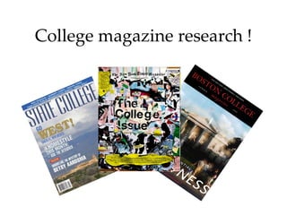
- 2. Masthead Cover lines Main cover line Skyline Main image Barcode This magazine is really simple, with all the info characteristically on the left hand side. This is because on the shelf, the left hand side is all you can see. The main image consists of a landscape scene of presumably New Mexico, which shows of the scenery, but nothing of the actual college. The typography is also simple and bold, which draws the eye. In my opinion, it is poorly designed seeing as I am a college student and I wouldn’t buy it ! Not to mention it looks dull.
- 3. Skyline Masthead Dateline Main image Main cover line This example is even more simple than the last one ! It is extremely bold and has a very serious air to it. It is missing cover lines, a barcode and even a mention of a left hand third. I can imagine this being sold on campus and including lots of boring college information. Stereotypically I would say that a geek/teachers pet kind of person would buy this. The sort who like to be up to date with all the serious stuff going on in the world. Not my cup of tea !
- 4. Masthead Cover lines Dateline Secondary masthead Even though it lacks most of the conventions that you would expect to see on a typical magazine, I think its better to leave some of them out, to be different. This mag, I actually like, and would consider buying (if it was’nt a stupidly high price or something !). Because of its lay out, the rag-tag collage look, because of the bright and exciting colours and because it pushes the boat out. (magazine wise) I seems that who ever designed this, put a lot of effort and time into it. Kudos to them !