1. Audience survey feedback
Receiving four out of five responses on the drafts created, I am happy enough to make do with that.
1. For a movie titled "The Ghost of Mary Ann Cotton", what would you like/need to see in
the movie poster?
For a movie poster, you have always got to expect an element within the poster that link with the
film itself otherwise it doesn’t really work. Using the title alone, I wanted to know what people
would picture or at least expect.
All very reasonable answers, I do hope to interpretate their wishes well. And for what hasn’t been
included, I will see what I can do for the final outcome once this is over. Like the children part is my
main concern as based off of what I have given myself to work with, I wouldn’t be able to work
around that.
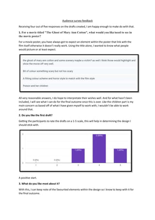
2. Do you like the first draft?
Getting the participants to rate the drafts on a 1-5 scale, this will help in determining the design I
should stick with.
A positive start.
3. What do you like most about it?
With this, I can keep note of the favourited elements within the design so I know to keep with it for
the final outcome.
2. Focusing on the black and white as well as the smoky effects, they will definitely be kept in mind.
4. What could be done better?
Not going straight to the opposite of the previous question, improvements were requested giving
me three separate notes from everyone to keep in mind.
The font is in definite need of changing, more of a play around will be done to better please the
audience. The worrying thing now is the concern of the mans arm comment when it is clear the
ghost should be a woman.
5. What do you hate most about it?
Now to the ‘definitely get rid of’ section.
With the main change suggested being about the black and white, it seems like the previous
comment of creating both a black and white version as well as the coloured version for the
audience was a good idea and I will use that for the final product.
6. Do you like the second draft?
3. Going in a loop here pretty much with the questions, only this time the same questions are asked for
the second draft showcased.
With plenty more votes on four this time, I didn’t expect this one to get more likes than the first but I
suppose that is all on personal opinion.
7. What do you like most about it?
For this design the font does appear to be preferred alongside the layout.
8. What could be done better?
Wanting more of a darker feel for the poster, by the bottom two comments it does seem as though
this could be the running choice for the final product.
9. What do you hate most about it?
4. Considering there was two who couldn’t think of anything they wanted changing, I didn’t expect
much from this question. But altogether I didn’t expect all of them to level with each other on the
responses.
10. Do you like the third draft?
For a final time, the loop:
Bringing the middle option back, people are not liking this design. Which, neither do I so I am not
surprised there.
11. What do you like most about it?
All agreeing for this design, the favourited element is the horror aspect from the characters
positioning.
12. What could be done better?
5. The font, text placement and poster size are all the target issues here.
13. What do you hate most about it?
Although this draft clearly isn’t the most liked, it is nice to hear people still enjoy the concept with
the only comment being about the text which I can second there.
14. Which draft is your favourite?
Needing an overall here, the most liked draft will be turned into the final outcome. And if it were
the case where two designs were liked equally due to the even number of participants, then there
would have been two to upgrade for the variety rather than picking between.
With the winner being draft two, looks like that is about to become my final product.
15. In the final outcome, what detail would you like kept?
Combing all three designs in this question, from what they have already seen I wanted to know
what detail, simple or not, the audience wanted to be kept for the product so I know either not to
remove it, or to add it depending on the detail they mean.
6. For the black and white answer, as I said earlier I will take the advice of creating both that version,
as well as a coloured copy.
Unable to re-shoot at this time, I am unable to change the time of day the images were taken but
maybe when I get back to editing I can create more of an “evening” setting.
With the next two, the transparent effects and smoke answers are no issue at all, and with me going
for the middle option that doesn’t have the mouth cover, I will have to leave that answer out.
16. In the final outcome, what detail would you like scrapped?
Back in the opposite direction, knowing what the audience would like kept in the design, I wanted
to also know what detail we needed to be rid off.
What is a shame as well, is the request of changing the character behind from a man to a woman. I
will see what I can do in photoshop but other than that I can’t really do much there.
17. Any further comments or suggestions?
For the final question, the participants were allowed to say as they please encase they had any
further notes in need of sharing.
With three responses, everybody seemed happy enough with the survey and what was already said.