SlideShare ist ein Scribd-Unternehmen logo
1 von 2
Downloaden Sie, um offline zu lesen
 Excel is commonly used, accessible to most staff with a computer,
and has a wide range of charts and graphs built in. See sidebar for
more ideas & training resources.
 Tableau Desktop & Tableau Public tableausoftware.com web-based
visualization tool for creating graphs and interactive dashboards.
Tableau Public is free to use, but any data you upload and use be-
comes publicly available, so be cautious with program data but go
wild with open data sets!
 ManyEyes www-958.ibm.com/software/analytics/manyeyes free,
web-based chart/graph tool
 R is a free, open source tool for data management, analysis, and vis-
ualizations, including static and interactive charts and dashboards
Bonus: Can you code? Check out d3 d3js.org is a JavaScript library for
manipulating documents based on data
Have no fear: if your tool of choice is the
ubiquitous MS Excel, you can still create
beautiful visualizations.
Ann Emery (http://annkemery.com/
excel) has excellent short video tutorials
in her for creating interesting graphs
using Excel and some creative maneu-
vering of data, rows, and columns.
Think about how to make your Excel
graph or chart sing: change fonts, color
palettes, and use other formatting
tricks to trick people into thinking you
used a fancy viz tool.
Think about your choice of chart types:
avoid creating pie charts, which can be
hard for the human eye to see, and con-
sider horizontal bar charts instead of
vertical ones, which give you more space
for your axis labels and categories.
AMANDA MAKULEC / John Snow Inc. amakulec@jsi.com
Piktochart.com, ea-
sel.ly and Infogr.am offer templates
and design approaches for in-
fographics, if that’s the next step for
your viz. Infogr.am and Piktochart can
read your Excel data, making it easy to
incorporate your graph into a larger
infographic. Contact Amanda Makulec
for a slidedeck overview of the various
tools and their uses.
Timeline JS (timeline.verite.co)
allows you to create free timelines us-
ing Excel or Google Docs. Tiki Toki (tiki-
toki.com) also creates timelines, but
requires you pay for external embed
and public views.
Gephi. Designs
simple network analysis visualizations.
Here’s a really cool video, showcasing
some of the program’s features. UCI-
NET. It is most often used for more
complicated analyses, whereas Gephi
is limited to really nice basic visualiza-
tion and a few typical network stats.
NodeXL. Is often used by social media
professionals who I know to map their
reach or diffusion across different net-
works. Simple and easy to use.
Sometimes you might want to create a visualization using second-
ary data. The following sites are great resources for health-
related datasets:
DHS Program—http://www.dhsprogram.com—Contains all
DHS datasets .
STATcompiler—http://www.statcompiler.com—Simple in-
terface for downloading select DHS data in table s or visuali-
zations. Also has a mobile app available for Apple, Android &
Windows devices for on-the-go stats access!
World Bank Data—http://data.worldbank.org—includes
most WHO, DHS, and UN statistics.
Institute for Health Metrics and Evaluation (IHME) Global
Health Data Exchange—http://
www.healthmetricsandevaluation.org/ghdx—Includes data
from all IHME research and others.
AIDSVu.org—Has both state and county level HIV data.
Juice Labs Chart Chooser—The tool is designed
to help you choose your chart type, and to provide
Excel and Powerpoint templates to make it quick and
easy to create and customize charts and graphs with
your own custom data.
Storytelling with Data Excel Template—Cole Nauss-
baumer’s terrific viz blog has a set of Excel templates
to download with some of her Excel workarounds
built in to make your graphs beautiful with minimal
effort
Colorbrewer—Provides color advice for cartography
that’s applicable beyond the GIS world. Each map
view provided has been carefully designed to be a di-
agnostic tool for evaluating the robustness of individ-
ual color schemes. Full use of this tool will benefit
your map designs because colors (even very similar
colors) are easy to differentiate when they appear in a
nicely ordered sequence (such as a legend).
Color Oracle—Free color blindness simulator for Win-
dow, Mac and Linux. It takes the guesswork out of
designing for color blindness by showing you in real
time what people with common color vision impair-
ments will see.
Color-hex —Gives information about colors including
color models (RGB,HSL,HSV and CMYK), Triadic colors,
monochromatic colors and analogous colors calculat-
ed in color page for the technically inclined. Color-
hex.com also generates a simple css code for the se-
lected color.
Color Palette Generator —Creates color sets based off
images
Design-Seeds—Gives you a space to browse designer-
quality color palettes
If you’re looking for visualization resources, tips, tricks, and
ways to connect with other visual enthusiasts, check out these
great sites & communities.
Data Viz Hub—http://www.datavizhub.co —Simple blog
&affiliated listserv for sharing examples, tools, resources,
and questions for the community.
HelpMeViz—http://www.helpmeviz.net—Open commu-
nity for posting Excel viz issues and allowing the communi-
ty to play with your data and make suggestions for how to
improve your visualizations.

Weitere ähnliche Inhalte

Mehr von Amanda Makulec

Developing Dashboards with User-Centered Design
Developing Dashboards with User-Centered DesignDeveloping Dashboards with User-Centered Design
Developing Dashboards with User-Centered DesignAmanda Makulec
 
The Simpsons, Design, and Data Use
The Simpsons, Design, and Data UseThe Simpsons, Design, and Data Use
The Simpsons, Design, and Data UseAmanda Makulec
 
Visualizations with Empathy
Visualizations with EmpathyVisualizations with Empathy
Visualizations with EmpathyAmanda Makulec
 
Visualizations with Empathy: Developing Audience Personas
Visualizations with Empathy: Developing Audience PersonasVisualizations with Empathy: Developing Audience Personas
Visualizations with Empathy: Developing Audience PersonasAmanda Makulec
 
Are Dashboards the Magic Bullet?
Are Dashboards the Magic Bullet?Are Dashboards the Magic Bullet?
Are Dashboards the Magic Bullet?Amanda Makulec
 
Designstorm How-to: Dot Plots
Designstorm How-to: Dot PlotsDesignstorm How-to: Dot Plots
Designstorm How-to: Dot PlotsAmanda Makulec
 
Data Dinner Parties
Data Dinner PartiesData Dinner Parties
Data Dinner PartiesAmanda Makulec
 
The Human Element
The Human ElementThe Human Element
The Human ElementAmanda Makulec
 
Designing Usage Dashboards for mHealth Program Monitoring
Designing Usage Dashboards for mHealth Program MonitoringDesigning Usage Dashboards for mHealth Program Monitoring
Designing Usage Dashboards for mHealth Program MonitoringAmanda Makulec
 
Data Visualization Design Best Practices Workshop
Data Visualization Design Best Practices WorkshopData Visualization Design Best Practices Workshop
Data Visualization Design Best Practices WorkshopAmanda Makulec
 
Making Data Meaningful
Making Data MeaningfulMaking Data Meaningful
Making Data MeaningfulAmanda Makulec
 
Chart Makeover: A Women's Nutrition Bar Chart
Chart Makeover: A Women's Nutrition Bar ChartChart Makeover: A Women's Nutrition Bar Chart
Chart Makeover: A Women's Nutrition Bar ChartAmanda Makulec
 
A Data Viz Makeover: Approaches for Improving your Visualizations
A Data Viz Makeover: Approaches for Improving your VisualizationsA Data Viz Makeover: Approaches for Improving your Visualizations
A Data Viz Makeover: Approaches for Improving your VisualizationsAmanda Makulec
 
Alternative Reporting Formats
Alternative Reporting FormatsAlternative Reporting Formats
Alternative Reporting FormatsAmanda Makulec
 
Introduction to Infographic Design
Introduction to Infographic DesignIntroduction to Infographic Design
Introduction to Infographic DesignAmanda Makulec
 
Creating Functional Art in Excel
Creating Functional Art in ExcelCreating Functional Art in Excel
Creating Functional Art in ExcelAmanda Makulec
 
Design for Delight
Design for DelightDesign for Delight
Design for DelightAmanda Makulec
 
Identifying Your Audience
Identifying Your AudienceIdentifying Your Audience
Identifying Your AudienceAmanda Makulec
 
August Designstorm: Alternative Reporting Formats
August Designstorm: Alternative Reporting FormatsAugust Designstorm: Alternative Reporting Formats
August Designstorm: Alternative Reporting FormatsAmanda Makulec
 
June Design-storm : Piktochart
June Design-storm : PiktochartJune Design-storm : Piktochart
June Design-storm : PiktochartAmanda Makulec
 

Mehr von Amanda Makulec (20)

Developing Dashboards with User-Centered Design
Developing Dashboards with User-Centered DesignDeveloping Dashboards with User-Centered Design
Developing Dashboards with User-Centered Design
 
The Simpsons, Design, and Data Use
The Simpsons, Design, and Data UseThe Simpsons, Design, and Data Use
The Simpsons, Design, and Data Use
 
Visualizations with Empathy
Visualizations with EmpathyVisualizations with Empathy
Visualizations with Empathy
 
Visualizations with Empathy: Developing Audience Personas
Visualizations with Empathy: Developing Audience PersonasVisualizations with Empathy: Developing Audience Personas
Visualizations with Empathy: Developing Audience Personas
 
Are Dashboards the Magic Bullet?
Are Dashboards the Magic Bullet?Are Dashboards the Magic Bullet?
Are Dashboards the Magic Bullet?
 
Designstorm How-to: Dot Plots
Designstorm How-to: Dot PlotsDesignstorm How-to: Dot Plots
Designstorm How-to: Dot Plots
 
Data Dinner Parties
Data Dinner PartiesData Dinner Parties
Data Dinner Parties
 
The Human Element
The Human ElementThe Human Element
The Human Element
 
Designing Usage Dashboards for mHealth Program Monitoring
Designing Usage Dashboards for mHealth Program MonitoringDesigning Usage Dashboards for mHealth Program Monitoring
Designing Usage Dashboards for mHealth Program Monitoring
 
Data Visualization Design Best Practices Workshop
Data Visualization Design Best Practices WorkshopData Visualization Design Best Practices Workshop
Data Visualization Design Best Practices Workshop
 
Making Data Meaningful
Making Data MeaningfulMaking Data Meaningful
Making Data Meaningful
 
Chart Makeover: A Women's Nutrition Bar Chart
Chart Makeover: A Women's Nutrition Bar ChartChart Makeover: A Women's Nutrition Bar Chart
Chart Makeover: A Women's Nutrition Bar Chart
 
A Data Viz Makeover: Approaches for Improving your Visualizations
A Data Viz Makeover: Approaches for Improving your VisualizationsA Data Viz Makeover: Approaches for Improving your Visualizations
A Data Viz Makeover: Approaches for Improving your Visualizations
 
Alternative Reporting Formats
Alternative Reporting FormatsAlternative Reporting Formats
Alternative Reporting Formats
 
Introduction to Infographic Design
Introduction to Infographic DesignIntroduction to Infographic Design
Introduction to Infographic Design
 
Creating Functional Art in Excel
Creating Functional Art in ExcelCreating Functional Art in Excel
Creating Functional Art in Excel
 
Design for Delight
Design for DelightDesign for Delight
Design for Delight
 
Identifying Your Audience
Identifying Your AudienceIdentifying Your Audience
Identifying Your Audience
 
August Designstorm: Alternative Reporting Formats
August Designstorm: Alternative Reporting FormatsAugust Designstorm: Alternative Reporting Formats
August Designstorm: Alternative Reporting Formats
 
June Design-storm : Piktochart
June Design-storm : PiktochartJune Design-storm : Piktochart
June Design-storm : Piktochart
 

KĂĽrzlich hochgeladen

April 2024 - NLIT Cloudera Real-Time LLM Streaming 2024
April 2024 - NLIT Cloudera Real-Time LLM Streaming 2024April 2024 - NLIT Cloudera Real-Time LLM Streaming 2024
April 2024 - NLIT Cloudera Real-Time LLM Streaming 2024Timothy Spann
 
Biometric Authentication: The Evolution, Applications, Benefits and Challenge...
Biometric Authentication: The Evolution, Applications, Benefits and Challenge...Biometric Authentication: The Evolution, Applications, Benefits and Challenge...
Biometric Authentication: The Evolution, Applications, Benefits and Challenge...GQ Research
 
Semantic Shed - Squashing and Squeezing.pptx
Semantic Shed - Squashing and Squeezing.pptxSemantic Shed - Squashing and Squeezing.pptx
Semantic Shed - Squashing and Squeezing.pptxMike Bennett
 
Top 5 Best Data Analytics Courses In Queens
Top 5 Best Data Analytics Courses In QueensTop 5 Best Data Analytics Courses In Queens
Top 5 Best Data Analytics Courses In Queensdataanalyticsqueen03
 
ASML's Taxonomy Adventure by Daniel Canter
ASML's Taxonomy Adventure by Daniel CanterASML's Taxonomy Adventure by Daniel Canter
ASML's Taxonomy Adventure by Daniel Cantervoginip
 
Thiophen Mechanism khhjjjjjjjhhhhhhhhhhh
Thiophen Mechanism khhjjjjjjjhhhhhhhhhhhThiophen Mechanism khhjjjjjjjhhhhhhhhhhh
Thiophen Mechanism khhjjjjjjjhhhhhhhhhhhYasamin16
 
Effects of Smartphone Addiction on the Academic Performances of Grades 9 to 1...
Effects of Smartphone Addiction on the Academic Performances of Grades 9 to 1...Effects of Smartphone Addiction on the Academic Performances of Grades 9 to 1...
Effects of Smartphone Addiction on the Academic Performances of Grades 9 to 1...limedy534
 
How we prevented account sharing with MFA
How we prevented account sharing with MFAHow we prevented account sharing with MFA
How we prevented account sharing with MFAAndrei Kaleshka
 
Easter Eggs From Star Wars and in cars 1 and 2
Easter Eggs From Star Wars and in cars 1 and 2Easter Eggs From Star Wars and in cars 1 and 2
Easter Eggs From Star Wars and in cars 1 and 217djon017
 
Learn How Data Science Changes Our World
Learn How Data Science Changes Our WorldLearn How Data Science Changes Our World
Learn How Data Science Changes Our WorldEduminds Learning
 
Identifying Appropriate Test Statistics Involving Population Mean
Identifying Appropriate Test Statistics Involving Population MeanIdentifying Appropriate Test Statistics Involving Population Mean
Identifying Appropriate Test Statistics Involving Population MeanMYRABACSAFRA2
 
NO1 Certified Black Magic Specialist Expert Amil baba in Lahore Islamabad Raw...
NO1 Certified Black Magic Specialist Expert Amil baba in Lahore Islamabad Raw...NO1 Certified Black Magic Specialist Expert Amil baba in Lahore Islamabad Raw...
NO1 Certified Black Magic Specialist Expert Amil baba in Lahore Islamabad Raw...Amil Baba Dawood bangali
 
Predicting Salary Using Data Science: A Comprehensive Analysis.pdf
Predicting Salary Using Data Science: A Comprehensive Analysis.pdfPredicting Salary Using Data Science: A Comprehensive Analysis.pdf
Predicting Salary Using Data Science: A Comprehensive Analysis.pdfBoston Institute of Analytics
 
Heart Disease Classification Report: A Data Analysis Project
Heart Disease Classification Report: A Data Analysis ProjectHeart Disease Classification Report: A Data Analysis Project
Heart Disease Classification Report: A Data Analysis ProjectBoston Institute of Analytics
 
20240419 - Measurecamp Amsterdam - SAM.pdf
20240419 - Measurecamp Amsterdam - SAM.pdf20240419 - Measurecamp Amsterdam - SAM.pdf
20240419 - Measurecamp Amsterdam - SAM.pdfHuman37
 
RS 9000 Call In girls Dwarka Mor (DELHI)⇛9711147426🔝Delhi
RS 9000 Call In girls Dwarka Mor (DELHI)⇛9711147426🔝DelhiRS 9000 Call In girls Dwarka Mor (DELHI)⇛9711147426🔝Delhi
RS 9000 Call In girls Dwarka Mor (DELHI)⇛9711147426🔝Delhijennyeacort
 
Student profile product demonstration on grades, ability, well-being and mind...
Student profile product demonstration on grades, ability, well-being and mind...Student profile product demonstration on grades, ability, well-being and mind...
Student profile product demonstration on grades, ability, well-being and mind...Seán Kennedy
 
INTERNSHIP ON PURBASHA COMPOSITE TEX LTD
INTERNSHIP ON PURBASHA COMPOSITE TEX LTDINTERNSHIP ON PURBASHA COMPOSITE TEX LTD
INTERNSHIP ON PURBASHA COMPOSITE TEX LTDRafezzaman
 
Statistics, Data Analysis, and Decision Modeling, 5th edition by James R. Eva...
Statistics, Data Analysis, and Decision Modeling, 5th edition by James R. Eva...Statistics, Data Analysis, and Decision Modeling, 5th edition by James R. Eva...
Statistics, Data Analysis, and Decision Modeling, 5th edition by James R. Eva...ssuserf63bd7
 
Predictive Analysis for Loan Default Presentation : Data Analysis Project PPT
Predictive Analysis for Loan Default  Presentation : Data Analysis Project PPTPredictive Analysis for Loan Default  Presentation : Data Analysis Project PPT
Predictive Analysis for Loan Default Presentation : Data Analysis Project PPTBoston Institute of Analytics
 

KĂĽrzlich hochgeladen (20)

April 2024 - NLIT Cloudera Real-Time LLM Streaming 2024
April 2024 - NLIT Cloudera Real-Time LLM Streaming 2024April 2024 - NLIT Cloudera Real-Time LLM Streaming 2024
April 2024 - NLIT Cloudera Real-Time LLM Streaming 2024
 
Biometric Authentication: The Evolution, Applications, Benefits and Challenge...
Biometric Authentication: The Evolution, Applications, Benefits and Challenge...Biometric Authentication: The Evolution, Applications, Benefits and Challenge...
Biometric Authentication: The Evolution, Applications, Benefits and Challenge...
 
Semantic Shed - Squashing and Squeezing.pptx
Semantic Shed - Squashing and Squeezing.pptxSemantic Shed - Squashing and Squeezing.pptx
Semantic Shed - Squashing and Squeezing.pptx
 
Top 5 Best Data Analytics Courses In Queens
Top 5 Best Data Analytics Courses In QueensTop 5 Best Data Analytics Courses In Queens
Top 5 Best Data Analytics Courses In Queens
 
ASML's Taxonomy Adventure by Daniel Canter
ASML's Taxonomy Adventure by Daniel CanterASML's Taxonomy Adventure by Daniel Canter
ASML's Taxonomy Adventure by Daniel Canter
 
Thiophen Mechanism khhjjjjjjjhhhhhhhhhhh
Thiophen Mechanism khhjjjjjjjhhhhhhhhhhhThiophen Mechanism khhjjjjjjjhhhhhhhhhhh
Thiophen Mechanism khhjjjjjjjhhhhhhhhhhh
 
Effects of Smartphone Addiction on the Academic Performances of Grades 9 to 1...
Effects of Smartphone Addiction on the Academic Performances of Grades 9 to 1...Effects of Smartphone Addiction on the Academic Performances of Grades 9 to 1...
Effects of Smartphone Addiction on the Academic Performances of Grades 9 to 1...
 
How we prevented account sharing with MFA
How we prevented account sharing with MFAHow we prevented account sharing with MFA
How we prevented account sharing with MFA
 
Easter Eggs From Star Wars and in cars 1 and 2
Easter Eggs From Star Wars and in cars 1 and 2Easter Eggs From Star Wars and in cars 1 and 2
Easter Eggs From Star Wars and in cars 1 and 2
 
Learn How Data Science Changes Our World
Learn How Data Science Changes Our WorldLearn How Data Science Changes Our World
Learn How Data Science Changes Our World
 
Identifying Appropriate Test Statistics Involving Population Mean
Identifying Appropriate Test Statistics Involving Population MeanIdentifying Appropriate Test Statistics Involving Population Mean
Identifying Appropriate Test Statistics Involving Population Mean
 
NO1 Certified Black Magic Specialist Expert Amil baba in Lahore Islamabad Raw...
NO1 Certified Black Magic Specialist Expert Amil baba in Lahore Islamabad Raw...NO1 Certified Black Magic Specialist Expert Amil baba in Lahore Islamabad Raw...
NO1 Certified Black Magic Specialist Expert Amil baba in Lahore Islamabad Raw...
 
Predicting Salary Using Data Science: A Comprehensive Analysis.pdf
Predicting Salary Using Data Science: A Comprehensive Analysis.pdfPredicting Salary Using Data Science: A Comprehensive Analysis.pdf
Predicting Salary Using Data Science: A Comprehensive Analysis.pdf
 
Heart Disease Classification Report: A Data Analysis Project
Heart Disease Classification Report: A Data Analysis ProjectHeart Disease Classification Report: A Data Analysis Project
Heart Disease Classification Report: A Data Analysis Project
 
20240419 - Measurecamp Amsterdam - SAM.pdf
20240419 - Measurecamp Amsterdam - SAM.pdf20240419 - Measurecamp Amsterdam - SAM.pdf
20240419 - Measurecamp Amsterdam - SAM.pdf
 
RS 9000 Call In girls Dwarka Mor (DELHI)⇛9711147426🔝Delhi
RS 9000 Call In girls Dwarka Mor (DELHI)⇛9711147426🔝DelhiRS 9000 Call In girls Dwarka Mor (DELHI)⇛9711147426🔝Delhi
RS 9000 Call In girls Dwarka Mor (DELHI)⇛9711147426🔝Delhi
 
Student profile product demonstration on grades, ability, well-being and mind...
Student profile product demonstration on grades, ability, well-being and mind...Student profile product demonstration on grades, ability, well-being and mind...
Student profile product demonstration on grades, ability, well-being and mind...
 
INTERNSHIP ON PURBASHA COMPOSITE TEX LTD
INTERNSHIP ON PURBASHA COMPOSITE TEX LTDINTERNSHIP ON PURBASHA COMPOSITE TEX LTD
INTERNSHIP ON PURBASHA COMPOSITE TEX LTD
 
Statistics, Data Analysis, and Decision Modeling, 5th edition by James R. Eva...
Statistics, Data Analysis, and Decision Modeling, 5th edition by James R. Eva...Statistics, Data Analysis, and Decision Modeling, 5th edition by James R. Eva...
Statistics, Data Analysis, and Decision Modeling, 5th edition by James R. Eva...
 
Predictive Analysis for Loan Default Presentation : Data Analysis Project PPT
Predictive Analysis for Loan Default  Presentation : Data Analysis Project PPTPredictive Analysis for Loan Default  Presentation : Data Analysis Project PPT
Predictive Analysis for Loan Default Presentation : Data Analysis Project PPT
 

Love Your Data : Free Design Tools & Resources
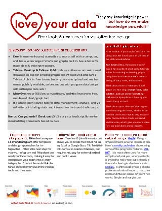
  • 1.  Excel is commonly used, accessible to most staff with a computer, and has a wide range of charts and graphs built in. See sidebar for more ideas & training resources.  Tableau Desktop & Tableau Public tableausoftware.com web-based visualization tool for creating graphs and interactive dashboards. Tableau Public is free to use, but any data you upload and use be- comes publicly available, so be cautious with program data but go wild with open data sets!  ManyEyes www-958.ibm.com/software/analytics/manyeyes free, web-based chart/graph tool  R is a free, open source tool for data management, analysis, and vis- ualizations, including static and interactive charts and dashboards Bonus: Can you code? Check out d3 d3js.org is a JavaScript library for manipulating documents based on data Have no fear: if your tool of choice is the ubiquitous MS Excel, you can still create beautiful visualizations. Ann Emery (http://annkemery.com/ excel) has excellent short video tutorials in her for creating interesting graphs using Excel and some creative maneu- vering of data, rows, and columns. Think about how to make your Excel graph or chart sing: change fonts, color palettes, and use other formatting tricks to trick people into thinking you used a fancy viz tool. Think about your choice of chart types: avoid creating pie charts, which can be hard for the human eye to see, and con- sider horizontal bar charts instead of vertical ones, which give you more space for your axis labels and categories. AMANDA MAKULEC / John Snow Inc. amakulec@jsi.com Piktochart.com, ea- sel.ly and Infogr.am offer templates and design approaches for in- fographics, if that’s the next step for your viz. Infogr.am and Piktochart can read your Excel data, making it easy to incorporate your graph into a larger infographic. Contact Amanda Makulec for a slidedeck overview of the various tools and their uses. Timeline JS (timeline.verite.co) allows you to create free timelines us- ing Excel or Google Docs. Tiki Toki (tiki- toki.com) also creates timelines, but requires you pay for external embed and public views. Gephi. Designs simple network analysis visualizations. Here’s a really cool video, showcasing some of the program’s features. UCI- NET. It is most often used for more complicated analyses, whereas Gephi is limited to really nice basic visualiza- tion and a few typical network stats. NodeXL. Is often used by social media professionals who I know to map their reach or diffusion across different net- works. Simple and easy to use.
  • 2. Sometimes you might want to create a visualization using second- ary data. The following sites are great resources for health- related datasets: DHS Program—http://www.dhsprogram.com—Contains all DHS datasets . STATcompiler—http://www.statcompiler.com—Simple in- terface for downloading select DHS data in table s or visuali- zations. Also has a mobile app available for Apple, Android & Windows devices for on-the-go stats access! World Bank Data—http://data.worldbank.org—includes most WHO, DHS, and UN statistics. Institute for Health Metrics and Evaluation (IHME) Global Health Data Exchange—http:// www.healthmetricsandevaluation.org/ghdx—Includes data from all IHME research and others. AIDSVu.org—Has both state and county level HIV data. Juice Labs Chart Chooser—The tool is designed to help you choose your chart type, and to provide Excel and Powerpoint templates to make it quick and easy to create and customize charts and graphs with your own custom data. Storytelling with Data Excel Template—Cole Nauss- baumer’s terrific viz blog has a set of Excel templates to download with some of her Excel workarounds built in to make your graphs beautiful with minimal effort Colorbrewer—Provides color advice for cartography that’s applicable beyond the GIS world. Each map view provided has been carefully designed to be a di- agnostic tool for evaluating the robustness of individ- ual color schemes. Full use of this tool will benefit your map designs because colors (even very similar colors) are easy to differentiate when they appear in a nicely ordered sequence (such as a legend). Color Oracle—Free color blindness simulator for Win- dow, Mac and Linux. It takes the guesswork out of designing for color blindness by showing you in real time what people with common color vision impair- ments will see. Color-hex —Gives information about colors including color models (RGB,HSL,HSV and CMYK), Triadic colors, monochromatic colors and analogous colors calculat- ed in color page for the technically inclined. Color- hex.com also generates a simple css code for the se- lected color. Color Palette Generator —Creates color sets based off images Design-Seeds—Gives you a space to browse designer- quality color palettes If you’re looking for visualization resources, tips, tricks, and ways to connect with other visual enthusiasts, check out these great sites & communities. Data Viz Hub—http://www.datavizhub.co —Simple blog &affiliated listserv for sharing examples, tools, resources, and questions for the community. HelpMeViz—http://www.helpmeviz.net—Open commu- nity for posting Excel viz issues and allowing the communi- ty to play with your data and make suggestions for how to improve your visualizations.