This is my presentation to show the differences in how two Music magazines with similar brand ideas choose to use conventions to promote their magazine toward their audience.
2. The house style of this Issue of the
magazine is very blatant (though it can
vary from different issues). The house
colour sets a sensible yet attractive tone
for younger readers who are more
attracted to the topic/features.
The House style colour scheme is Black,
with White, Yellow, and Red Features.
(E.G text, logos, magazine Masthead).
S
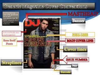
4. Breaking Usual Conventions
On this magazine cover there is no
proper mode of address to the
audience (Apart from the direct
gaze of the main cover image).
And there is no borders to any of
the magazine cover.
There is no more Article Images
(Cover photos) to help advertise
some of the other features in the
magazines, this is an unusual thing
as most magazines try to advertise
as much as Is needed to gain a
bigger audience. Another
conventions which has been
altered from the usual is that the
Sell Line of this Magazine is
placed in very small white lettering
under the Masthead, rather than
clear view of the reader.