
Empfohlen
Weitere ähnliche Inhalte
Was ist angesagt?
Was ist angesagt? (16)
Ähnlich wie Music Magazine Analysis Design Elements Front CoversTITLEURB Disorder XLR8 Magazine Cover Analysis Artistic Styles
Ähnlich wie Music Magazine Analysis Design Elements Front CoversTITLEURB Disorder XLR8 Magazine Cover Analysis Artistic Styles (20)
Kürzlich hochgeladen
Kürzlich hochgeladen (20)
Music Magazine Analysis Design Elements Front CoversTITLEURB Disorder XLR8 Magazine Cover Analysis Artistic Styles
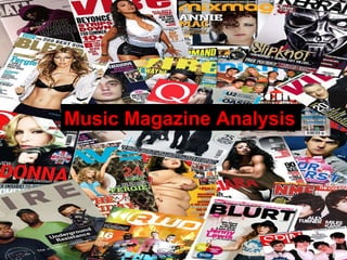
- 1. Music Magazine Analysis Yasmine Sadr Music Magazine Analysis
- 2. Front Cover 1 URB magazine is a monthly American magazine devoted to electronic music, hip hop, and urban lifestyle and culture. Based in Los Angeles, California, the magazine was founded in 1990 by Raymond Roker . This music magazine is very different to the typical UK music magazines on the market such as NME and Mix mag. The front cover is very simple and does not include the typical information such as, pull quotes and lead articles. The reader will not really know what the inside of the magazine is about until the open it. This could also give the impression that this magazine is important and well known so they do not need to advertise what is inside.
- 3. Masthead Main Image Lead Article Cover lines
- 5. Front Cover 2 Disorder magazine originally started off as a London based magazine, but it is now extremely well known and is sold in over 21 countries. Disorder started off as a fanzine and copies were sold in Local record stores in London. Disorders objective of the magazine was to use the magazine as a portfolio and stepping stone for the founders’ talents, but the demand for more editions was immediate. Disorder magazine is very arty and shows a lot of photoshop skills that have been used. I think that the magazine is very different to any UK music magazines on the market. The layout and design looks more focused on art and design, this makes the cover very appealing and therefore attracting customers. Presentation is key with successful magazines and Disorder seem to have made this their main focus from the choice of colours, to the strong main image and the bold fonts.
- 6. Masthead Cover lines Lead Article. Additional Cover lines Main Image
- 9. Main Image Masthead Cover Lines
- 11. Contents Page 1 This contents page for URB magazine is quite normal and conventional compared to the front cover, although the contents page still does not include loads of additional information and advertisements, it just has the most important parts of the magazine included. The image on this contents page is very strong. There is a very limited colour pallet compared to the front cover. The have not titled the contents page, ‘contents’ but have used the title ‘guts’ instead, this is again to stand out and show originality to other magazines which would just use ‘contents’ as the title. All of the pages and articles that URB think would be the most popular are in bold, this to to make them stand out and therefore more people will read them. The main image is of the lead article, this was used on the contents page because this article is one of the key selling points of this issue, therefore it need to attract the readers and direct them to article quickly. This image is captioned stating that it is the main article and also giving the reader the page number to locate it.
- 12. Contents Page 2 This contents page is my personal favorite, I think that it has been very well edited and designed. It is very different to the usual music magazine contents page, firstly because they have chosen to have it horizontally covering two pages, usually it is vertically covering on page, sometimes two. Another difference would be that they have created a ‘key’ for this contents page, each showing different topics and genres of the magazine, for example, there is a key for music, fashion and regular. This therefore makes it easier for the readers to locate what they want to read.
- 14. Contents Page 3 The layout to this magazine follows on with the unconventional and alternative theme of XLR8 Magazine. The there is a very limited colour palette where the main image is again the main focus.
- 16. Double Page Spread 1
- 18. Double Page Spread 2
- 20. Double Page Spread 3