
Empfohlen
Weitere ähnliche Inhalte
Was ist angesagt?
Was ist angesagt? (20)
Andere mochten auch
Andere mochten auch (19)
Ähnlich wie How My Media Product Challenges Conventions
Ähnlich wie How My Media Product Challenges Conventions (20)
Kürzlich hochgeladen
Kürzlich hochgeladen (20)
How My Media Product Challenges Conventions
- 1. In what ways does your media product use, develop or challenge forms and conventions of real media products?
- 2. what I found out from my research From my research I found out the following things: • That my target audience would like a horror movie. • Most of the effective horrors are done hand held • I then researched some Handheld horrors: Peeping tom: http://www.youtube.com/watch?v=dwNMeCgnFpU clover field: http://www.youtube.com/watch?v=oSFCV4uATpI The Blair Witch Project: http://www.youtube.com/watch?v=D51QgOHrCj0 I discussed which shots were effective within each of these trailers to give me some insight into the shots I could use for my trailer and I also commented on how hand held cameras have an impact on the trailer.
- 3. the theory of trailers Trailers were made for advertisement purposes in order for the film makers to promote the film before it comes out and it will give them a rough idea whether people will like the film or not. Or whether it targets a niche audience or a large audience. Conventions of my trailer I personally think my trailer challenges and is similar to other conventions with in the media world for example in my trailer I took a lot inspiration from the film Eden lake where it was based is forest/ field area. A lot of my film was filmed by handheld which I took this element from the film Blair witch project. Although it does challenge other movie trailer because it has quite a confusing story line the plot is a lot different to other conventional horror films. Some of the shots especially the panning shot at the end is very different because what I did was I made this shot go faster so it makes the audience feel disorientated And also ending blankly with a loud scream is also very different as normally the end shot of horror trailers is there climax point. I did this because I want people to think what happens for that girl to scream like she did so the audience will go and see my trailer.
- 4. Camera Angles Within my trailer I have a variety of camera angles and a mixture of different shot for example: • The canted angle of Alice and Leonna’s feet is quite different as you don’t see this feature in many other Horror trailers. • The back shot of Alice being followed is very effective and although this effect isn't used in many other horrors they do actually have the scenes where they feel like somebody is watching them which builds the tension up within the audience. • Another camera shot is the medium shot of Alice and Leonna with the voice over saying “ what’s that” this is quite conventional to other horror trailers because they turn around suddenly like they have heard something or seen something which is used in most conventional horror trailers. • The ending panning shot is quite interesting because it is really fast. Compared to real horror trailers this is very different as I have given nothing away and it normally ends on a climax point where you see what happens but I don’t really use this effect in order to make sure I don’t reveal too much within my trailer. • Obviously some of the camera angles are not as technical as the ones on a real movie trailer but they do look real and work really well together.
- 5. Sound +Editing I did quite a bit of editing in order for my trailer to be effective and successful. The things I edited were: • The camera shots- some of my shots had to be cut because there was laughing or smiling, I had to edit this out because I want my trailer to look as real as possible and conventional to other horror films. The difference between my trailer and professional trailers is that they have professional people who edit there trailers and they also have better equipment and technology for editing where as we used t adobe premiere pro which is suitable for what I need. • I didn’t edit the lighting because I wanted It to be a more believable trailer which compared to real trailers they edit their lighting to make it darker in order to make the film darker and mysterious. • The sound within my trailer Is quite similar to a real trailer because I used a nice piece of music called churched throughout my trailer which created the eerie feeling. I also added sound effects to my trailer like most horror trailers have a banging noise or a scream this is there for effect to make the audience more engaged to what they are watching, well my trailer has a scream at the end when it goes black this leaves a sense of unknown to what happens and who scream it is and also I included the heartbeat sound getting faster as Alice is being followed which again creates tension. • So I believe my trailer has a great use of sound and is a main element within my trailer. Compared to other trailers It is quite similar.
- 6. Mise en scene Mise en scene is about the location, costumes and props. My trailer had 2 locations the first location was a field and the second location was an enclosed public footpath. I chose these two locations because they have open space and they are public. This made my trailer feel like a real trailer because it had a good location and I actually thought about what was in the background e.g. houses and other items. My characters wore very normal and stereotypical cloths for teenagers this would make my trailer look like a real trailer because they are just normal average teenagers wearing what they like to wear the only think I asked Alice to wear in the wintery scene was a coat and scarf and this was for an audience point of view to make it seem like it is a cold and chilly day. Although the locations in most horror trailers are based in a House or private land. For us this is really difficult to do unless we get written permission from the owners and then you have to be really prepared on the shots you would like to do.
- 7. Inspiration for ancillary texts The Friday the 13th movie poster was the inspiration my movie poster I like how the whole of the man can been seen, I also like the writing underneath the title. The magazine I took inspiration from was this empire Magazine. I used the magazine name empire and the massive preview special but I changed the writing to how I wanted it. This magazine was inspirational to me and stood out because of the picture, font and colour scheme.
- 8. Research For my research I looked at two magazines: • Empire- is very simple, but very effective, I like the fact they listed film. The font is simple but readable which is what you want for a magazine • Total film – this magazine seemed to be more arty and it also has a clear colour scheme which I would like to see in my magazine. Arty clear Font Good clear image Blue White red Bar code found Colour on all scheme magazines.
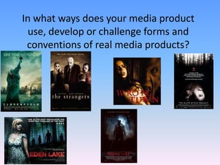
- 9. For my research of movie posters I looked at the following movie posters: • Blair Witch Project- the Blair witch project poster was very simple but is very effective because of the back drop of the forest and the close-up of the girls eyes looking terrified. It is very different from other horror movie posters because of the writing in the middle (telling us about the background of the story.) • Friday the 13th – the Friday the 13th movie poster is the one that I based mine around because I really like the whole image of the poster the full image of the person, and I used this effect on mine. I also placed my title at the bottom like the Friday 13th poster so you can see the full image. • Prom Night -The prom night poster is very arty and the emphasises the Word prom in the title with the image of the sparkly tiara. • The ring 2 –the ring two emphasises the word ring because the shape in the background is of a ring and the image of the girl with the hair in front of her face it make it remain unknown what she looks like.
- 10. Conventions of ancillary texts For ancillary texts I had inspiration from the empire magazine and I took some of the features and adapted them to my magazine from the magazine for example the colour scheme I used red and white but this is because the title of my film was red or white. For my movie poster it had the same style as the Friday 13th poster I used the full image of will on my poster with him at an angle looking down which was the same style and format as the Friday 13th poster but the convention that’s different is the colour I chose to make my poster black and white which is very different to conventional horror movie poster because they are stereotypically in colour.