
Empfohlen
Weitere ähnliche Inhalte
Was ist angesagt?
Was ist angesagt? (20)
Ähnlich wie Rihanna - Loud
Ähnlich wie Rihanna - Loud (20)
Mehr von wilsonkateemily
Mehr von wilsonkateemily (20)
Kürzlich hochgeladen
Kürzlich hochgeladen (20)
Rihanna - Loud
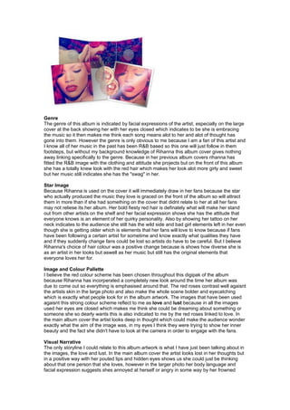
- 1. Genre The genre of this album is indicated by facial expressions of the artist, especially on the large cover at the back showing her with her eyes closed which indicates to be she is embracing the music so it then makes me think each song means alot to her and alot of thought has gone into them. However the genre is only obvious to me because I am a fan of this artist and I know all of her music in the past has been R&B based so this one will just follow in them footsteps, but without my background knowledge of Rihanna this album cover gives nothing away linking specifically to the genre. Because in her previous album covers rihanna has fitted the R&B image with the clothing and attitude she projects but on the front of this album she has a totally knew look with the red hair which makes her look alot more girly and sweet but her music still indicates she has the "swag" in her. Star Image Because Rihanna is used on the cover it will immediately draw in her fans because the star who actually produced the music they love is graced on the front of the album so will attract them in more than if she had something on the cover that didnt relate to her at all her fans may not reliese its her album. Her bold fiesty red hair is definately what will make her stand out from other artists on the shelf and her facial expression shows she has the attitude that everyone knows is an element of her quirky personality. Also by showing her tattoo on her neck indicates to the audience she still has the wild side and bad girl elements left in her even though she is getting older which is elements that her fans will love to know because if fans have been following a certain artist for sometime and know exactly what qualities they have and if they suddenly change fans could be lost so artists do have to be careful. But I believe Rihanna's choice of hair colour was a positive change because is shows how diverse she is as an artist in her looks but aswell as her music but still has the original elements that everyone loves her for. Image and Colour Pallette I believe the red colour scheme has been chosen throughout this digipak of the album because Rihanna has incorperated a completely new look around the time her album was due to come out so everything is emphasised around that. The red roses contrast well agaisnt the artists skin in the large photo and also make the whole scene bolder and eyecatching which is exactly what people look for in the album artwork. The images that have been used agaisnt this strong colour scheme reflect to me as love and lust because in all the images used her eyes are closed which makes me think she could be dreaming about something or someone she so dearly wants this is also indicated to me by the red roses linked to love. In the main album cover the artist looks deep in thought which could make the audience wonder exactly what the aim of the image was, in my eyes I think they were trying to show her inner beauty and the fact she didn't have to look at the camera in order to engage with the fans. Visual Narrative The only storyline I could relate to this album artwork is what I have just been talking about in the images, the love and lust. In the main album cover the artist looks lost in her thoughts but in a positive way with her pouted lips and hidden eyes shows us she could just be thinking about that one person that she loves, however in the larger photo her body language and facial expression suggests shes annoyed at herself or angry in some way by her frowned
- 2. forehead and her stretched out body which indicates lust to me, love for someone she can't have. I believe if this album came with a picture book this would be the storyline it would use because by the artist using simple facial expressions you can instantly relate to her feelings and even by listening to some of the songs from the album they are about loving and hating someone. Also because of the roses being used in the images it suggests Rihanna has suddenly turned alot more girly compared to her previous album "Rated R" where she was seen as more of a rockchick. This element again shows her fans how diverse she can be as an artist but still produce the best quality music she can. Typography and Composistion The text/font that has been used on this album cover is very plain and simple and I believe this is because they didn't want to take all the attention away from the stunning photos used of the artist. Personally I thought the font used would of been more vintage looking and maybe a copy of the font used on her tattoo to link two elements together but this white writing does stand out more than I thought it would, i think the colour works so well because the artist is so well known her name didn't need to be really bold, if fans saw her picture they would automatically know it was her this is why it's been posisitioned in the corner of the album rather than in the middle. The font of the album title is also the same but it's just been made slightly larger and with the large spaces between each letter it makes it look more unique and different which is exactly what the artist is like.