Bridge Fight Board by Daniel Johnson dtjohnsonart.com
Front cover analysis 1
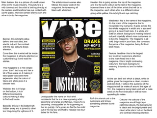
1. Header- this is going across the top of the magazine and it is the same colour as the rest of the magazine, however there is text of the other artists that will be in the magazine, each other artist is a different colour going white yellow, this is bright and eye catching. Masthead- this is the name of the magazine, it’s the brand of the magazine that is recognized my everyone. It goes across the the whole magazine in width and is san serif giving it a clean fresh look. It is white and bold on a black background making it stand out and hopefully attract more customers on to buy the magazine. The magazine is all bold, bright and in your face, this connotes the genre of the magazine, being for loud, beat music. Main feature- this is a picture of a well known Artist in the music industry. The picture is a mid close-up and the artist is looking directly at the camera and therefore has eye contact with us the public. The eye contact draws us in and attracts us to the magazine. Feature headline- this is the largest text to attract customers attention to the main head line in the magazine. It is in bright contrasting colours to the black background meaning it stands out and is visible easily. Colours- the colours of the magazine are all bright eye catching colours, the background is black and the bright yellow and clean white stand out on the black and contrast drawing attention. Barcode- this is in the bottom left hidden away and is joined to other text disguising the ugliness of it.. Puff- this stands out to the customers and brings something different to the magazine. Banner- this is bright yellow behind the black text, this stands out and the contrast with the two colours draws attention. Cover line- this is what will be inside the magazine, it attracts attention so customers buy it and read the stories. Website- this is in large on the bottom, it is in different contrasting colours making it easy to find and locate. The artists mis en scenes also follows the colour code of the magazine, he is wearing all black with white text.. This magazine is a mid ranged price, it isn't too busy and has a lot of free space on it making it look upper class and more expensive, also the colour of black and white gives it a classier look. All the san serif text which is black, white or yellow gives the magazine a clean, modern and slick look. I believe the audience of the magazine will be males of around the ages of 16+, the magazine being black and with a male artist on the front indicates it will be more appealing to males. Unstoppable- the name on his t-shirt represents that he is a new a growing artist becoming very large and famous, it says he is becoming ‘unstoppable’ as he is growing so fast so quickly. He's grown so fast he has sold out of his O2 tour and had to release new tour dates for his fans.