
Empfohlen
Weitere ähnliche Inhalte
Kürzlich hochgeladen
Kürzlich hochgeladen (20)
Empfohlen
Empfohlen (20)
Mario Testino
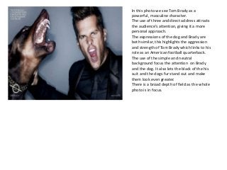
- 1. In this photo we see Tom Brady as a powerful, masculine character. The use of three and direct address attracts the audience’s attention, giving it a more personal approach. The expressions of the dog and Brady are both similar, this highlights the aggression and strength of Tom Brady which links to his role as an American football quarterback. The use of the simple and neutral background focus the attention on Brady and the dog. It also lets the black of the his suit and the dogs fur stand out and make them look even greater. There is a broad depth of field as the whole photo is in focus.
- 2. This photo is remarkable because of It’s heavy emphasis on movement. The black and white filter gives it a more mysterious and engaging aspect and helps their faces stand out in the photo. The clothes hanging in the background make the women's clothing look a lot more bold and exciting creating a more glamorous, yet powerful message. In this photo there is direct address, this is intimidating yet endearing. Their positions show vigorous movement, their stance is strong and outlines a dangerous feeling. There is a narrow depth of field as the background is slightly out of focus, this is so the main focus of the photo is the women.
- 3. This photo Mario Testino has taken is great for many reasons. It has low contrast lighting which creates a warm feeling. He has her arm wrapped around her which shows security and love. The wedding ring has deliberately been placed on Williams chest to emphasize their love and also focus on their royalty and wealth. There is a narrow depth of field as the back window and greenery is blurred. This is to show that the couple are the main focus of the photo. You can tell that the rule of thirds has been used to draw the audience into their eyes, the direct address also attracts the attention as its more endearing.
- 4. What strikes me about this photo is how elegant it is. The black and white filter is used well as it brings out her features and reflects a past time zone. There is quite a narrow depth of field as the background is unfocused, this is to emphasise Emma Watson is the main attraction. They have used perfect direct address to give this a more meaningful and more personal message, this captures the audience. There is a high contrast lighting as around her,the shadows are very dark, this contrasts well with the calm brightness of Watsons skin. The positioning of her body is quite graceful and implies a sense of warmth and beauty. The rule of thirds has been deliberately used to pull the attention to Emma Watsons face and eyes.
- 5. I chose this photo because of the mysterious element. There is a narrow depth of field, which bring out the models glossy eye even more. There seems to be quite natural lighting used in this photo which forms a more subtle photo. Her lipstick has deliberately been chosen as red to stand out again her pale skin which gives it a more fascinating photo. This is a close up shot which makes it more personal to he audience as it is like the model is looking right at us and aiming the meaning of the photo at you. The positioning of the material hides the left side of her face which stresses the mystery and unknown behind this character.