

Empfohlen
Weitere ähnliche Inhalte
Mehr von Theo Perry
Mehr von Theo Perry (19)
Kürzlich hochgeladen
Kürzlich hochgeladen (20)
Album Covers
- 1. Album Covers
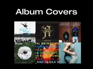
- 2. Architects The gritty look of this album cover suggests aggression. This will appeal to people who like hard music – rock/metal. The logo on the front looks like it could be a tattoo design of some sort, this may also appeal to the target audience as rock and metal music are closely connected to tattoos. Dark colours (black and grey) represent the darkness of the music, as they are connected to bad things – death, depression. The logo is gold with a crown around it. This gives the band an image of royalty; that they are the best at what they do – they are the kings of rock. It also identifies the album name ‘Hollow Crown’. The sharpness of the logo also adds to the hard rock association.
- 3. Placebo This image is fairly deep and dramatic, Linking to the bands music, where the lyrics are often very emotional. You can see that the album isn’t going to contain happy, joyful music. The text is bold and serious, suggesting the music will be likewise, bold and serious. The cold blue background implies sadness. Which will appeal to an audience that maybe feel lost or upset.
- 4. Bombay Bicycle Club This image addresses fun, excitement and also some aspects of deeper emotions. Which is exactly what the album is about (‘I had the blues but I shook them loose’). The dull black and white colours represent the dramatic aspects of life, but the image itself is exciting – A man jumping into an awaiting crowd. This will appeal to an audience that just wants to escape from their troubles, and break lose – jump into a crowd. The blue title is breaking outside of a box, further emphasising the escapism aspect of this album. The body language of the image suggests movement, which will appeal to an audience that want to jump around to some chirpy tunes.
- 5. Crystal Castles This picture is taken up against a dirty, grotty garage door, implying their music is rebellious which will appeal to the target audience. The body language of the artists is unusual, which represents their music. The sloppy, slashy image implies that their music is a bit weird and maybe harsh sounding. The font and replication of the title looks digital, which reflects their electro music.
- 6. Bonobo The large vinyl record made of household objects suggests creativity. So the audience can expect complex and creative music. The green grass is calming, so we can see that the album will not contain rock music or pop, but maybe soothing jazz. So this album will appeal to an audience looking to relax. The formal font of the title represents the music's formality. You would not expect foul language in this album.