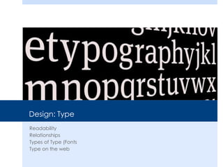
This document discusses type and font readability and relationships. It provides guidelines for using type effectively, including:
1) Readability is the most important purpose of type, allowing easy reading and understanding of text. Factors like size, color and font can contribute or distract from readability.
2) Using one consistent type family with little variation is called "concordant" and communicates formality but can be dull. Mixing similar but different typefaces is "conflicting" and less interesting. Using distinct, different typefaces is "contrasting" and makes for the best designs.
3) There are categories of type including oldstyle, modern, slab serif, sans serif, script
2. Readability
Type has multiple purposes but the most important is readability.
The ability for a reader to easily read and understand the text.
Contributors/Distractors
Size, color, texture, light, font, weight, relationship etc.
4. Concordant
Uses one type family with little change in style, size or weight. This can be used to
communicate a sedated or formal situation but can also be dull.
5. Conflicting
When you combine type faces that are similar but not
the same. This makes the page less interesting because it
is not concordant.
Times New Roman
&Palatino
6. Contrasting
When you combine
separate typefaces
that are distinct and
different from each
other. The best designs
have contrast and this
includes font.
17. My Rules
Never use more than three fonts and two is probably enough
Never use more than one serif font
Never use more than one san serif font
Never use more than one decorative font and only in limited doses
Typically, I choose one Serif, one san and call it a style!