Vip Call Girls Bhubaneswar 🐱🏍 9777949614 Independent Escorts Service Bhubane...
Intro2musicadverts
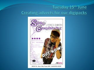
1.
2. Aims
To learn and understand advertising terminology.
To confidently analyse and deconstruct magazine
advertisements using the P.E.E. structure.
To be able to explain how the audience are targeted.
9. What is the purpose of adverts?
To tell us about a product/service/company.
Shows us the benefits of the product – how it can offer
a solution to a ‘problem’.
Persuade us to believe what we are seeing/ hearing and
buy.
10. Advertisers go to great lengths to try and make
their product/company/service stick out in a
saturated market.
Adverts are usually bright, colourful and are eye
catching.
Adverts can also use celebrity endorsement to
promote their product/company/service.
They may use ‘shock tactics’ to gain attention.
11. •What is being
advertised?
•Who is the advert
targeting?
•What stereotyping
is being used?
•What message does
this give to the
audience?
12. Advertising Perfume.
Targeting women.
Showing stereotypical
female as beauty.
Message to the audience is
that if women buy and use
this product they will
achieve this beauty.
Theme of freedom, caged
birds. Message: If you wear
this perfume you will be
free to express your beauty.
13. Your Task
To create a print magazine advertisement for the
digipack.
Your advertisement needs to have an image of the
singer/artist/band.
Ensure you have a consistent theme throughout your
digipack.
14. KEY TERMINOLOGY AND CONVENTIONS FOR
A MUSIC ADVERTISEMENT
How many can you identify?
15. KEY TERMINOLOGY AND CONVENTIONS FOR A
MUSIC ADVERTISEMENT
PACK-SHOT
AN IMAGE OF THE PRODUCT
FOR EASY RECOGNITION IN
SHOPS. CONVENTIONALLY
SET IN THE LOWER RIGHT
HAND CORNER.
ACTION LINE
USUALLY AT THE FOOT
OF THE PAGE. THIS
GIVES THE INTERESTED
READER ADVICE AS TO
WHERE TO FIND THE
PRODUCT OR
ADDITIONAL
INFORMATION.
MAIN IMAGE/
FOCAL POINT
THE MAIN IMAGE THAT IS
RELEVANT TO THE IMAGE OF
THE BAND OR IS ECHOED IN
THE ALBUM COVER/ MUSIC
VIDEO IMAGERY.
BODY COPY
THE MAIN BLOCK OF
TEXT ON A DISPLAY
ADVERTISEMENT. ITS
FUNCTION IS NOT TO
CATCH THE EYE BUT
TO PROVIDE FURTHER
INFORMATION.
BAND NAME &
TITLE
THE BAND NAME SET IN
ITS USUAL TYPOGRAPHY
FOR INSTANT
RECOGNITION. THE
ALBUM TITLE WILL ALSO
HAVE ITS OWN
TYPOGRAPGY.
REVIEWS
SOUNDBITES / QUOTES OR
RATINGS FROM MUSIC
MAGAZINES ABOUT THE DVD.
OTHER ASPECTS
YOU MIGHT ALSO INCLUDE
SCREEN GRABS FROM THE DVD/
SOME EXPLANATION OF THE
CONTENT/ EMPHASISE THE
MUSIC VIDEO FOR THE SINGLE
YOU HAVE PRODUCED/ EXTRAS.
16. Pack (or product) shot
The pack shot is centred
and the image on the
pack shot is the same as
the background image
and it almost looks like
looking through the
lens of a camera as it is
filming.
.
17. Other key features to consider in adverts
Slogan
Web addresses
Release dates
Quotes from magazines
Contact details
Colour – connotations/denotations
Font – size/colours/underlined etc
Target audience
Message/Ideologies
Representation
20. Usual Typography
The font used for the main title is very funky.
The font is a way of branding the group. Due to
it’s funky font it gives a very happy and lively
representation to the group. It makes them
seem very fun and exciting. Also by using
yellow they are reinforcing the bright and
liveliness of their music and their band.
Main Image
For the main image, The Pharcyde’s have
taken a picture of the whole group posing in
different directions. This shows to the audience
that each member of the group is different and
has his own style and personality. For example
the member in the white hat looks more stylish
and cool in comparison to the guy in the red
hat who looks more dopey/funny.
Album Title
Although the album title is not very big it still is
quite attractive. This is due to the colours and
the font. The colours are very bright; and once
again the colour yellow is used which has
become of source of recognition. The font is
also in a funky graffiti form. This links back to
the band having a funky and lively
representation. This has been shown
throughout the album title.
21. This is an advertisement for a CD
album. It’s aim is to appeal to a wider
range of audiences through a
magazine. By adding it into a
magazine they are able to draw their
target audiences attention to the
album which also increases the
recognition of the album.
The advert is targeting mainly young
males from the age of 16-23. I know
this because it is a Hip Hop album
and the hip hop genre is mainly
listened by young males. Also it is
targeting people who pay interest in
the Hip Hop genre as it is from a Hip
Hop magazine. This also links into
the advert targeting black working
class people as they pay a lot of
interest in the Hip Hop genre.
22. The artists are represented to be
quite funky, fun and entertaining.
This is shown throughout the
advert due to the colour scheme,
typography and also the way the
main image has been taken. These
key features are also used to help
give their music the same
representation as their image e.g.
lively and funky.
In addition to the representation
the key features also help give a
message to their audience. The
message that the album cover
gives is that the band have very
upbeat and wild music,
23.
24. Magazine Advert Homework
Due Tuesday 22nd June
Find TWO music magazine advert (print or online) from
TWO different music genres – advertising a
single/album.
Deconstruct and analyse your advert. Highlight the key
conventions (artist name, album title, slogan, logo, action
line, pack shot and so on) and use the P.E.E. structure.
Write an accompanying paragraph answering the following
questions:
What is being advertised?
Who is the advert targeting? How do you know?
How is the artist and their music represented? Is stereotyping
being used?
What message does the advert give to the audience about the
album?
Please include a copy of your adverts.