
Empfohlen
Weitere ähnliche Inhalte
Kürzlich hochgeladen
Kürzlich hochgeladen (20)
Empfohlen
Empfohlen (20)
Magazine Conventions
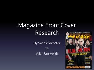
- 1. Magazine Front Cover Research By Sophie Webster & Allan Unsworth
- 2. House Style The overall house style of the magazine is based on the colours red and yellow. These colours contrast strongly against each other, as well as the dark and shadowed background. This draws the attention of the audience as both of the colours are bright enough to be noticed amongst other magazines. The font is also noticeable as the text is consistent. With an army style font taking up the headlines and sub headlines while a bold yet simple font is used to add information. This is them only compromised with the masthead and tagline which use the same, messier font. These two font styles are consistent throughout the magazine.
- 3. Mast Head The mast head on the magazine challenges the usual conventions as the text isn’t the biggest on the cover. This goes against the conventions as it isn’t the mast head that draws the audience to the magazine, but the headline which is the bigger and bolder text on the cover. However, the mast head does draw attention as the colour is bright and starkly contrasts against the background with the bright yellow colour and thin red outline. The colour is bright enough to draw the attention of the audience. As well as the fact that the font is completely different to the rest of the font used on the cover. It’s also covered by the main image, which suggests that it’s noticeable enough to be covered and still recognized.
- 4. Tagline The tagline goes against the usual conventions, as it lists things within the magazine and the genre’s the magazine covers instead of using a short sentence to promote it. The font is the same as the mast heads, keeping the house style together as it keeps to continuity. The text isn’t the only white text on the cover, but it stands out the most as it’s similar to a banner and is at the very top of the page.
- 5. Main Image The main image is the largest image on the cover. It’s central within the page, covering both the main headline and the masthead. The background is dark, making the subjects in the image blend slightly as they are wearing dark clothes. The overlap over the various text implies that the subjects in the picture are important enough to not need the text for the audience to recognize who they are. Due to the main subjects stance and hand gestures, it could also imply that they don’t care if they are known or not, so that cover the text. They use direct address as the subjects look straight at the camera which includes the audience and gets their attention.
- 6. Main cover line / Sub-cover lines The headline is in the biggest font on the front cover, taking up the most space in a large red font. The font used is then used on the rest of the subheadlines. This continuity continues the housestyle, along with the colours. The font is bold and eye catching, and the style looks as though it doesn’t belong on a punk magazine due to it’s connotations of being a primarily ‘army’ font. The subheadlines use two different styles. Those on the bottom and top framing the cover are bright yellow with a red outline in a bold and simple font as they list content within the magazine. On the other hand, the more important articles within the magazine follow the same style of the headline, with the ‘army’ font as the title, and simple yet bold text underneath explaining the content. The colours are yellow and white, making the text stand out against the background.
- 7. Other Images The only other image on the cover is the joint image of two promotional offers of art prints. These two images are small and in the corner of the cover, and partially covered by the main image. This signifies that the promotion is not the main pull of the magazine. However, the images are both framed in white, making them stand out.
- 8. Main Conventions The main conventions within the cover are simple and obviously put in the right hand bottom corner of the cover. The barcode is the largest image with the price and issue number above it in a small font (relative to the rest of the font on the cover) in a bright red. This stands out against the black background, and contrasts with the white background of the barcode. It also supplies the magazines website underneath the issue number and price.