
Empfohlen
Empfohlen
Weitere ähnliche Inhalte
Kürzlich hochgeladen
Kürzlich hochgeladen (20)
Empfohlen
Empfohlen (20)
Maloney Interpretive Sign Design
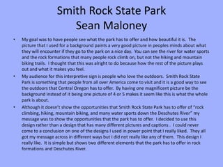
- 1. Smith Rock State Park Sean Maloney • My goal was to have people see what the park has to offer and how beautiful it is. The picture that I used for a background paints a very good picture in peoples minds about what they will encounter if they go to the park on a nice day. You can see the river for water sports and the rock formations that many people rock climb on, but not the hiking and mountain biking trails. I thought that this was alright to do because how the rest of the picture plays out and what it makes you feel. • My audience for this interpretive sign is people who love the outdoors. Smith Rock State Park is something that people from all over America come to visit and it is a good way to see the outdoors that Central Oregon has to offer. By having one magnificent picture be the background instead of it being one picture of 4 or 5 makes it seem like this is what the whole park is about. • Although it doesn’t show the opportunities that Smith Rock State Park has to offer of “rock climbing, hiking, mountain biking, and many water sports down the Deschutes River” my message was to show the opportunities that the park has to offer. I decided to use this design rather than a design that has many different pictures and captions . I could never come to a conclusion on one of the designs I used in power point that I really liked. They all got my message across in different ways but I did not really like any of them. This design I really like. It is simple but shows two different elements that the park has to offer in rock formations and Deschutes River.
- 3. 1st-2nd • Added more pictures to better relay my message • Added captions to those pictures • Changed format of the design
- 5. 2nd-3rd • I wanted more of a rocky/outdoors feel so I changed the background • Took away captions • Resized and reformatted the design with title in middle of the page to draw attention to the title
- 7. 3rd-4th • Tried something completely new that I liked. • Used the best picture of Smith Rock State Park as background • Switched text boxes to fit into the background • Added title in the sky to almost look like clouds
- 9. 4th-Final • I knew I was close but still not quite there. • Change the font of the title. I wanted something that stood out more and you could see from farther away. • Changed location of the text boxes. They were running into the picture and didn’t fit very well. I resized them and the text box that is on the left side, I tried to align it with the tree line at the same angle. • The final change that I made was to the text. Made it bolder and easier to read.