
Empfohlen
Weitere ähnliche Inhalte
Was ist angesagt?
Was ist angesagt? (20)
Andere mochten auch
Andere mochten auch (13)
Ähnlich wie Friday the 13th analysis
Ähnlich wie Friday the 13th analysis (20)
Friday the 13th analysis
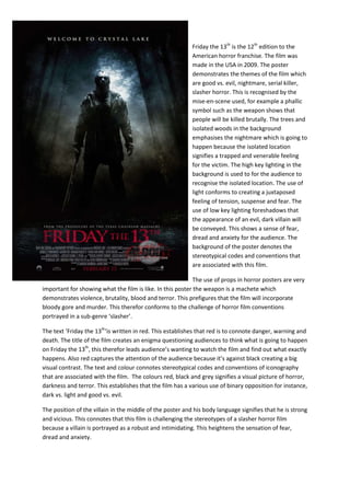
- 1. Friday the 13th is the 12th edition to the American horror franchise. The film was made in the USA in 2009. The poster demonstrates the themes of the film which are good vs. evil, nightmare, serial killer, slasher horror. This is recognised by the mise-en-scene used, for example a phallic symbol such as the weapon shows that people will be killed brutally. The trees and isolated woods in the background emphasises the nightmare which is going to happen because the isolated location signifies a trapped and venerable feeling for the victim. The high key lighting in the background is used to for the audience to recognise the isolated location. The use of light conforms to creating a juxtaposed feeling of tension, suspense and fear. The use of low key lighting foreshadows that the appearance of an evil, dark villain will be conveyed. This shows a sense of fear, dread and anxiety for the audience. The background of the poster denotes the stereotypical codes and conventions that are associated with this film. The use of props in horror posters are very important for showing what the film is like. In this poster the weapon is a machete which demonstrates violence, brutality, blood and terror. This prefigures that the film will incorporate bloody gore and murder. This therefor conforms to the challenge of horror film conventions portrayed in a sub-genre ‘slasher’. The text ‘Friday the 13th‘is written in red. This establishes that red is to connote danger, warning and death. The title of the film creates an enigma questioning audiences to think what is going to happen on Friday the 13th, this therefor leads audience’s wanting to watch the film and find out what exactly happens. Also red captures the attention of the audience because it’s against black creating a big visual contrast. The text and colour connotes stereotypical codes and conventions of iconography that are associated with the film. The colours red, black and grey signifies a visual picture of horror, darkness and terror. This establishes that the film has a various use of binary opposition for instance, dark vs. light and good vs. evil. The position of the villain in the middle of the poster and his body language signifies that he is strong and vicious. This connotes that this film is challenging the stereotypes of a slasher horror film because a villain is portrayed as a robust and intimidating. This heightens the sensation of fear, dread and anxiety.