Nurturing Families, Empowering Lives: TDP's Vision for Family Welfare in Andh...
Needcontents pg
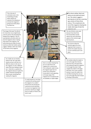
1. This is the axis of The colours yellow, black and
orientation seen in the white are very bold and stand
Guttenberg principle, out. The colours suggest a
which catches are
warning due to the fact a warning
attention first allowing us
sign consists of these three
to know the magazine is
going to be mainly about colours. This compliments the
You Me At Six. rest of the magazine showing the
reader what type of style the
magazine uses.
The image of the band ‘You Me At The rule of thirds is also used,
Six’ show them very straight faced because if we drew three
and very serious also portraying the lines horizontally it would
feeling of the magazine. Their all capture the most interesting
wearing black and white which are aspects of the contents page
also the magazine colours relating like the picture.
them back to the magazine. The
white back ground makes the band The columns allow the
stand out, while their leather jackets contents page to be more
suggest ‘rebellion’ which also relates organised. Also its easier to
to the theme of the magazine. read for the readers because
it’s all in small bits and in one
place.
As a reader we are instantly
drawn to the ‘win’ sign which The numbers allow the reader to
stands out due to the fact its in turn to the page that interests
Here is an advert showing how
different colours to the rest of them the most, and saves them
you can subscribe to the
the magazine. Its also a different time looking through the magazine
magazine for a certain price.
style of font also making to stand for the page they want. Helps
This is telling the reader to buy
out. I think this is a positive for navigate the reader to the pages
the magazine again but at a
the magazine because it grabs the they want. This is also a positive
certain price saving them
readers attention knowing that because it saves the reader time
money which is very appealing
they can gain something from and effort knowing they can just
to the age range of the
reading this magazine. turn to the page they want instead
magazine 16-21 (students) who
of finding it themselves.
are probably on a tight budget.
If I could improve on one thing
it would be the writing used in
the magazine. As a reader I
find the font very boring and
small and not very attractive.
To ensure my magazines more
attractive I would use a bigger
font so it looks as if there’s less
text to read.
2. The word ‘contents’ is very clear and at
the top of the page establishing what
page the readers on.
The font used is
very formal and not
very attractive
which compliments
the rest of the Similar to the Kerrang magazine
magazine and the Uncut also uses the rule of thirds
style it uses. making the image used the central
attraction. Due to the fact this is the
only image used tells the audience
that Marc Bolan will be the
magazines main feature. Also it
shows the magazine is aimed at an
older audience 20+ through the lack
of images.
The page numbers also
stand out, once again
navigating the reader to
The background used is of a field in
the page they want
an open environment suggesting the
specifically. They also fit
magazine takes more of a relaxed
into the colour scheme
approach to music and more of an
giving it a clear reference
open approach.
to the magazine that the
readers reading.
The magazine also uses
columns making the contents
page very organised and easy
The guitar in the image is shown to be a
to follow, which could
classical guitar reminding the audience
compliment the rest of the
what kind of music the magazine features
magazine suggesting the Unlike Kerrang Uncut doesn’t feature a
which is classical rock music. This once
magazine is organised making subscription offer which I think is a
again suggest that the magazine is aimed
it easier to read. After looking weakness. To improve this magazine I
at an older audience.
at both of the contents pages I would put a subscription offer on the
have chosen to use columns on contents page allowing the reader to
my contents page because it buy more of the magazine but at a
makes it a lot easier for the certain price.
reader to read and it also looks
more presentable.