

Empfohlen
Weitere ähnliche Inhalte
Was ist angesagt?
Was ist angesagt? (18)
Andere mochten auch
Andere mochten auch (19)
Ähnlich wie Comparing print with online
Ähnlich wie Comparing print with online (20)
Mehr von Vicky Casson
Mehr von Vicky Casson (19)
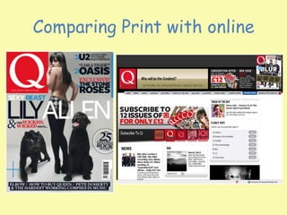
Comparing print with online
- 1. Comparing Print with online
- 2. • Audience identification with the iconic, recognisable masthead first appeals to consumers – taking up 15% of the front cover an enigmatic, upper case, bold, white on red, block serif letter „Q‟ is a box on the left hand side top of the cover.
- 3. • This departs from the conventions of magazine covers that normally run a masthead run along the top of the front cover. „Q‟ is enigmatic, just like the regular Spine Line which changes every months because many readers will be uncertain why it is called by this name and according to the Editor it looks original and displays better on newsstands (the magazine was planned to be called „Cue‟ as in cue the music but it was thought there was an outside chance it could be mistaken for a snooker magazine, a sport which was very popular when Q launched in 1986. The white letter could signify simplicity or purity while a red background has connotations of danger – the founders of the magazine thought at the time that the music press was ignoring older, primarily male music buyers. Audience Enigmatic: Something that makes readers engage with a text by asking questions. •Spine Line: Text written along the spine of a magazine.
- 4. • Within the masthead, the magazine‟s tagline is foregrounded – „A DIFFERENT TAKE ON MUSIC‟. This again encodes a sense of originality and almost „independence‟ to audiences. • Q magazine devotes a significant amount of content to established, mainstream Rock artists and belongs to the Rock genre frequently running articles on its favourite British bands including the Rolling Stones, Stone Roses and Blur. • A DIFFERENT TAKE ON MUSIC‟ however is another successful way to market to audiences who perhaps do not have the significant cultural capital of the primary reader Tagline: The saying or textual association of a magazine. Cultural Capital: The pre existing knowledge, skills and experience an audience have that affect their reading or deconstruction of a media text.
- 5. • Q magazine has high production values and this is evidenced by its glossy, monthly format and also by fact that it is published by the Bauer Media Group, one of the oligopoly of magazine publishers who acquired EMAP in 2008. Bauer own 282 magazines in 15 countries and also TV and Radio stations and are the UK‟s largest publishing group. • It is with this financial backing that Q can sustain relatively low monthly circulation of 80,400, as with most other consumer magazines a common occurrence with many diversifying into new media as with Q‟s website www.qthemusic.com. • Bauer‟s other music magazine titles include Mojo and Kerrang who, like Q have diversified into cross media platforms like Q TV and Q Radio. • The Q Awards are also sponsored by the brand (though Bauer) and remain one of the UK‟s most prestigious music awards. It with this in mind that Q sees itself as more sophisticated than other titles offering quality and still attracting high profile advertisers despite the low circulation. Q‟s demographic have a high potential for advertising spend suggesting ABC1, aspirers, male skew, urban and city living 25-45 who are „into their music‟
- 6. • Q have hybridised up to a point with the Rock genre very much apparent but with a focus occasionally on quality indie artists like Pete Doherty and Elbow. Q want to be associated with successful music artists and a way of maintaining their place in the market is by flexibility in terms of genre (see also Kerrang magazine). • Guitar bands are Q‟s main focus and as a result have a close relationship with the Glastonbury Festival producing a free daily newspaper during the festival although as with the above front cover are comfortable with running covers devoted to popular female artists who are invariable framed for the male gaze with this audience in mind. • In April 2010 Q caused controversy when they ran a front cover featuring Lady Gaga, centrally framed in medium shot covering her breasts, only to be banned by some US retail outlets. Unashamedly „boysey‟ Q‟s sister papers include Empire, a wholly mainstream, male dominated film magazine and football magazine FourFourTwo. Hybridised: Where the conventions of two or more genres are combined Framed for the Male Gaze: Where a subject is set within the frame (e.g. a magazine cover) and is sexualised for male audiences (from Laura Mulvey’s male gaze theory).
- 7. • Q are also well known for compiling „lists‟ – on the above front cover a typical example of this would be cover line „The 25 Greatest Rock Movies‟ and have an extensive „Review‟ section (new releases, reissues, live concert reviews and film). • Q TV closed in July 2012 but again focussed on Rock videos and Rock films with the occasional indie and „alternative‟ reference. The saturation of music TV channels and low viewing figures made it untenable that it continue broadcasting. • Q Radio however continues and is available on the internet, on digital radio or on digital television networks with the added advantage of limited production costs while the cost of maintaining Q TV was considerable and without enough advertising revenue to cover costs. • As with the print music magazine, the brand Q • remains recognisable, but for how long?
- 8. • Cover lines on the right hand side of the this edition anchor the masculine representations with not only bands like U2, The Stone Roses and Oasis having hyper real, stereotypical connotations but the lettering also appears in bold, upper case, sans serif block with its own signification of masculinity. • All bands are British and entirely male with all Oasis and The Stone Roses conforming to a hell raising, bad boy image which would be read as aspirational by much of the target audience who are fans of the groups Hyper Real: An exaggerated representation.
- 9. • U2 are foregrounded as a dominant, successful global band with their lead singer Bono often revered and enigmatic. • The sub headings „Good lord, it‟s their masterpiece‟ and „The 55 pint interview‟ again serve to anchor these hyper real masculine associations that the readers expect. The mode of address is used to facilitate this with the magazine talking directly to the reader in an informal way with common use of exclamation marks creating the myth of a personal communication. • This is s similar technique uses by Men‟s Lifestyle magazines to create a form of inclusivity like the readers are all part of the same homogenous group. Collective identity Foregrounded: Where an image or person is put at the front of audiences’ minds.
- 10. The central image, Lilly Allen is a carefully constructed photo shoot ensuring the singer appear frames centrally in long shot, topless looking back at the male audience. Her body language, including a hand on hip, her seductive gaze, and dress code including black tights, heels and hot pants are straight out of a Men‟s Lifestyle magazine and are common conventions • This simplistic, almos t minimalistic front cover suggests the sophistication that Q magazine are looking to achieve – many lower production value magazines have cluttered from covers that have limited design considerations.
- 11. • Across her body the main cover line, „SEXY BEAST LILY ALLEN‟ has its own connotations and could be understood as a pun with the presence of two black Panthers flanked to either side. • Wild cats stereotypically are associated with a sexual connotation (sleek, dangerous, uncontrollable, deadly but beautiful) and are used in this way on the front cover. • Again written in sans serif font her name is foregrounded large as a banner and the colour palette is also stereotypically masculine using silvers, blacks, whites and reds which also serve to create more of an aesthetically pleasing cover. Written underneath Lily Allen‟s name in smaller, italicised this time red for passion and danger upper case text is use of alliteration „WICKED, WICKED WAYS‟ which allows audiences to decode the impact of the sexual representation through use of language.
- 12. • The cover lines that run along the bottom of the front cover signify their importance in terms of genre in that are mainly indie compared to the main cover lines about Rock bands at the top right of the page. Pete Doherty‟s on and off drug dependency is referred to by the cover line „PETE DOHERTY AND THE HARDEST WORKING CORPSES IN MUSIC‟ but a hyper real masculine representation is still apparent as like the other Rock artists he has a bad boy image. • The only female frame of reference on the front cover is an overtly sexualised Lily Allen whose presence is for male audiences and potentially for a secondary female target audience who could see her as an aspirational role model. • Her agreement to appear on the front cover of Q is an interesting one from a marketing perspective as lyrically many of her songs reflect a fierce independence but arguably the cover image references the significant other (men) that her songs do not – this would be a mutually beneficial marketing agreement both for Q and Lily Allen as with the Lady Gaga front cover, both would benefit from notoriety and publicity while Q remain associated with quality artists
- 15. • Q‟s online music magazine, www.qthemusic.com makes continual reference to the established brand that is Q Magazine – much of the homepage is devoted to the print version with subscription offers found in the leaderboard and with an option of a hero shot which is a larger image of the subscription advert. • It would be safe to say that this particular online magazine relies on the iconic print version which it regularly pays homage to. • On the homepage, qthemusic has the significant advantage of immediate navigation and audio visual links and it is constructed in such a way as to be subservient to the dominant print product despite its millions of page impressions and hits compared to the low circulation of Q magazine.
- 16. • The leaderboard boasts the same house style as the print magazine masthead by having the letter Q positioned top left using the same typography and colour palette but without the tagline, „A DIFFERENT TAKE ON MUSIC‟ – • this allows online consumers to focus more on the interactive elements which are not so apparent in the printed version. Next to the magazine title the interactivity starts with the rhetorical question „Who will be the greatest?
- 17. • Wri • Written underneath it states ‟25 YEARS OF DISCOVERING GREAT MUSIC‟ suggesting optimistic ambition to be responsible for the success of more artists than is probably the case. „Who will be the greatest‟, as with the colour palette of red and the font used in the masthead conforms to a house style in Q magazine that as previously identified is keen on list generation e.g. 100 best songs, videos or albums. • This list generation also creates a hierarchy and allows the magazine, both in print and online formats to take an opinionated, subjected but informed analysis on the Rock, indie and „alternative‟ music scene.
- 18. • The use of rhetorical question and indeed list generation conforms to masculine stereotypes of challenge and recording of information for purposes of historical documenting. This is one of the biggest challenges to qthemusic, to reference history and tradition but within a digital, interactive media format. With this in mind the online music magazine still has a male skew with ABC1, aspirers, urban and city living but has a younger demographic. Again stereotypically, older men tend to collect magazines and buy vinyl and CDs while younger audiences use new media and download music. The website caters for both and it is worth recognising again that this is a stereotypical assumption – retro culture is very popular among young target audiences and Rock and older indie bands like the Stone Roses, frequently foregrounded by Q move carefully into this equation. To support this, still in the leaderboard within the smaller Q subscription advert the rock and indie bands Blur, The Darkness and The Stone Roses are advertised as being in the latest edition, all established and historical bands with their better years behind them. Also included are Kasabian, an indie Rock band, Drake, a Hip Hop artist (perhaps acknowledging the younger online audience) and British comedian Ross Noble, himself a surreal but stereotypically masculine character who would conform to the traditional gender skew offered by the brand, Q.
- 19. • The layout of the website is minimalistic, similar to the printed magazine itself but traditional to many homepages i.e. boxy and with little variation of font – significant amounts of white space are above the fold and below the fold (more below the fold as most of the information viewed on homepages is on the top half of the homepage) making navigation straightforward and simplistic Above the Fold: The top half of a homepage. Below the Fold: The bottom half of a homepage.
- 20. • Convergent links on the leaderboard allow users to navigate to landing pages containing a variety of rich media and additional audio-visual content including News, Video, Q Radio, Features, Track of the Day, Gallery , Q Covers (again reinforcing the dominance of the printed magazine), Ticket Shop, T Shits Shop (an an example of B2B merchandising), Promotions and Newsletter. • All the above links reflect the interactive nature of qthemusic with more added value but without a glossy magazine in their hands
- 21. • Promotions and Newsletter. All the above links reflect the interactive nature of qthemusic with more added value but without a glossy magazine in their hands. • The homepage has much lower production values but is able to synergise with Q Radio, link to an archive thus reinforcing the brand, offer instant tickets, photo galleries and merchandising all appealing to a younger demographic.
- 22. As an online Rock magazine qthemusic is less interactive than www.welovepopmag.co.uk and www.toppmag.com as although targeting a younger audience than Q magazine the users are likely to be more „serious‟ about music and less likely to need to be entertained by non relevant interactive links.
- 24. • The hero shot is traditionally placed underneath the leaderboard and is simply a larger advert for Q magazine inviting users to subscribe with inset images of back copies – this branding reinforces the arguably opinionated approach the brand has by promoting itself and not an artist on the main image on the homepage. Next to the hero shot is further evidence of Q‟s subjective, opinionated approach to reviewing with „Track of the Day‟ and „What‟s your favourite Blur album? Hero Shot: The main image on a homepage, above the fold.
- 25. • This interactivity encourages users to identify with a band that is frequently featured within the covers of Q, thus reinforcing the magazine‟s own mediated representation of the music industry. This mediation however is tempered with a clear understanding of the target audience and an awareness of their needs and wants. • Again, good use of white space enables users to navigate above the fold to the next two sections which again ensure interactivity with past news and editions but also a substantive section, „News‟ which runs along the left hand side of the home page and extends right down from above the fold to below the fold – news items offer 3 or 4 lines of emboldened text to attract the target audience followed by 3 or 4 more lines of text with the opportunit • y of clicking through to • the extended story
- 26. • This assumes a certain level of knowledge in relation to the target audience and allows them to utilise their cultural capital in relation to choice of story. • Stories and news as of 6th August 2012 included Morrissey balking at the “blustering jingoism” of the Olympics encoding up to a point a preferred reading that Q are a bit trendy and anti establishment which would be aspirational with some of their „political‟, more left wing readers. • Three other stories make reference to Blur, one to icon Bruce Springsteen and another offering tickets to see another „grandfather‟ of rock, Lou Reed. As identified earlier, association with established stars remains important to qthemuisic.
- 27. • Further convergent links to Q Radio again develop a cross media approach to continuing the brand image of Q while the right hand side of qthemusic has a larger amount of white space below the fold reflecting the lack of navigation of this part of homepages by users. • In terms of design and layout what it also serves to generate is visual interest in the news column as it is juxtaposed to nothing. Qthemusic normally runs skyscraper adverts along both sides of the homepage and relate directly to the target audience in terms of their gender e.g. adverts for Whiskey which stereotypically is a spirit drunk by older male consumers. Juxtaposition: Where something is deliberately placed next to something to create a third meaning. Skyscrapers: Adverts that run down the side of a web page (and that look like skyscrapers).
- 28. Your task • In the exam you can use these details if they are relevant, however, you need to use your own case studies to prove that you are an „independent learner‟ and that you haven‟t just been „spoon fed‟. • You can use the case study you created earlier in the year, and add detail to it, so it reads more like this one. • Have your glossary by your side so you can raise the level of your response to an A+ use of terminology.