126 years of Wimbledon programme design
•
2 gefällt mir•591 views

The first and oldest tennis tournament, Wimbledon which is 137 years old this year, is underway on the outskirts of London, England. For those who managed to get a ticket and a seat in Centre Court or any of the courts for thatmatter, they’ll be carrying at least one of three things; a glass of Pimms, a carton of strawberries and cream or a copy of this years Wimbledon programme, which they’ll keep for years to come. Read the full article on Creative Bloq - http://www.creativebloq.com/print-design/wimbledon-programmes-61412151 Presented by St Ermin's Hotel London - http://www.sterminshotel.co.uk/

Empfohlen
Empfohlen
Weitere ähnliche Inhalte
Kürzlich hochgeladen
Kürzlich hochgeladen (20)
Empfohlen
Empfohlen (20)
126 years of Wimbledon programme design
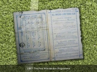
- 1. 1887: The First Wimbledon Programme
- 13. 2013: Wimbledon Programme signed by Andy Murray
- 14. 126 years of Wimbledon Programme Designs Created by View the full article on
Hinweis der Redaktion
- The first Wimbledon programme was released in 1887 when the tournament celebrated its 10th birthday. Despite being just shy of 130 years old, its in rather good condition with most details still visible.
- There are very minor design changes between the 1887 programme and the one pictured above from 1894. The use of borders and page separators increased and more attention was applied to the design of the overall layout. The programme also uses a varied typeset with serif, sans serif and calligraphic style fonts featured in the design.
- A rather small leap was taken from the 1890s to the 1900s with the designs sticking to the design established in 1887. The design consists of a simple, monochrome design with similar decorative borders and typesets.
- The design of the 1922 programme didn’t see any changes, if at all, when comparing its design to designs created in previous decades. This design strategy reoccurs again in the 1960s to 1970s.
- Ten years on and the design took another rather large leap in terms of design. The programme uses a solid blue colour scheme throughout, similar to that of the first programme. However, when comparing it to the programme designed a decade earlier, the form factor is wider representing a traditional programme which stays consistent with the rest of the programmes featured in this article, which are representative of a small magazine.
- The 1940s saw another significant change in programme design. Wimbledon designed the front cover to be as simple as possible. Information, such as fixtures, was removed and replaced with photography to create a standard layout for the front cover, which is still being used today.
- In the 1950s, Wimbledon introduced vibrant colours to the programme design, mainly used in blocks as seen in the above copy of the 1952 Wimbledon programme. Black and white photographs were still a major part of the programme front cover design throughout the 1950s solely due to limited technological advancements and cost.
- The overall design of programmes created in the 1960s followed on from where the 1950s left off. The front cover was restructured along with font styles, colours and sizes. These remained until the end of the 1970s.
- The 1980s saw another significant design change, with the front cover photograph removed and replaced with the common name for the tournament, Wimbledon, placed on the front cover instead. A shortened version of the year was used, removing the 19—prefix from the year. The headline used a variant of 3D text – a first since the tournament began.
- Technological advancements in the 1990s allowed Wimbledon to provide full colour illustrations starting from the middle of the decade. The gates of the Lawn Courts at Wimbledon are featured on the 1990 programme.
- The 2007 Wimbledon programme, pictured above, went through another restructuring process with changes in font sizes and positioning of the ‘Wimbledon’ and ‘Lawn Tennis Championships’ event titles. A large colour illustration of centre court, without the roof that was still being developed, was placed in the centre of the front cover.
- In 2013, the Wimbledon programme was significantly redesigned again. Block colours were slimmed down and changed into borders which were then placed on the left hand side, of which the logo overlaid, located towards the top of the programme. The border colours were coordinated with the colours of the logo; green and purple, which is now a tradition in modern Wimbledon branding symbolising the Wimbledon tennis tournament. Large colour photography is prominent on the front cover, as seen on the 2013 cover pictured above with the trophy for the Gentlemens singles final. The copy was signed by British-favourite, Andy Murray, who eventually won the trophy.