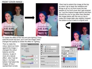
1. To create the effect of the red and pink lighting I have
used the brush tool and put it over the image I then
changed the opacity to create the effect of lighting.
Then to make the
colour stand out more
against the image, I
changed the colour
balance and the
vibrancy to give it
more of a natural
effect , also I had an
Idea in my head
before I had taken the
images of how I
wanted them to look.
I then had to extend the image at the top
so when I go to layer the headline and
things to go on my front cover the two
people on my front cover don’t get covered
up, I put the original image behind and then
moved the one on top down then blended
the image below with the one on top to
make the image taller also slightly cropped
the bottom to put it back to original size
FRONT COVER IMAGE -
2. DOUBLE PAGE SPREAD IMAGE -
Again I have used the brush tool to create the
lighting effect or the old fashioned photo
effect I then changed the hue and saturation
to make the colour stand out, I also changed
the opacity so the colour doesn’t completely
cover the image and it creates a lighting effect
like I did on the front cover image. Changing
the hue/saturation of the image takes away
the harshness of the colour so its more light, I
then changed the brush layer to ‘overlay’
which slightly changes opacity and colour the
opacity was 9% which only gives a slight
colour ‘flare’ across the middle colour is red
and the two at the top and bottom are blue.
3. This was an image I created for the double page spread I wanted to create an album
cover which looked convincing the colours on the image wasn’t edited in I used a filter
in front of the camera when I took the original image which caused this effect.
I cropped the image to make is down to a square size which is the standard album
shape
I used an image I found of the internet to give the image
colour and layered it behind, I then used the shape tool to
create a circle and a pentagon to layer over it and to make
it look unusual
I then added text to give the album a name along with the
artist name I changed up the font to make it look unusual
IMAGES ON DOUBLE PAGE SPREAD IMAGE -
4. IMAGES ON DOUBLE PAGE SPREAD IMAGE -
I used the technique that I used
on the front cover where I use
the brush tool to create colour
over the images then I change
the opacity this time I put colour
in each corner of the images it
gives them a vintage look this
gives it a layered effect
I messed around with the hue/saturation of the image once the colour was over
the top to make the colours change then I changed the layer to overlay to make
it look like the image came out like that natural a sort of polaroid effect.