
Empfohlen
Weitere ähnliche Inhalte
Ähnlich wie Q magazine front cover analysis
Ähnlich wie Q magazine front cover analysis (18)
Mehr von shanwa-lton
Mehr von shanwa-lton (20)
Kürzlich hochgeladen
Kürzlich hochgeladen (20)
Q magazine front cover analysis
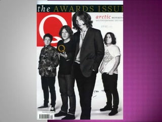
- 2. Mast head – The mast head is very simple just the letter Q – being the magazines recognisable symbol- in a bold white and red colour theme. Its bold effect stands behind the main image which blends in nicely as a whole image, because the mast head is bold and recognisable to its audience it can take risks like this. The skyline – the sky line is very bold as it is the main text on the whole front cover seen as there is no main lead article or cover lines. It’s written in gold making the text seem important as it’s quite a royal choice or colour. Its states ‘The awards Issue ‘which is just publicising Q magazine. Main image – the main image on this Q magazine, is a medium close up making it the main focus, as also all of the text has either been blended in or placed around the image. The band has been put into black and white making the front cover as a whole have a laid back approach, as it makes the band look calm. This is also good on keeping small focus on the text as they have been put in brighter colours. The lead man at the front is holding a – what appears – to be a trophy which is just a giant Q this is directly under the mast head Q which symbolises a mirrored effect, also it looks good by the colour differences on both Q’s.