Mastering Project Planning with Microsoft Project 2016.pptx
13 Basic and Fundamental Tips to Improve Mobile Form UX
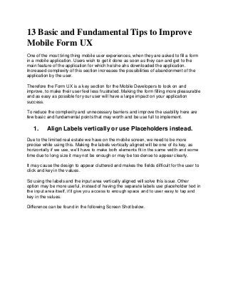
1. 13 Basic and Fundamental Tips to Improve
Mobile Form UX
One of the most tiring thing mobile user experiences, when they are asked to fill a form
in a mobile application. Users wish to get it done as soon as they can and get to the
main feature of the application for which he/she ahs downloaded the application.
Increased complexity of this section increases the possibilities of abandonment of the
application by the user.
Therefore the Form UX is a key section for the Mobile Developers to look on and
improve, to make their user feel less frustrated. Making the form filling more pleasurable
and as easy as possible for your user will have a large impact on your application
success.
To reduce the complexity and unnecessary barriers and improve the usability here are
few basic and fundamental points that may worth and be use full to implement.
1. Align Labels vertically or use Placeholders instead.
Due to the limited real estate we have on the mobile screen, we need to be more
precise while using this. Making the labels vertically aligned will be one of its key, as
horizontally if we use, we’ll have to make both elements fit in the same width and some
time due to long size it may not be enough or may be too dense to appear clearly.
It may cause the design to appear cluttered and makes the fields difficult for the user to
click and key in the values.
So using the labels and the input area vertically aligned will solve this issue. Other
option may be more useful, instead of having the separate labels use placeholder text in
the input area itself, it’ll give you access to enough space and to user easy to tap and
key in the values.
Difference can be found in the following Screen Shot below.
2. 2. Use reasonably a big fields area
It’ll be of great help for your user, if they can easily tap the fields to key in the values,
rather tapping very carefully to avoid the mistake, or accidently tap the wrong field, so
keep the input area larger and easily tap-able. Minimum height of any text area should
not go below 40 PX.
3. User appropriate Labels
While designing a form always keep in mind to provide the user enough information for
what they need to enter in each field. Use meaningful and self-explanatory
words/sentence in labels so that user can easily understand what they need to key in.
Do not use repetitive or too lengthy information in labels, it’ll make your user confused
and ultimately frustrated.
4. Use GPS
If your form requires inputting the users’ location/address use GPS to grab the data and
have them appeared automatically in those fields, BUT must keep the option open if
user wants to edit these values.
It’ll please the user and increase their interest in the application.
3. 5. Make calls-to-action as large as possible
This is seems like an obvious point and yet so many retailers still expect their users to
press a CTA the size of a pinhead in order to submit the form.
Be at least 44x44 pixels.
Have plenty of white space around them to prevent erroneous clicks.
Use a color that’s distinct from the rest of the page elements.
Have the difference reviewed between following 2
6. Avoid unnecessary and optional fields
As we have limited space and mobile form design should be very optimum, so keep the
unnecessary fields out to simplify the process.
For example, “Re-Password” field can be excluded, and instead give the user ability to
view the characters while typing so that user will know what he/she is typing.
Avoid any other unnecessary field which is not required by your application core
business criteria, it’ll be a waste of time and tedious for the user to see or have seen no
use of the details he/she had provided.
Avoid asking DOB and the Age both; anyone can serve the purpose, if you really need
this.
4. 7. Make use of Social Network Plugin for User Registration
User’s registration some time is the very first process user need to go through before
they really play with the app.
Therefore make this process as much as automated. Using Register with Facebook,
Twitter, Google +, LinkedIn may enhance the process. This will give the user option to
avoid keying in registration form values and can fasten the process and avoid or
decrease the users’ frustration as well.
8. Condense into a single page if possible
Office Depot is a great example of this as its guest checkout only requires the card
details, address, phone number and an email address before you can confirm the
payment. This makes the process feel extremely short and should help reduce the
amount of dropouts. Therefore condense your design in one single page if possible.
See the following Image.
9. Simplify the Data Entry Process
Typing with mobile keyword is always very frustrating for the user therefore provide user
with form where they have to make key board entry as less as possible. This can be
achieved by using following.
For any numeric entry, you may provide a Slider with appropriate Range, instead of the
manual entry. For example if asking for Age/Weight of the user you can provide Slider
5. with appropriate range over it instead of the text box to type in. Sliding finger is much
easier for the user then carefully typing the numeric digits from the keyboard.
Use appropriate keyboard type for every Fields. For example for entering the Email field
you should provide the Keyboard having “@” and “.com” keys. For Phone number fields
provide user with Numeric keyboard.
For any Date entry, providing user a Text field will be a tedious work, so provide user a
Calendar instead, it’ll make the process faster and interesting.
10. Divide Form in different Section/Segments
In case if a form requires having too many fields; divide and arrange the fields in
multiple segments/sections.
E.g. If a form requires users’, Personal, Qualification, Biological details and Address, in
this case keep the Personal Information in one segment, Qualification information in
another segment, biological details in different segment and address in different
segment.
Designing the form this way makes the user psychologically feel less tedious then
having all in one full page. So after completing every segment of the form user get a feel
of success and that will keep him/her going.
11. Keep the data saved at every stage
One of the most frustrating things mobile user experiences is that, if for some reason,
he/she navigates away from the app in the mid of form filling and then returns again to
find the Empty form. All the data he has previously filled has lost.
Therefore to avoid this frustration, you can save the previous data in the temporary
memory so that when user returns they’ll find the previously entered data OR alert them
while navigating away about the loss of data.
12. Avoid putting unnecessary Alert
Form validation is a key for the application & developers to ensure the correctness of
the data.
But some time it gets frustrating for the user if for some wrong entry they are getting
alerts boxes and taping OK again and again, therefore simply mark the wrong entry with
some color code instead of putting Alert boxes.
13. Use of Progress bar
6. Ultimately a Form is being filled to be submitted. Some time due to huge amount of data
or some time due to slow internet connection it takes longer to complete this process of
Form Submission. So in this case notify the user about the progress. Keeping the user
waiting on “Loading…” mask makes them feel annoying or frustrating.
Therefore, use of a progress bar in this case, will make them feel safe and progressive.
Thanks for Reading.
Do write your comments.
rupeshchanchal@gmail.com