SlideShare ist ein Scribd-Unternehmen logo
1 von 4
Downloaden Sie, um offline zu lesen
DESIGN NOTES
data e versione www.dadda.it roberto@dadda.it 1 di 4
Why we should never use all uppercase
for long text and why we should not
disturb the upper part of a text.
Newbies in Newsgroups are often identified by the fact that they write ALL CAP: not only
all cap is considered like screaming and impolite by netiquette but also because is more
difficult to read.
There are quite a lot of studies about readability of all cap long texts; the magic number is
40% less readable.
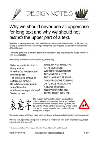
Readability difference is quite obvious just reading:
1
The reason for this difference in readability is
quite obvious if you consider that when reading
known words we do not read letter by letter, we
do see the whole word in a way very similar to the
one we do youse for pattern recognition like in
ideograms or signs.
If we write upper and lower case each word gets a shape and recognition becomes easier.
When a text, specially a long one, is difficult to read users will, even unconsciously, loose
interest on it and leave it!
1
Shakespeare, William, “The Tragedy of Hamlet, Prince of Denmark“ Act III, Scene I
DESIGN NOTES
data e versione www.dadda.it roberto@dadda.it 2 di 4
We may go even further with our experiments, try to read this text:
Difficult, even if you have just encountered the very same text in previous page if we take
out the upper part of the words reading becomes VERY difficult!
It looks like the lower part of the word shape is not so useful to identify words , maybe the
upper part is.
Let’s try to read the text in next page:
DESIGN NOTES
data e versione www.dadda.it roberto@dadda.it 3 di 4
Definitely easier, isn’t?
The upper part of words si the one we use more while reading.
AND SO WHAT?
1) Avoid upper case only in lengthy texts
2) Is good for titles, for short phrases or to put emphasis on a
word (consider bold also)
3) Give some space between lines and between the first line of
blocks and graphical elements to avoid disturbing the upper
part of the text.
DESIGN NOTES
data e versione www.dadda.it roberto@dadda.it 4 di 4
Older programmers like me know very well how hard is all cap reading because in the first
fast printers of large computer systems lower case was not available:

Weitere ähnliche Inhalte

Ähnlich wie Why we should avoid all uppercase text

Technical writing made easier
Technical writing made easierTechnical writing made easier
Technical writing made easierFauzi Rakhman
 
Publishability workshop: Writing readable academic text
Publishability workshop: Writing readable academic textPublishability workshop: Writing readable academic text
Publishability workshop: Writing readable academic textLawrie Hunter
 
Dig imag unit 4 module 1 learning about type fonts and properties[2]
Dig imag unit 4 module 1 learning about type fonts and properties[2]Dig imag unit 4 module 1 learning about type fonts and properties[2]
Dig imag unit 4 module 1 learning about type fonts and properties[2]kateridrex
 
Wd133 unit 4 module 1 learning about type fonts and properties[2]
Wd133 unit 4 module 1 learning about type fonts and properties[2]Wd133 unit 4 module 1 learning about type fonts and properties[2]
Wd133 unit 4 module 1 learning about type fonts and properties[2]kateridrex
 
How to Make Your Strings Translator Friendly
How to Make Your Strings Translator FriendlyHow to Make Your Strings Translator Friendly
How to Make Your Strings Translator FriendlyNaoko Takano
 
December 12, 2019 GRIPS readability workshop
December 12, 2019 GRIPS readability workshopDecember 12, 2019 GRIPS readability workshop
December 12, 2019 GRIPS readability workshopLawrie Hunter
 
Ewrt1 a w15 class 7
Ewrt1 a w15 class 7Ewrt1 a w15 class 7
Ewrt1 a w15 class 7grendel8729
 
Peer feedback factual layout
Peer feedback factual layoutPeer feedback factual layout
Peer feedback factual layoutashboyne
 
Jenny Hill's Tips For Bid Writing
Jenny Hill's Tips For Bid WritingJenny Hill's Tips For Bid Writing
Jenny Hill's Tips For Bid WritingJenny Hill
 
Spadoni • revised Jan. 2020 —continued— Checklist for .docx
Spadoni • revised Jan. 2020 —continued— Checklist for .docxSpadoni • revised Jan. 2020 —continued— Checklist for .docx
Spadoni • revised Jan. 2020 —continued— Checklist for .docxrosemariebrayshaw
 
Accessibility in email - #EoAInsights
Accessibility in email - #EoAInsightsAccessibility in email - #EoAInsights
Accessibility in email - #EoAInsightsMark Robbins
 
How to Edit Paper Fastly?
How to Edit Paper Fastly?How to Edit Paper Fastly?
How to Edit Paper Fastly?Edit My Draft
 
Naming Things (with notes)
Naming Things (with notes)Naming Things (with notes)
Naming Things (with notes)Pete Nicholls
 
Style Manual for the Computer
Style Manual for the ComputerStyle Manual for the Computer
Style Manual for the ComputerJennifer S. Groff
 
A guide to english punctuation rules
A guide to english punctuation rulesA guide to english punctuation rules
A guide to english punctuation rulesMyAssignmenthelp.com
 
Class 9 n writing workshop essay 2
Class 9 n writing workshop essay 2Class 9 n writing workshop essay 2
Class 9 n writing workshop essay 2jordanlachance
 

Ähnlich wie Why we should avoid all uppercase text (20)

Technical writing made easier
Technical writing made easierTechnical writing made easier
Technical writing made easier
 
Publishability workshop: Writing readable academic text
Publishability workshop: Writing readable academic textPublishability workshop: Writing readable academic text
Publishability workshop: Writing readable academic text
 
Dig imag unit 4 module 1 learning about type fonts and properties[2]
Dig imag unit 4 module 1 learning about type fonts and properties[2]Dig imag unit 4 module 1 learning about type fonts and properties[2]
Dig imag unit 4 module 1 learning about type fonts and properties[2]
 
Wd133 unit 4 module 1 learning about type fonts and properties[2]
Wd133 unit 4 module 1 learning about type fonts and properties[2]Wd133 unit 4 module 1 learning about type fonts and properties[2]
Wd133 unit 4 module 1 learning about type fonts and properties[2]
 
How to Make Your Strings Translator Friendly
How to Make Your Strings Translator FriendlyHow to Make Your Strings Translator Friendly
How to Make Your Strings Translator Friendly
 
Ewrt 1 c class 8
Ewrt 1 c class 8Ewrt 1 c class 8
Ewrt 1 c class 8
 
Steps of editing a paragraph
Steps of editing a paragraphSteps of editing a paragraph
Steps of editing a paragraph
 
December 12, 2019 GRIPS readability workshop
December 12, 2019 GRIPS readability workshopDecember 12, 2019 GRIPS readability workshop
December 12, 2019 GRIPS readability workshop
 
Ewrt1 a w15 class 7
Ewrt1 a w15 class 7Ewrt1 a w15 class 7
Ewrt1 a w15 class 7
 
Peer feedback factual layout
Peer feedback factual layoutPeer feedback factual layout
Peer feedback factual layout
 
Jenny Hill's Tips For Bid Writing
Jenny Hill's Tips For Bid WritingJenny Hill's Tips For Bid Writing
Jenny Hill's Tips For Bid Writing
 
Spadoni • revised Jan. 2020 —continued— Checklist for .docx
Spadoni • revised Jan. 2020 —continued— Checklist for .docxSpadoni • revised Jan. 2020 —continued— Checklist for .docx
Spadoni • revised Jan. 2020 —continued— Checklist for .docx
 
Accessibility in email - #EoAInsights
Accessibility in email - #EoAInsightsAccessibility in email - #EoAInsights
Accessibility in email - #EoAInsights
 
How to Edit Paper Fastly?
How to Edit Paper Fastly?How to Edit Paper Fastly?
How to Edit Paper Fastly?
 
Naming Things (with notes)
Naming Things (with notes)Naming Things (with notes)
Naming Things (with notes)
 
Style Manual for the Computer
Style Manual for the ComputerStyle Manual for the Computer
Style Manual for the Computer
 
A guide to english punctuation rules
A guide to english punctuation rulesA guide to english punctuation rules
A guide to english punctuation rules
 
Resume' DIY Fixes (CV)
Resume' DIY Fixes (CV)Resume' DIY Fixes (CV)
Resume' DIY Fixes (CV)
 
Class 9 n writing workshop essay 2
Class 9 n writing workshop essay 2Class 9 n writing workshop essay 2
Class 9 n writing workshop essay 2
 
Class 18 1 a
Class 18 1 aClass 18 1 a
Class 18 1 a
 

Mehr von Roberto Dadda

Mehr von Roberto Dadda (20)

01 usability
01 usability01 usability
01 usability
 
02 unusability
02 unusability02 unusability
02 unusability
 
03 users models
03 users models03 users models
03 users models
 
04 user centered design
04 user centered design04 user centered design
04 user centered design
 
05 1 artifacts
05 1 artifacts05 1 artifacts
05 1 artifacts
 
05 2 artifacts
05 2 artifacts05 2 artifacts
05 2 artifacts
 
07 norms and standards
07 norms and standards07 norms and standards
07 norms and standards
 
08 vision and gestalt
08 vision and gestalt08 vision and gestalt
08 vision and gestalt
 
09 colors
09 colors09 colors
09 colors
 
10 form design
10 form design10 form design
10 form design
 
11 error management
11 error management11 error management
11 error management
 
12 tipography for the web
12 tipography for the web12 tipography for the web
12 tipography for the web
 
14 accessibility short
14 accessibility short14 accessibility short
14 accessibility short
 
13 equilibrium order time
13 equilibrium order time13 equilibrium order time
13 equilibrium order time
 
15 emotional design
15 emotional design15 emotional design
15 emotional design
 
Poli15 uffizi - 2016-02-03
Poli15   uffizi - 2016-02-03Poli15   uffizi - 2016-02-03
Poli15 uffizi - 2016-02-03
 
Poli15 careffour - 2015-12-01
Poli15   careffour - 2015-12-01Poli15   careffour - 2015-12-01
Poli15 careffour - 2015-12-01
 
Poli15 barbie - 20160202
Poli15   barbie - 20160202Poli15   barbie - 20160202
Poli15 barbie - 20160202
 
Poli15 guanda publishing - 2016-02-03
Poli15   guanda publishing - 2016-02-03Poli15   guanda publishing - 2016-02-03
Poli15 guanda publishing - 2016-02-03
 
Poli15 sansha
Poli15   sanshaPoli15   sansha
Poli15 sansha
 

Why we should avoid all uppercase text

  • 1. DESIGN NOTES data e versione www.dadda.it roberto@dadda.it 1 di 4 Why we should never use all uppercase for long text and why we should not disturb the upper part of a text. Newbies in Newsgroups are often identified by the fact that they write ALL CAP: not only all cap is considered like screaming and impolite by netiquette but also because is more difficult to read. There are quite a lot of studies about readability of all cap long texts; the magic number is 40% less readable. Readability difference is quite obvious just reading: 1 The reason for this difference in readability is quite obvious if you consider that when reading known words we do not read letter by letter, we do see the whole word in a way very similar to the one we do youse for pattern recognition like in ideograms or signs. If we write upper and lower case each word gets a shape and recognition becomes easier. When a text, specially a long one, is difficult to read users will, even unconsciously, loose interest on it and leave it! 1 Shakespeare, William, “The Tragedy of Hamlet, Prince of Denmark“ Act III, Scene I
  • 2. DESIGN NOTES data e versione www.dadda.it roberto@dadda.it 2 di 4 We may go even further with our experiments, try to read this text: Difficult, even if you have just encountered the very same text in previous page if we take out the upper part of the words reading becomes VERY difficult! It looks like the lower part of the word shape is not so useful to identify words , maybe the upper part is. Let’s try to read the text in next page:
  • 3. DESIGN NOTES data e versione www.dadda.it roberto@dadda.it 3 di 4 Definitely easier, isn’t? The upper part of words si the one we use more while reading. AND SO WHAT? 1) Avoid upper case only in lengthy texts 2) Is good for titles, for short phrases or to put emphasis on a word (consider bold also) 3) Give some space between lines and between the first line of blocks and graphical elements to avoid disturbing the upper part of the text.
  • 4. DESIGN NOTES data e versione www.dadda.it roberto@dadda.it 4 di 4 Older programmers like me know very well how hard is all cap reading because in the first fast printers of large computer systems lower case was not available: