
Empfohlen
Weitere ähnliche Inhalte
Was ist angesagt?
Was ist angesagt? (19)
Andere mochten auch
Ähnlich wie Font
Ähnlich wie Font (20)
Font
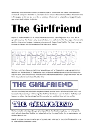
- 1. We decided to do an individual research on different types of fonts that we may use for our title and also credits such as sequence then later on present the chosen font and then we talk about how affective the font is .The purpose for this is to give us an idea on what type of font would be suitable for our blog and how the type of font would relate to thriller film. The Girlfriend Overall we like this font because its simple and affective therefore it doesn’t give too much away. We all agreed in our group that if we are going to use a font we are to use fonts like this. These types of fonts tend to catch the viewers mind because it creates an enigma towards the storyline of the film. Therefore it may also connotes on the easy and also naturalness of the character in the film. This font created lots of argument within our group because half of the people in our group said that they liked this font this because it 3D .However the critics for example me believe that the storyline for this film does not relate to the font therefore makes it useless and un affective therefore lying to the viewers that this film is about action or technology (futuristic) films This font looks identical to the Great Gatsby film title font. However we like this font because it as this class towards it and uncertainty of not knowing what the film or the title type is about .We liked the font overall however we believe that the setting of our film means the font would not blend well into our film. This font looks like a friendly and maybe girlish type of fonts therefore this may favour one certain gender which is female. Overall we liked the font but we believe that the type of thriller film we are doing does not associate with this font. Overall we believe that planning what type of fonts we might use or use for our thriller film would set us up for easier planning later on the course.