
Empfohlen
Empfohlen
Weitere ähnliche Inhalte
Kürzlich hochgeladen
Kürzlich hochgeladen (20)
Empfohlen
Empfohlen (20)
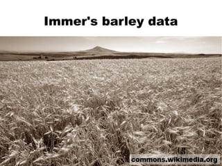
Immer's barley data
- 6. The right visualisation can help you spot mistakes in your data
Hinweis der Redaktion
- In 1934, R F Immer published a paper looking at the yields of different varieties of Barley.
- The rows on the plot are sorted by average yield over the two years, from the highest yielding Trebi variety down to the lowest yielding Svansota variety. Notice that yields for each variety were higher in 1931 than in 1932.
- The previous results were averages from 6 different sites in the Northern United States. The next obvious question is “What happens if you split the data up by site?”
- Average yields changed from site to site, but the general shape is similar in each case. This means that the conclusion of which varieties are higher yielding than others is robust. However, there is one odd thing about the dataset that becomes apparent when you split the data this way.
- At the Morris site, yields are consistently lower in 1931 compared to 1932; the opposite situation to everywhere else. This is widely believed to be a mistake in the dataset.
- The moral of the story is to draw lots of graphs. Visualising your data in many ways can give you greater insight, and help you spot mistakes.
- Thanks for listening.